Take a minute to think about the countless emails that land in your inbox, competing for your attention daily. Have you ever thought about what makes these emails stand out? What prompts you to read or bin it? Good email design is the answer.
When it comes to email marketing, email design is often the unsung hero. To make things right again, we have put together this article where we explore why email design matters, best email design practices as well as real-life industry examples to get you inspired.
Why Email Design Matters
Email design plays a pivotal role in communication strategy as it’s often the first point of contact with your audience, setting the tone for their perception of your brand. A well-designed email not only ensures readability and engagement but also reinforces brand identity through consistent use of colors, typography, and imagery.
It serves a dual purpose: capturing attention in an overcrowded inbox and effectively conveying your message, whether it’s promotional, informational, or transactional. Essentially, the design of an email is not just about aesthetics; it’s about creating a seamless and memorable experience that aligns with the purpose of your message and the identity of your brand.
5 Crucial Elements of an Email Design
But what makes an email stand out? A good email design boils down to 5 critical elements. Balancing those elements in your email design can create attention-grabbing, engaging, and actionable emails that stand out. Let’s dive in:
- Email Layout. The email layout is the alpha and the omega of a winning email design. The layout will determine how the content and the visual elements of the email are presented. With the readers’ attention being limited, a well-crafted layout must ensure that the main message of the email is crystal clear at a glance.
The layout will also determine the white space or other elements like columns and sections where the copy will be arranged. Always make sure that your layout is neat and doesn’t lead to a cluttered design! - Typography. Typography is another crucial element that can make or break an email design. Typography includes everything from the choice of font and its size to text formatting, line spacing, and everything in between.
In email design, legibility is key when it comes to typography, so make sure that this is always in line with widely accepted accessibility guidelines and that the fonts are compatible with your current email service provider. Finally, don’t forget to be consistent across your email, always adhering to your brand’s identity. - Imagery. Images and other graphic elements like gifs and animations can boost the effectiveness of your email design. These elements, apart from making your email visually appealing, also help you convey your message in a far more engaging way than copy does. Make sure to optimize the images, ensuring optimal load time, and always add alt text.
- Buttons. CTA buttons are another vital element for a high-converting email design, and so is linking them to the appropriate landing pages. Buttons are the elements that can make your email design more actionable and attention-grabbing. Don’t forget to add an ‘Unsubscribe’ button at the footer of your email.
When designing email CTA buttons you can experiment with the color, size, and microcopy. Always ensure that your design is responsive and works well on both mobile and desktop devices by conducting a UX audit. - Color. Last but not least, colors can have a huge impact on your email designs. Apart from being consistent with your brand’s guidelines, also ensure that the use of color in your emails is accessibility-friendly. Finally, it’s handy to know that colors have the power to evoke emotions, so be intentional when choosing a color palette for your email.
Key Features of Email Design
If you want to delve into the nuances of email design, look no further. We have compiled a list of the key features of email design and how you can optimize those to create captivating email design campaigns.
Copy
Copy is the king when it comes to email design. Always aim for clear and concise content that conveys at a glance the main reason you are reaching out to your audience. Avoid lengthy, text-heavy sections and complex language full of jargon.
For a more engaging copy, use as few words as possible and tailor your message to the specific needs of your target audience. A compelling subject line and a punchy pre-header are also crucial for boosting those click-through rates.
Subject Line
The subject line is the gatekeeper of your email’s success. It’s the first thing recipients see and determines whether they’ll open the email or not. Crafting a compelling subject line is an art—it should be concise, intriguing, and relevant to the content of the email.
A great subject line resonates with your audience’s interests or needs, creating a sense of urgency or curiosity. Remember, the subject line sets the tone for your email, so make it count!
Structure
Ever wondered why some emails grab your attention while others don’t? It’s all in the structure. Make sure that the information is organized in a logical order following the main header, main body, and clear call-to-action structure.
To improve your email design, consider adding more white space to create clear separation between sections. Additionally, ensure that the design is responsive and optimized for various devices, with a special focus on mobile compatibility.
Headings
Headings are another very important characteristic of email design. Visual hierarchy is key here. In a nutshell, main headings can help you ‘boost’ the content that needs to be consumed first by the reader, while secondary information can be added in the form of subheadings or regular text.
Links
Links play a massive role in email design. The descriptive text that you are using on your links can make or break your click-through rate. Avoid generic and misleading text; instead, be very specific about what users should expect to see upon clicking the link.
Last, but not least, ensure that links stand out from the rest of your text. Don’t forget to add an unsubscribe link at the footer of your email, giving the option for your email readers to opt out.
Calls-to-Action
As briefly discussed earlier in this article, call-to-action buttons can play a pivotal role in user engagement and help generate leads. Be intentional about the location of your buttons. As a rule of thumb, those are placed near the end of the email, offering a call to action as a response to the message of the main body. The microcopy on your buttons is another element that should be carefully thought through — actionable language boosts the click-through rates.
Visuals
Choose images or graphics that enhance your message, and avoid overused stock images. Gifs and animations can add a fun touch, but keep them compressed for quick loading. Always include alt text for images. Be careful not to overload your email with too many visuals, as this can overwhelm and distract your readers.
Color
Personalized CTAs, especially those tailored in color, perform 202% better than basic CTAs. Colors have an emotional impact on your readers. A good grasp of the psychology of colors is essential as this can guide the selection of the right colors for your email designs. For instance, blue conveys trust, while red is associated with stronger emotions like strength or passion.
Typography
As touched on earlier, typography is a big one in email design. There are lots of fonts that you can use in your HTML email builder, but it’s better to opt for safe web fonts that are supported by all the major email providers. This way, you can ensure that your typography will be delivered exactly as you designed it.
Brand Identity
Last but not least, marketing emails are a great way to connect with your target audience, so make sure that your email design is according to your brand book. Use your brand style elements consistently across your email body, and don’t forget to add your logo and social media icons in a prominent spot to increase brand awareness.
5 Email Marketing Design Examples to Inspire You
It’s always better to learn from an example. We did some research and put together this list of 5 great email marketing examples from leading companies.
1. Surreal
The Surreal email design captivates with a playful and bold approach, emphasizing its product’s uniqueness. The design starts with a striking, high-contrast image of a cereal bowl, followed by a quirky, humorous question that challenges conventional breakfast habits.
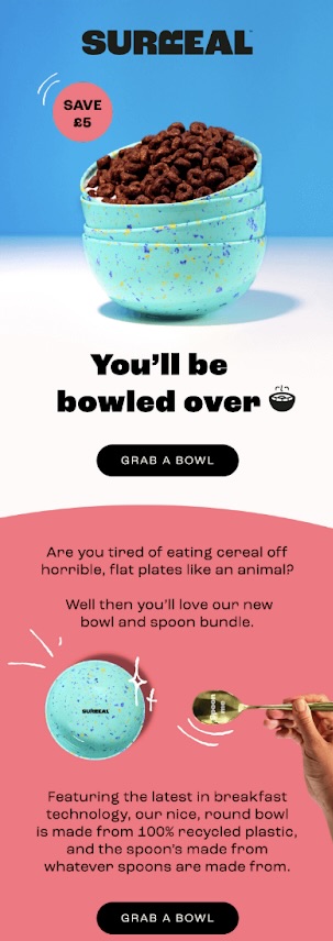
The email introduces Surreal’s new bowl and spoon bundle with a clear call-to-action and a limited offer to save money, creating a sense of urgency. The email concludes with a persuasive nudge: limited availability, reinforcing the exclusivity of the offer.
What we love:
- The use of humor and a conversational tone makes the offer relatable and engaging;
- Vibrant colors and dynamic images draw attention to the products;
- The call-to-action is catchy and directly tied to the product, encouraging immediate interaction.
2. Airbnb
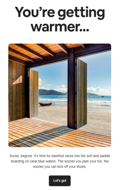
Airbnb is the leading online marketplace for homestays and experiences. In this email example, Airbnb has crafted a harmonious one-column layout email with ample white space that ticks all the boxes. From spot-on hierarchy to an engaging headline and a timely message, their email marketing is a great real-life source to get inspired.
What we love:
- A creative yet simple headline that immediately spikes interest;
- Minimalistic design with a prominent CTA, great use of color contrast;
- Engaging and actionable copy speaks to the reader, making them want to immediately kick off their shoes and go to the beach.
3. Thinx
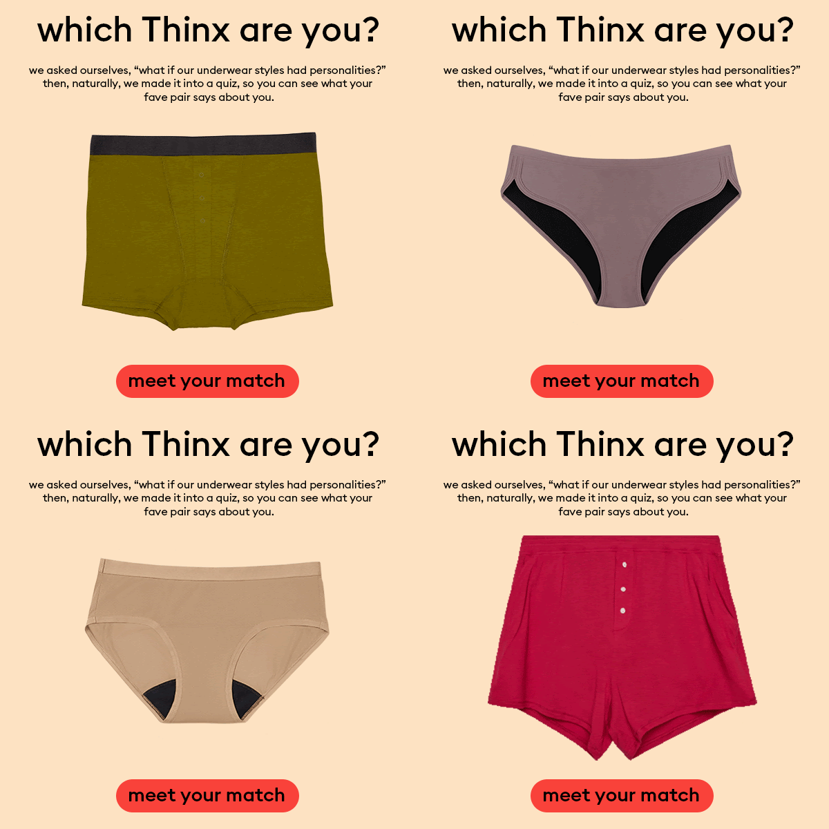
Thinx is a New York-based company that manufactures period underwear as an alternative to traditional feminine hygiene products. This is an exemplary email of personalization done right through dynamic content in email marketing. The email features a captivating heading, and the main design element is a gif showcasing different products denoting different types of personalities.
What we love:
- Eye-catching gif not only attracts attention but also showcases their products;
- Quiz is a great way to raise customer engagement;
- Personalized CTA in contrasting colors invites each reader to participate in the quiz and boosts the click-through rate.
4. West~bourne
West~bourne is presenting a chic, minimalist email design highlighting their product, Everyday Avocado Oil, as more than ordinary. The email is dominated by a high-resolution image of oil being poured, visually conveying the product’s quality and appeal. The design utilizes a bold, contrasting font to capture attention, while the tagline “Not your average oil” cleverly sets it apart from competitors.

What we love:
- The image is the hero, drawing the eye and emphasizing the product’s purity and premium nature;
- A testimonial included as a quote adds a personal touch and suggests gift potential;
- The clear, central CTA “Shop Everyday Avocado Oil” in a noticeable button encourages immediate action and simplifies the user journey.
5. Popsmith
Popsmith presents a vibrant email design that emphasizes the joy of snacking with their modern Popper and popcorn kits. The effective email design, with a bold headline, “YOUR SECRET TO PERFECT POPCORN EVERY TIME”, draws readers in. It features a warm color scheme that complements the product’s branding and an engaging image showcasing its ease of use.

What we love:
- A prominent, enticing offer of an extra 10% off encourages quick action;
- Clear, concise messaging highlights the product’s simplicity and appeal to all skill levels;
- The footer provides easy navigation links and essential information, encouraging further engagement with the brand.
Email Design Best Practices
If you want to craft professional and effective marketing emails, these golden rules are a must:
- Responsive emails. Mobile-friendly emails are here to stay! Always ensure that the email design is responsive to cater to the unique design needs of each device. Don’t forget that mobile device users are on the rise, so check how your email renders on mobile devices;
- Consistent branding. Brand identity is key when it comes to email design. Branding consistency can work wonders when it comes to building a memorable, strong brand that consumers can trust. For an on-brand email design, make sure to always include your logo and not deviate from your brand colors;
- Legibility. Fonts can be pretty, but make sure to prioritize legibility above beauty in your email design. For your main body, choose a 14-16 font, and don’t forget to ensure color contrast between the text and the background;
- A/B testing. Always A/B test your emails. A/B testing involves sending the same email with one variation to determine which version will perform better. CTAS and subject lines are some of the elements that you can test out and determine what works best for your target audience.
Key Takeaways: Email Design
When it comes to crafting emails, design is so much more than purely aesthetics. Written and visual content can evoke emotions, create hierarchy, and build trust, leading to the creation of not only beautiful but also engaging marketing emails.
Here are some key points to remember from this article:
- Good email design enhances engagement and reinforces brand identity;
- Crucial elements of email design include a clear layout, readable typography, custom images, and actionable CTA buttons;
- A compelling and eye-catching subject line is key to getting emails opened;
- Emails should have a logical structure with distinct headings and links for easy navigation;
- Use consistent branding, responsive design, and A/B testing to maximize your email marketing efforts and audience engagement.
Also read:
