Sending your first newsletter can feel like shouting into an empty room. But that shouldn’t stop you from starting one and trying to build a thriving community.
Sending your first newsletter can feel like shouting into an empty room. But don’t let that stop you.
If you’re already juggling a hundred things, planning a newsletter shouldn’t add to the mess.
Good news? We’ve tested and found simple practices that can turn random readers into loyal fans.
Let’s talk about what actually works and how you can make your newsletter planning feel exciting, not exhausting.
20 Email Newsletter Best Practices
Most newsletters fail because they chase numbers, not people. Let’s flip the script and find out what actually makes readers stick around.
So, before focusing on open rates, let’s brush up email campaign optimization fundamentals, like building a high quality and engaged email list.
Building and Maintaining an Email List
Your goal should be to build an engaged email list, first of all. Everything else would be in vain if you don’t attract high-quality subscribers.
Here’s what you should do to build a quality email list:
Using Double Opt-in
Getting someone on your list is exciting — but getting the right people is even better. Double opt-in helps you build a clean, engaged audience from the start.
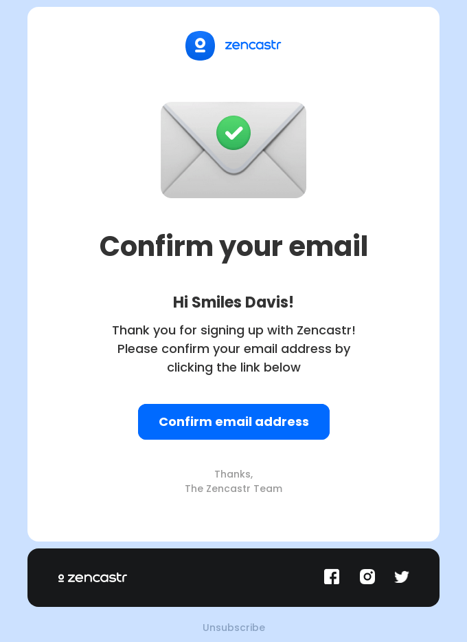
A double opt-in process asks the potential subscriber to confirm their interest in the welcome email.
You might think an extra step can be counter-intuitive but think of it like this — it’s not about making things more complicated; but making sure every subscriber actually wants to hear from you.
Here’s why you should adopt a double opt-in signup process:
- Filters out bots and fake signups. Only real people will confirm their email and join your list;
- Improves deliverability. Fewer fake or uninterested contacts means your emails land in inboxes, not spam folders;
- Shows commitment. A confirmed subscriber is already a little more committed to your brand.
And here’s what your double opt-in email should look like:
Cleaning Email Lists
Holding onto dead email addresses does more harm than good. An unclean list hurts your deliverability, wastes money, and drags engagement rates down.
You must periodically clear your email list to maintain list hygiene. It’s not about losing people; it’s about making space for the right ones.
Here’s what you should do for email list cleanup:
- Removes inactive subscribers. If someone hasn’t opened your emails in months, it’s time to let them go;
- Watch for hard bounces. Delete email addresses that are invalid to protect your sender reputation;
- Segment before removing. Plan a re-engagement email campaign first; some people need a nudge to get active.
Best Practices for Newsletter Signup
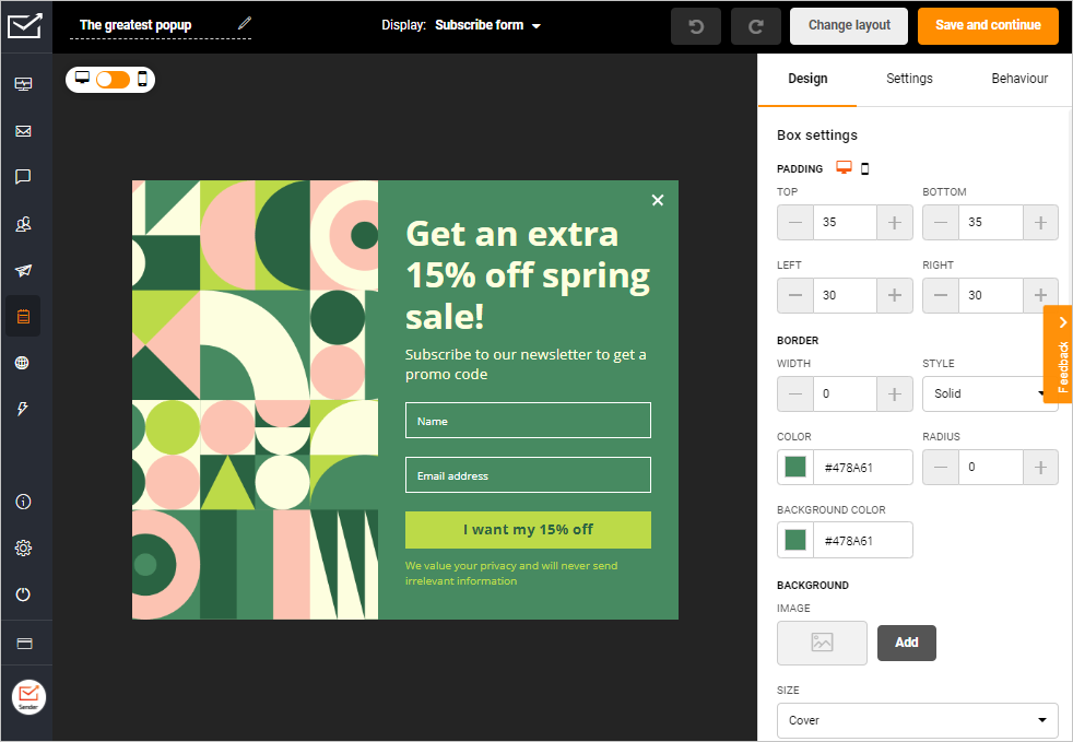
Your signup process is the first step in building trust. Make it effortless and set expectations about what they’ll receive right from the start.
Use eye-catching forms and incentives like discounts or exclusive content. The easier and more transparent the process, the more likely people will subscribe.
- Use a single-step signup form with minimal fields;
- Offer a clear value proposition for signing up;
- Display your privacy policy to build trust.
Improving Newsletter Open Rates
Did you know that 47% of email recipients open an email based on the subject line alone? If you’ve not yet thought of optimizing your newsletter to boost the open rates, here are some best practices for you:
Compelling Subject Lines
Your subject line is your first (and often the only) chance to grab audience attention. Your email subject line should intrigue the email recipients, compelling them to open your email.
Keep it short, direct, and relevant—aim for 50 characters or less. Play with emotions or curiosity to spark interest.
Here are some email subject line optimization tips to keep in mind:
- Make readers curious. ‘New Year surprise inside’ can be a good way to share offers;
- Personalize. Your email subject lines should change based on behavior, or preferences;
- Create urgency. ‘Last chance to save 20%!’ creates FOMO.
If you’re ever stuck with finding the perfect subject line, just check out our subject line library.
Preheader Text Optimization
Your preheader text is like a movie trailer. It offers a sneak peek into your email.
Think of it as an extension of your subject line. Together, they should create a narrative or promise that convinces a reader to open the email. Use the preview text to offer context and avoid repeating the subject line.
Here’s how to create better preheader texts:
- Tease the content. ‘Find out why everyone’s talking about this’;
- Highlight benefits. ‘Exclusive deals inside—don’t miss out!’;
- Intrigue your audience. Share a promise of a sneak peek about the latest updates or industry news.
Sender Name
Your sender name sets the tone of the email conversation. Because before readers even see your subject line, they notice who it’s from.
So, the sender name decides if your email feels like a welcome message or instant spam.
Here are a few tips to make it recognizable and real:
- Use your brand or personal name. ‘Emily @ Sender’ feels way more human than just ‘updates’;
- Stay consistent. Don’t confuse readers by switching names — familiarity builds trust;
- Avoid no-reply addresses. Nothing screams ‘I don’t care’ louder than a no-reply@yourbrand.com.
Audience Segmentation
Not all subscribers are the same, so why send them identical emails? Segmenting your audience helps send the right message to the right people.
For starters, you should segment your list based on behaviors (e.g., past purchases), demographics (e.g., age, location), or preferences (e.g., product interests). This will help you to:
- Send personalized discounts to repeat buyers;
- Create location-specific promotions for regional audiences;
- Share relevant content based on past email interactions to avoid spam folders.
Newsletter Design and Layout
Great newsletter design is more than just choosing the best fonts for email readability—it’s all about functionality. A well-designed email guides readers, ensures clarity, and drives action.
Here are some newsletter design tips and email layout best practices to help you get better results.
Content Layouts
Your layout is the backbone of your newsletter, or any digital marketing asset, in fact. Your readers will always remember you for a visually appealing layout.
Use email newsletter templates with a clean structure. Adding columns, grids, or blocks to group relevant information is a good way to optimize the reading experience.
Here are some more ways to create a smooth newsletter layout:
- Divide in two columns. Use a two-column layout to balance text and visuals;
- Break down segments. Organize using clear headers and subheaders, if you’re covering different engaging email content ideas in a single newsletter;
- Pay attention to formatting. Stick to consistent padding and margins for a polished look.
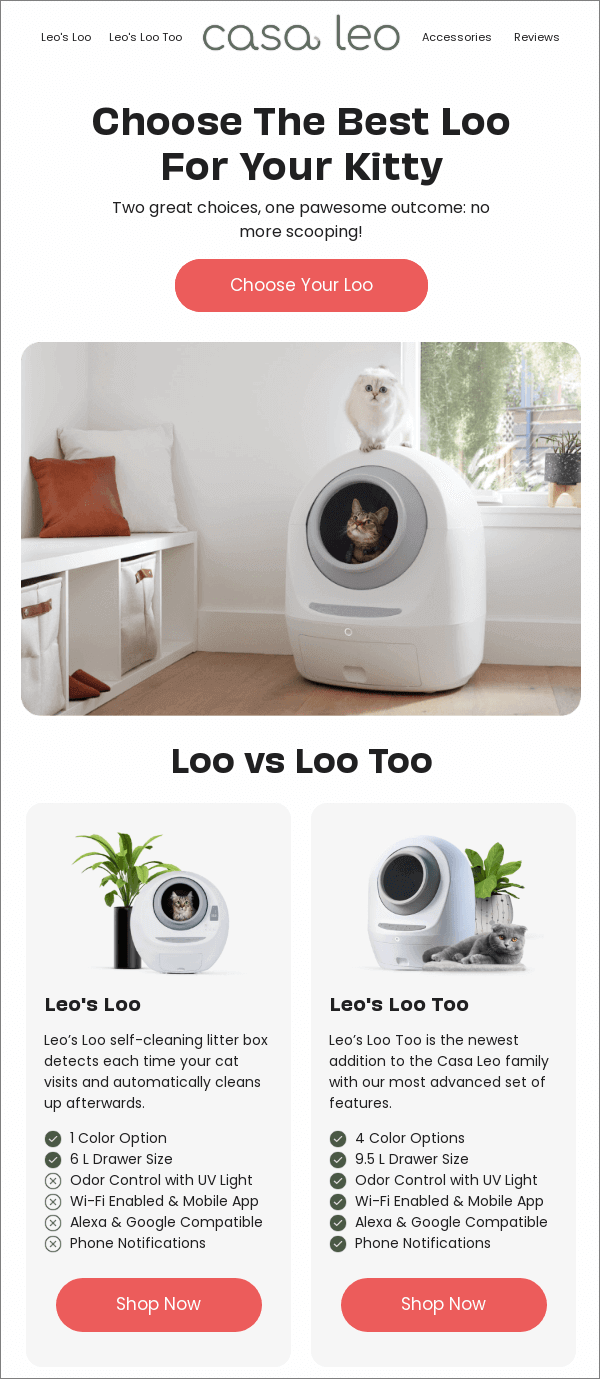
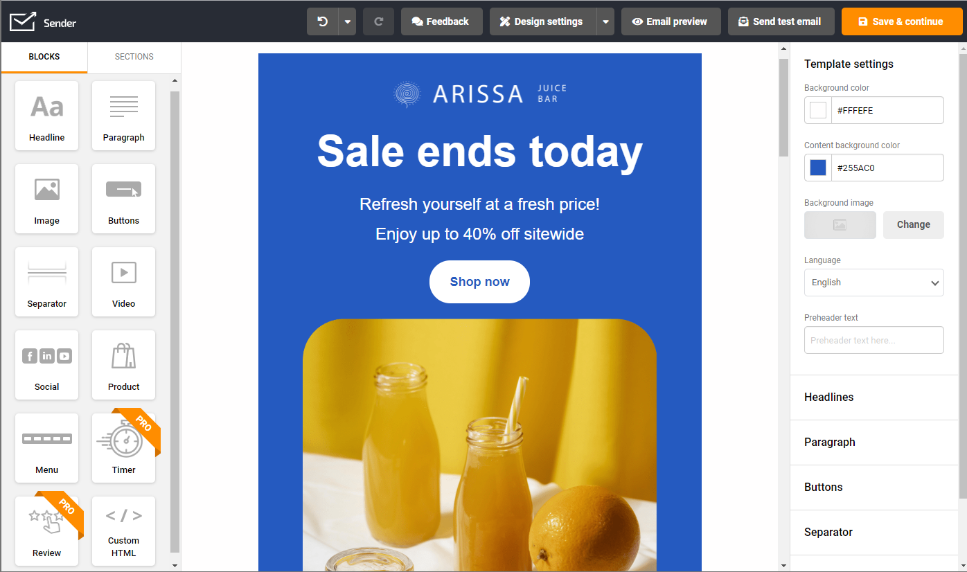
Look how Casa Leo used different sections to create a great layout for their newsletters:
Creating a newsletter has never been easier with Sender’s drag-and-drop email builder. It saves your time & money!
Visual Hierarchy
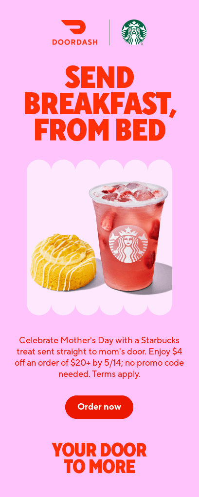
Your audience’s eyes should naturally flow through your email content, guided by design. That’s what a logical visual hierarchy promises.
Use bold, attention-grabbing headlines as your anchors. Follow this with supporting text and eye-catching visuals, layering less critical information as they scroll.
Use contrasting colors, font sizes, and weights to highlight critical elements like CTAs. Here are some more tips:
- Play with fonts. Highlight headlines with larger, bolder fonts;
- Contrast helps. Use color contrast to emphasize CTAs and key points;
- Write strategically. Layer body content, from most to least important to guide the newsletter’s focus.
Here’s a nice example of visual hierarchy and contrasting colors used the right way in a newsletter:
Email Width
Good design starts with making things comfortable for the reader’s eyes. Nobody likes reading an email that feels cramped or stretched across the whole screen.
Having the right email width is formatting 101 and makes your newsletter easy to read. The best way to create a visually appealing email as a beginner is to pick a responsive template.
Here are some specific tips to adjust email width:
- Stick to 600–640 pixels. This range looks great on most devices without forcing readers to scroll sideways;
- Always account for mobile users. Use a responsive design that automatically resizes on smaller screens;
- Test before you send. Always preview your email across devices to make sure it feels natural and easy to navigate.
Use White Space for Readability
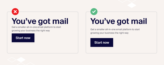
White space is the empty breathing room around your text and images and makes your email feel clean, calm, and easy to read.
With lots of content to scroll through on the internet, people stop at pieces that doesn’t overwhelm them.
The right use of white space in email design can do wonders for your engagement rates. Here are some tips to use white space to your advantage:
- Break up big chunks. Use short paragraphs and leave space between sections so it doesn’t feel like a wall of text;
- Let important elements breathe. Add extra space around headlines, images, and call-to-action buttons to make them pop;
- Focus on the flow. White space isn’t just about looks; it should help readers move naturally from one part of your email to the next.
Here’s a great example of how white space can make your content look more readable:
Inverted Pyramid Layout
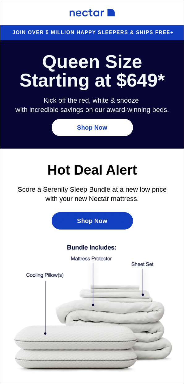
The inverted pyramid is a proven layout structure for digital content, like email newsletters. It puts the most important information first, leverages storytelling in email marketing, and is followed by everything else like supporting details and persuasive email CTAs.
Hook your readers immediately with a compelling headline or key message. This helps them grasp the essence of your email even if they don’t scroll. Follow with details and end with a clear, action-driven CTA.
Here are some tips:
- Start with a bold headline or offer, like “20% Off This Week”;
- Layer in supporting details to explain the value;
- Conclude with a prominent, click-worthy CTA.
Curious about how an inverted pyramid looks in an email newsletter? Have a look at the following newsletter by Nectar:
Visual Breaks for Easy Skimming
No one likes long walls of text. So, adding visual elements in newsletters makes your newsletter inviting and easy to read.
Break content into digestible chunks using headers, add images, or dividers. Use white space generously to enhance readability and focus.
Here are some more ideas for using visual breaks in newsletters:
- Use section dividers. Design for readability by inserting dividers between sections;
- Break down text. Use, bullet points, pull quotes or callouts to emphasize key points;
- Use emojis and icons. Add icons to visually summarize newsletter ideas without extra text.
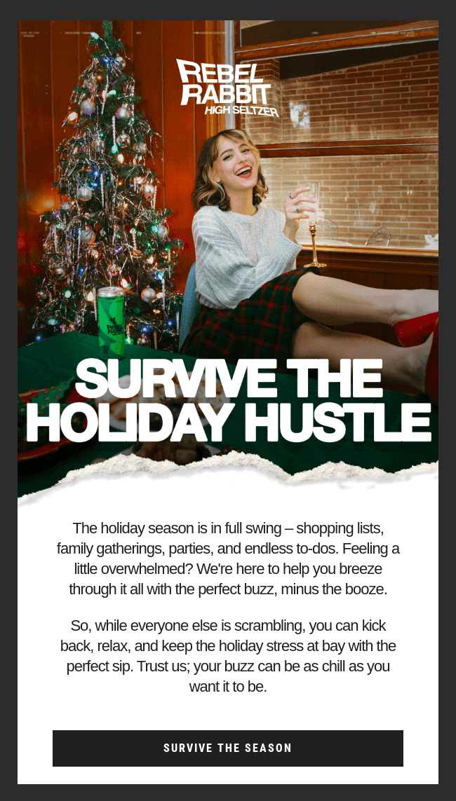
Have a look at the following email by Rebel Rabbit. They’ve used dividers, images, and boxed layouts, together in a single email as visual breaks.
Interactive Elements
Interactive elements breathe life into your newsletters by turning them into an engaging experience.
You can try adding elements like product carousels, polls, or even mini-games to your newsletters. Even something as simple as a clickable rating scale can make a difference.
- Add polls to gather quick feedback;
- Use image sliders to showcase multiple products or ideas;
- Add hover effects to some elements for grabbing attention.
Remember, interactivity should add entertainment or value without overwhelming the reader or slowing down the load times.
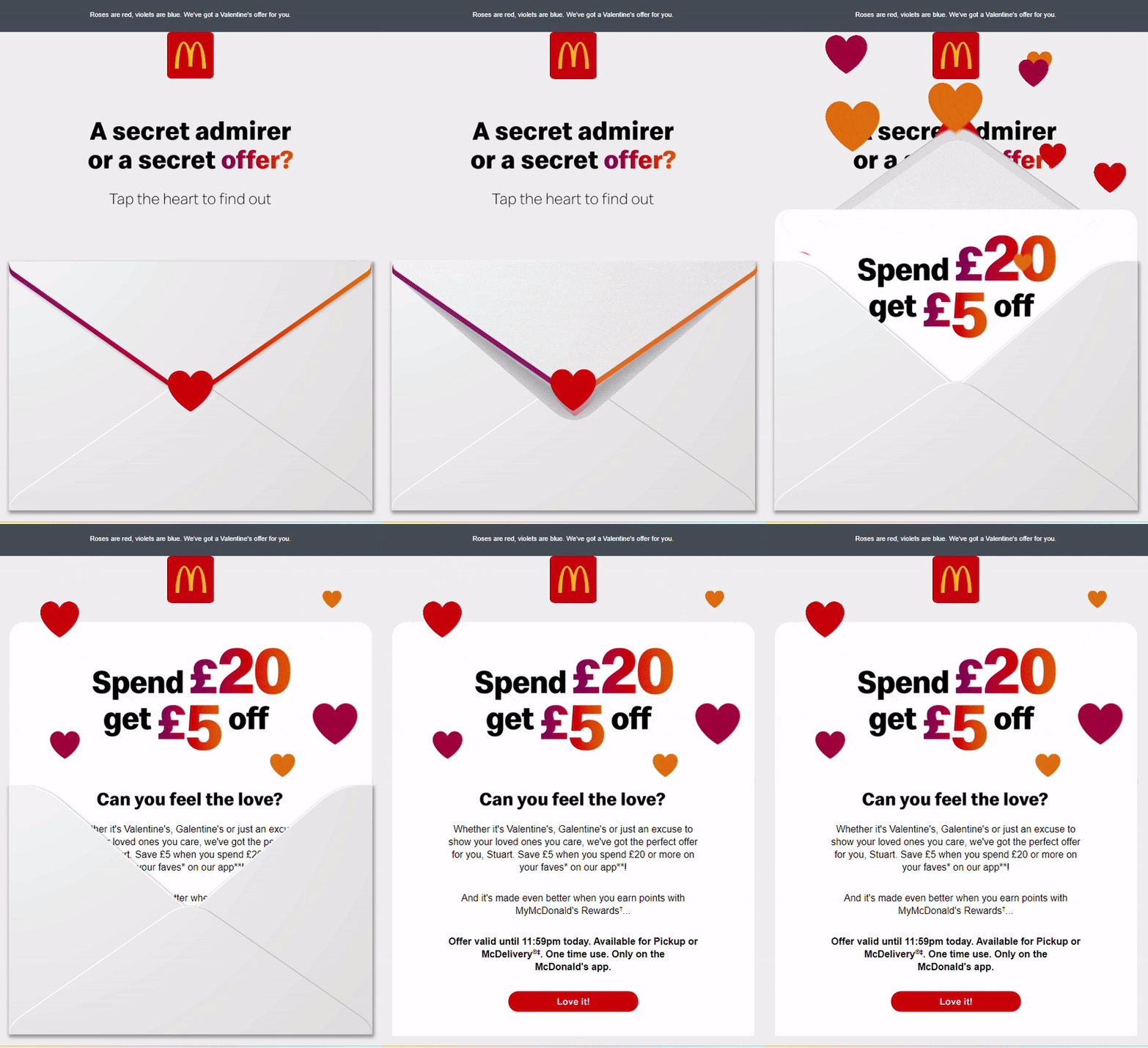
McDonald’s uses interactive GIFs in their email campaigns to maximize engagement. Have a look at one of their campaigns:
Multi-CTA Approach
Adding multiple CTAs in your newsletter ensures you don’t lose a chance to convert. So, strategically place different CTAs throughout the email.
You can personalize it to a specific audience’s needs. For example, include a primary CTA at the top for immediate action and supporting CTAs in subsequent sections to increase engagement.
- Include a prominent CTA above the fold;
- Use action-driven language like ‘Grab Offer Now’ in CTA;
- Use a secondary CTA like following you on social media channels for more deals.
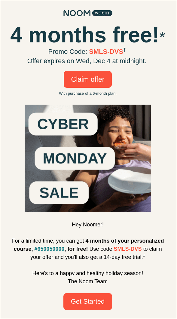
Look at the following email by Noom. It uses two complementing CTAs, both within the same newsletter:
Button Contrast & Size
While talking about CTAs, we can’t stop emphasizing the size and color of your buttons enough. CTAs are the workhorses of your newsletter, and the right color adds a spotlight to them.
Use high-contrast colors to make buttons stand out against the background. Size matters, too—a button should be large enough to click comfortably, especially on mobile devices.
- Choose bold, high-contrast colors like orange on white;
- Keep button text crisp: “Buy Now” or “Learn More”;
- Use enough padding and white space for easy clicks on mobile.
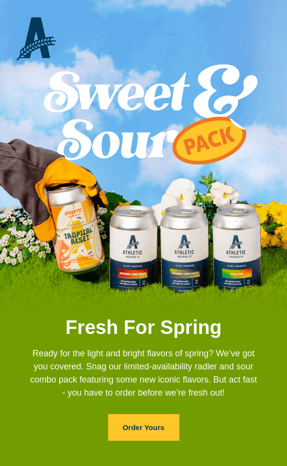
Have a look at this beautiful email by Athletic Brewing with a standout CTA button:
Refining Newsletter User Experience
As we mentioned before, design matters a lot in making a newsletter effective. Another thing is the reader experience your newsletter offers.
Here are some email newsletter best practices to improve your UX:
Mobile Optimization
Over half of all emails are opened on mobile devices. A clunky email on a small screen will lose readers before they even start. So, creating a mobile-friendly email design only makes sense.
Use a responsive design that can adapt to different screen readers and devices. Use readable fonts, tappable buttons, alternative text for images, and single-column layouts for better readability.
Here are some more mobile optimization tips:
- Be concise. Write shorter subject lines; keep under 50 characters;
- Large CTAs. Use a large and tappable CTA button (at least 44×44 pixels);
- Test your emails. Test on various email clients and devices before sending.
- Don’t forget alt texts. Add alt text to all newsletter images.
Here’s an example of how your emails should appear on different devices:
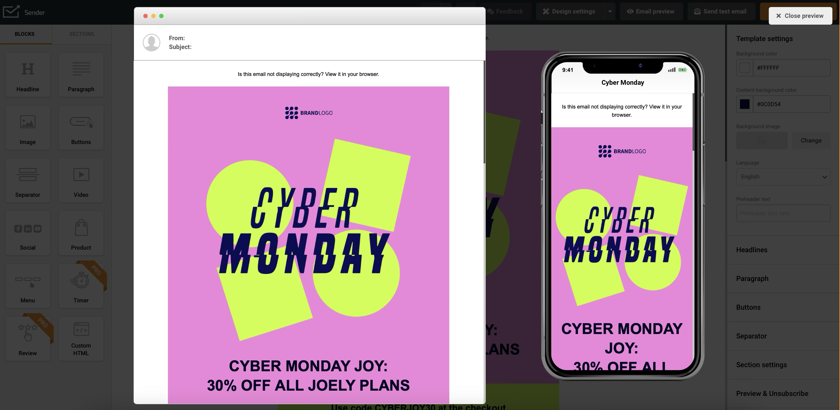
No time to optimize for mobile? Pick a professional template from Sender’s library, customize, and see it rock across devices.
Clear Unsubscribe
A clear unsubscribe process shows respect for your audience. Make your unsubscribe button simple and direct — it’s a sign of trust and ensures GDPR and CAN-SPAM compliance.
Use clear wording like ‘Unsubscribe’ instead of vague terms. Add links in a prominent spot, usually in the footer.
Here are some good practices for unsubscribe links:
- Make it easy to unsubscribe. Add direct links and make sure the unsubscribe links work;
- Offer control. Give an option to allow users to manage preferences;
- Avoid complicated processes. One-click unsubscribe process is the best.
Remember, a hidden or confusing unsubscribe button can frustrate your audience and hurt your sender’s reputation.
Send Time Optimization
Sending your newsletter at the wrong time means your email can get lost in the crowd.
Analyze your past email marketing campaigns and audience’s behavior to find optimal send times. Our research tells us people prefer receiving newsletters late in the evening. But testing is key to finding your sweet spot.
Here are a few tips to optimize your send time:
- Track metrics. Track open rates using your newsletter marketing platform;
- Observe traffic spikes. Compare newsletter engagement with website traffic using Google Analytics;
- Account for global audiences. Consider time zone segmentation if you have an international audience;
- Schedule your newsletters. Schedule at the times when your audience appears most active.
Looking for specific hours? Discover the best time to send an email in 2025.
Content Personalization
Generic newsletters won’t make a great impression. Nowadays, email personalization goes beyond adding names. Your newsletter should feature interesting content that feels tailor-made for your readers. Utilize data like purchase history, location, or preferences to create relevant newsletters.
Here are some simple yet effective email personalization techniques:
- Use dynamic content. Add dynamic content in newsletters based on user behavior;
- Localize your offer. Send location-specific deals or events;
- Utilize audience tags. Use custom tags for names, recent purchases, or preferences.
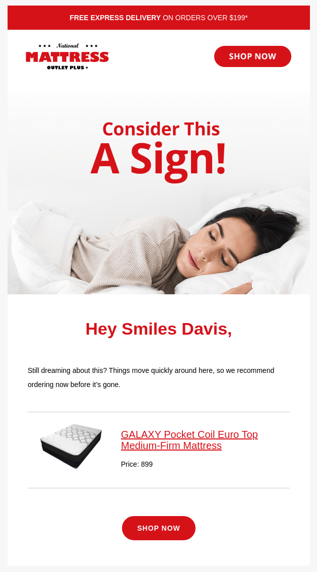
Here’s an example of how you can personalize an abandoned cart using product blocks and name tags to make it contextual:
What Makes a Great Newsletter?
As you know now, creating an effective newsletter isn’t just about fancy visuals or engaging subject lines—it’s about being relevant and providing value to your target audience.
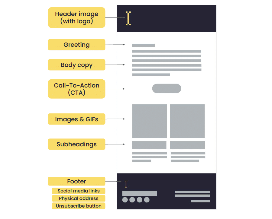
As a parting reminder, here’s a structure of what your email newsletter should look like:
Also, remember to add the following elements to create memorable newsletters that stand out:
- Clarity and value in every issue. Why should someone open your newsletter? Be clear before creating newsletters and deliver useful stuff;
- A clear purpose. Know why you are doing it — whether you want clicks, update your audience, or build a community. Without a clear goal, it’s just noise;
- Reader-centric content. It’s never about what you want to say but what your audience wants to hear. Create newsletter content that speaks to their needs and pain points.
