To be honest, as an email marketing expert, I sometimes wish I could A/B test every decision in life (maybe my friends wouldn’t return my Christmas presents the next day). Well, while we haven’t cracked the code on that yet, there is one area where strategic experimentation reigns supreme: email marketing.
In the world of inboxes and open rates, knowledge is truly king. That’s why email marketing A/B testing is so essential. This isn’t just some fancy trick – email campaign testing, and more specifically email variations testing, is the backbone of any successful email marketing strategy.
In this article, I’ll equip you with proven split-testing strategies to help you achieve email marketing success by one test at a time.
What is Email Split Testing?
Split or A/B testing in email marketing (sometimes also called multivariate testing) is like having a mini science lab for your email campaigns.
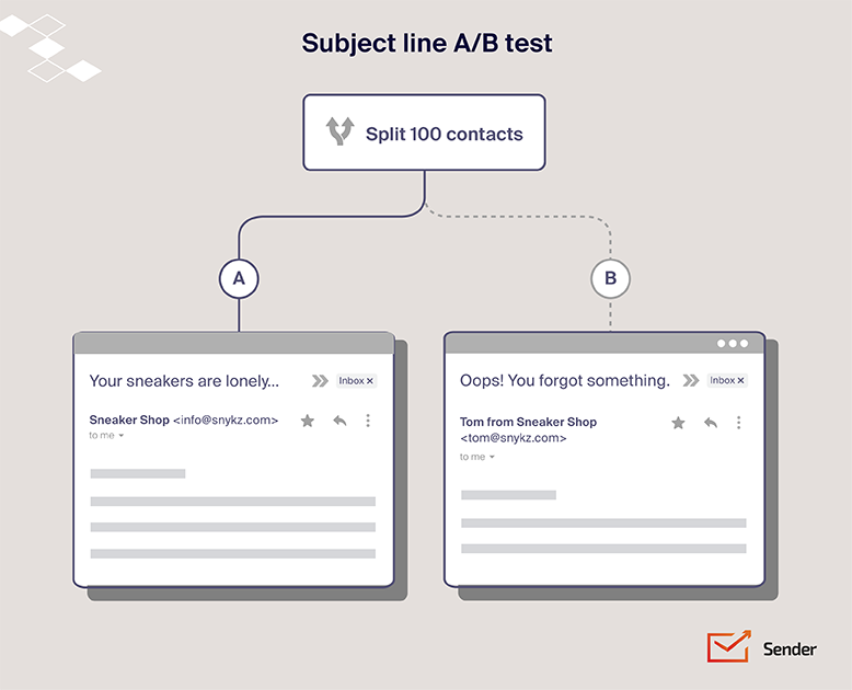
You create two (or more) slightly different versions of an email and send them to a portion of your subscribers to determine a winning version which is then sent to the rest of subscribers. Or used for future email optimization.
Common elements tested in email split testing:
- Email subject line. Because let’s be honest, a boring subject line is a one-way ticket to the dreaded spam folder;
- Sender name. Is your audience more likely to open an email from “Company Name” or “Jane from Marketing”?;
- Email design/layout. A clean, visually appealing layout can make all the difference in engagement;
- Call-to-action buttons. The placement, color, and the copy on your buttons can significantly impact click-through rates;
- Email copy. Experiment with different writing styles, lengths, and levels of personalization to see what resonates;
- Images or media usage. Do more images equal more clicks, or do your subscribers prefer a scannable, text-heavy format?;
- Send times. Timing is everything. Test different days and times to see when your audience is most receptive.
Benefits of Email Split Testing
Okay, so split testing sounds kind of cool, but what’s in it for you? Here’s the deal: email split testing offers a ton of benefits that can take your email marketing strategy from good to “wow, did you see our email marketing performance this month?”
- Increased open rates and click-through rates. By testing different elements, you’ll discover what truly grabs your audience’s attention and compels them to click;
- Better understanding of audience preferences. Stop guessing what your audience wants and rely on data. Split testing provides valuable insights into their preferences, helping you tailor future campaigns for better engagement;
- Improved ROI from email marketing campaigns. When you know what works, you can optimize your campaigns for maximum conversions;
- Higher email conversions. By optimizing your emails for conversions, you can turn more subscribers into customers;
- Data-driven email marketing. Say goodbye to gut feelings and hello to data-backed decisions that drive results.
How to Set Up an Effective Email Split Test
Ready to unleash the power of A/B testing email marketing? Here’s your step-by-step guide:
1. Define the Goal of Your Test
Before you start A/B testing, you need to define the goal of your email marketing test. This means being specific about what you want to achieve with your experiment.
Are you hoping to improve open rates by trying out different approaches to subject line A/B testing? Do you want to see a higher click-through rate by testing email design? Or is your main objective to increase conversions on your website?
Clearly stating your goal will guide your testing process:
- What metric do you want to improve? (e.g., open rate, click-through rate, conversion rate)
- By how much do you want to improve this metric? (Set realistic expectations)
- How will this improvement impact your overall business goals? (Connect your test to a larger purpose)
2. Identify the Variable to Test
Pick one element to focus on for each test. Don’t try to change everything at once – that’s like changing lanes, adjusting your radio, and grabbing a snack while driving – a recipe for disaster! Focus on one element at a time for clear, actionable results.
Here are some ideas to get you started:
- Subject line. During subject line testing, experiment with tone (formal vs. casual), length (short and sweet vs. detailed), or phrasing (questions vs. statements);
- Email copy. Test different lengths (short and punchy vs. long-form), levels of personalization (using the recipient’s name vs. a generic greeting), or message framing (highlighting benefits vs. features);
- Call-to-action (CTA). Play around with button color (see which one stands out more), text (make it clear and concise), or placement (above the fold vs. below the fold);
- Images. Test the inclusion of images (image-heavy vs. text-based), type of images (product shots vs. lifestyle images), or placement of images (leading with an image vs. placing it further down);
- Design. Experiment with different layouts (single-column vs. multi-column), color schemes (bold and bright vs. muted and minimalist), or fonts (serif vs. sans-serif);
- Send time. Try different days of the week (weekdays vs. weekends) or times of day (morning vs. afternoon vs. evening) to see when your audience is most engaged.
3. Create A/B Variations
With a crystal-clear goal in mind, it’s time for the fun part: creating your A/B test variations. Remember, the key here is to make one change at a time.
If you’re testing email subject lines, for example, don’t also change the email design. Why? Because if you change multiple elements simultaneously, you won’t know which change actually influenced the results.
Let’s say you’re testing email subject lines to improve open rates. The two versions could be your current subject line as control, while your variation could experiment with:
- Urgency: “Last chance to grab this deal!” vs. “Sale ends soon”
- Personalization: “Hey [Name], check out this offer” vs. “Special offer inside!”
- Curiosity: “You won’t believe this deal…” vs. “50% off your favorite products”

4. Segment Your Audience
So, you’ve got your goal, you’ve crafted your brilliant variations, and now you’re ready to unleash your A/B test upon the world. But wait! Before you hit that launch button, there’s one more crucial step: segmenting your audience.
Segmentation for email AB testing involves dividing your audience into smaller groups based on shared characteristics. These characteristics could be demographics (age, location, gender), behavior (past purchases, website activity), or even engagement with your previous emails.
Why is this important? Because different segments might respond differently to your variations. A subject line that resonates with millennials might fall flat with baby boomers. A promotional offer that entices frequent buyers might not appeal to first-time customers. By segmenting your audience, you can tailor your tests to specific groups and gain more insightful data.
5. Choose the Right Sample Size
The ideal sample size depends on several factors, including your desired confidence level, statistical power, and the expected difference between your variations. Confidence level refers to how certain you are that your results are accurate. Statistical power, on the other hand, refers to the probability of detecting a real difference between your variations if one exists.
While there are complex statistical calculations behind determining the precise sample size, there are readily available online calculators and tools that can simplify the process. Input your desired confidence level (typically 95%), statistical power (usually 80%), and estimated conversion rates for each variation, and the calculator will provide the recommended sample size.
6. Use Email Marketing Tools
Manually managing split testing email marketing can get messy fast. That’s where email A/B testing tools come in. These handy tools automate the process, from sending out your different subject lines to tracking results and declaring a winning version.
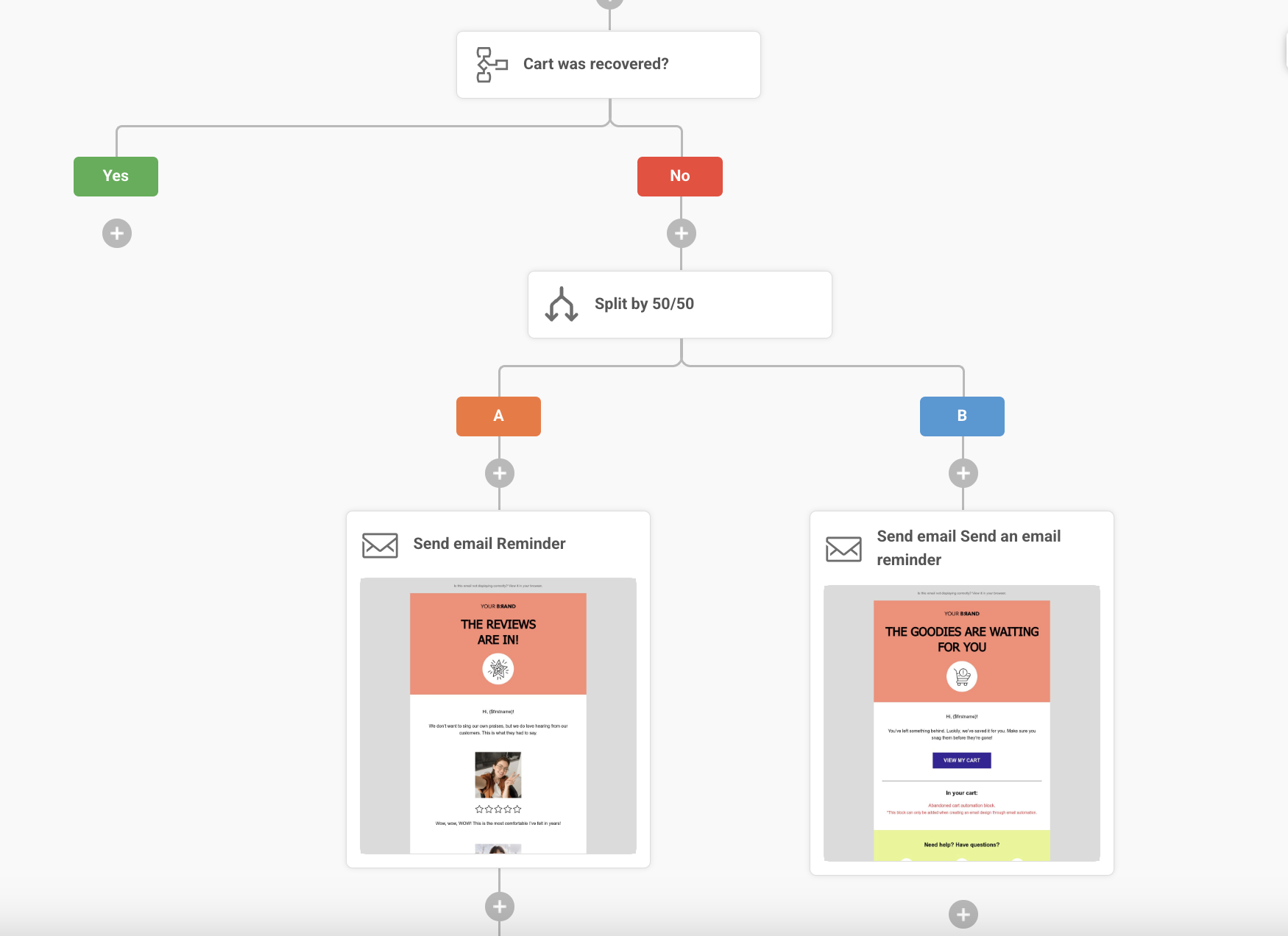
Want to get the most out of email testing tools? Here’s a pro tip: it isn’t just for single emails – you can A/B test an entire email automation sequence. Yep, every welcome email, abandoned cart reminder, and post-purchase follow-up is an opportunity to optimize and improve results.
By A/B testing different elements within each step of your automated emails, you can fine-tune your entire sequence for maximum engagement and conversions. Experiment with your subject line, content variations, sending times, and more to see what resonates best with your audience at each stage of their journey.
With Sender, A/B testing your email automation workflows is a breeze — even on our free plan.

7. Run the Test and Analyze the Results
Let your test run its course (usually 24-48 hours for email campaigns) and then dive into the data. Consider these metrics:
- Email open rate testing. Track how many people opened each version;
- Click-through rate improvement. Analyze how many people clicked on links within your emails;
- Email conversion rates. See which version led to the most desired actions (sign-ups, purchases, etc.);
- Email engagement metrics. Measure unsubscribes, spam complaints, and bounces.
By analyzing these metrics, you’ll gain valuable insights into what resonates with your audience and what falls flat. This data will help you refine your email marketing efforts, implement subject line optimization and craft email campaigns that deliver real results.


