While most people don’t differentiate the two professions, they have distinct tasks in the building sector.
However, the two work together to ensure that these buildings are conducive to living. Even if both engage in designing, architects deal with the building’s design while interior designer deals with the inside decor and arrangements.
Emailing has become a vital tool in the success of businesses across industries in the eCommerce world. As a result, the architecture and interior design sector are also strategizing their email marketing campaigns to generate more leads and boost their ROI.
In this case, brands send architecture and interior newsletters to their email lists to inform, promote their services, and guide customers throughout their buying journey. This article provides tried and tested examples of these newsletters and subject lines.
Architecture & Interior Newsletters
Archiproducts Newsletter Template
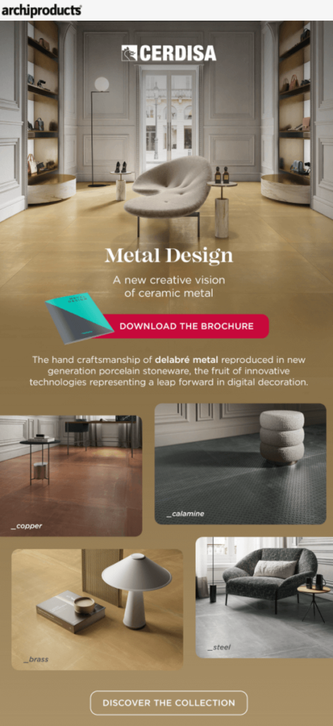
Most people want to be associated with the “latest” things. The headline of this email hints that its products are classier and more prestigious.
The design of this architecture newsletter is beautiful, comprising sample interior designs and limited texts. It focuses on a specific upgraded metal (ceramic) and demonstrates its appearance on different surfaces. In addition, there are links to enable recipients to explore more looks to make an informed decision.
The “Discover the Collection” CTA calls the reader to action without sounding promotional.
Dezeen Daily Newsletter Template
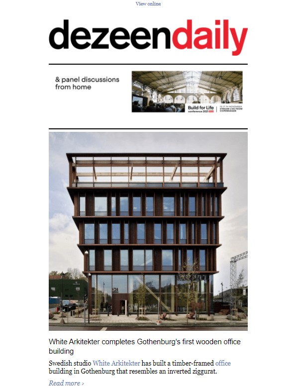
“Timber tower | 3D internet | Seaweed dyes” as the headline of this newsletter means that the bulletin gives insight into these three things.
The email message provides hints on each and gives links for further reading from the website.
Then the reader can access all they need, including architecture and interior design services, among others.
Also, the reader can explore more designs and choose what best fits their needs by visiting the website.
Zhush Newsletter Template
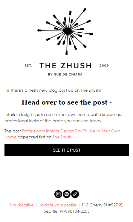
This email’s approach is a great marketing strategy. First, you boost customers’ engagement with your brand by offering them valuable content. Secondly, the subject line introduces the blog’s topic, which every homeowner would like to read.
This interior design newsletter invites its readers to visit the brand’s website through the provided link and learn from their latest post. Upon visiting the website, the customers can access other pages, including the product pages, and further engage with the brand.
Zocohome Newsletter Template
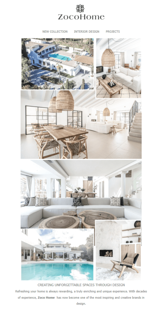
The subject line has a calm tone to tell the reader how the brand cares about them. Through this newsletter, the brand portrays a picture of a reliable, inspirational, and creative design partner to its clients.
The image plus a few text email designs are excellent as it enables the reader to pick essential details within no time. In addition, the “Discover our interior design services” CTA inspires recipients to explore the various designs available and make the choice that pleases them.
Design Your Home Newsletter Template
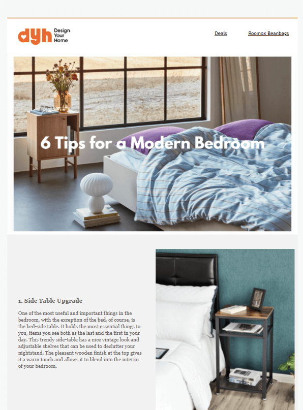
From the subject line, the audience can tell what the newsletter carries. For example, the “New blog post” headline directs the audience to open the email and learn something new from the brand’s post. This approach will always drive visitors to your site if you offer them value-adding content.
The blog post includes several sections, each giving insight into particular items in the bedroom. In addition, it encourages the readers to regularly refresh the relaxation room as this enhances mental and overall body wellness.
Such helpful content makes your customers visit your site and seek your services due to your portrayed expertise.
RJ Living Newsletter Template
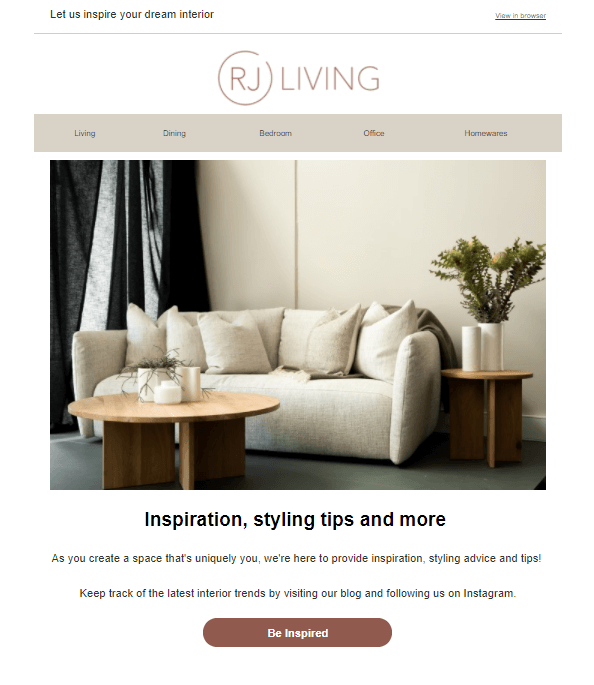
“Create a home you feel good in” is the title of this bulletin. It’s very captivating because we all want to be comfortable in our homes!
The brand offers inspirational and styling tips to its subscribers. In addition, it provides advice on enhancing a conducive atmosphere in every room in the house through blogs and Instagram posts.
The email design has only a few wordings, while the great-looking images do the rest of the communication. The “polite” CTAs will get the reader clicking to take the necessary action.
Interior Define Newsletter Template
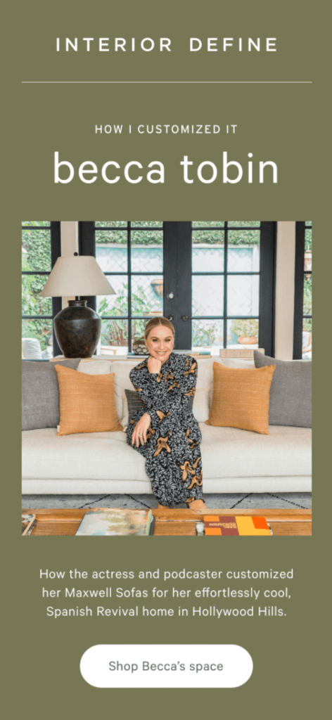
The title “How Becca Tobin customized it” is attention-grabbing for many recipients. All her fans will be curious to learn a thing or two from the star! Therefore, the open rate of such an email would be very high.
The newsletter content is also impactful as the audiences take every word seriously because it’s from a reputable person. In addition, the well-customized furniture creates a relaxed atmosphere and comfort in the living room and maximizes the available space.
Lastly, the CTA “Shop Becca’s Space” can push many to purchase as it creates an impression that one is buying from the celebrity and not the brand.
Life Interior Newsletter Template
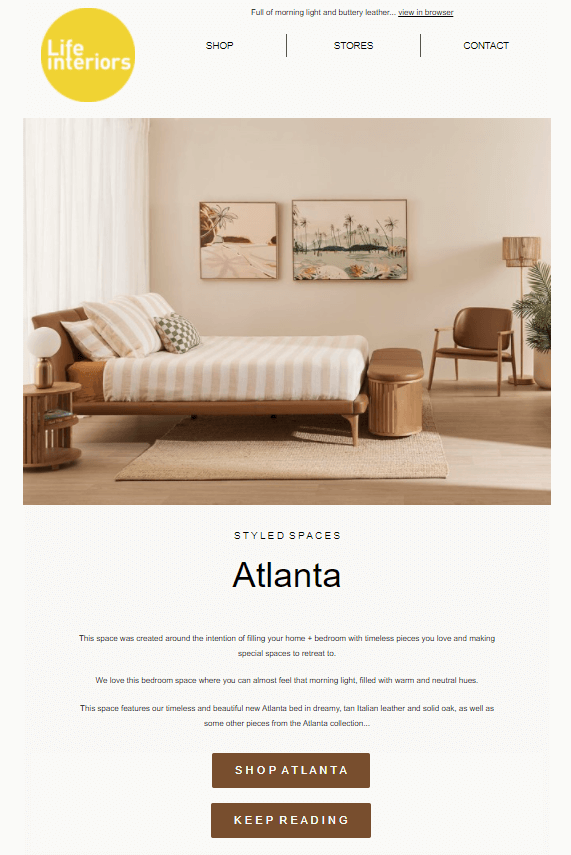
As you can see, “Shop the look” is the newsletter’s subject line. It inspires the audience to open the email to see choices made for them by the brand. And, they are great indeed!
About the visual side, the space outlook in the bedroom is excellent. One can almost feel the natural morning light and warmth.
Also, the email has color consistency, with the brown color contrasting well with the white background. After the CTA invites readers to purchase, another tells them to read on and explore to see what else they might need. When customers can navigate your website, engagement with your brand is increasing.
Dwell Newsletter Template
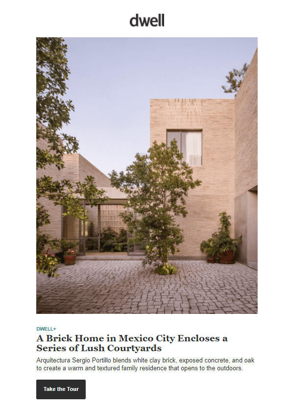
“Scandinavian-Inspired Cabins at $70k and above” is a section of the newsletter’s headline that can drive interested parties to open the email for more information.
The email message is about how this new company can help the recipient construct and do interior décor for a cabin. The reader may use the cabins during holidays with their families. It’s, therefore, necessary to make the home comfortable for relaxation purposes.
The CTAs enable recipients to explore the brand’s site and finally lead them to subscribe for more informative content. After gathering enough information, they can then access the products they need from the website.
Pure Salt Interior Newsletter Template
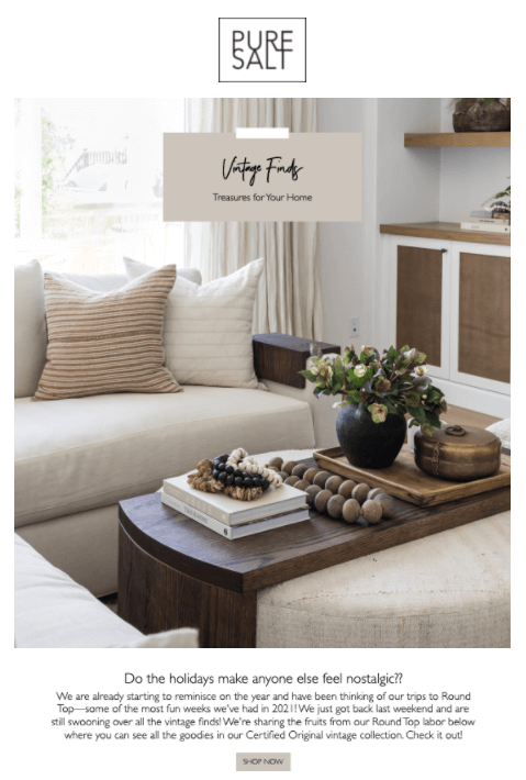
“Vintage Is Always in Season,” as the headline of this email, gives customers confidence about the brand. They can get something suitable and advanced to fit their needs at all times.
If you noticed, the email’s design appeals to the reader, with images taking center stage plus limited texts. The photos give a clear picture of a perfect interior design.
The bulletin creates a relaxed mood with its calm photos. Moreover, it has links to the product pages where the recipient can shop what pleases them from the variety.
Architecture & Interior Email Newsletter Subject Lines
An ideal subject line causes the reader to open your email among the countless emails they receive daily. Here are some of the best examples that work:
- We love design. Do you have a project?
- Meet the Palmer Chair, created by you!
- Let’s create wonders. Starting a new project?
- Before & After: An Old Corner Store Becomes the Ultimate Work
- New products arrived
- Our Tried and True
- We create & turn it into reality
- Refresh your living room with 15% off!
Also read:
Sending Stunning Email Newsletters to Boost Your Architecture and Interior Design Business
Creating awareness of your brand to new customers and maintaining an engaged customer base is vital for any business to excel. The architecture and interior design industry is working hard to reach out to their audience with rich content helpful to the reader and, at the same time, promotes these businesses.
After going through the newsletter template examples, you can now put your right foot forward in your digital marketing campaigns.
You can also acquire templates or create yours to craft relevant emails with multipurpose marketing platform Sender.net – It has all the necessary tools and features, including advanced email design-builder, multichannel automation, which combines emails + SMS so on.
