You want results from every campaign you run. But only 3 out of 100 people who click a link will buy something from your website. That’s enough to demotivate anyone. So, what’s the best way to convince prospects to buy from you more often?
The secret sauce lies in building high-converting landing pages for your product or service. Landing pages are dedicated pages on your website, designed and structured to make a visitor take action.
We’ll look at 10 professional landing page examples to inspire you to create your first product landing page that converts.
What is a Product Landing Page?
If you’ve been in business and checking out competition for a while, you must’ve seen showcase pages with a single CTA. These ‘dedicated pages’ are what you call a product landing page.
It’s a tiny nook on the website designed to highlight the benefits and grab customer attention through several unique elements like social proof, dedicated CTAs, product benefits, FAQs, etc.
Effective product landing pages grab attention, spark interest, and convince a visitor to act instantly. They are designed for conversion, whether it’s a sale, lead generation, or any other goal.
Product Landing Page Examples for Inspiration
Eager to create your product landing pages but confused about where to begin? Use the following landing page examples to get inspired and launch your landing page. Let’s go!
Recess — Best Product Landing Page Design
Recess has a vibrant product landing page to showcase its craft mocktails in a can. The brand uses a beautiful layout with a catchy banner and product image to hook the visitor immediately.
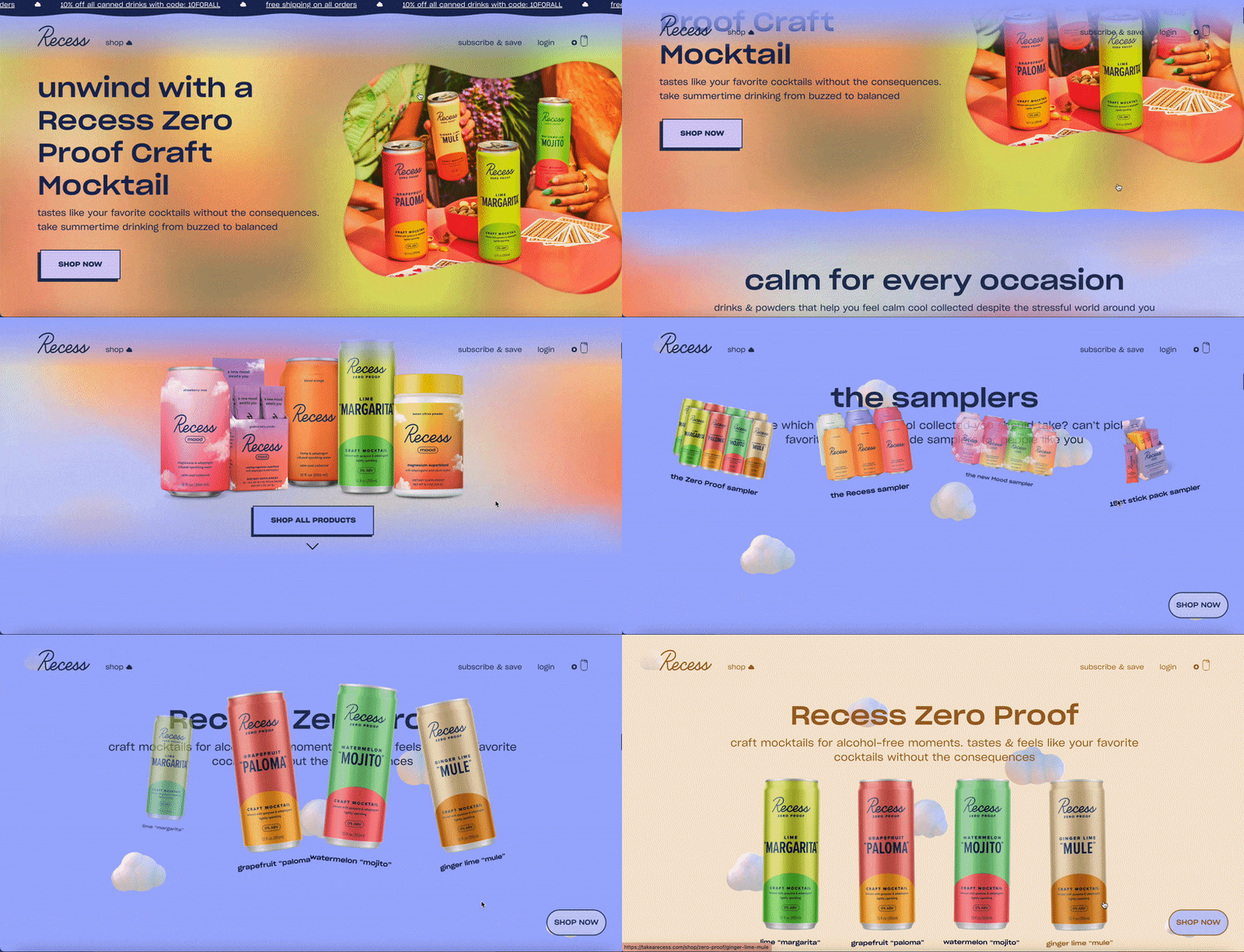
Bright colors and bold typography make this landing page stand out. The page also has a unique design that is easy to navigate. The 3D elements in the ‘Why’ section catch the attention of the ‘quick scroller’. The animation is on-point, too, as someone scrolls. This is the best way to hook visitors and entice them to try the product.
How to make your landing page this cool?
- Use interesting colors and layouts;
- Play with animation and 3D elements to make it scroll-stopping;
- Add beautiful product images wherever possible.
Apple’s MacBook Air — Minimalist Product Landing Page Example
Apple’s landing pages are a class apart; everyone in the design community simply loves how their website landing pages look and function.
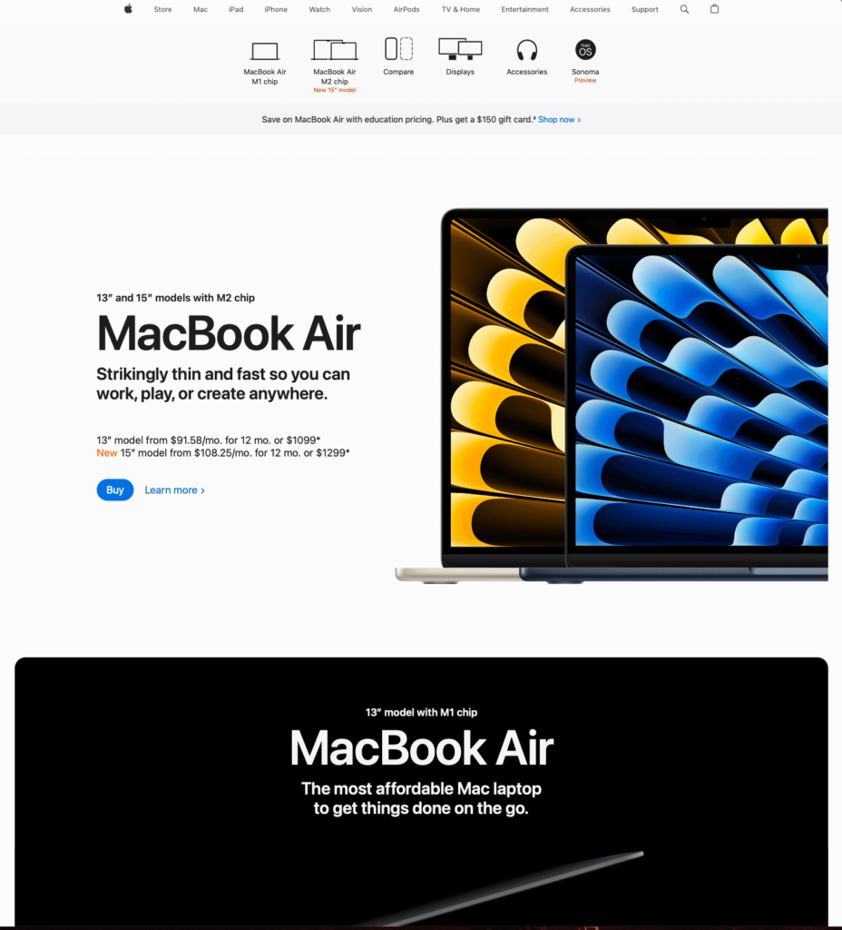
This landing page is no different. It uses beautiful imagery and animations to showcase the MacBook Air. The page has a clear product selection table to address confusion associated with different models of MacBook Air and speed up the decision. Not that Apple needs any ‘validation,’ but the three elements at the bottom assure the customers that they can expect fast delivery and easy payment terms.
How to make your landing page this cool?
- Stay minimalist and informative in your approach;
- Address apprehensions and objections through interactive elements;
- Make your product the hero of your landing page.
Birchbox — Great Product Landing Page Template
The brand’s homepage functions as a great landing page template that uses beautiful imagery and a clean design to showcase the product.
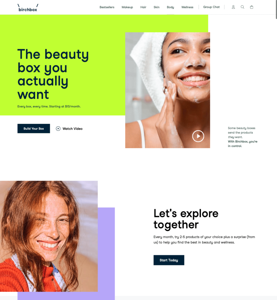
Birchbox uses a boxed design with a clean background and lots of visual elements to grab attention. The nudge to ‘start today’, along with clear steps and dedicated sections to address apprehensions, is a great way to make customers ‘crave’ your product.
How to make your landing page this cool?
- Add video to the landing page banner above the fold;
- Never forget the power of contextual product page CTA;
- Add a section about ‘how your product works’ to increase the chances of conversion.
Sonos Roam – Product Landing Page with Product Benefits
Ecommerce companies create conversion-focused product pages to convince a visitor to checkout. Sonos added a dedicated section showcasing the features and benefits of its product on its landing page.
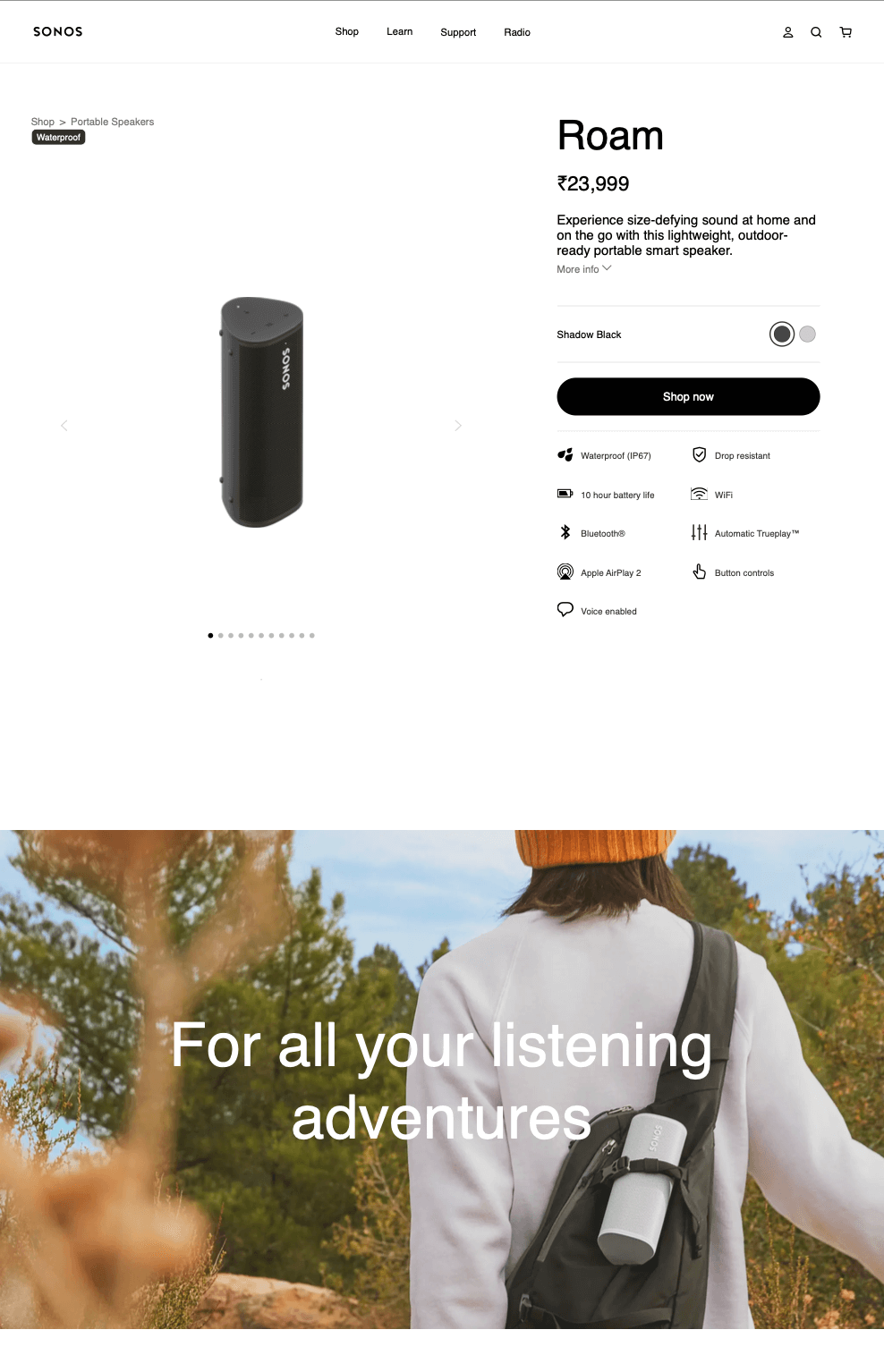
The page looks like a standard ‘product page’ at a glance, but as you scroll, it starts unfolding a world of benefits. A visitor who might be on the fence would surely be compelled to buy the product as he sees the product in action along with a benefit-driven copy.
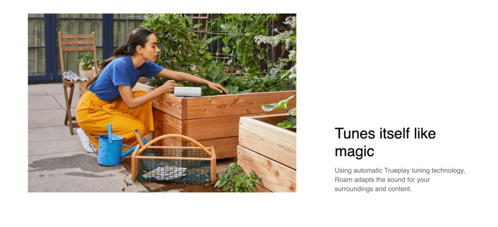
The aesthetics, followed by a clear description of the product capabilities, are enough ‘fuel’ for a gadget enthusiast to buy. The FAQ, reviews, and product guide are a cherry on the cake that’ll boost the conversion rate.
How to make your landing page this cool?
- Go in-depth on your product benefits and real-world applications;
- Ditch stock images and use actual photographs;
- Always add a section for FAQs to address common questions.
Rapscallion Soda — Product Landing Page with Interactive Elements
This product landing page by Rapscallion shouts out loud at the potential buyer and drives home the point that there’s nothing better than a clean design.
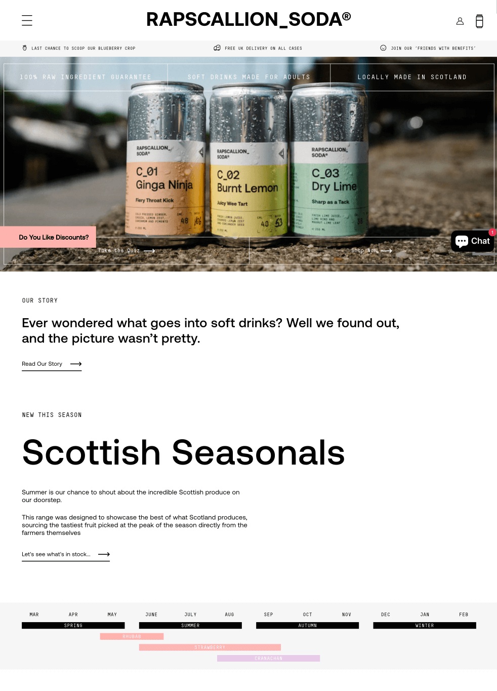
The product landing page has multiple sections and elements to engage the visitor. For example, the ‘What’s your Flavor’ quiz section will engage the visitors and push them further into the funnel (and give the brand insights into creating personalized content).
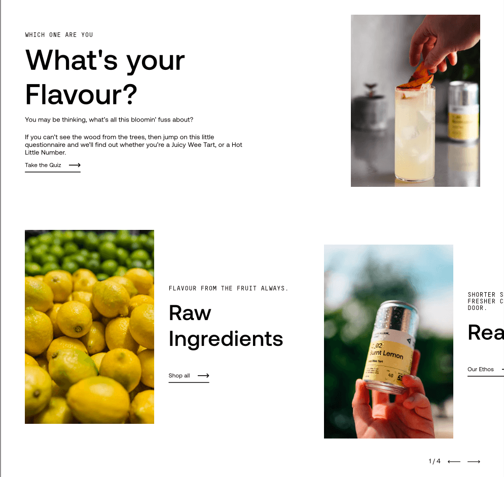
Every segment is informative, enticing and makes users feel the brand’s vibe. The ‘discounts popup’ and the chatbot are additional engagement boosters too.
How to make your landing page this cool?
- Use multiple elements to grab attention and hook the visitor;
- Add a chatbot to increase conversions;
- Stick to your brand’s tone and design aesthetics.
Judy — Effective Landing Page with Positive Customer Reviews
This landing page looks vibrant and feels straight out of an adventure. The bold orange is sure to grab instant attention.
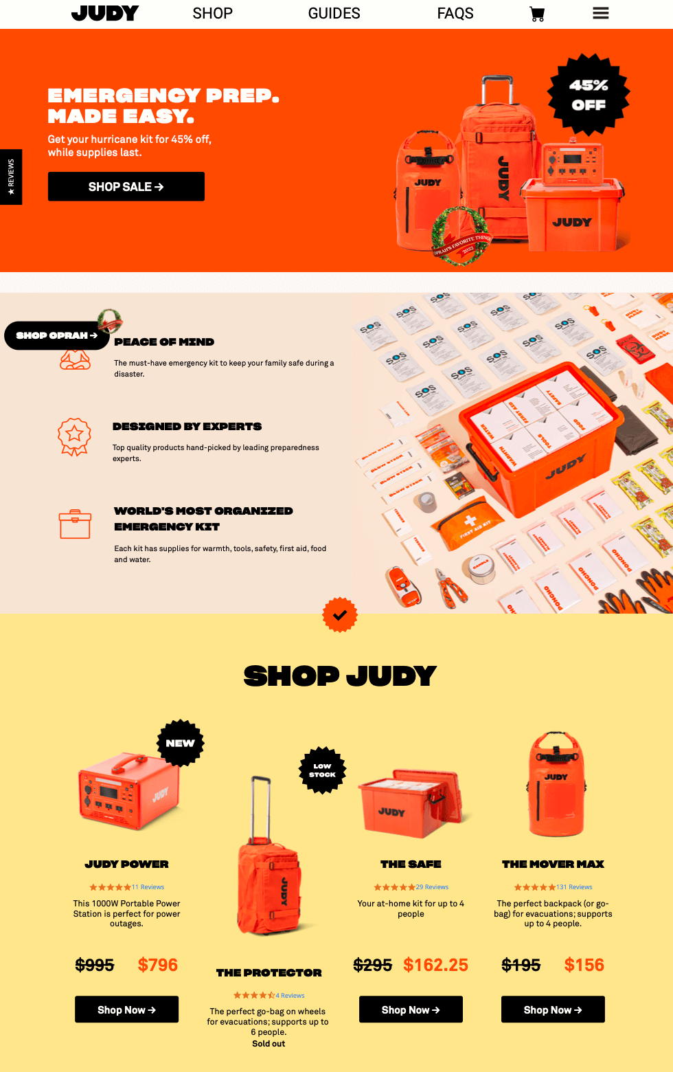
Designed for outdoor and emergency gear, the landing page has everything potential buyers need – benefits, price points, product ranges, features, guides, and more.
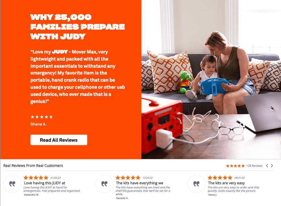
The additional social proof section with the headline ‘Why 25,000 families prepare with Judy’ confirms that the product is worth the buyer’s money.
How to make your landing page this cool?
- Add elements that reflect your product benefits and brand values;
- Create lead magnets and embed them into landing pages;
- Show additional benefits (and perks) of acting instantly.
Bev — Product Landing Page with Video and Bold Headline
Your product landing page should always reflect your brand personality. And what’s better than showing it in style through a video banner? Here’s an example by Bev.
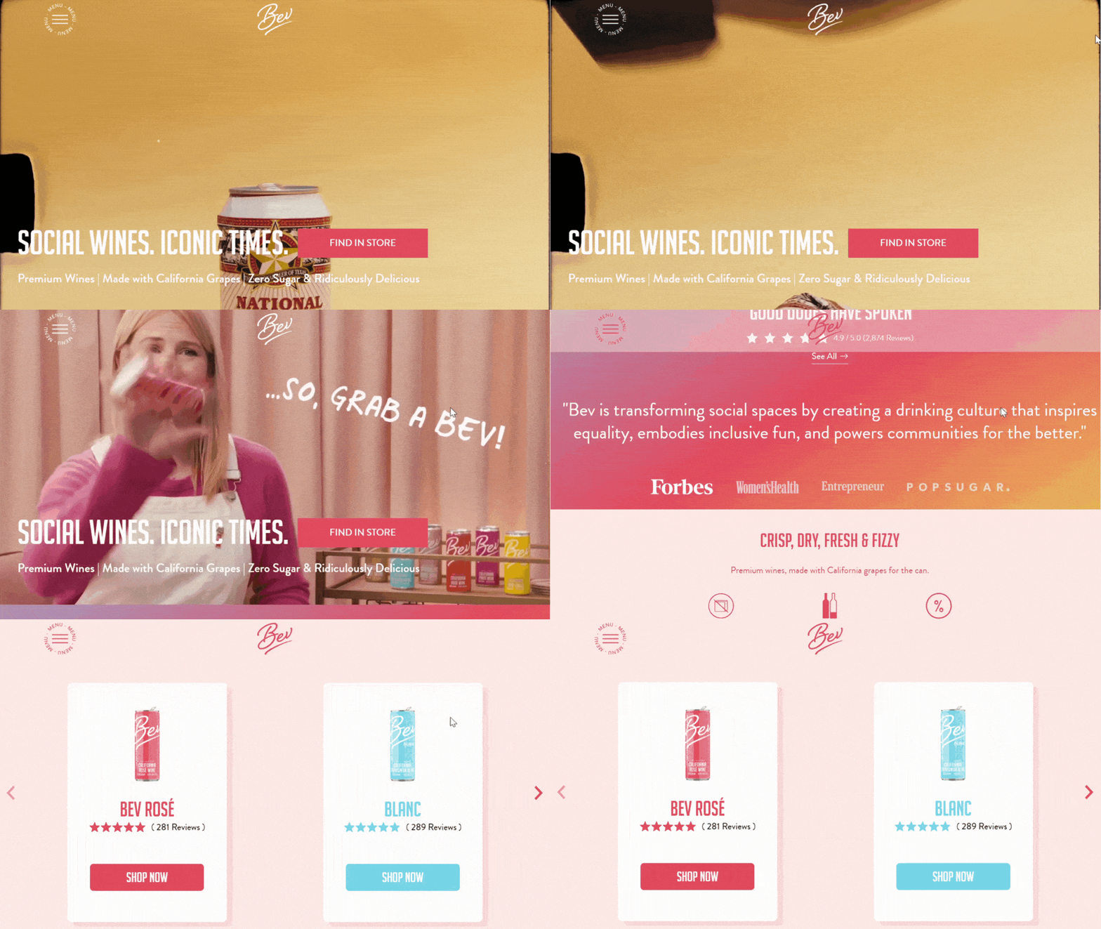
The video banner with enticing product shots is an instant scroll-stopper. The copy of the page, along with multiple interactive content elements (like the Bev Locator near you), is definitely an exciting addition to this landing page.
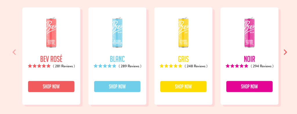
The landing page is designed in a distinctive pastel shade to match the product colors and brand guidelines, making it look refreshing. The mention of ratings and reviews alongside product imagery and a CTA button is surely a conversion booster.
How to make your landing page this cool?
- Add videos to your product landing pages;
- Give subtle hints of how much customers like your products through reviews and ratings;
- Write witty and engaging copy.
Sunbasket — Product Landing Page with Problem-Focused Headline
Your product landing page can be a great ‘teaser’ too. This particular landing page by Sunbasket is a great example of that.
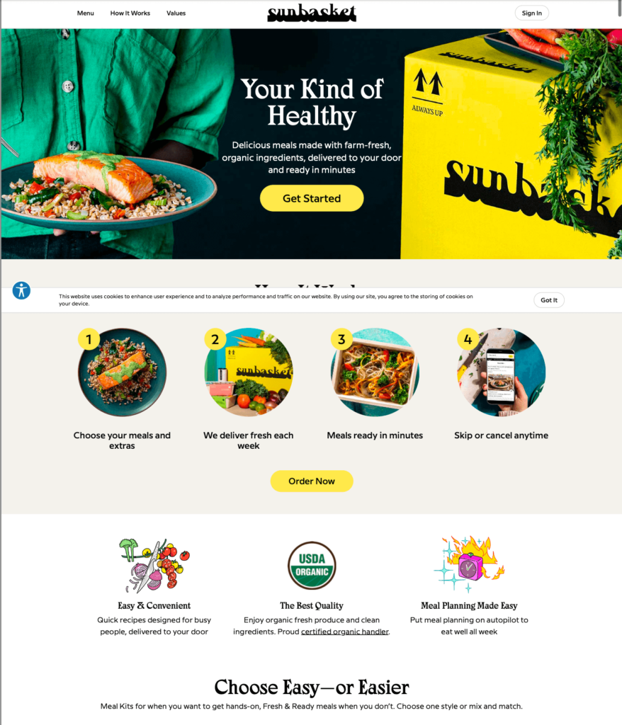
The landing page has a clear headline with appetizing visuals and a copy that speaks directly to the visitor. The meal kits section engages visitors with its thoughtful suggestions and meal ideas. There’s also ample social proof in the form of reviews and public mentions of the brand in famous publications, strengthening the credibility.
How to make your landing page this cool?
- Show how the product can add value to the buyer’s life;
- Give them different options to act in multiple CTA sections;
- Add social and media mentions to the landing page.
The Farmer’s Dog — One of the Best Pet Product Landing Pages
Your landing page must make the reader curious, and sometimes it involves making the visitor question their biases and preconceived notions. This page by The Farmer’s Dog quells a visitor’s notion about dog food.
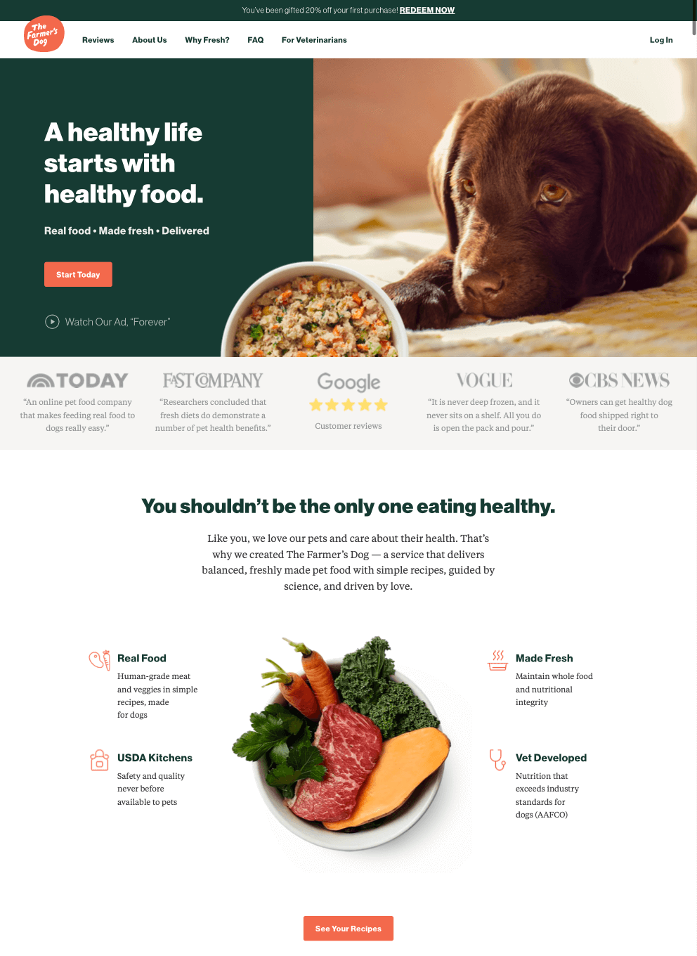
The page highlights the importance of providing healthy food and appeals to the emotional attachment of a human to a pet.
Different sections on the page address various apprehensions and objections of the potential buyer, and the landing page copy does a great job of answering the most common questions.
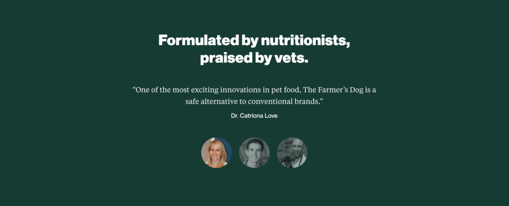
The infographic with the benefits of healthy food is a scroll-stopper that engages you with the brand’s offering. There’s even a social proof section, including reviews by actual users and expert testimonials to enhance the trust factor.
How to make your landing page this cool?
- Add an infographic explaining the benefits or key attributes;
- Address key apprehensions through dedicated sections;
- Include expert testimonials that visitors can trust.
Hello Axis — Minimal Product Landing Page
Hello Axis uses white space freely in their product page design. The brand has cleverly placed the idea of window blinds in everyday living and showcased it beautifully.
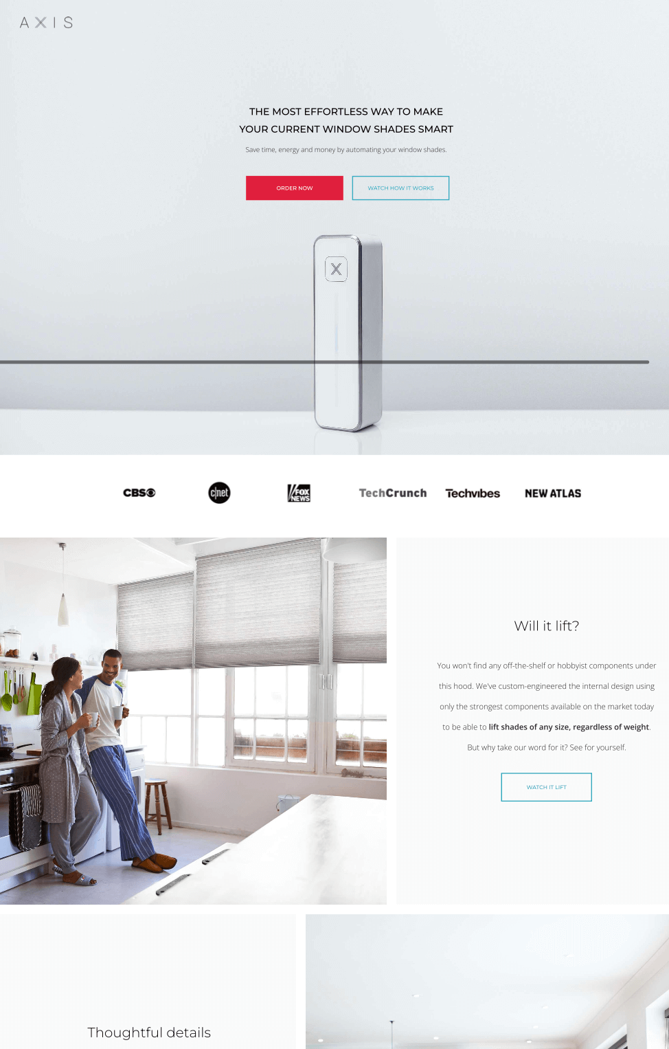
The page has one single purpose — to make the visitor order their product, as it should be. The different sections answer common queries through boxed product page layouts presenting a picture and supplemental copy.
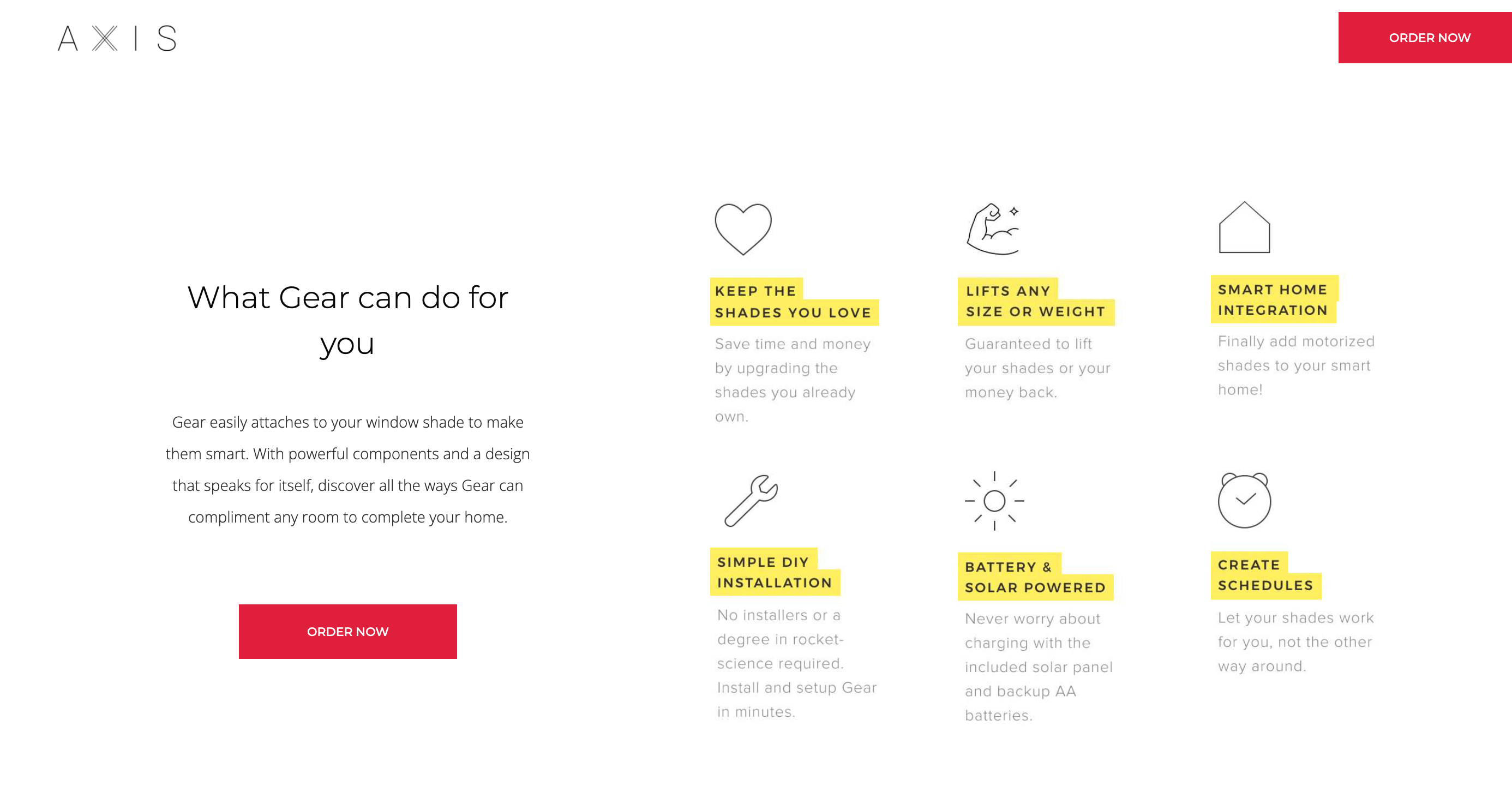
The social proof in the form of customer testimonials is also good. While they’ve kept it minimal, they could’ve improved the page design and even added a blinds element to the scroll to make it more appealing and engaging.
How to make your landing page this cool?
- Keep the design minimalist and use lots of white space;
- Show how your product works through real-world images;
- Make visitors keen on trying out your product through unique elements.
Unbounce — Includes Customer Testimonials on the Landing Page
Social proof is a big thing nowadays, as prospects want to hear from others before buying something. In fact, 92% of customers are apprehensive to buy when there are no customer reviews.
So, adding customer testimonials on your landing page is always good. Unbounce understood the assignment and has a highlighted section about what users think about the tool:
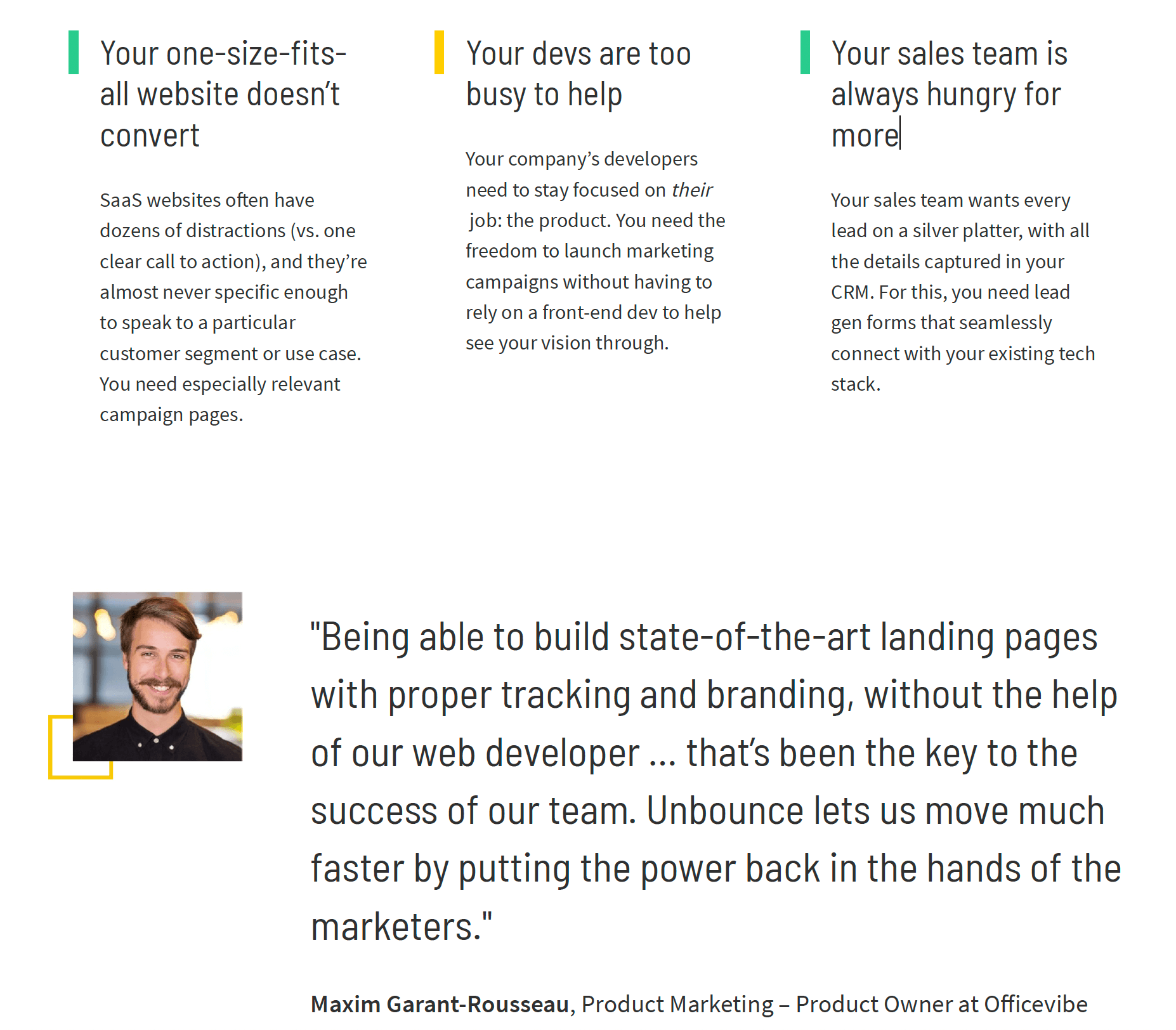
They’ve added separate blocks about the experience as testimonials after every fold so prospects can soak in the thoughts of other users. Using testimonials from established startups/businesses adds more credibility to their claims.
How to make your landing page this cool?
- Clean layout with lots of white space;
- Large, contextual testimonial blocks after every fold;
- Reviews from leading companies validated by real images + job titles.
Shopify — Product Landing Page with Success Stories
Case studies and success stories are highly convincing. Because people relate to other’s stories and journeys more than anything else. Shopify has added user success stories on its landing page to convince visitors. Have a look:
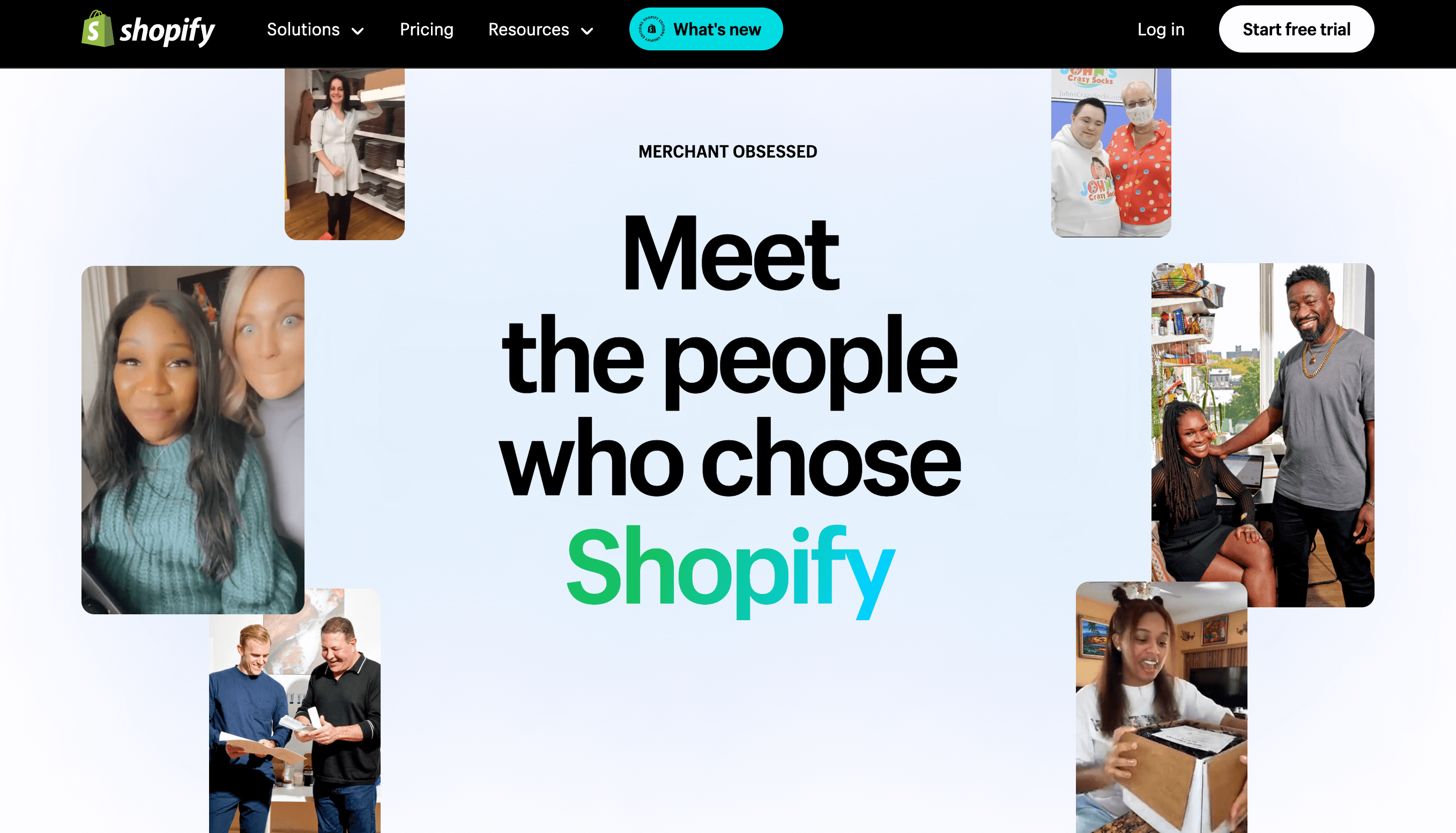
The entire section showcases happy users and shares select case studies from the most successful ones in the form of videos and tiled sections.
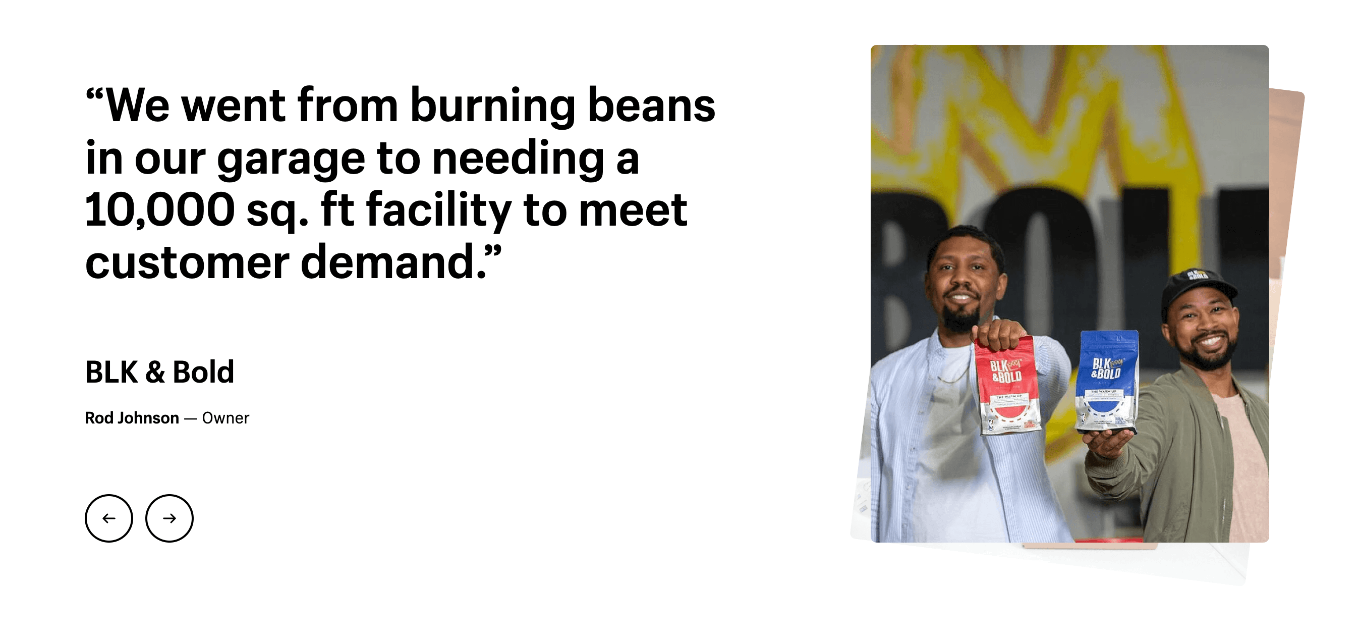
They’ve given prominent placement for each customer and have used quotes from user interviews that make everything more believable.
Visitors can browse the different stories, and there’s even a video of a user talking about Shopify and why it works best for their business. Real users with real stories of success are always eye-catching and convincing — the reason why Shopify uses them everywhere across their website landing pages.
How to make your landing page this cool?
- Interactive layout with real images and videos;
- Compelling copywriting and placement;
- Video tiles on the main banner about success stories.
FreeCodeCamp — Landing Page with User Testimonials
FreeCodeCamp works in the online education industry, a highly competitive sphere in itself. Plus, they have to convince users that they’re better than traditional classroom programs. So, they added testimonials from alumni who’ve been placed at top tech companies.
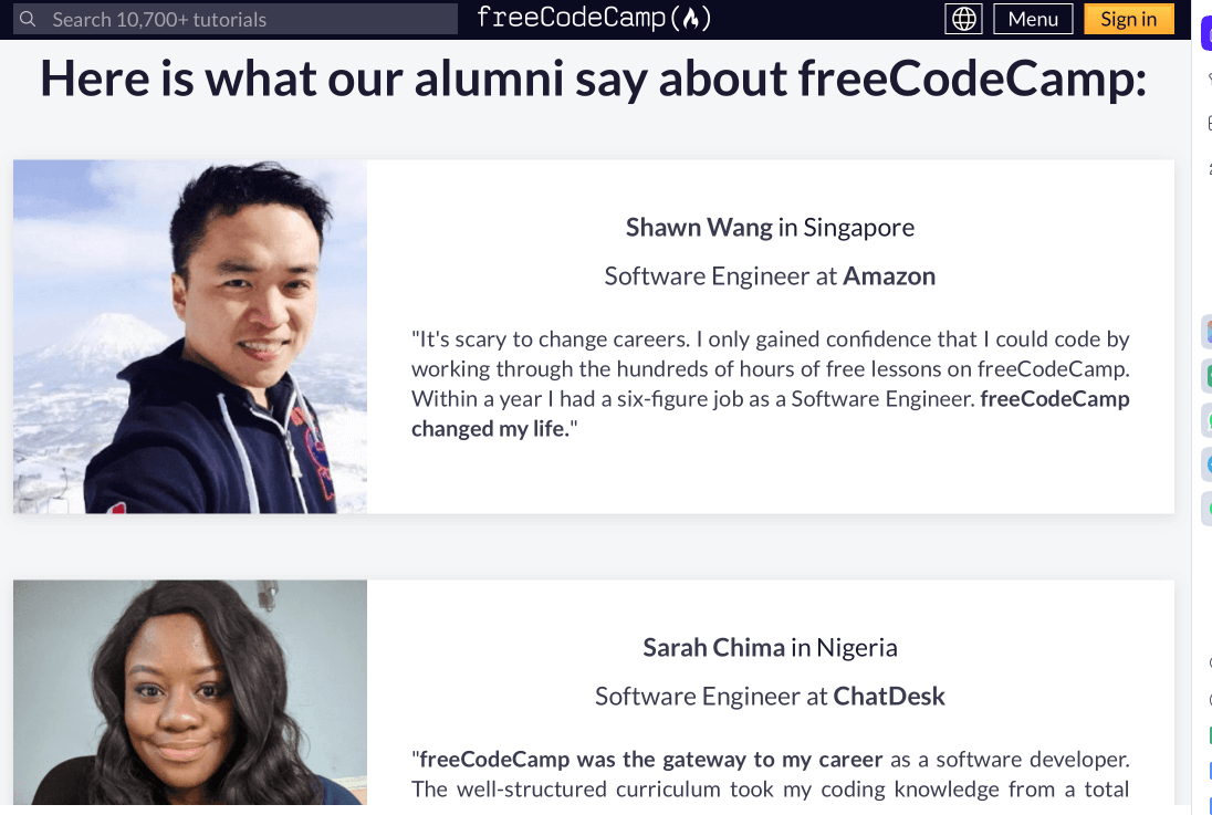
The testimonials are placed right after the first fold so that visitors can dive straight into what others have to say about FreeCodeCamp. Using big names from the tech industry in their testimonial section adds a layer of authority regarding the curriculum quality.
Plus, every testimonial is about how FreeCodeCamp helped users learn a skill and land a dream job — something that their target audience wants.
How to make your landing page this cool?
- Real images and job positions with every testimonial;
- Aspirational reviews about career switch and skill development;
- Review section right below the first fold on the landing page.
Slack — Engaging and Informative Product Landing Page
One of the best ways to engage users via a landing page is to add interactive elements to them. Slack has used gifs of people using different features on every section of its landing page.
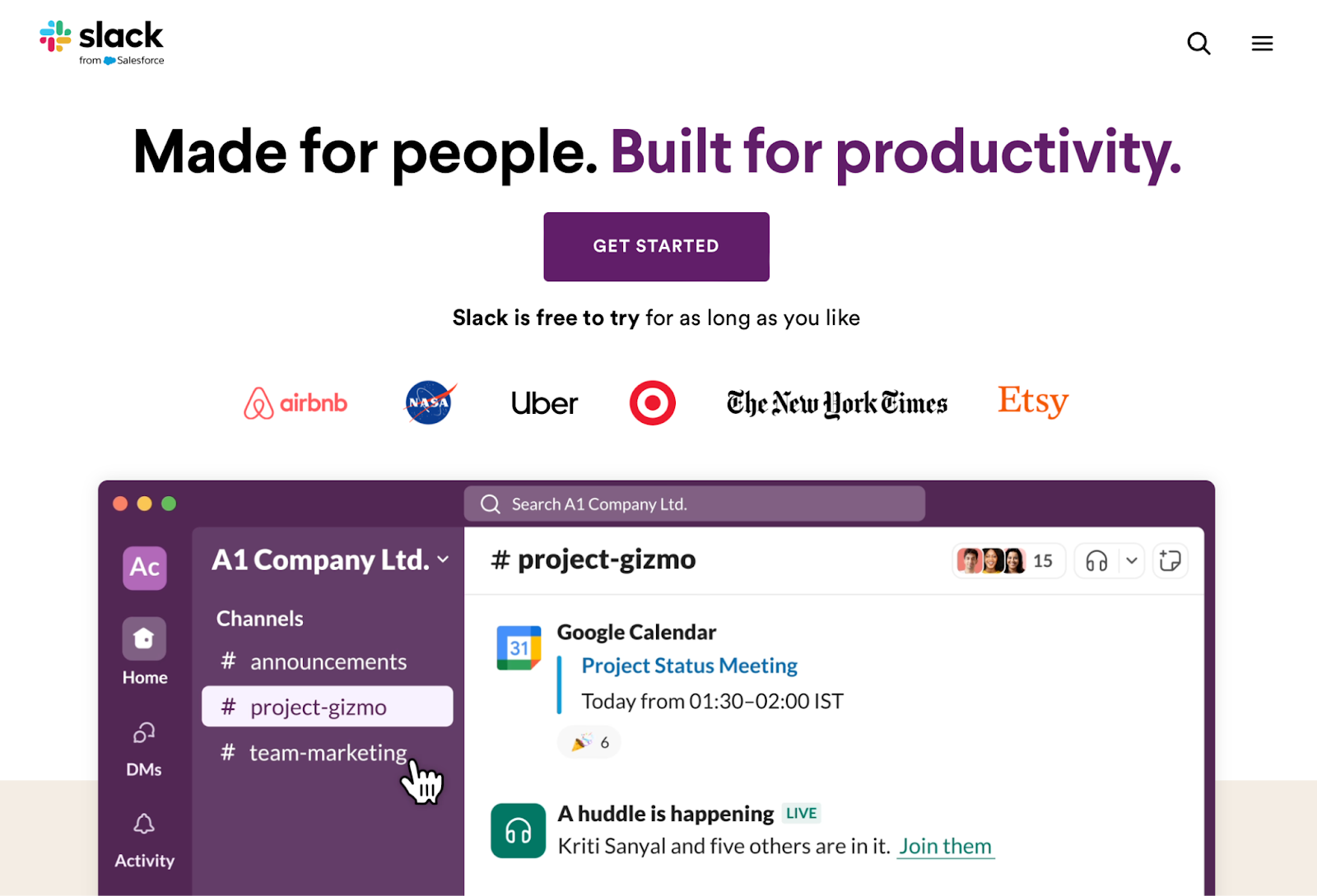
They’ve added a large dashboard gif right on the hero banner, showing the ease of coordinating using Slack for teams. As one scrolls, separate sections highlight different features and benefits, complemented by moving animations of each use case.
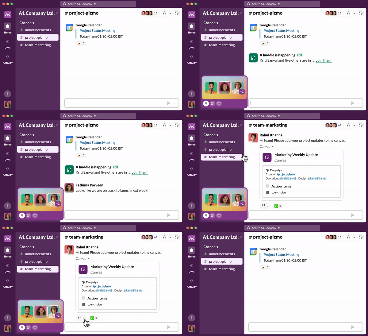
The GIFs on the landing page grab prospects’ instant attention, which is something we’re all striving for as business owners.
How to make your landing page this cool?
- Contextual animations with every section of the landing page;
- Relevant links to supporting pages for further reading/exploration;
- Real-life scenario is highlighted in the hero section.
Tesla — Interactive and Visual Appeal Product Landing Page
If there’s one thing you want to learn from Tesla, check how they design visually appealing and mesmerizing landing pages. They’ve literally turned their pages into a cinematic experience with large ‘visual’ hero (header) sections.
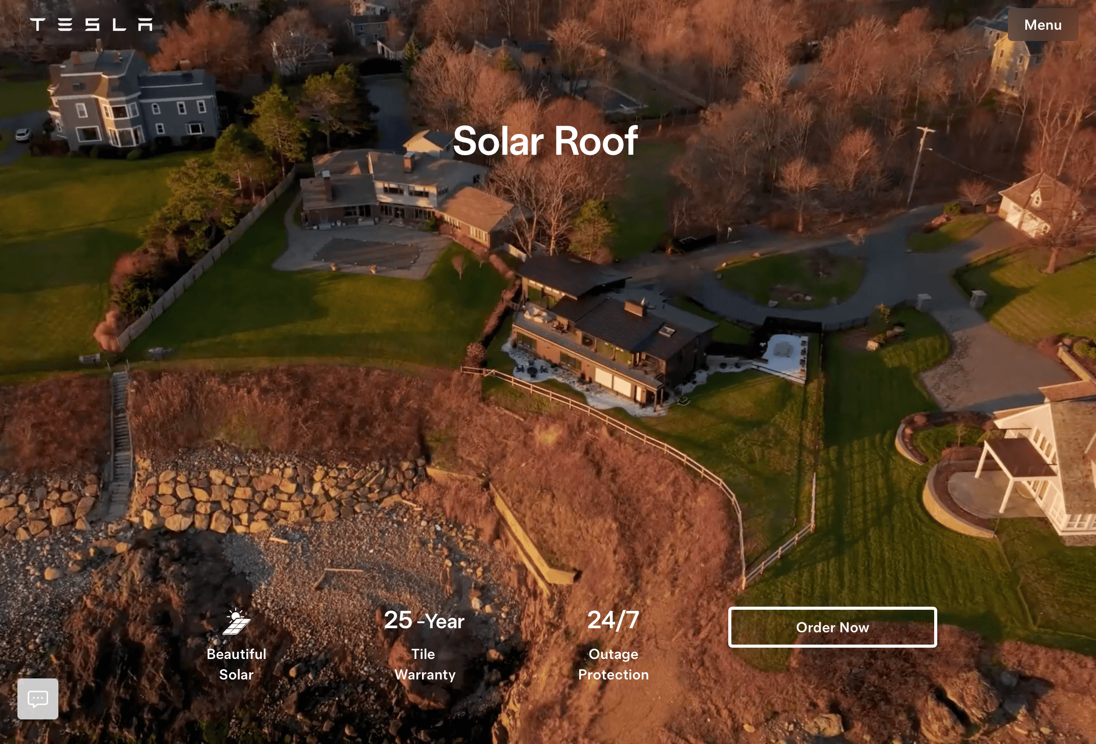
The video is in a loop, showing their product in a cinematic setting. The hero section has little info, just enough to tease the visitor. As you scroll down, every section has detailed sections that address different apprehensions, along with appealing images and relevant CTA buttons.
There’s even tabbed information below in the highlighted section as users click on one of the sections.
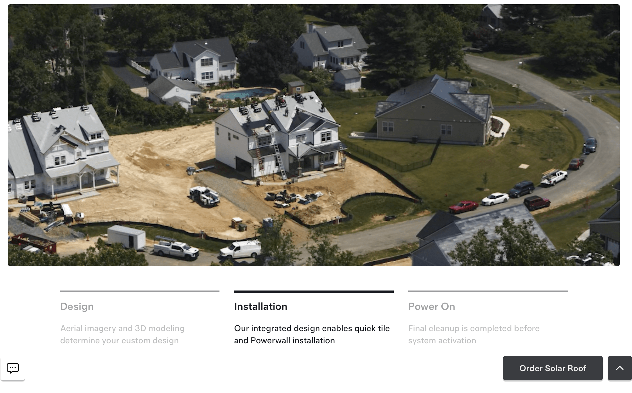
All in all, the page has several elements for the user to interact, engage, and enjoy — from cinematic visuals to interactive elements.
How to make your landing page this cool?
- Large hero section with cinematic video of application;
- Interactive elements and CTA on the page;
- Hovering CTA button throughout the scroll length of the page.
Loom — Landing Page with Contextual Customer Testimonials
Loom is known for simplifying demo videos and product documentation. So, when it has to show how people (and companies) use its product, the best way is to add contextual reviews from top professionals in the industry. It has a dedicated reviews section on its landing page:
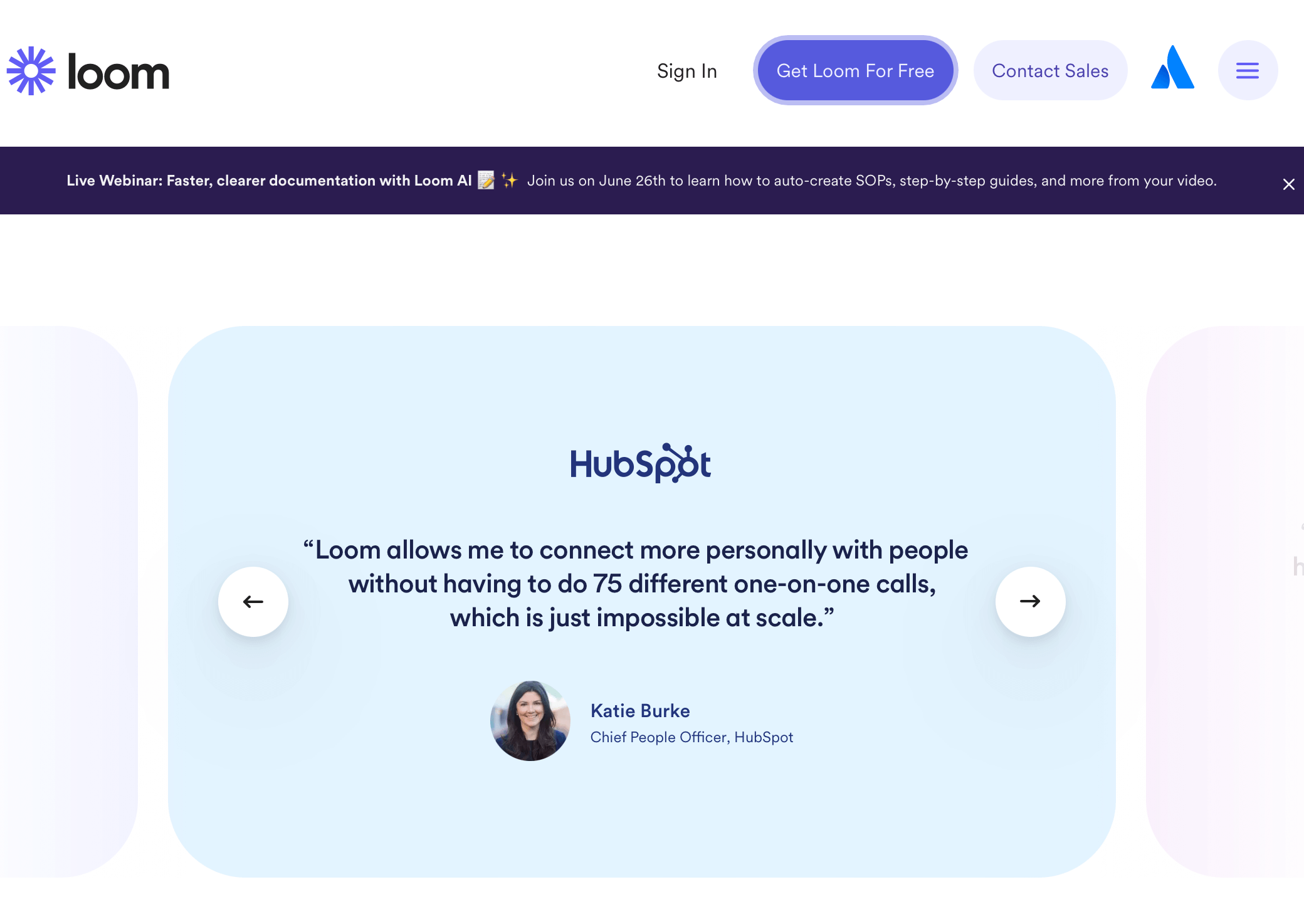
The landing page section highlights relevant reviews about the usefulness of the tool and how much time one can save. The use of real images and designations adds a layer of credibility to the discussion.
They’ve even added the product logo to the testimonial to show associations with its users’ brands — a nice touch that boosts the trust factor.
How to make your landing page this cool?
- Simple layout with dedicated blocks for each section;
- On-point reviews targeting the exact pain point for which the tool is known;
- Addition of the user’s product logo to add an extra layer of credibility.
Product Landing Page FAQs
What Types of Products Can I Sell via the Product Landing Page?
Creating persuasive product landing pages involves telling a story that your audience is eager to hear. It’s about addressing their pain points and guiding them toward making a decision. Here’s what to add to a landing page to make it happen:
- Explain the value in the headline. This is what captures their attention and hooks them to read further. So, always create a snappy and engaging title. It should succinctly communicate the unique value your product brings to the table;
- Show how to do it using a sub-heading. Your subtitle should supplement your title by clarifying how your product delivers the promised value. This is where you explain your ‘secret sauce’ without revealing too much of the recipe;
- Add a compelling visual above the fold. Humans are visual creatures. Including high quality images, videos, or graphics helps your visitors visualize your product, understand how it works, and imagine themselves using it;
- Add real testimonials to make them believe. Nothing builds trust quite like testimonials and reviews. Showcasing positive feedback from satisfied customers makes your product more believable and trustworthy;
- Showcase benefits, features, and address objections. Highlight key features and benefits, and anticipate any objections using engaging copy. Always circle back to the value your product delivers;
- Nudge the visitor to take the next step using a CTA. A clear, compelling call-to-action (CTA) is crucial. Whether it’s “Buy Now,” “Download,” or “Subscribe,” make it easy for your visitors to take the next step towards becoming customers.
- Add use cases and other social proofs. Showcase real-life examples of your product being used, or share case studies. These ‘stories’ help your potential customers envision the real-world value of your product.
- Tie up loose ends using FAQs. An FAQ section can resolve any lingering doubts or questions. It’s like a safety net, catching any concerns that might otherwise deter your potential customers.
- Repeat your call-to-action using a secondary CTA. Repetition reinforces action. By the end of your page, visitors should see a second CTA, prompting them to decide once they’ve learned more about your product.
- Add a founder’s note. A personal note from the founder or the team adds a human touch. It helps forge a connection and makes your brand more memorable. After all, people connect with people, not just products.
What are the Types of Product Landing Pages?
Landing pages are the best way to turn visitors into members of your community. Their types depend on the kind of product/service you’re selling. Here are the different kinds of pages you can create:
- Physical product landing page. Got a new-age kitchen gadget or a handmade artisan necklace that’ll make customers drool? Create a landing page for new products without thinking twice. Product showcase pages with vibrant photos, lively descriptions, and videos help your customers visualize it in their hands.
- Digital product landing page. If your product is digital, a landing page can be perfect for pitching its benefits, use cases, and showcasing social proof. Build a landing page, add an email marketing funnel, and see your revenue grow.
- Service landing page. Whether you’re a digital marketing guru, a financial wizard, or a dog grooming expert, services can be marketed exceptionally using landing pages. Use them to tell your story, showcase your skills, and showcase to potential clients why you’re the best in the business.
- Memberships and subscription landing page. Got a monthly subscription package or a premium content membership program? Landing pages are perfect for drumming up interest and racking up subscribers. Showcase the value of joining your exclusive club, and let the sign-ups roll in.
- Event and webinar landing page. Whether you’re promoting online courses, business conferences, or charity runs, events and webinars can be effectively promoted via landing pages. Tell your audience what they’ll learn, who they’ll meet, or how they’ll make a difference by attending your event.
- App download landing page. If you’ve developed an app for tracking daily steps, order takeout, learning a new language, or any innovative idea, a landing page is an ideal place to coax visitors into hitting that download button.
Key Takeaways: Product Landing Page Design
Landing pages keep the spotlight on the product and give a visitor a glimpse into the benefits and USPs of any product. If you’re planning on creating product landing pages, here are some product page best practices:
- Always add social proof, FAQs, product benefits, and appeal to a customer’s pain points if you want to create the best product landing pages;
- Never forget to add a section about product features and real-world use cases to your landing pages.
- Add lots of visual elements and videos (if possible) to stop a scrolling visitor, become memorable, and build a remarkable product landing page;
- Use no-code landing page builders if you don’t have designers and developers to build landing pages for your products.
Also read:
