Do you know how they say that if you want to get something, you first have to give something? It’s never been more true than when it comes to squeeze pages.
Squeeze pages are a highly effective way to collect email addresses for a mailing list or generate sales leads. Even 74% of businesses use web forms to generate leads, with 49.7% saying online forms are the highest-converting lead generation tools.
However, first, you must offer your potential customers valuable content before prospects give their email addresses. So, we’ll cover everything you need about squeeze pages, how to create one, and some excellent examples in this blog post. Read on!
What is a Squeeze Page?
Squeeze pages are high-converting lead pages designed to collect email addresses from potential customers. You can persuade or “squeeze” website visitors to give this information by promising valuable content, giving them a special offer, or restricting access to site information.
Squeeze pages are typically brief, but they almost always have the following:
- A headline that clearly communicates the benefit you’ll offer.
- Supporting text that provides enough information for the website visitor to make a decision.
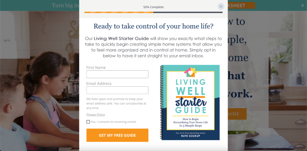
- An embedded signup form with one or two fields (name and email address) that allows visitors to opt in without leaving the page.
Here’s an effective real estate squeeze page example – Sender’s Black Friday ebook:
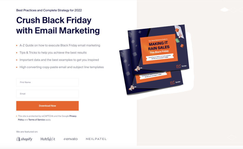
The reason why the squeeze page works so well? There’s more than one:
- A powerful headline delivers a strong message;
- The copy explains why the user cannot miss out on it;
- Call-to-action (CTA) encourages the reader to act immediately and leave contact details.
The best part? Anyone can easily create such a great squeeze page using a free form builder like Sender. Check how easy it is.
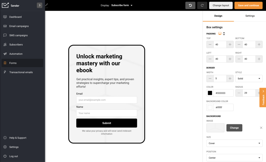
Want to create one in minutes? Sender’s got you covered – craft high-converting forms and popups in minutes and build your email list effortlessly.
Why Are Squeeze Pages Important?
Squeeze pages are irreplaceable when capturing your visitors’ email addresses to sell them on something later eventually. It removes distractions and promotes the benefits of your offer — providing a clear and compelling CTA.
That allows you to move visitors further down your sales funnel and create a long-term relationship with them.
Who Uses Squeeze Pages?
Squeeze pages are used in all business niches — from eCommerce and fashion to SaaS companies. The pages aren’t industry-specific since their primary purpose incorporates all businesses irrespective of size or location.
So, whether you run an online store or have revolutionary marketing software, developing a lasting relationship with potential customers will help you sustain long-term success. And the first step to achieve that is to collect their names and email addresses — the primary purpose of a squeeze page.
How to Create a Squeeze Page
Now you know that squeeze pages are crucial if you have an ecommerce store in Shopify, WordPress, or any other platform. Creating a squeeze page with plugins like Elementor or Divi is especially easy if you use WordPress.
Now let’s see five tips on how to optimize a squeeze page to be most effective:
1. Define Your Target Audience
To hook and keep your squeeze page visitors, you need to target your audience precisely. Find out their interests, values, and goals. You can extract more details from your customer profile.
Then, address your visitors’ interests and pain points, and emphasize the main benefit of your proposal.
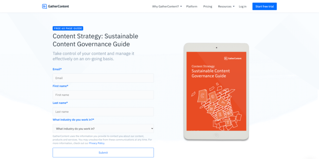
2. Propose a Captivating Offer
Before you design your squeeze page, you must create a lead magnet — something you’ll give website users in exchange for their email addresses.
The lead magnet is usually a digital asset such as:
- eBook
- Newsletter
- Video or webinar
- Whitepaper
- Podcast
- Free report
Ensure that the offer promised on the squeeze page is exclusive to website visitors and unavailable elsewhere.
What’s more, the content has to be well thought out to look valuable for the visitors in the first place. Consider what kind of potential customers you want to collect emails from and offer something to their needs.
For example, inexperienced users might be more drawn to extensive guides like webinars and reports, while experts are more interested in quickly digestible content like newsletters or whitepapers.
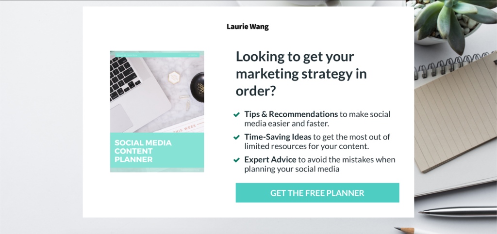
3. Write a Killer Headline and Powerful Copy
The first thing website visitors notice when they see your squeeze page is your headline. So, the headline must clearly inform them of the benefit your lead magnet will offer.
Here are some effective headlines you can use:
- Learn How _____ Makes ____ Per Year
- Learn How to ____ In _____ Minutes
- Get ____ With Less ____
- Free ebook: Insider _____ Tips From Experts
In the meantime, your copy should always supplement the headline information – elaborate on the offer – or create urgency. Here are some example phrases:
- Limited time, this month only, now
- Once in a lifetime, last chance, never again
- Offer expires, now or never, final
- Already used by ___ users, downloaded ___times
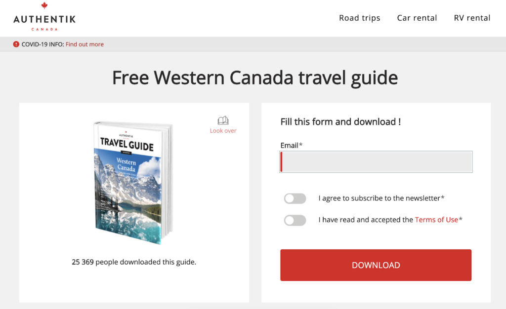
4. Create a Squeeze Page Design
To create an effective squeeze page, use relevant, high-quality images and pay close attention to the page structure — it should be clean, concise, and have high readability. Consider the association you want to create with your product and choose a complementary design and color.
Also, limit the number of form fields visitors need to fill out. People will only sign up if you ask for as little information as possible.
That said, creating popup and opt-in forms with Sender is easy. Sender has user-friendly builders with customized predesigned templates and straightforward designs.
5. Create a Clear CTA
A CTA encourages website visitors to take action. It should be specific so visitors can follow it easily. “Book a demo”, “Buy now,” and “Click to subscribe” are all examples of effective CTAs.
Make sure that the CTA button stands out too. Use vibrant and contrasting colors and ensure it is large enough for desktop and mobile users to engage with.
Squeeze Page vs. Landing Page
At first glance, squeeze pages appear similar to landing pages, but they’re slightly different. Although both have one CTA, are based on a single webpage, and are ideal for targeted campaigns.
Here are some key differences between a squeeze page and a landing page:
| Squeeze Page | Landing Page |
| Usually brief and straightforward | Can vary in length |
| Has one or two form fields (name and email address) | Can have multiple form fields to collect as many details as possible |
| Often used at the start of the buyer’s journey | Can be used at any stage in the buyer’s journey |
| It’s rare to drive traffic from email sources | Often drives traffic from multiple sources like email and social media (Facebook, Twitter) |
| Always has form fields for lead generation | Can use CTA buttons and forms |
Squeeze Page vs. Post-Click Landing Page
A post-click landing page is a separate page from your website’s navigation that uses convincing elements to persuade users to take a specific action. This action can range from downloading an ebook, signing up for a newsletter, or registering for a free trial.
In contrast, a squeeze page is a page within the website designed to collect a visitor’s email address by providing something valuable in return.
How does a squeeze page differ from a post-click landing page in short:
| Squeeze Page | Post-click Landing Page |
| A single page with limited distractions | Can be a single-page or multi-page |
| Has one or two form fields (name and email address) | Can have multiple form fields to collect as many details as possible |
| Used to capture visitor information (leads) | Used to drive conversions (sales, sign-ups, etc.) |
| Collects essential information (name, email) | May gather more extensive details (name, email, phone, etc.) |
| Often used with targeted advertising or dedicated campaigns | Can be utilized with various traffic sources |
Squeeze Page vs. Sales Page
The main goal of a squeeze page is to gather visitors’ contact details to build a mailing list or generate leads rather than directly making a sale.
In contrast, a sales page is designed to persuade and convert visitors into customers by presenting product or service information, highlighting benefits, and utilizing persuasive elements such as testimonials, pricing details, and strong call-to-action to drive immediate purchases.
Here are a few key differences between squeeze pages and sales pages:
| Squeeze Page | Sales Page |
| Simple, focused design with a clear value proposition | Attention-grabbing design with persuasive elements |
| Has one or two form fields (name and email address) | Can have multiple form fields to collect as many details as possible |
| Focus on contact information capture | Emphasis on product/service features, benefits, and persuasive elements |
Squeeze Page vs. Home Page
A homepage is the main website page where visitors can easily navigate to the rest of your website. While a squeeze page is a page within the website designed to get visitors’ names and email addresses.
Reverse Squeeze Page
With a reverse squeeze page, you give away something valuable upfront and then ask for an email address in exchange for more in-depth content.
Reverse squeeze pages are effective because:
- They build trust before obtaining the visitor’s email, which saves you a lot of effort when initially warming up your email list.
- You can sell and promote offers instantly with little risk of turning off your visitors.
- You can build a list of interested prospects eager to buy from you.
3 Excellent Squeeze Page Examples
One of the best ways to guide you when creating a squeeze page is to look at successful cases. Here are three squeeze page examples to inspire your design:
Copyblogger
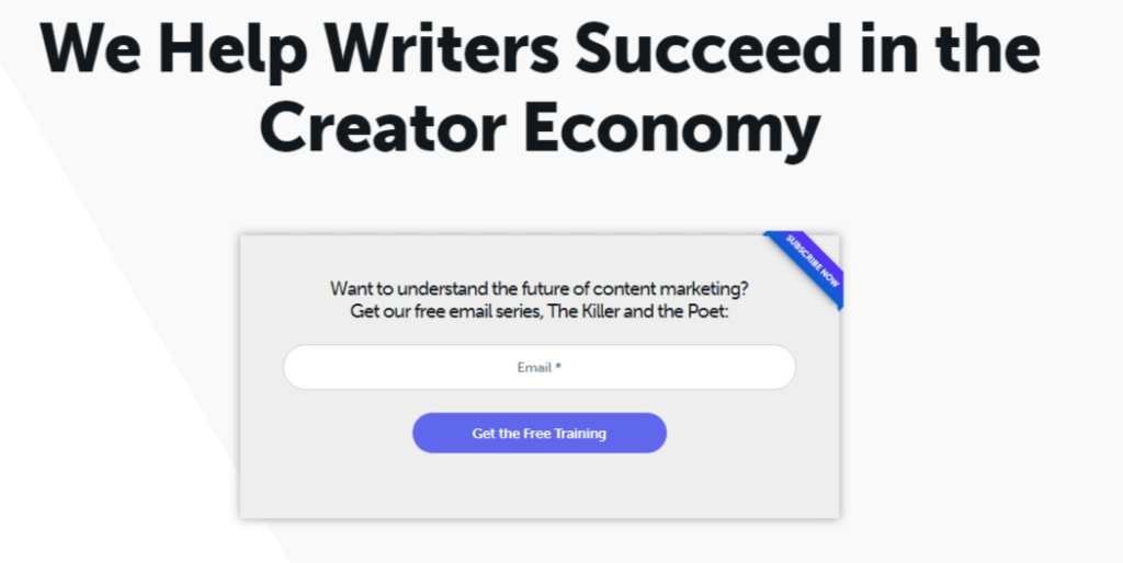
Copyblogger provides content marketing services, training, and resources. So, email marketing is essential for building an audience and retaining long-term relationships with them.
Here’s what we loved about their squeeze page:
- An eye-catching headline with an intriguing perspective;
- A close-to-perfect copy, promising a way for the reader to reach an ambitious goal;
- A compelling offer of free training in exchange for a visitor’s email address.
Marie Forleo
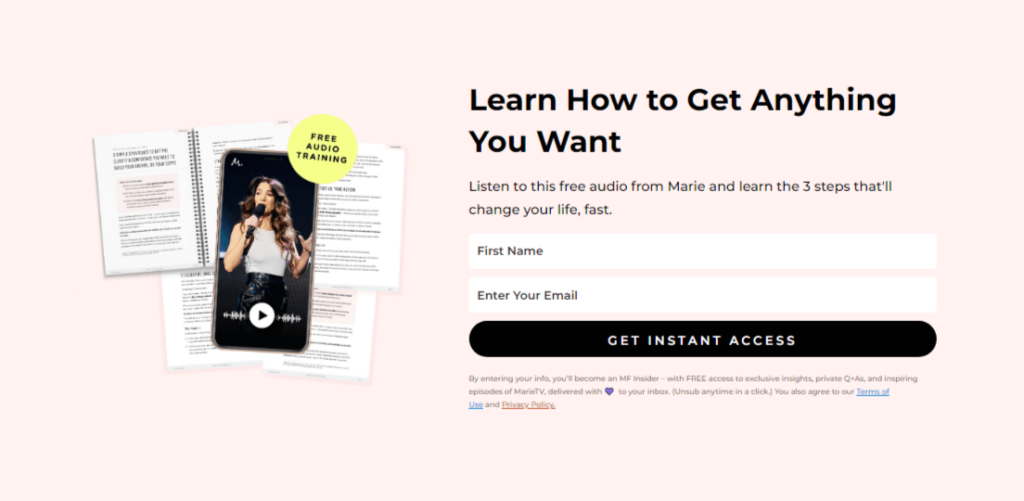
Marie Forleo is an influential entrepreneur and motivational speaker known for her dynamic personality and empowering approach to life and business. She uses email marketing to share exclusive insights nurturing her community while leveraging the power of personalized communication to strengthen her brand presence.
Here’s what we loved about her squeeze page:
- A headline with an offer that’s hard to miss out on;
- Clear CTA encouraging to act immediately;
- A lead magnet tailored to her busy target audience to be consumed on the go;
- Assurance that the visitors can unsubscribe anytime, in case they’re now worried about spam pages.
Ramit Sethi
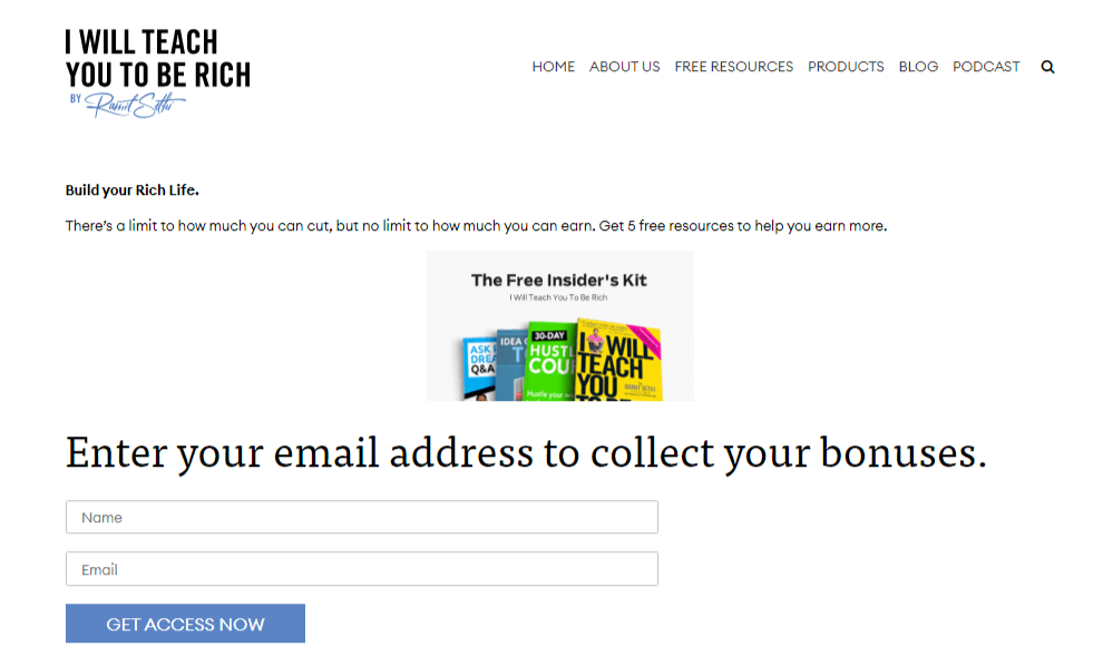
Ramit Sethi is a renowned personal finance expert, author, and entrepreneur who has transformed how people approach money. Email marketing enables his brand to deliver personalized and targeted content and establish itself as a trusted authority in personal finance.
What we loved about this squeeze page:
- A short yet powerful headline;
- The copy mentions “The Free Insider’s Kit” to make visitors feel like they’re part of the inner circle;
- The fear-of-missing-out (FOMO) tactic used to collect email addresses.
Key Takeaways: Squeeze Pages
- Squeeze pages are highly effective in collecting email addresses and generating leads, with online forms being one of the high-converting lead generation tools.
- Businesses can benefit from squeeze pages regardless of niche, size, or location.
- Before you create squeeze pages, define your audience and tailor them to an irresistible offer that cannot be found anywhere else.
- Best practices to create a high-converting squeeze page include a killer headline and powerful copy, a page design with relevant imagery, and a clear CTA.
Use one of Sender’s free form builder templates to create and optimize squeeze pages for successful lead generation.
Also read:
- Email Marketing Lead Generation: Best Practices & Strategies
- 5 Lead Generation Strategies to Swear by
- 6 Best Lead Nurturing Software in 2023
Author Bio
Vesta Oldenburg is a content writer specializing in email marketing strategies. In her daily work, creativity intertwines with a strategic mindset to create content that captivates its readers.
