Losing a subscriber feels like losing an ally on the competitive digital battlefield. But how do you ensure that subscribers don’t turn into strangers again? Reactivation email campaigns can help.
A carefully crafted reactivation or “we miss you” email can serve as a gentle nudge, reminding your once-loyal customers that they’re more than just data points to you—they’re valued members of your brand community. It’s your signal flare in the dark, inviting them back into the fold.
But how do you convince these bored subscribers to jump back on board? If that’s keeping you awake at night, you’re in the right place. Let’s look at different reactivation email templates and explore how to engage your dormant subscribers.
What are Re-Engagement Emails?
Your email list has all kinds of subscribers — some loyal engagers while others are just silent observers. Some subscribers must’ve signed up but no longer engage with your emails.
Re-engagement emails are like a friendly nudge to these dormant subscribers, reminding them of your presence and enticing them to rekindle their interest in your business. These emails are a cost-effective way to breathe life into your email list and potentially win back customers who may have slipped away.
Re-engagement emails work as a gentle tap on the shoulder and saying, “Hey, we miss you!” and aim to reignite the spark of interest among those who’ve gone quiet. These emails often come bearing gifts in the form of special offers, discounts, or exclusive access, enticing subscribers to come back and engage with your brand once more.
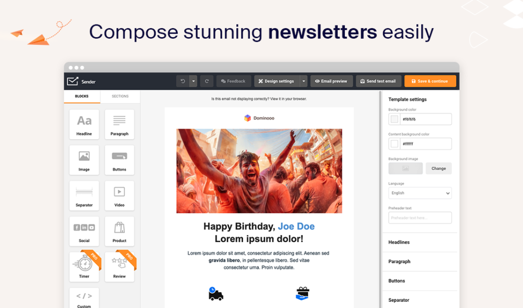
It’s not as complicated as it sounds — in fact, with Sender’s drag-and-drop email builder, making a re-engagement email takes minutes! Just choose one of the pre-made templates and adjust it to your needs and branding.
Why Subscribers Stop Engaging: Most Common Reasons
Subscribers in 2023 are tired of marketing messages. In fact, 73% of consumers in the US want to receive fewer marketing messages going forward. And the reasons are not hidden. Here’s why subscribers go dormant:
- Overwhelm. An average user receives 100-120 emails per day in 2023. It’s natural to feel overwhelmed with inboxes getting flooded so quickly. So, your subscribers may disengage when they receive so many emails;
- Irrelevance. If your emails don’t align with the interests or needs of your subscribers, they’re likely to lose interest. Personalization is key to keeping content relevant;
- Frequency. Bombarding subscribers with frequent emails can lead to fatigue. Finding the right balance between staying in touch and not overwhelming them is crucial;
- Lack of value. Subscribers expect value from your emails. If your content doesn’t provide solutions, entertainment, or insights, they’ll lose motivation to open or engage with your messages;
- Poor timing. Sending emails at inconvenient times can lead to them being ignored. Understanding your audience’s schedule and preferences to choose the best time to email can improve engagement rates;
- Changing interests. People’s interests and needs evolve with time. If your emails don’t adapt to these changes, subscribers may lose interest and disengage;
- Digital burnout. Some individuals experience digital burnout and choose to disengage from various online activities, including emails.
Understanding the reasons behind your subscriber behavior can help you tailor your email re-engagement campaigns to address specific pain points and rekindle the interest of your audience.
We Miss You (Re-Engagement) Email Examples That Work
Are you already excited to plan re-engagement email campaigns for your inactive subscribers? Here are some of the best re-engagement emails you can take inspiration from to create your very own successful campaign.
1. Ruggable Abandoned Cart Recovery Email
Re-engagement email campaigns are not just for inactive subscribers. You can rekindle lost interest in an abandoned cart, too, just like Ruggable did here with its abandoned cart recovery email:
Subject line: Don’t Miss Out – Free Shipping + 15% EXTRA Off
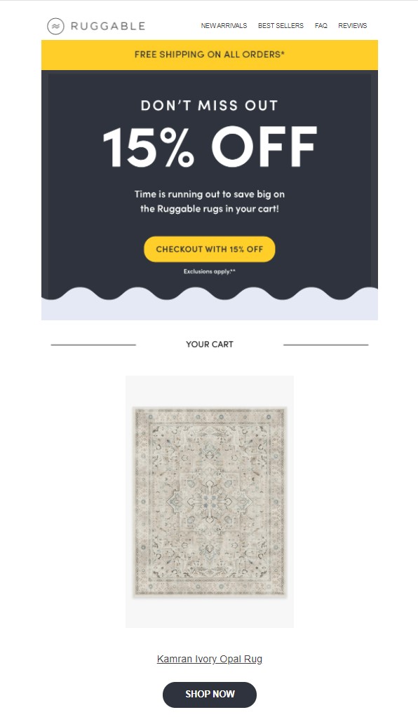
This email serves as a textbook example of how to ace re-engagement. The subject line immediately grabs your attention with its time-sensitive and too-good-to-pass-up deal—free shipping and a 15% discount.
Once you’re lured in, the email doesn’t disappoint. A visually attractive product image makes you curious and invites you to look deeper. The unmissable CTA button practically makes the purchase process easy for you. And if the spotlighted product isn’t up your alley, the email cleverly incorporates additional CTAs that steer you toward different sections of the website. It’s like having a digital tour guide—helpful but never pushy, leading you where you want to go.
Key Takeaways
- Hook readers with a time-sensitive and irresistible offer in the subject line;
- Facilitate easy shopping by coupling eye-catching product images with a standout CTA;
- Enrich the customer journey with extra CTAs, offering multiple shopping options;
- Maintain a warm and hospitable tone to transform the email into a welcoming space for re-engagement.
Need more inspiration for abandoned cart emails? Say no more, we got you: 17 Abandoned Cart Emails To Get Shoppers Back
2. High Sierra Last Call Email
High Sierra uses an email to re-engage subscribers who lost their way through their website. Their email is simple yet effective:
Subject line: Did you forget something?
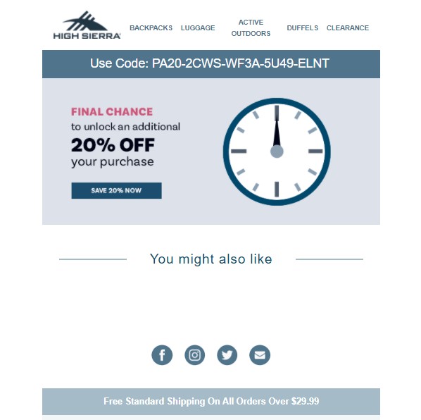
The email deploys the ultimate power word in its subject line – “you”, to grab instant attention. Why is this so effective? Well, it’s like sending a personalized email; the reader instantly feels singled out for something special.
Now, let’s talk about that juicy offer in the email. This isn’t just your run-of-the-mill price slash; it adds to an already generous initial reduction. It’s the marketer’s secret weapon for swooping in and reactivating those fence-sitting, last-minute buyers during a flash sale. Imagine it as the final sparkler in a fireworks show, designed to dazzle and make a lasting impression.
Key Takeaways
- Use the word “you” to make the email look personalized;
- Make your offer irresistible by stacking discounts, especially to entice last-minute shoppers;
- Skillfully combine personalization and urgency to craft an email that’s practically a call to action itself.
3. Birthdate Candles Final Chance Email
Birthdate Candles takes urgency to a new level with its email campaign, which should be required reading for anyone looking to create a sense of FOMO.
Subject line: Hurry! Stock’s Running Out ⏰
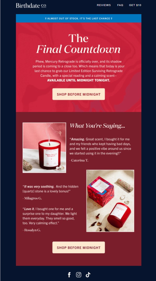
The subject line is a showstopper, warning that stock is running out and only a few pieces remain. This isn’t just suspense; this is the digital equivalent of a ticking time bomb in a movie, keeping you on the edge of your seat.
Once you dive into the email body, the urgency continues to ratchet up. It announces that you’ve until midnight to make a purchase—it’s practically shouting, “Time’s running out!”.
To further facilitate that sense of immediacy, a strategically placed CTA sits just below this deadline disclaimer, making it easier than ever to act fast. And let’s not forget the genius inclusion of a review section. Reviews are the ecommerce version of peer pressure; knowing that others have jumped in and loved the product makes it that much more tempting to make the purchase.
Key Takeaways
- Leverage a sense of urgency in both the subject line and email body to drive immediate action;
- Optimize the placement of the CTA for maximum visibility and ease of access;
- Include genuine reviews to capitalize on social proof, making the offer even more compelling;
- Combine urgency, ease of action, and social validation to create a powerful re-engagement email.
4. Society6 Abandoned Cart Recovery Email
Society6 crafts an email that’s like a warm invitation back to a shopping journey that was almost left incomplete.
Subject line: Holding Up The Line For the Next 48 Hours!
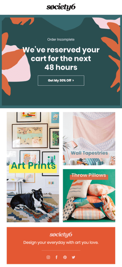
The subject line isn’t just informative; it’s practically comforting, reassuring you that the items you left behind are still available—but only for 48 hours. It taps into the fear of missing out while offering a solution, a smart move that nudges you back to the shopping cart.
The visual layout of the email complements its brevity, making the message easy to scan and absorb in seconds. It’s not just about what is said; it’s also about how it’s visually communicated. And here’s the cherry on top—a generous 30% discount is presented, tempting you to complete your abandoned shopping journey. If that’s not persuasive, what is?
Key Takeaways
- Use a reassuring yet time-sensitive subject line to remind customers about their abandoned shopping carts;
- A visually appealing and succinct layout helps the reader quickly understand the email’s purpose;
- Generous discounts placed as a CTA button can be the final nudge that encourages completion of the purchase;
- Employ a blend of comfort, urgency, and a tempting offer to turn abandoned carts into successful transactions.
Also read: Abandoned Cart Email Templates: Engaging & Superb Examples
5. Drybar Flash Sale Email
“Drybar” serves up a refreshing cocktail of engagement and incentive, starting with a subject line that’s not shy about the deal at hand—a whopping 40% off. It grabs attention without being overtly formal, giving a casual, friendly vibe that most customers find inviting.
Subject line: 40% Off, Just For You!
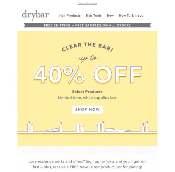
Inside the email, the brand ups the ante by offering free shipping and free samples, sweetening the deal further. A clear and strategically placed CTA button guides customers straight to the discounted products, leaving little room for hesitation. But that’s not all; there’s an extra layer of enticement for newcomers.
“Drybar” suggests signing up for future newsletters, teasing even more irresistible offers and a signup gift as a welcome gesture. It’s as if the brand is laying down a golden path of rewards, just waiting for you to step on.
Key Takeaways
- A casual, eye-catching subject line featuring the discount can grab immediate attention;
- Layer your incentives—start with a big discount, and follow with additional perks like free shipping and samples to solidify the deal;
- Make your CTA clear and easy to find for a seamless shopping experience;
- Use the opportunity to encourage signups for future newsletters, promising additional offers as an extra incentive.
If you’re itching for some flash sale email inspiration, look no further than this must-read article: 10 Flash Sale Email Examples & Subject Lines
6. NBA Store Re-engagement Email
The “NBA Store” scores a slam dunk with an email that perfectly complements its engaging subject line.
Subject line: Exclusive 25% Off on All Orders
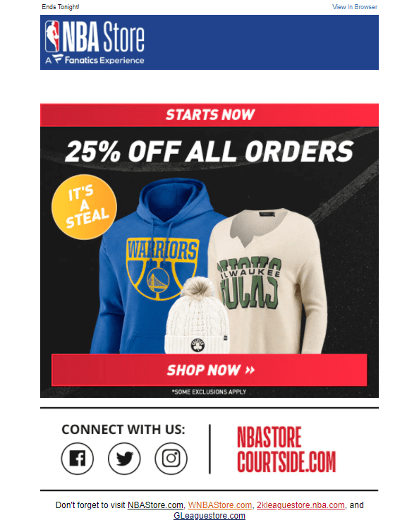
This email example has a catchy subject line. It’s brief and straight to the point. The “NBA” store makes the recipient eager to know more about the email content by including a fantastic offer.
The email body is as simple as the subject line is. It includes the offer, the images of the products on offer, and a clear CTA, which stands out and is noticeable.
It also provides social media icons to encourage more interactions. This example is excellent when the brand wishes to reactivate those old subscribers and gain more attention.
Also read: How to Write Re-Engagement Emails That Reactivate Old Subscribers
7. iStaging Customer Reactivation Email
“iStaging” uses a minimal reactivation email that’s straightforward and direct. The subject line is clear – promising exclusive access and the allure of free products. Who wouldn’t click on that?
Subject line: Exclusive Access + Free Perks
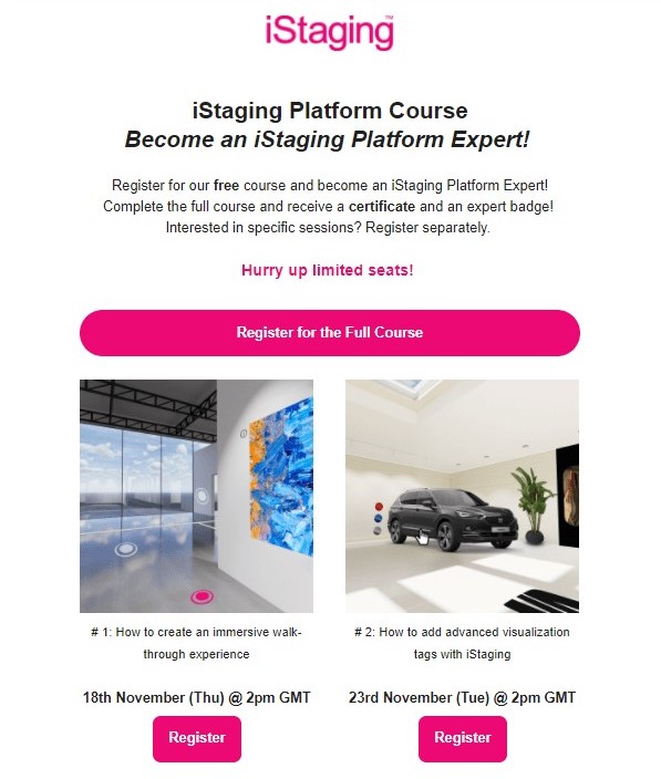
The email is on point when it comes to brand consistency. Its signature color is strategically deployed to highlight key areas, creating a visually appealing yet recognizable palette that elevates the user experience. And those CTAs? They may seem overly abundant, being placed under every course description, but that makes it ridiculously easy for recipients to take action. It’s like a helpful nudge rather than a pushy shove.
Key Takeaways
- A concise subject line with the promise of exclusive content and freebies is a click magnet;
- Consistency in brand color doesn’t just look good; it enhances brand recognition and sets the stage for the CTAs;
- Capturing attention is one thing; making it easy to take action is the real deal, as it’s here with the CTAs.
8. Pinkblush Flash Sale Invitation Email
If you’re looking to re-engage those subscribers, consider taking a page out of Pinkblush’s book. Their emails are straightforward but incredibly effective, creating an engagement flow that’s worth replicating.
Subject line: Double the Deal with Exclusive Discount!
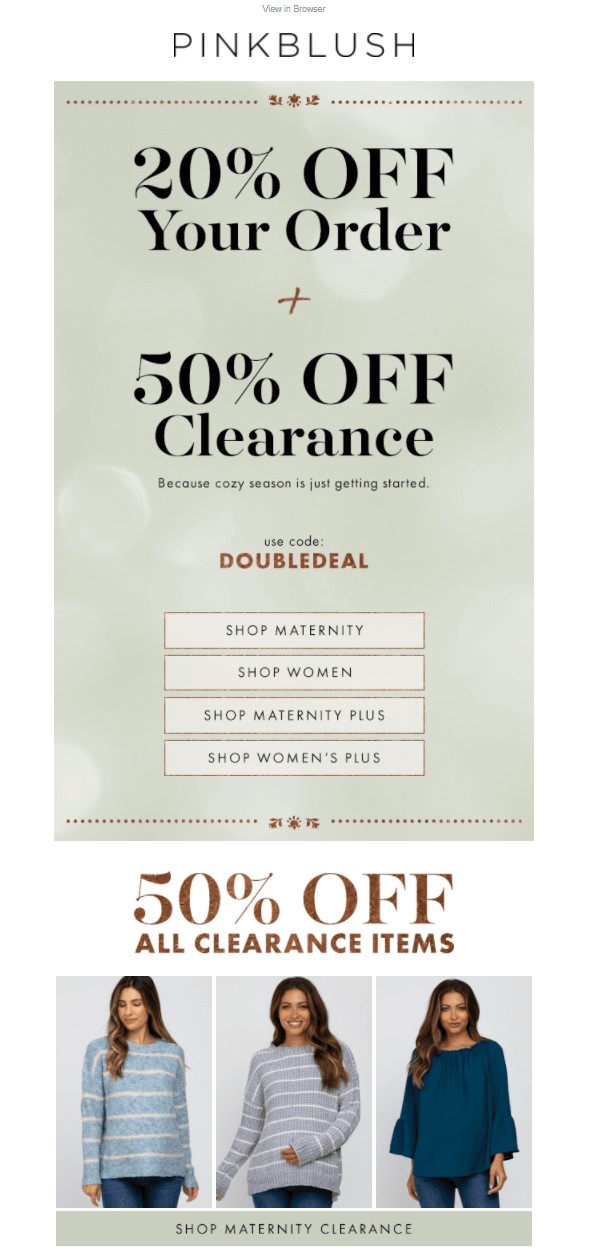
Pinkblush embraces the warm and fuzzy with an email that feels like a comforting hug right from the subject line. Utilizing cozy language and pale tones, they roll out the red carpet in an email designed to make you feel special and invited.
What catches your eye right off the bat? The phrase “double the deal” is a brilliant bit of wording that creates a compelling incentive to dig deeper. Because let’s face it, who doesn’t love double the goodness?
The email body contains offers beautifully paired with vivid imagery. They use images not just as eye candy but as persuasive agents that invite clicks. And speaking of clicks, let’s talk CTAs. Placed under each item, these clickable gems are designed to swiftly usher you from the desire to acquisition.
Key Takeaways
- Cozy, inviting language in the subject line makes opening the email irresistible;
- The phrase “double the deal” packs a powerful psychological punch, making you curious to learn more;
- Vibrant images paired with compelling offers create an intoxicating mix that’s hard to resist;
- Multiple CTAs may feel like overkill, but they let the subscriber jump straight into what they’re looking for.
9. Tomtop Last Call Email
Tomtop is an expert in the slow and subtle art of wooing back lost customers through engaging emails. The subject line itself is part of a series cleverly designed to keep recipients coming back for more.
Subject line: Thanks for Coming Back! Here’s Your Prize!
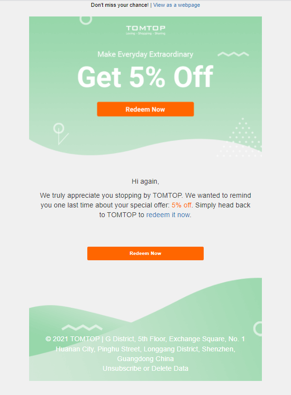
The subject is like a breadcrumb trail leading you back to the brand. And what’s at the end of that trail? A thoughtful “thank you” note paired with a discount. It may sound a tad desperate, but let’s be real—sometimes desperation comes off as genuine concern, and in this case, it works wonders.
The “thank you plus discount” gambit serves a dual purpose. Not only does it make past customers feel valued and important, it also works as a test for seeing if customers are still loyal. It’s an unsentimental but effective strategy: sort your subscribers like your laundry. Keep the responsive ones and give the non-responsive ones the boot to keep your email list lean and clean.
Key Takeaways
- Create a series of emails to create a narrative pull and entice the recipient into the brand’s orbit;
- Add a thank you note plus a discount coupon to show genuine customer appreciation;
- Keep the email short and straightforward.
Crack the code of the science behind last chance emails and how to make them irresistible: 12 Last Chance Email Examples and Templates
10. Soak and Sleep Reactivation Email
Soak and Sleep understands the power of clean, clear messaging and smart, limited-time offers for reactivation. The brand makes each email not just a call to action but a call to make an informed decision.
Subject line: Last Chance – 25% Off!
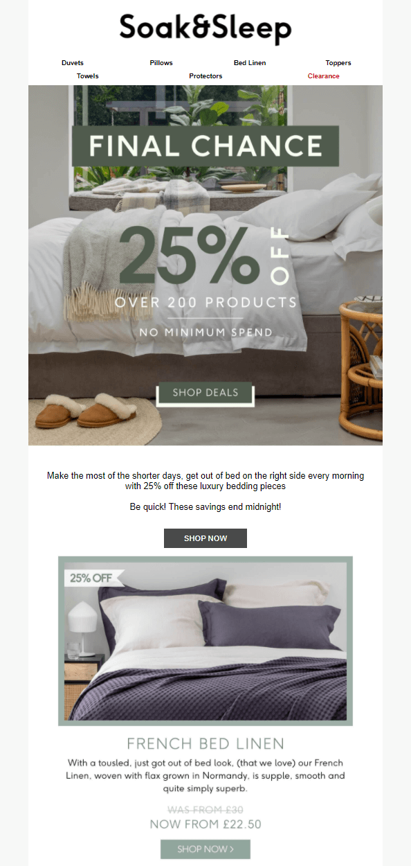
The subject line epitomizes minimalist elegance, a simple “Last Chance” that screams urgency without frills, distractions, or noise. No dancing emojis, no GIFs—just plain words that are the email marketing equivalent of minimalistic impact.
Inside the email, each product photo is paired with a clear description. Here, visuals aren’t just eye candy; they’re visual aids helping buyers make an informed decision. And then there’s the discount—25% off—which, paired with the “final chance,” practically commands immediate action.
Key Takeaways
- Keep the email design and content simple, clear, and minimalist;
- Add limited-time discounts to your reactivation emails to entice subscribers to act;
- Add and link product visuals within your emails to appeal to subscribers further.
15 ‘We Miss You’ Email Subject Lines
Want interesting subject lines for your re-engagement email campaigns or ‘we miss you emails’? Here are 15 subject lines to help you get started. Use them as inspiration, or feel free to steal them for your next campaign:
- Long Time No See! Here’s a 20% Off Coupon!
- We Missed You! Come Back and Enjoy a Special Treat.
- Haven’t Seen You in a While – Is Everything OK?
- Your Cart Misses You. Where Have You Been?
- It’s Been Too Quiet Without You. Let’s Catch Up!
- Hey [First Name], We Miss Your Smiling Face!
- You’re Missed: Enjoy This Gift on Us!
- Feeling Lonely? Here’s Something to Bring You Back.
- You’ve Been Gone Too Long—We Saved Your Seat!
- Missing You! Save 30% on Your Next Visit.
- Guess Who’s Been Missing You? (Hint: It’s Us!)
- Haven’t Seen You Lately—Did We Do Something Wrong?
- You’re Like Family to Us, and We Miss You!
- It’s Been Ages! Here’s a Special Offer:
- You Left Us Hanging! Want to Pick Up Where You Left Off?
Key Takeaways: We Miss You Emails
Win-back or re-engagement emails to entice an inactive subscriber to come back is a great idea to keep your email list healthy. Here are some tips for sending win-back campaigns to your inactive subscribers:
- Always add special offers or perks to your miss you or reactivation emails;
- Schedule reactivation emails through a marketing automation solution;
- Experiment with multiple subject lines before you send re-engagement emails at scale;
- Plan a win-back email campaign every quarter to bring inactive subscribers back to your email list.
Also read:
- How to Create an Effective Customer Win-Back Campaign?
- 20+ Follow-Up Email Examples & How to Write a Good Template
- 15 Welcome Email Examples from Well-known Brands
Author Bio
Anmol Ratan Sachdeva is a content marketer and small business consultant who has a strong grip on topics like marketing automation, email marketing, and content marketing. He loves to write about building, improving, and growing a business.
