We all know automation saves time. So why not use it for customer onboarding?
Research suggests that 76% (Gallup) of companies spend 2 hours weekly on follow-ups and reminders. Naturally, ~2 in 3 (or 67.3%) companies want to automate these menial tasks, and that’s where customer onboarding software comes in.
In this blog, we will share the best customer and client onboarding software you can save time, improve customer satisfaction and help customers use your product effectively. Shall we begin?
Disclaimer: This article evaluates various customer onboarding platforms, including Sender, which our company owns. We present assessments based on research, industry standards, and user feedback. We selected these platforms after comparing their features, pricing, and performance. We don’t earn any commissions from links in this article.
What is Customer Onboarding Software?
Customer onboarding software helps you automate and optimize the onboarding processes. It lets you speed up the process and ensures every customer feels valued and supported when signing up, that way improving customer satisfaction.
This may include delivery of required onboarding material by email, sharing help docs, personalizing workflows to match their ‘usage’ or personalized learning paths, or delivering self-paced instructions, when they need it the most.
With such a tool, you can create and manage the entire relationship with customers during their onboarding based on their needs, interests, or preferences. Advanced platforms also support enterprise CRM workflows like Salesforce onboarding to ensure seamless transitions from sales to customer success teams.
Also, using customer onboarding software minimizes the time-to-value for end customers. This means they can get value from their subscription or purchase immediately. Customer onboarding software also helps gather valuable customer data, helping in optimizing the overall experience that boosts customer retention rate.
Why Customer Onboarding Software Tools Matter
Customer onboarding software isn’t just a nice-to-have—it’s a business-critical investment that directly impacts your bottom line and customer relationships. When implemented effectively, automated onboarding systems transform the way new clients experience your product while delivering measurable results for your organization.
- ROI and business benefits. Companies that implement structured onboarding processes consistently see higher customer lifetime value and significantly faster time-to-value compared to manual approaches (that are prone to human error). The onboarding ROI often becomes apparent within the first quarter of implementation;
- Cost of poor onboarding. A substantial portion of customer churn occurs within the first few months, often due to confusion, frustration, or failure to realize product value during the critical onboarding period. Smart onboarding cost reduction strategies can prevent these expensive losses;
- Impact on customer retention. Customers who complete a structured onboarding process are significantly more likely to remain active users and generate additional revenue through upsells and expansions—outcomes that revenue teams rely on for consistent growth.
How to Choose Customer Onboarding Platform
Choosing the perfect customer onboarding platform is the same as picking a vacuum cleaner—you need to know how convenient it is, how many alternative heads it has and whatnot. That is, if you care about the final result (and if you’re reading this, we believe that you do!).
Before we go deep into the specifics of each onboarding solution, here are some things you should consider first:
- Define your onboarding goals: Start by identifying what you actually want the platform to achieve—whether it’s guiding new users inside your product, automating welcome sequences, reducing support tickets, or accelerates time-to-value ratio. Your goals immediately narrow your options, since some tools excel at in-app onboarding while others shine in lifecycle automation or customer success workflows.
- Assess ease of use: A customer onboarding platform should empower your team, not slow it down. Look for intuitive builders, drag-and-drop editors, and templates that let non-technical teams create guides, flows, and playbooks without coding. If every update requires developer help, the tool will become a bottleneck.
- Check integration capabilities: Seamless integration with your CRM, analytics tools, product data sources, and support systems is essential. The more user data the platform can pull in—events, usage patterns, lifecycle stages—the more accurate your onboarding triggers, personalization, and reporting will be.
- Evaluate workflow automation and triggers: Automation saves hours of manual work and keeps onboarding consistent. Choose a platform that supports behavior-based triggers, segmented messaging, and multistep journeys. This lets you personalize onboarding experiences based on what users do (or don’t do) inside your product.
- Look at analytics depth: Strong analytics tell you where users get stuck, which steps drive activation, and how well your onboarding content performs. Prioritize platforms that show user behavior in real time, highlight friction points, and provide data-driven insights—not just vanity metrics.
13 Customer Onboarding Software Comparison Table
Before we dive deep into each tool, let’s take a look at a handy comparison table:
| Provider | Best For | Integration capabilities | Pricing | G2 Ratings |
| Sender | Small businesses looking for all-in-one solution | Ecommerce, CRM, SMS | From $7/mo | 4.7 |
| Rocketlane | Project teams, collaborative onboarding | CRMs, Slack, Jira, APIs | From $19//mo | 4.7 |
| Userpilot | Product teams, SaaS user onboarding | Segment, Mixpanel, HubSpot | From $299/mo | 4.6 |
| ClientSuccess | Customer success teams, enterprise clients | Salesforce, HubSpot | Custom pricing | 4.4 |
| Userguiding | SaaS and web apps onboarding | Segment, Intercom | From $174/mo | 4.7 |
| Churnzero | Subscription businesses, retention focus | CRMs, Slack, Analytics | Custom pricing | 4.7 |
| WalkMe | Large enterprises, complex systems | Enterprise systems, Salesforce | Custom pricing | – |
| Encharge | Automating onboarding flows with CRM-connected behavioral journeys | CRM, Email, Zapier | From $79/mo | 4.7 |
| Customer.io | Multichannel onboarding messaging (email, SMS, in-app) with deep personalization | Email, SMS, In-app | From $100/mo | 4.4 |
| ActiveCampaign | Small teams wanting onboarding automation + CRM in one system | CRMs, Zapier, Email | From $19/mo | 4.5 |
| Userflow | Fast, no-code in-app onboarding flows and interactive product walkthroughs | Segment, Intercom | From $240/mo | 4.8 |
| Appcues | Enterprise-grade in-app onboarding with advanced segmentation & targeting | Segment, Mixpanel, CSS | From $300/mo | 4.6 |
| Chameleon | Growth teams creating highly tailored onboarding experiences with granular targeting | Segment, Advanced Targeting | From $279/mo | 4.7 |
13 Best Customer Onboarding Software for SaaS
Planning to set up a customer onboarding process but got overwhelmed with all the available options? Well, you’re not alone. Check this curated list of the 13 best customer onboarding solutions to help you decide. When looking to streamline your onboarding process, consider the following software:
- Sender
- Rocketlane
- Userpilot
- ClientSuccess
- UserGuiding
- ChurnZero
- WalkMe
- Encharge
- Customer.io
- ActiveCampaign
- Userflow
- Appcues
- Chameleon
Each one offers some unique features for building a seamless onboarding experience. Let’s look at these solutions one by one.
Sender — Specialized in email-based onboarding sequences
Sender is a robust onboarding solution designed to meet the needs of ecommerce businesses that struggle to offer a consistent onboarding experience. With automated campaigns, smart segmentation, and omnichannel marketing features, Sender gives you everything you need to nurture, onboard, and delight customers.
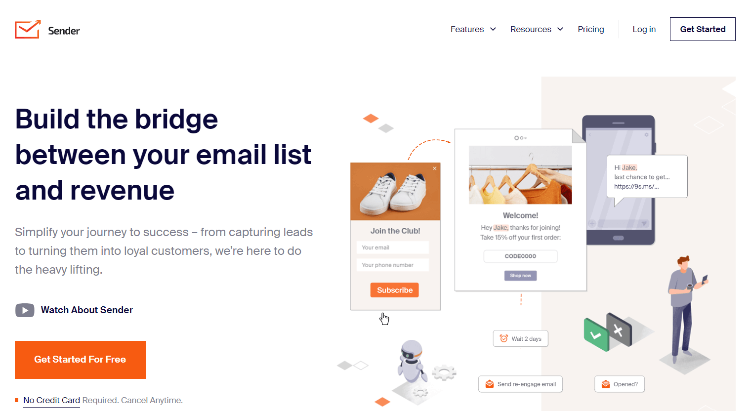
From product tours and tutorials to interactive checklists and tooltips, deliver onboarding material automatically with Sender.
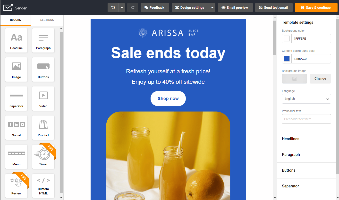
Its workflow builder allows you to schedule automated onboarding emails, welcome emails, follow-ups, and even nurture leads via SMS campaigns. Make sure to reach the right audience at the right time with smart segmentation based on their online behavior and data.
Sender’s human-friendly user interface sets it apart from the competition. Its intuitive dashboard is incredibly easy to use, even for those with limited technical knowledge. Also, Sender integrates seamlessly with popular ecommerce platforms, allowing you to automate your customer onboarding process and save time.
Standout Features
- Automated onboarding. Intelligent workflow builder to schedule automatic emails based on user activity, behavior, or segmentation;
- Behavioral segmentation. Segment your audience or users based on behavior, activity, or custom fields with comprehensive real-time analytics integration;
- Omnichannel onboarding. Create campaigns to assist and direct users using email as well as SMS;
- Landing page builder. Easily design and launch custom landing pages to guide users, capture leads, or showcase key content—all without needing coding skills;
- 24/7 customer support. Access round-the-clock assistance to resolve issues, answer questions, and ensure your onboarding campaigns run smoothly at all times.
Use Cases by Industry
Sender works well for all kinds of businesses, enabling automation, personalized messaging, and better engagement. By combining email with SMS marketing, it creates a unified approach that boosts effectiveness and return on investment.
- Online Stores: Automate product suggestions, cart abandonment reminders, and follow-ups after purchases. One retailer actually increased revenue by 30% just by using personalized product recommendations.
- SaaS Companies: Use Sender’s analytics to monitor how users behave, send tailored onboarding emails, and win back customers with re-engagement campaigns.
Pros & Cons
- Affordable pricing structure, including a free plan
- Easy-to-use drag-and-drop editor
- Superb deliverability
- Powerful automation workflows
- Suitable for small to mid-sized businesses
- Branding on free plan
- Fewer integrations than some competitors
Sender Pricing
- Forever free plan for up to 2500 subscribers and no feature restrictions;
- Sender’s pricing for paid plans starts at $7 per month for up to 2500 subscribers.
Choose Sender as your customer onboarding tool and deliver a personalized experience that keeps them returning for more. It’s free—give it a try now!
“Overall, my experience with Sender has been very positive. It’s reliable, easy to learn, and has everything I need to run successful email campaigns for my business. I’ve saved both time and money since switching over.”
— Lahaga from Capterra
Rocketlane — Track Onboarding Progress with Kanban Boards
Rocketlane is a customer onboarding platform designed specifically for B2B SaaS companies that need visual project management capabilities. The platform combines traditional project management methodologies with customer success best practices to deliver structured onboarding experiences.
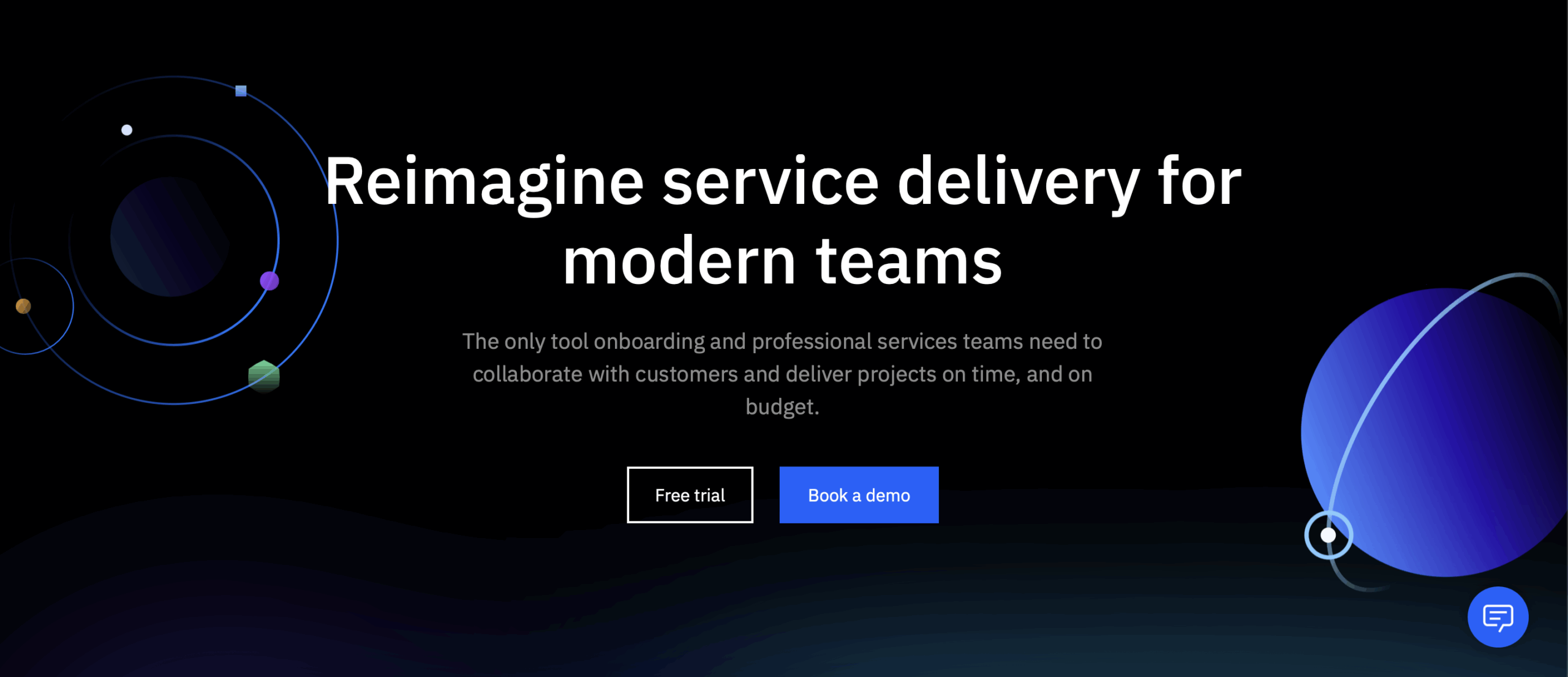
What sets Rocketlane apart is its Kanban-style board system that allows teams to track each customer’s onboarding journey visually. You can create customized workflows, do task assignment, and monitor progress in real-time across multiple client onboardings simultaneously.
The platform also includes time tracking, milestone management, and automated status updates that keep both your team and customers informed about progress. This visual approach helps identify bottlenecks quickly and ensures no critical onboarding steps fall through the cracks, ultimately reducing time-to-value and improving customer satisfaction.
Standout Features
- Visual project management. Kanban-style boards that provide clear visibility into each customer’s onboarding progress with customizable workflow stages and automated status updates;
- Time tracking and milestones. Built-in time tracking capabilities with milestone management that helps teams meet deadlines and identify bottlenecks before they impact customer satisfaction;
- Client collaboration portal. Dedicated customer-facing dashboards where clients can track their own progress, access resources, and communicate directly with onboarding teams in a shared workspace;
- Template library. Pre-built onboarding templates for different customer types and use cases that accelerate setup time and ensure consistency across implementations. These templates work seamlessly with API onboarding tools;
- Resource management. Team capacity planning and workload distribution features that help optimize resource allocation across multiple concurrent customer onboardings.
Use Cases by Industry
Rocketlane excels in complex B2B environments where onboarding involves multiple stakeholders and lengthy implementation processes. The visual project management approach helps teams coordinate across departments while keeping clients informed throughout their journey.
- Enterprise software. Manage multi-phase implementations with clear timelines, milestone tracking, and stakeholder coordination across technical and business teams. Project plans become transparent and actionable for all stakeholders;
- Professional services. Streamline client onboarding process with customizable workflows, document sharing, and progress transparency that builds trust and reduces queries.
Pros & Cons
- Purpose-built for customer onboarding with reusable templates
- Branded customer portal with real-time client visibility
- Time tracking, resource management, and feedback collection
- Centralized communication with chat and document sharing
- Steep learning curve for non-technical users
- Limited reporting & analytics options
- Integration options can be limited
- Some performance lags & occasional UI slowdowns
Rocketlane Pricing
- Paid plans start at $19 monthly per team member, paid annually;
- Free trial available to explore the platform’s onboarding capabilities before making a commitment.
Userpilot — No-Code In-App Guidance for Product Adoption
Userpilot is an intelligent user onboarding solution designed to deliver a personalized onboarding experience for SaaS products and startups. The tool helps segment customers based on real-time behavior or predefined personas to ensure maximum engagement.
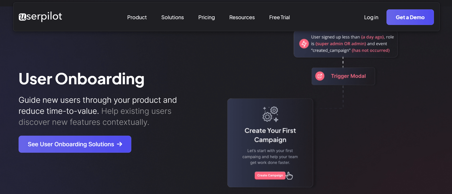
This low-code onboarding platform eliminates the need for technical skills while providing sophisticated customization options. Userpilot assists in creating personalized onboarding experiences for their customers based on their interests and engagement. With its powerful features, such as in-app hints & tips, on-demand assistance, real-time user segmentation, and onboarding checklists, Userpilot enables SaaS businesses to seamlessly onboard trial customers, boost delight, and improve feature discoverability.
One of the key advantages of Userpilot is its ability to collect valuable user feedback and insights. By leveraging this data, businesses can gain a deeper understanding of their customer’s needs and preferences, enabling them to tailor their onboarding experience accordingly.
Standout Features
- Personalized experiences. Businesses can optimize and personalize onboarding journeys based on user engagement, interests, activity, or personas;
- In-app interactions. Improve feature adoption and nudge users through in-app hints, tips, and suggestions;
- Discover opportunities & optimize. Track user activity and deliver exceptional experiences to reduce time-to-value for trial users & new signups for maximum conversions and delight;
- Monitor progress. Set up and track customer onboarding goals to understand the impact of onboarding automation and take necessary steps based on data;
- Set up checklists. Gamify the onboarding process and make it more engaging by highlighting the path to activation for new users.
Use Cases by Industry
Userpilot is particularly effective for SaaS companies and digital products that need to guide users through complex interfaces and feature sets. The platform’s behavioral segmentation ensures personalized experiences that match user expertise levels and goals.
- SaaS Platforms: Create contextual product tours and feature announcements that help users discover value quickly and increase feature adoption rates. This approach has proven to be a game changer for many companies.
- EdTech Companies: Guide students and educators through learning platforms with progressive disclosure and achievement-based onboarding that matches learning pace.
Pros & Cons
- No-code builder for easy flow creation
- Wide range of UI patterns: tooltips, modals, banners
- Built-in A/B testing and feedback tools
- Strong event tracking and segmentation
- Web-only, limited mobile support
- Enterprise-level pricing
- Advanced triggers and analytics have a learning curve
- Custom design may require CSS tweaks
Userpilot Pricing
- Starts at $249 monthly for up to 2500 subscribers/users, paid annually;
- Free 14-day trial is available for testing the platform.
ClientSuccess — Visual Customer Onboarding Tracking
Evident from its name, ClientSuccess is a comprehensive customer success platform designed to simplify onboarding without complicating anything. ClientSuccess tracks customers’ interests and desired outcomes and maps them to an ideal onboarding flow.
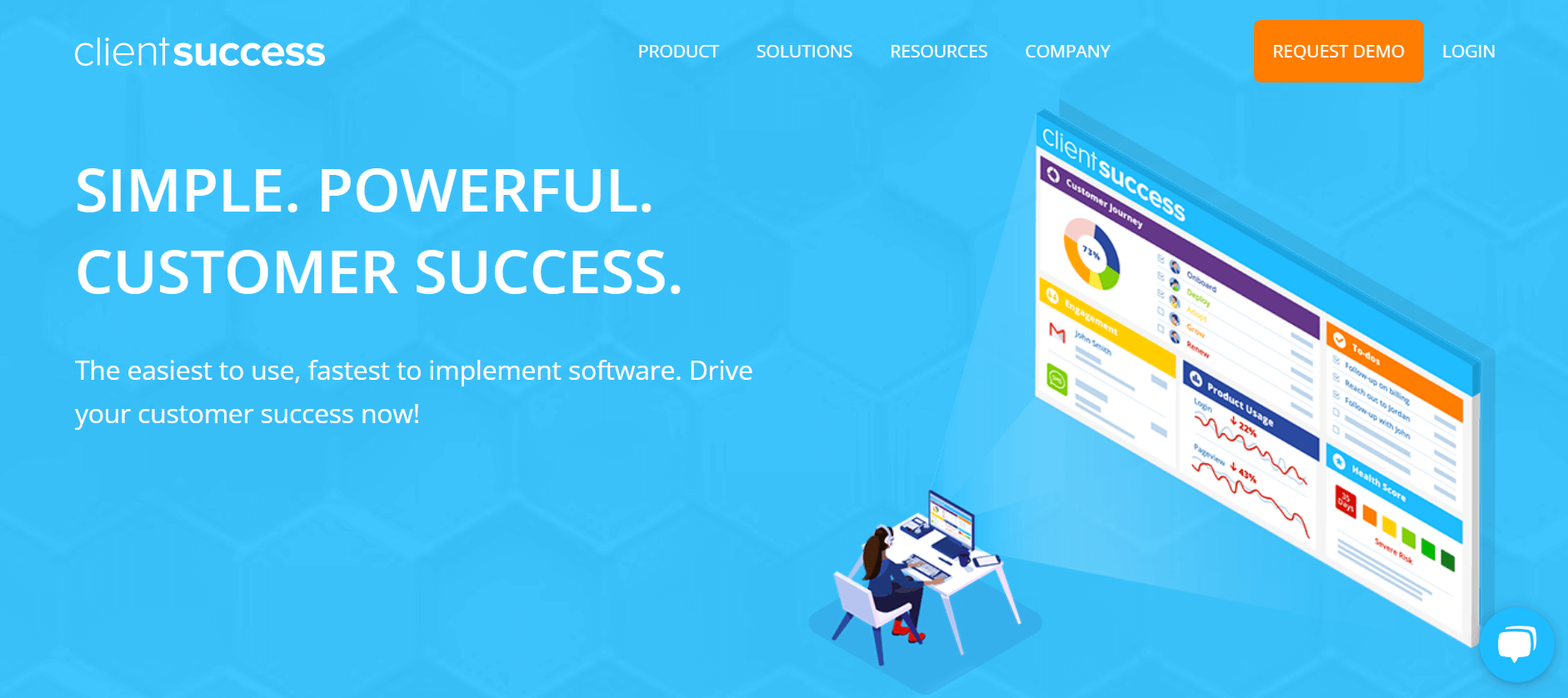
ClientSuccess ensures smooth handoff from sales to customer success and links customers’ interests to key business outcomes. It also helps your team to guide users through the onboarding process, visualize product usage, and monitor the progress of client onboarding automation.
One of the key strengths of ClientSuccess is its ability to centralize all client data, allowing you to track and manage customer onboarding progress easily. With its intuitive dashboard, you can gain valuable insights into each client’s journey and identify any bottlenecks or areas for improvement.
ClientSuccess also sets up automated workflows and streamlines task management for the efficient onboarding process to ensure no critical steps are missed. This saves you time and effort and enhances the overall customer experience.
Standout Features
- Automatic handovers. Set up individual KBOs (key business objectives) while handing over customers from sales to customer success and automate the process without missing any step;
- Integrates with existing solutions. Fetch customer data from multiple places — CRM, helpdesk, marketing funnel, etc. to witness customer interests and interactions on a central dashboard for personalizing onboarding experience;
- Track usage. Witness how customers are using the product to improve customer experience and track the success of feature adoption tactics during onboarding;
- Assign & track tasks. Organize onboarding experience by assigning onboarding tasks to individual team members and tracking the progress of onboarding steps;
- Discover deviations. Identify bottlenecks or problems during onboarding and take corrective actions to bring the onboarding process on track with Key Business Outcomes.
Use Cases by Industry
ClientSuccess works best for subscription-based businesses with high-touch customer relationships where retention is critical. The platform’s integration capabilities make it ideal for companies with complex tech stacks requiring unified customer data.
- B2B SaaS: Track customer health scores, automate renewal processes, and identify expansion opportunities through comprehensive usage analytics and engagement tracking.
- Consulting Firms: Manage client relationships from initial onboarding through project completion with automated workflows and performance monitoring capabilities.
Pros & Cons
- Intuitive UI and dashboards for CSMs
- Centralized client data and engagement tracking
- Strong communication tools with inbox integration
- Good customer support and onboarding help
- Reporting and analytics can be limited
- Some users report data sync issues
- Automation features are basic compared to other CS platforms
- Occasional performance issues and feature overwhelm
ClientSuccess Pricing
- No Free plan is available;
- Custom pricing after booking a demo and requesting a quote from their website.
Userguiding — Simple Product Tours and Walkthroughs
Userguiding is a unique product onboarding software that helps you set up a self-serving user onboarding process.
UserGuiding is a no-code solution that integrates ‘helpful’ tooltips, guided walkthroughs, and interactive in-app experiences to kickstart the user adoption contextually. These interactive walkthroughs allow users to learn by doing, creating a more engaging and effective onboarding experience.
It allows you to set up interactive product tours for customers to take them through your platform’s various features and analytics functionalities, ensuring maximum adoption. And with additional ‘handholding’ features, including checklists, support centers and multi-language support for international user bases, to maximize user delight—you won’t find a more user-oriented solution than UserGuiding.
The built-in analytics and reporting tools provide valuable insights into your customer onboarding process. You can customize these reports to identify areas for improvement using analytics to optimize your onboarding strategy.
Standout Features
- Product walkthroughs. Create self-guided walkthroughs for new customers to reduce the time-to-value automatically;
- Feature adoption. Tooltips and interactive guides to assist users in trying out a new feature and improve activation;
- Set up resource center. Create a self-guided resource center to embed in your website or product by converting frequently asked questions into interactive guides;
- Onboarding checklists. Design and implement onboarding checklists to let customers onboard themselves without too much ‘prying in.’
- Collect customer feedback. Launch in-app surveys to discover what users want and use the data to improve the onboarding experience.
Use Cases by Industry
UserGuiding is particularly effective for SaaS companies and web applications that need to guide users through complex interfaces without overwhelming them. The platform’s self-service approach reduces support burden while improving user activation and feature discovery.
- SaaS Platforms: Create interactive product tours that help new users discover key features at their own pace, reducing time-to-value and support tickets. The self-guided approach works especially well for freemium models where users need to experience value quickly.
- Ecommerce Platforms: Guide customers through checkout processes, account setup, and advanced features like wishlist management or subscription services with contextual tooltips and walkthroughs that increase conversion rates.
Pros & Cons
- Easy to set up
- Supports tooltips, modals, checklists, and in-app surveys
- Highly customizable themes and branding
- Collects user feedback via microsurveys
- Analytics are basic and limited
- Pricing jumps significantly between tiers
- Limited integrations and data control
- Manual localization; no AI-powered translation
UserGuiding Pricing
- Basic plan starts at $174 per month for up to 2,000 users;
- The free limited-period trial is also available.
Churnzero — Real-Time Onboarding Monitoring to Prevent Churn
Churnzero is an AI-powered customer onboarding solution focused on reducing customer churn and providing revenue intelligence. The platform has unique features to enhance the customer onboarding experience.
Unlike other customer onboarding software, ChurnZero allows SaaS businesses to identify and address customer issues before they escalate proactively. With its advanced analytics tools, ChurnZero provides valuable insights into customer behavior and helps companies understand the factors that lead to customer churn.
ChurnZero allows you to track customers’ onboarding journey, establish onboarding milestones, manage onboarding tasks, automate assignments, and stay informed on onboarding progress in real time.
The most helpful feature of the platform is the ability to automate customer engagement. You can segment customers, set up a playbook, and automate repetitive tasks to ensure the most helpful content is presented to customers at the right time using automated emails and in-app messages. The platform processes a large number of user interactions to optimize these automated workflows.
Standout Features
- Centralized data. Find everything from customer profiles, custom alerts, segments, interactions, dashboards, and customer reports;
- Automatic workflows. Automate contextual communication, emails, and messages based on customer journeys, walkthroughs, and segments;
- Customer collaboration. Stay in touch with customers and assist them at every step of SaaS onboarding through in-app communication, walkthroughs, success centers, and surveys;
- Churn & renewal forecasts. Discover at-risk customers, find upsell opportunities, and forecast future revenues through customer health scores and intelligent AI insights.
Use Cases by Industry
ChurnZero is designed for subscription businesses with recurring revenue models where preventing churn is paramount. The AI-powered insights help identify at-risk customers before they decide to leave, enabling proactive intervention strategies.
- SaaS companies. Monitor usage patterns, automate health scoring, and trigger interventions when customers show signs of disengagement or reduced activity.
- Membership organizations. Track engagement levels, automate renewal campaigns, and identify expansion opportunities through behavioral analysis and predictive modeling.
Pros & Cons
- Real-time churn alerts
- Automation workflows
- CRM and usage-data integration
- In-app messaging and guides
- Expensive for small teams
- Setup can be complex
- Limited email features
- No mobile app
Churnzero Pricing
- Custom pricing after booking a demo and requesting a quote from their website.
WalkMe — Enterprise Digital Adoption with Smart Walkthroughs
WalkMe is a powerful onboarding platform that improves the pace of user adoption and streamlines employee onboarding for SaaS businesses. By utilizing available customer data, WalkMe allows you to simplify the user experience and improve customer satisfaction.
WalkMe helps identify the bottlenecks to adoption, find where users are struggling, simplify complex workflows, and create personalized experiences that drive SaaS feature adoption. One of the standout features of WalkMe is its interactive guidance system — TeachMe.
An option to offer step-by-step instructions via easily customizable help menus for self-service support eliminates confusion or frustration during the onboarding process. Not only does this improve customer satisfaction and reduce support requests, it helps create ‘power’ users.
Companies use the solution to train employees, increase knowledge retention, and improve customer satisfaction scores. Teams can create comprehensive video tutorials and onboarding materials with just a few clicks.
Standout Features
- Powerful AI-Driven intelligence. Track where users get stuck and understand, predict, and act on user behavior to improve the SaaS onboarding process;
- Automate processes. Automate repetitive tasks and eliminate empty clicks across applications to streamline and optimize onboarding;
- Intelligent insights. Discover what’s working and take corrective actions to improve onboarding process.
Use Cases by Industry
WalkMe excels in enterprise environments with complex software ecosystems and diverse user bases requiring comprehensive training. The platform’s robust analytics help organizations understand adoption challenges and optimize user experiences.
- Enterprise software. Simplify complex workflows with step-by-step guidance that reduces training costs and accelerates team productivity across departments;
- Healthcare systems. Guide medical professionals through regulatory compliance procedures and software updates while maintaining patient care quality standards. The platform can handle complex tasks across an entire website or application ecosystem.
Pros & Cons
- Powerful in-app guidance tools
- Strong user analytics
- Helps reduce support load with self-service
- Scales well across web and mobile
- Very steep learning curve
- High pricing for most teams
- Advanced setups require technical skills
- Maintenance can be time-consuming
WalkMe Pricing
- Custom pricing model, available after requesting a demo from their website.
Encharge — Behavior-Triggered Emails for SaaS Onboarding
Encharge is a powerful automation solution for SaaS customer onboarding focused on providing behavioral automation and email marketing features.
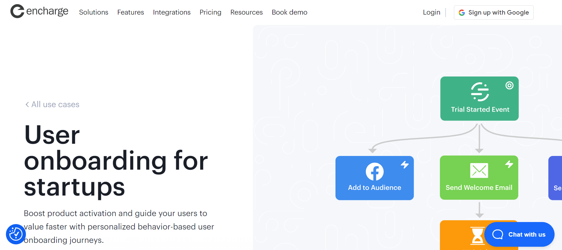
With Encharge, you can streamline your onboarding process and deliver personalized experiences to your clients and customers. It enables you to segment your audience, track behaviors, personalize communication, and deliver a contextual onboarding experience for SaaS users.
Encharge’s automation capabilities help you set up automated onboarding flows, ensuring that each client or customer receives the right information at the right time. Encharge frees up your team’s time by automating repetitive tasks, allowing them to focus on more strategic initiatives.
Another advantage of Encharge is its integration with other existing tools like CRM systems, email marketing services, and project management tools. This seamless integration lets you consolidate all your customer data in one place and create a unified view of each SaaS client or customer.
Standout Features
- Automatic flowbuilder. Use visual workflow builder for creating onboarding sequences based on user behavior and customer journey;
- Behavioral emails. Send automated emails based on online activity, in-app behavior, or engagement;
- User profiles. Get an overview of customer behavior, data, and interactions from a single dashboard with powerful third-party applications;
- Event management. Track and monitor active events within the app for personalizing the user experience.
Use Cases by Industry
Encharge works particularly well for SaaS companies that rely heavily on behavioral triggers and lifecycle marketing. The platform’s automation capabilities help nurture users through complex conversion funnels with minimal manual intervention.
- SaaS platforms. Automate trial-to-paid conversions with behavior-triggered campaigns that respond to user actions and engagement patterns in real-time;
- Online education. Nurture course completions and certifications through automated email sequences that adapt to learning progress and engagement levels.
Pros & Cons
- Powerful behavior-based automation
- Clean visual flow builder
- Real-time segmentation based on user activity
- High email deliverability with managed email infrastructure
- No built-in form builder
- Limited ecommerce support
- Interface can feel slow or confusing at first
- Fewer native integrations than some competitors
Encharge Pricing
- Starts at $79 per month for up to 2000 subscribers and 20,000 emails monthly;
- A 14-day free trial is also available.
Customer.io — Multi-Channel Personalized Messaging
Customer.io is another stand-out messaging platform that excels at creating personalized onboarding experiences across multiple channels. This onboarding tool allows you to orchestrate email, SMS, push notifications, and in-app messages all from a single dashboard.
What makes Customer.io stand out is its data-driven segmentation capabilities. You can create highly-tailored onboarding sequences based on user behavior, product engagement, and custom attributes.
The journey builder tool provides a user-friendly interface for mapping complex onboarding flows, while triggered messages ensure new customers receive important information at critical moments.
For instance, you can automatically trigger onboarding emails when users complete specific actions. A new user just tried out a key feature of your product? Well, an automated email will be there to congratulate them on this milestone!
Standout Features
- Multi-channel orchestration. Send perfectly timed messages across email, SMS, push notifications, and in-app channels. It’s like having one remote control for your entire communication stack;
- Behavioral segmentation. Automatically group users based on what they actually do in your product, not just what they say they’re after;
- Visual journey builder. Drag-and-drop your way to complex onboarding flows that would make a flowchart enthusiast weep with joy—no coding required;
- Real-time event tracking. Trigger messages the instant something happens in your app, creating those “how did they know?” moments that make customers feel truly understood. This creates a seamless user onboarding journey;
- Cross-channel A/B testing. Test different messaging approaches across all channels simultaneously. Why guess when you can know what actually works for your audience.
Use Cases by Industry
Customer.io thrives in environments requiring sophisticated multi-channel orchestration and real-time responsiveness. The platform’s strength lies in coordinating complex messaging across various touchpoints while maintaining consistent user experiences.
- Ecommerce platforms. Coordinate cart abandonment, shipping notifications, and post-purchase follow-ups across email, SMS, and push notifications seamlessly;
- Mobile apps. Trigger contextual in-app messages, push notifications, and email campaigns based on user behavior and lifecycle stage progression.
Pros & Cons
- Powerful, event-driven workflows
- Real-time segmentation based on user behavior
- Multi-channel messaging — email, SMS, push
- Deep API and integrations
- Steep learning curve for non-technical users
- Pricing scales quickly as your profile count grows
- Limited in-browser email builder
- Basic reporting, requires external tools for more detailed analytics
- Advanced designs need HTML/CSS
Customer.io Pricing
- Starts at $100 per month for up to 5000 subscribers and 1 million emails monthly;
- A 14-day free trial is also available.
ActiveCampaign — CRM Automation for Customer Retention
When it comes to combining onboarding with comprehensive marketing efforts, few tools do it as well as ActiveCampaign. This customer retention software goes beyond basic email automation to create meaningful, long-term relationships with your customers. New customer onboarding becomes significantly more effective with ActiveCampaign’s contextualized approach.
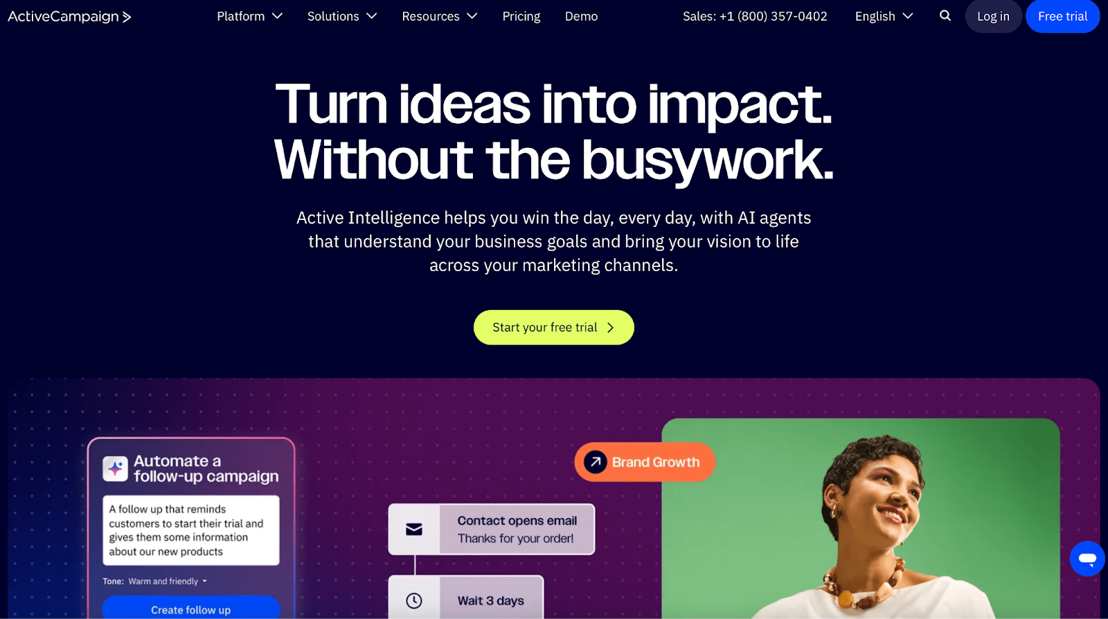
What makes ActiveCampaign’s CRM feature really useful is how it handles context. For instance, when someone becomes a customer, your onboarding emails already know their pain points from the sales conversations and what convinced them to convert.
ActiveCampaign also has a brilliant automation builder. You can create onboarding workflows that you can branch out based on deal size, sales notes, or even which salesperson closed the deal.
Standout Features
- Deal-based automation triggers. Set up different onboarding paths based on contract value, product tier, or sales cycle length;
- Smart contact scoring and tagging. The system learns from customer behavior and automatically updates profiles, so your onboarding stays relevant as people’s needs evolve;
- Pipeline-aware messaging. Send different onboarding content based on where customers came from in your sales funnel, acknowledging their specific journey to your product. Zapier integration enables automated workflow connections;
- Ready-to-use templates and training. Skip the “where do I start” panic with proven workflow templates; plus live webinars and workshops that show you exactly how to implement everything without getting overwhelmed.
Use Cases by Industry
ActiveCampaign excels in businesses where sales and marketing alignment is crucial for customer success. The platform’s CRM integration makes it ideal for companies with complex sales cycles requiring coordinated onboarding approaches.
- B2B services. Align sales handoffs with automated onboarding sequences that incorporate deal context and customer-specific pain points discovered during sales. This includes customer education materials tailored to their specific needs;
- Ecommerce businesses. Combine purchase history with behavioral data to create personalized post-purchase experiences that drive repeat sales and loyalty.
Pros & Cons
- Very powerful and flexible automation
- Built-in CRM and sales automation
- Advanced segmentation and personalization
- Strong deliverability and send optimization
- Steep learning curve for beginners
- CRM features feel basic for larger teams
- Pricing rises quickly as your list grows
- Reporting lacks deeper customization
ActiveCampaign Pricing
- Starts at $15 per month for up to 1,000 subscribers and 10,000 emails monthly;
- Free 14-day trial available with no credit card required.
Userflow — Code-Free Tours with AI-Powered Assistance
Userflow is another outstanding onboarding SaaS software that eliminates the need to have a coder by your side to have a winning onboarding solution.
From content marketing managers to customer success teams who just want to create helpful on-site tours, Userflow offers a ‘non-technical friendly’ solution that’s easy to tailor based on the brand’s style and services.
What really sets Userflow apart is its AI assistant that actually understands context, like providing relevant help based on where users are in your onboarding flow. The platform also lets you test flows in demo or staging environments before pushing them live. This makes it one of the most reliable user onboarding tools available.
We also love that you can try out Userflow’s demo onboarding experience before making the decision, too. The multi-language support is worth mentioning as well. Not only does it translate button text, it creates genuinely localized experiences that feel natural to users in different regions.
Standout Features
- No-code implementation. Build sophisticated onboarding experiences without writing a single line of code or waiting for developer to become available;
- Interactive walkthrough builder. Create step-by-step product tours that guide users through key features with tooltips, highlights, and contextual messaging that actually helps;
- AI-powered instant support. Provide immediate assistance through an intelligent chatbot that can answer common onboarding questions and escalate complex issues when needed;
- Multi-language capabilities. Deliver truly localized onboarding experiences with comprehensive translation support that goes beyond basic text conversion to cultural adaptation.
Use Cases by Industry
Userflow works best for companies prioritizing user experience and requiring frequent onboarding updates without developer involvement. The no-code approach enables rapid iteration and testing of different onboarding approaches.
- SaaS products. Create feature-specific walkthroughs and contextual help that adapts to user roles without requiring development resources or lengthy deployment cycles. Internal teams can manage this independently;
- Fintech applications. Guide users through compliance requirements and security features with clear, step-by-step processes and instructions that build confidence and trust.
Pros & Cons
- No-code builder for tours, checklists, and surveys
- Supports branching logic and multilingual flows
- Very intuitive, lightweight, and fast to implement
- Easy for non-technical teams to create in-app guidance
- Analytics are quite basic
- Pricing increases quickly with usage
- No mobile app support
- Complex setups may need developer help
Userflow Pricing
- Starts at $240 per month up to 3000 active users, billed annually;
- Free 14-day trial available with no credit card required.
Appcues — Customizable In-App Experiences for SaaS
Appcues is a no-code user onboarding platform that specializes in creating highly customizable in-app experiences for SaaS products. The platform enables product teams and customer success managers to build interactive product tours, tooltips, and guidance flows without requiring developer resources.
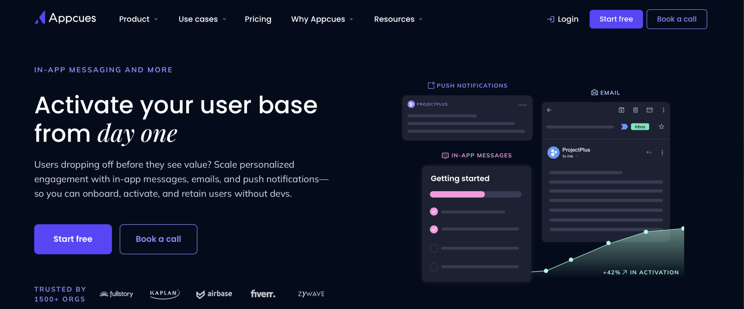
The standout feature of Appcues is its extensive customization capabilities that allow you to match your brand’s look and feel perfectly. You can create sophisticated product walkthroughs, feature announcements, and contextual help messages that integrate seamlessly with your application’s design.
The platform’s targeting and segmentation features ensure the right users see the right messages at the right time, while its analytics dashboard provides insights into user engagement and completion rates.
This level of customization helps create a cohesive user experience that feels native to your product, leading to higher engagement and feature adoption rates. SaaS onboarding becomes more effective when the experience feels truly integrated.
Standout Features
- Advanced customization options. Extensive design flexibility with custom CSS, branded elements, and responsive layouts that seamlessly integrate with your product’s existing interface;
- No-code drag-and-drop tool. Intuitive interface that enables product teams to create sophisticated onboarding flows without requiring developer resources or technical expertise;
- Smart targeting and segmentation. Behavioral and attribute-based targeting that ensures the right users see relevant messages at optimal moments throughout the entire customer journey;
- A/B testing capabilities. Built-in experimentation tools that allow teams to test different onboarding approaches and optimize conversion rates based on real user data;
- Advanced analytics dashboard. Comprehensive reporting on user engagement, completion rates, and conversion metrics with goal tracking and funnel analysis.
Use Cases by Industry
Appcues excels in product-led growth environments where user activation and feature adoption drive business success. The platform’s customization capabilities ensure onboarding experiences align perfectly with brand identity and user expectations.
- SaaS Platforms: Build sophisticated product tours and feature announcements that maintain brand consistency while driving user engagement and activation rates.
- Digital Tools: Create contextual guidance for complex workflows that reduces learning curves and improves user retention across different skill levels.
Pros & Cons
- Easy no-code tool for user onboarding flows
- Lots of UI patterns: modals, tooltips, banners
- Good for team collaboration on designs
- Built-in A/B testing for onboarding flows
- Can get expensive as user count grows
- Advanced customization may require CSS/JS
- Reporting is fairly basic
- Slower page load if many flows are active
Appcues Pricing
- Starts at $300 per month for 1 app and 5 user licenses, billed annually;
- Free 14-day trial available with full access to platform features and capabilities.
Chameleon — Dynamic Product Tours with Segmentation
Chameleon is an advanced in-app messaging platform that focuses on delivering highly targeted and dynamic product tours based on sophisticated user segmentation. The platform is designed for SaaS companies that need granular control over their user onboarding and feature adoption strategies.
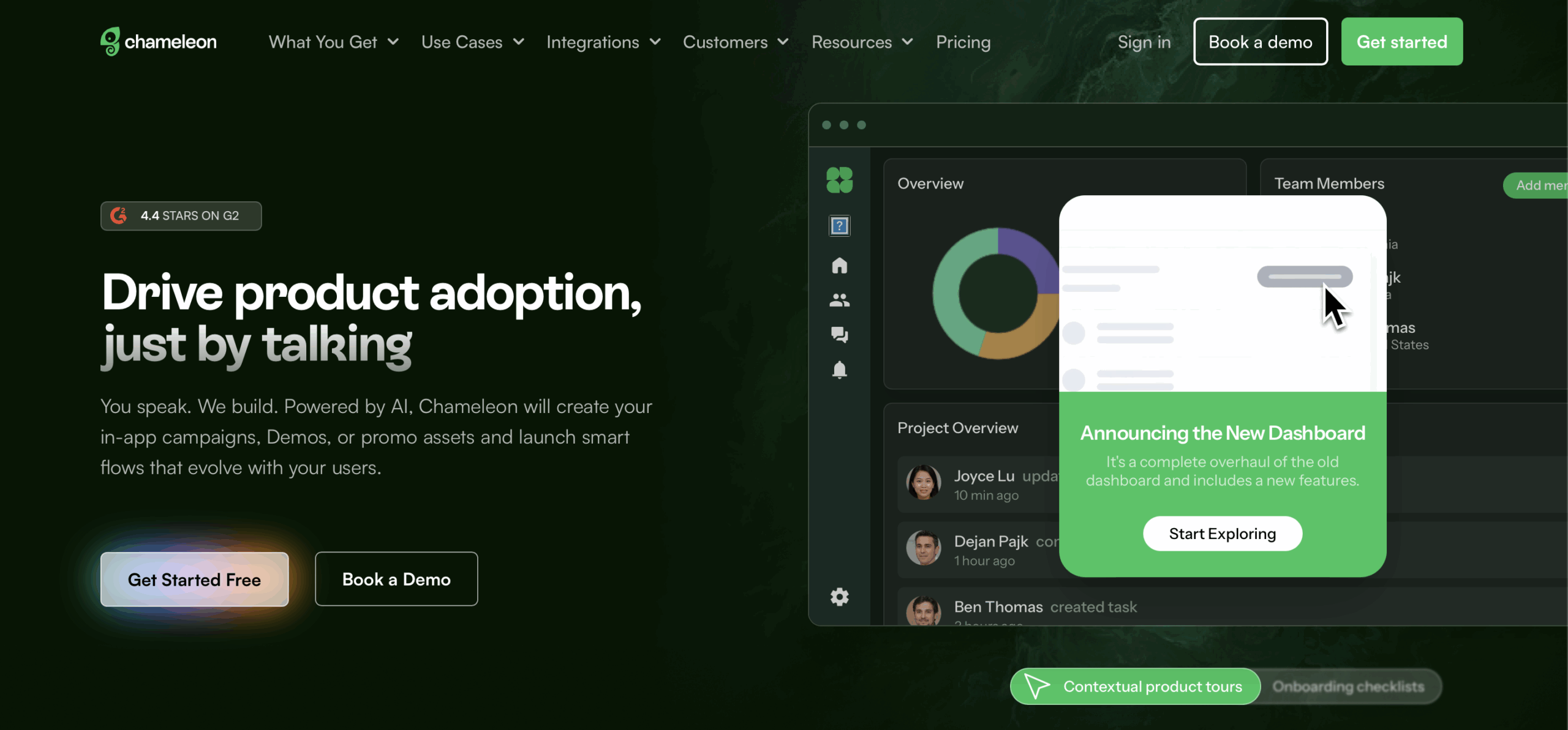
Chameleon’s key strength lies in its dynamic segmentation capabilities that allow you to create different onboarding experiences for various user personas, behaviors, or subscription tiers. The platform can automatically adjust tour content, messaging, and flow based on real-time user data and actions.
With features like A/B testing, advanced targeting rules, and contextual messaging, Chameleon enables you to deliver personalized experiences that feel tailored to each user’s specific needs and journey stage. This level of personalization significantly improves user engagement and helps drive faster feature adoption across different customer segments.
Plus, members of the support team to product managers can collaborate effectively using third-party tools integration.
Standout Features
- Advanced user segmentation. Sophisticated targeting based on user behavior, properties, and real-time actions that enables highly personalized onboarding experiences;
- Dynamic content personalization. Tours and messages that automatically adapt based on user data, subscription tier, or feature usage patterns without manual configuration;
- Multi-variate testing. Comprehensive A/B testing capabilities that allow simultaneous testing of different tour elements, messaging, and user flows for optimization;
- Contextual triggers. Smart activation based on user location within the app, specific actions taken, or time spent on particular features;
- Performance analytics. Detailed insights into tour completion rates, user engagement patterns, and conversion impact with cohort analysis and retention tracking.
Use Cases by Industry
Chameleon works particularly well for companies with diverse user bases requiring highly personalized experiences. The platform’s advanced segmentation capabilities enable tailored onboarding that matches specific user characteristics and behaviors.
- Enterprise SaaS: Deliver role-specific onboarding experiences that match user permissions, responsibilities, and feature access levels within complex organizational structures.
- Marketplace Platforms: Create different guidance flows for buyers versus sellers while maintaining consistent branding and user experience quality standards.
Pros & Cons
- Flexible no-code builder for in-app tours, banners, and tooltips
- Powerful segmentation and targeting based on behavior
- A/B testing and analytics built into the platform
- Lightweight, performance-conscious script
- Pricing can be steep for high monthly active users (MAUs)
- Limited third-party integrations vs bigger players
- Learning curve for non-technical teams
- Less suited for mobile apps compared to web-focused tools
Chameleon Pricing
- Starts at $279 per month for up to 2,000 monthly tracked users, with annual billing options;
- Free 14-day trial period available with access to core features and basic analytics.
FAQs
What’s the difference between customer and employee onboarding software?
Customer onboarding software helps new users get started with a product or service, guiding them through tutorials, walkthroughs, and support resources to boost adoption and reduce churn. While employee onboarding software is designed for new hires, streamlining HR processes, training, and compliance to help staff integrate quickly and efficiently into a company.
How much does customer onboarding software cost?
The cost of customer onboarding software varies widely depending on features, number of users, and the level of customization.
Prices can start as low as $50–$100 per month for basic plans, while more advanced platforms with analytics, automation, and integration capabilities can range from several hundred to over a thousand dollars per month. Many providers also offer scalable pricing based on the number of customers or seats.
Do I need technical skills to use onboarding software?
You don’t need technical skills to use onboarding software, at least not usually. Most onboarding software is designed with easy-to-use interfaces, drag-and-drop editors, and prebuilt templates, so you can set up workflows, tutorials, and guides without coding. However, for advanced customization, integrations, or API use, some basic technical knowledge may be helpful.
How long does implementation take?
Implementation time varies depending on the complexity of the software and the size of your organization. Simple onboarding tools can be up and running in a few days, while more advanced platforms with custom workflows, integrations, and training may take several weeks. Most providers, including Sender and Encharge, offer onboarding support to help speed up the process.
Can customer onboarding software integrate with my CRM?
Yes, most onboarding software should be able to integrate with your Customer Relationship Management toolkit. These integrations allow you to sync customer data, track progress, and automate workflows.
Conclusion
With the rapid rise of AI-powered tools, the automated customer onboarding process’ landscape has never been more competitive. On the bright side, SaaS companies now have more tailored solutions than ever before.
An automated client onboarding solution doesn’t just get users up and running—it plays a key role in boosting long-term retention and customer satisfaction rates. We hope our comprehensive list helps you find the right fit for your product that will make a difference. The right user onboarding software can transform your entire customer experience strategy.
Sources:
https://25054879.fs1.hubspotusercontent-eu1.net/hubfs/25054879/ebooks/The%20State%20of%20Customer%20Onboarding%20Report%202023.pdf?utm_medium=email&_hsmi=51193122&_hsenc=p2ANqtz–K2KrR7_4TqO0-k8qMiHBNTx75lC_loAzEi76i9tCnWEHHbRcyfPqQR5pwSwocne2WafKev7vysYXUEdP_LDqe_qBgjA&utm_content=51193122
