Did you know that abandoned carts are one of the biggest challenges for e-commerce businesses? When a shopper leaves your website without completing their purchase, it means you’re losing out on potential revenue.
But don’t worry; there are ways to reduce the incidence of abandoned carts. In this article, we will review the best ways to reduce abandoned carts. By addressing this issue, not only will you increase your sales, but you’ll also improve customer retention rates. Let’s start with the basics.
Importance of Abandoned Cart Email
Whopping $260 Billion of recoverable revenue is lost by businesses each year. Yet, it’s not the most astonishing thing, as ‘recoverable’ means that a portion of that money could’ve been regained. You already suppose how – yes, with abandoned cart emails.
On average, 69% of prospects abandon their shopping carts. There are many reasons, but the most evident turns out to be true:
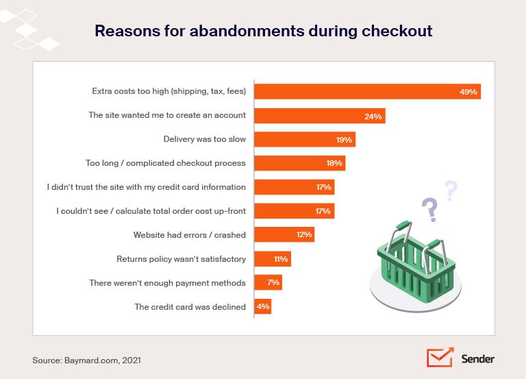
You can recover lost sales with a simplified order process and reduced shipping costs, but it’ll be only a tiny portion. Luckily, a good abandoned cart email strategy has a lot more potential. Abandoned cart emails have an impressive 49% open rate. 21% of the email users who open them will click through to their cart, and half of those users will buy the items.
In other words, you can generate considerable revenue for your business simply by sending automated abandoned cart emails. The best part? It’s cheap.
10 Abandoned Cart Email Templates to Steal
The best-abandoned cart email templates are simply ones that work. They convert lost shoppers into revenue for your store.
If you are wondering how to design email templates for abandoned cart scenarios, worry not we’ve got you covered. Below are some high-quality abandonment cart email samples that you can get inspired with.
1. Cart Abandonment Template by Moschino
The apparel and fashion industry is the biggest victim of the cart abandonment phenomenon. Many people like to ‘window shop’ virtually but don’t check out. Moschino, a fashion brand, has designed an appealing cart abandoned email to tempt buyers to give their choice a second thought.
The visual looks super attractive, as it rightly should. It mentions the details of the cart items, including their size and quantity. The bold CTA button — ‘return to checkout’ is an excellent take on creating a reminder CTA in cart recovery emails.
Subject Line: You left something behind!
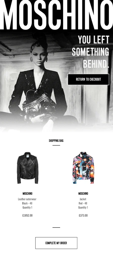
Why does this abandoned cart email work?
- Consistent color theme and visuals;
- Bold CTA that acts as a reminder and takes them back to check out;
- Descriptive product block.
2. Abandoned Cart Reminder Template by Society6
Society6 has used the header space cleverly in their cart abandonment email. They’ve fitted in everything necessary — a reminder, urgency, and offer in the first half of the email.
Subject Line: We’ve reserved your cart for the next 48 hours
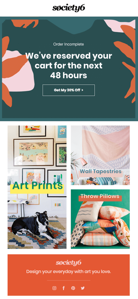
Why does this abandoned cart email work?
- Clear offer and CTA right above the fold;
- Time-based checkout to invoke a sense of urgency;
- Clutter-free email design.
3. Cart Recovery Template by Blu Dot Reassurance
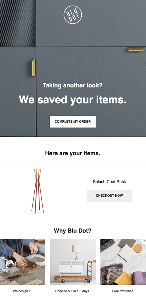
Blu Dot has used the concept of intrigue and interactivity in their cart recovery email template. The header image and a simple copy + CTA invoke a sense of ‘obligation’ for the buyer.
Simple copy that reassures the shopper that their cart is still alive and kicking. The cart item is prominently displayed to provide visual reinforcement. Lastly, there are compelling reasons why Blu Dot should be their number one choice for online shopping.
Subject Line: We’ve saved your items!
Why does this abandoned cart email work?
- Simple yet effective email copy;
- Clear CTA and product block;
- Reasons to reconsider buying from the store.
4. Checkout Template by Nomad Gear
Did you ever stop to take a second look if someone shouts, “What happened?”. This abandoned cart email tries to apply the same trick for cart recovery. Here’s what it feels like:
Subject Line: Steal the deal with new arrivals
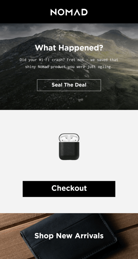
The result is a mix of compelling visuals with great brand copy, likely making a user buy from Nomad Gear. Clearly placed CTA button makes it easier for the shopper to act.
Service and quality are assured towards the bottom of the email through clearly worded returns/ exchange and warranty terms, respectively.
Why does this abandoned cart email work?
- Interesting copy that leverages the ‘shock and awe tactic;
- Contextual CTA button, right above the fold;
- Clean and on-point cart abandonment email design.
5. Whiskey Loot Abandoned Cart Email Template
This email is a bit different from the others in the list, majorly because this uses a benefits-driven approach rather than a product-driven tactic. Here, have a look:
Subject Line: Still thinking about it?
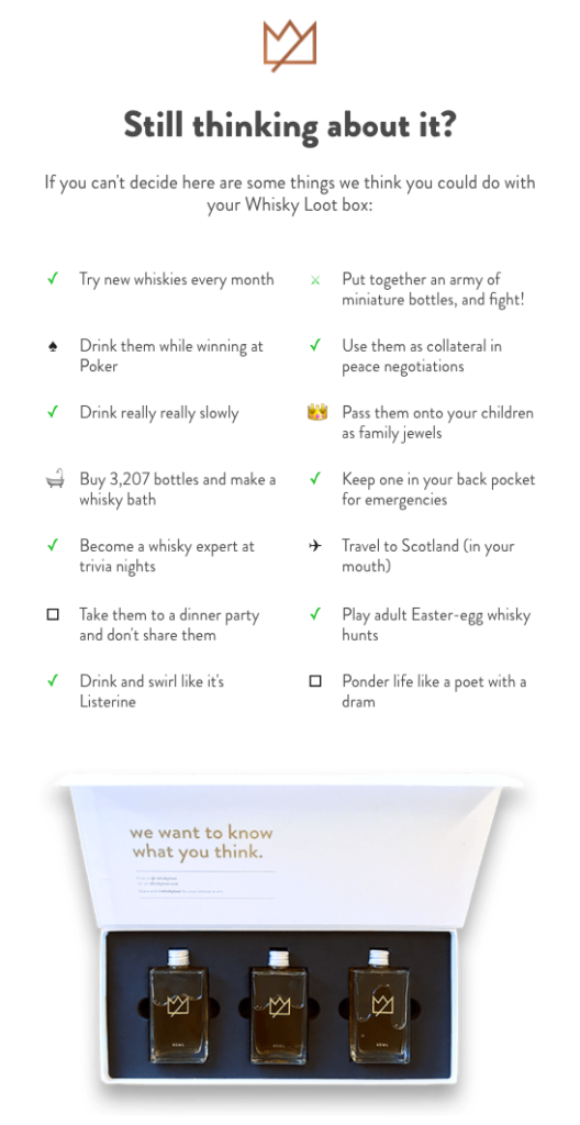
Notice how the email talks about the pros of completing the abandoned purchase. The benefits-driven copy takes the pressure off sales and can work wonders. And when you couple it with humor in a consistent brand voice, you get collateral that will create a strong brand recall and increase your sales revenue.
Knowing that the average shopper is likely to have questions about the product, FAQs have been provided to handle objections, a nice hack to boost conversions.
Why does this abandoned cart email work?
- Benefits-driven email copy;
- Clean and minimalist design;
- Strategic product placement;
- A subject line that grabs attention.
6. Abandoned Cart Email Template by Headspace
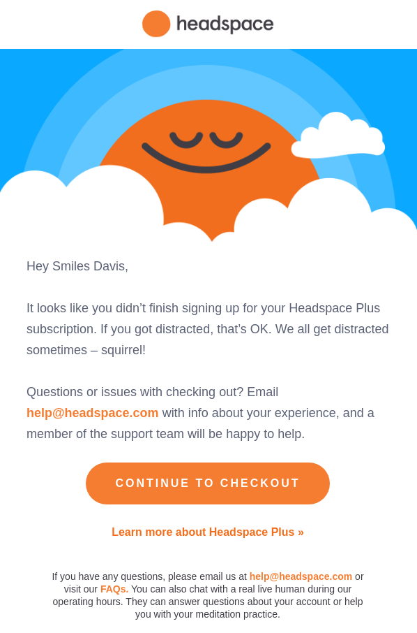
HeadSpace has used ‘simplicity’ as a weapon of choice in their cart abandonment and email sequence.
Nicely designed graphics, a funny and relatable tone, with a single, highly emphasized CTA button do the trick. Sometimes, simple is all ya’ need.
Subject Line: Quick checkout reminder
Why does this abandoned cart email work?
- Appealing and reassuring visual;
- Single CTA;
- Personalized salutation.
7. Shopping Cart Abandonment Email Template by Peel
Using abandoned cart emails is a great way to recover lost customers and persuade them to complete their purchases.
Although it may not be possible to convince all cart-abandoners to return to the checkout page and complete the process, it’s worth trying to eliminate as many lingering doubts as possible.
Here’s an excellent example from Peel:
Subject Line: Still Thinking it Over?
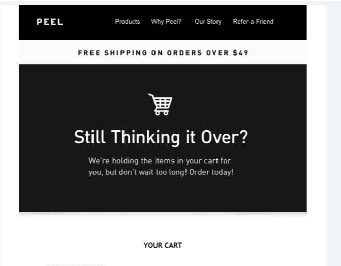
The best aspect of Peel’s abandoned shopping cart email is the free shipping offer. It encourages the customer to return to the website and complete their purchase and also incentivizes them to add more products to their cart before checking out.
Why does this abandoned cart email work?
- The email includes text like “Order today!” and “Don’t wait too long!” to create urgency for shoppers;
- It offers free shipping;
- It contains only a few elements and has a classic abandoned cart email layout: intro, cart items, call to action, questions, then footer.
8. Personalized & Plain Text Email by Beardbrand
This example will change your mind if you think a plain text email is boring. This is one of the best cart abandonment email examples of how when you get your messaging spot on, chances are that you don’t need supporting graphics and visuals.
Subject Line: Hey! You’ve items in your cart.
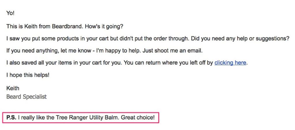
What we really like about the email above is the ecommerce personalization, almost like it’s coming from a friend—highly readable content writing in friendly, 100% non-salesy language.
Why does this abandoned cart email work?
- Personalized approach, as if written by a friend;
- One-on-one email copy;
- A contextual post-script message that appreciates the shopper’s choice.
9. Doggyloot Cart Recovery Email
If you’re a pet owner, it would be mighty difficult NOT to get wowed over by the copy of this abandoned cart email by Doggyloot:
Subject Line: Hurry! Items in your cart are almost sold out. (Not the original brand subject line)
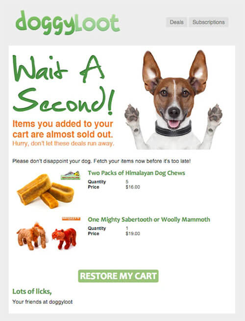
The visual elements are simple yet compelling, and the terms “don’t let these deals run away” and “fetch your items” are excellent contextual addition to the abandoned cart email.
Why does this abandoned cart email work?
- Interesting and cute header image and copy;
- Approachable and contextual email introduction text;
- Clear product blocks and CTA.
10. Abandoned Cart Reminder Email by Chubbies
Here’s an example of a contrasting approach — instead of creating a FOMO effect, this email by Chubbies has a calm and relaxing vibe. Have a look:
Subject Line: Hey! You forgot something — Get back! (Not the original brand subject line)
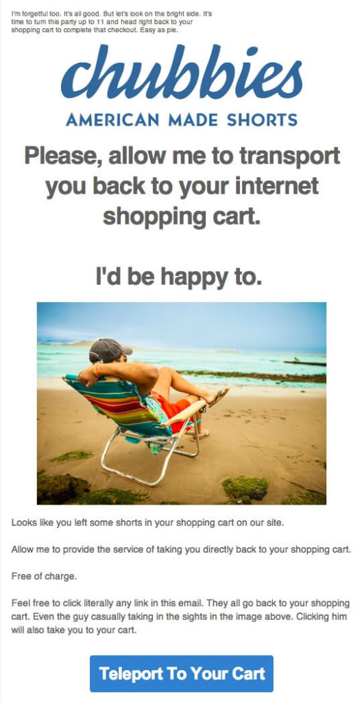
Why do we love it? Because its well-written tight copy complements the compelling visual inside the email body and the product being sold. The big and bold CTA button’s micro-copy carries the context beautifully.
Why does this abandoned cart email work?
- Laid back yet influential vibe in the email content;
- Contextual CTA button at the bottom of the email;
- A friendly tone gives a feeling of personalization.
Superb Abandoned Cart Email Examples
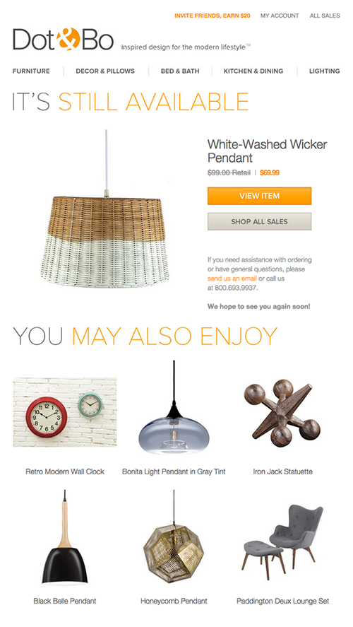
1. You Item is Still Available by Dot & Bo
The aesthetic HTML email by Dot & Bo is a beautiful reminder about ‘keeping it simple. The email headline ‘It’s still available is enough to remind customers to take action and creates urgency.
Subject Line: Your item is still available
Why does this abandoned cart email work?
- Subtly reassures the reader that their chosen item is still in stock;
- Secondary recommendations related to the primary product entice the shopper to come back and create an upsell opportunity;
- A direct subject line that makes an impact without being too salesy.
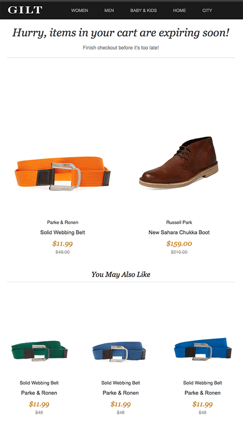
2. Your Cart is Expiring Soon Email by GILT
An abandoned cart email that tries to persuade users to complete the checkout based on a sense of urgency and upsell other current items is a sure-shot recipe for success. GILT’s following abandoned cart email uses the same strategy to re-hook the shopper. Have a look:
Subject Line: Your Cart Is Expiring Soon
Why does this abandoned cart email work?
- Simple and straightforward email copy;
- Recommended product block below the abandoned product cart;
- Discounts are marked clearly below the actual price of the products.
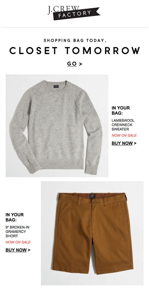
3. FOMO Email by J Crew Factory
Aspiration and ‘Fear of Missing Out’ — J Crew Factory used both cleverly in their abandoned cart email. The clever subject line with an equally compelling yet simple email design will make users click and give their carts a second thought. Have a look at their abandoned cart email.
Subject Line: Shopping Bag Today, Closet Tomorrow!
Why does this abandoned cart email work?
- Clever wordplay in the header section;
- Prominent and conveniently placed CTA buttons;
- Minimalist email design.
You might also like: 10 We Miss You Email Template Examples & Subject Lines
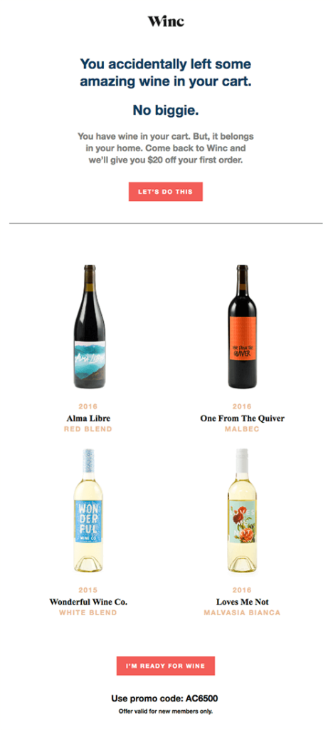
4. Creative Abandoned Cart Email by Winc
Winc’s abandoned cart email is undoubtedly the base of the best cart recovery email templates, purely because of the witty copywriting. The funny email reminds users of the joy they’re missing out on and also gives an extra discount coupon to check out as soon as possible.
Subject Line: Discount for first order
Why does this abandoned cart email work?
- Plenty of whitespaces to accentuate the product photography in the email design;
- Well-written, catchy, and friendly email copy;
- Great CTA placed strategically at the bottom;
- Discount code to allure the buyers to check out.
5. Free Shipping Offer by Lego
Lego has a very loyal fanbase. Still, they’re not safe from abandoned carts. Their cart abandonment emailer is an excellent example of how you can convince buyers to have a second look, even when you don’t want to provide extra discounts.
Subject Line: Free shipping offer
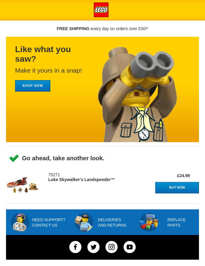
The email subject line gives the buyer a nudge to check out the shipping offer. And the emailer loops back their interest. Great illustration coupled with soft and apt copy written in the right brand tone that simply urges the user to “take another look.”
Needless to say, the prominently placed CTA button in more than a single place provides clarity to the user regarding what they need to do next.
Why does this abandoned cart email work?
- Catchy subject line;
- Clever emailer design topped with engaging email copy;
- Deliver of promise (free shipping offer) right above the fold.
6. Cart Recovery Email by Alex Mill
This email by Alex Mill tells how important it’s to make abandonment a reason to reach out. Instead of just reminding them to check out, the email reemphasizes the brand values that say that ‘the customer is valued’ and the brand will go the extra mile to take care of the customers.
Subject Line: Good News: We Saved Your Picks
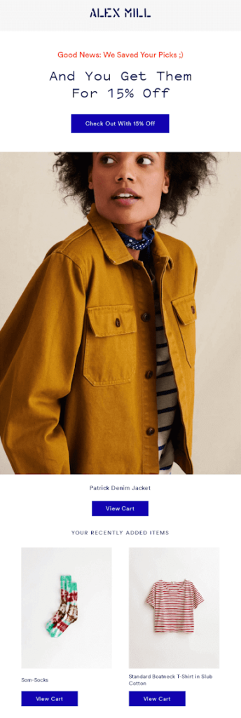
The subject line, we saved your picks, and the discount offer shows that Alex Mill cares that the customer checks out. A centrally placed product image that garners all the attention and then a discount offer placed on top of it that is very likely to attract clicks. We love the simplicity of this.
Why does this abandoned cart email work?
- Large product block;
- Personalized and highly relevant discount offer;
- Warm and reassuring subject line.
7. Discount Email by Columbia
This one ticks all the right boxes. A price drop announcement to the user who just placed this product inside their cart will likely inspire them to take the right action of checking out.
Subject Line: Great news! Price Drop
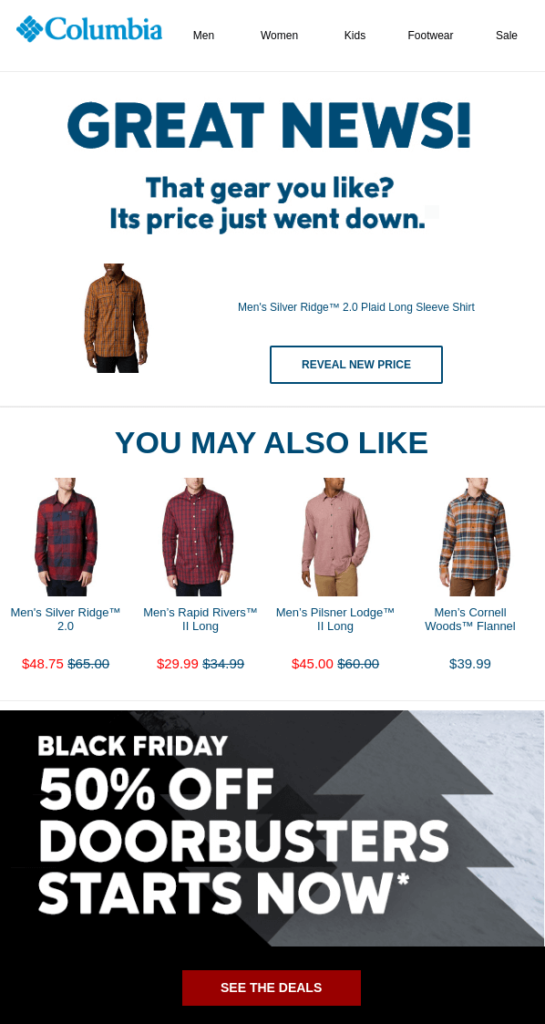
The 50% Black Friday special offer at the bottom and free shipping make it even more compelling. All in all, well designed. Would we click? Absolutely, yeah!
Why does this abandoned cart email work?
- A large banner with a positive copy tone;
- Contextual CTA that intrigues the buyer to click;
- Black Friday deal to increase the likelihood of a checkout.
8. Abandoned Checkout Email by Foot Cardigan via Shopify
Shopify stores are great for eCommerce, but most of the potential revenue is lost without an abandoned checkout email funnel. Here is an excellent example of an abandoned cart checkout email by Foot Cardigan:
Subject Line: Your Cart is About to Expire
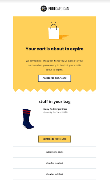
The email is clear, simple, and has a single purpose — reminding users that they forgot to complete their purchase. The yellow CTA button stands out and is a sure reason for a recipient to think about checking out.
Why does this abandoned cart email work?
- Clear and straightforward approach with no frills;
- Multiple CTAs, all driving users to complete the purchase;
- Clean and minimalistic email template design.
9. Good Abandoned Cart Email by Shopify
By now, you know a good abandoned cart email is the one that compels a person to check out. And what’s a better reason to check out than an additional discount voucher plus user feedback on the brand’s products? Look at the following abandoned cart email example by Jewlr:
Subject Line: Hi Rachel! Complete your purchase now
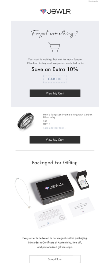
The best thing about this email — is a personalized subject line with the shopper’s name. That, along with the additional discount in the header, is a good reason to grab the attention and compel the shopper to complete their purchase.
Why does this abandoned cart email work?
- Personalized subject line;
- Great discount offer;
- Sense of urgency organically plugged into the introductory text of the email.
10. Abandoned Cart Email by Magento
You would still need an abandoned cart flow sequence when running an eCommerce store on Magento. Here’s a Magento 2 abandoned cart email template for inspiration. This one is by a jewelry brand that appeals to the human instinct of feeling appreciated:
Subject Line: Thinking about us?
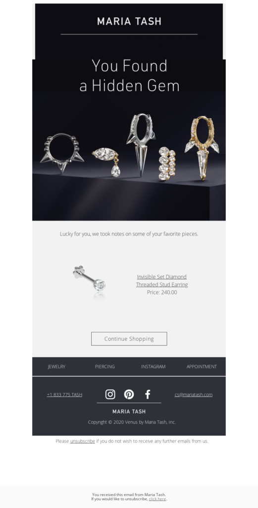
The clever subject line, complemented by a warm email header, will clearly make a mark in the recipient’s mind. The subtle ‘pun’ reference to gems (considering it’s from a jewelry store) will surely make the shopper laugh — a positive indicator to build trust.
Why does this abandoned cart email work?
- Simple yet compelling email copy and subject line;
- A clear and straightforward approach to cart abandonment recovery;
- Bold CTA button that stands out from the rest of the email.
11. Customizable Abandoned Cart Email by Shopify
Customization is the first step to being successful as an email marketer. When designing an abandoned cart email flow, pick a recovery cart email template you can customize and personalize according to the buyer’s lifecycle. Have a look at this abandoned cart email by Evo:
Subject Line: Your Cart is Ready When You Are
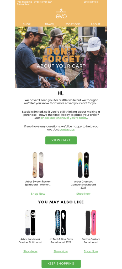
If you notice carefully, the email is divided into the header, introductory text, product blocks, USP section, and more. Each block is customizable, and the brand has used its colors and tone to create a relatable and memorable abandoned cart email. Mix and match various elements to create a great abandoned cart email for your eCommerce store.
Why does this abandoned cart email works?
- The interesting subject line and header text;
- Subtle reference about limited stock availability to create a sense of urgency;
- USPs are divided into separate blocks to convince the reader to check out.
Elements of Abandoned Cart Email Template
When someone abandons a cart, it takes work to bring them back. It’s just trying to convince someone to go on a second date after a disaster on the first one.
Thanks to abandoned cart emails, you can try to convince them to return. A catchy abandoned cart email design and a good ecommerce email subject line can bring a potential customer back.
But it’s not enough to send an email. It’s critical to build a relationship with them. So, you must be creative, provide value, and even be funny to tickle their funny bone. This will help you stand out and establish an emotional connection.
Connect with people on a personal level, use your unique brand voice, and personalize the following elements of your email copy and design:
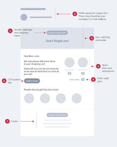
1. Catchy Subject Line
A catchy email subject line is the first thing you need to make sure it captures the recipient’s attention. When it comes to abandoned cart emails, a subject line that’s too long or too short won’t work. It’s best to use a subject line that’s snappy and direct. It’s recommended to use only a few words in the subject line because long, convoluted subject lines don’t get opened.
You can use this subject line to remind your visitor why they added the product to their cart in the first place.
2. Introduction Text
The introduction text is really important for creating an instant connection. You should use the intro text to convince your reader to take action while keeping it short, sweet, and direct.
You can get creative and use some witty one-liners in the preheader to complement your introduction text. Remember, the shorter the intro text, the more effective an abandoned cart email is.
3. Email Copy
When writing abandoned cart messages, keep the email copy simple and to the point. You don’t have to write a whole sales page on why customers should buy your products. If they add the items to their shopping cart, they already know about them, so keep it short and sweet.
Your recipients are likely occupied and may not even read through your entire email, so only add a few details.
4. Abandoned Item
The prime reason for reaching out to someone who abandoned the cart is to remind them to check out. So, you should always add a product block containing the abandoned item to remind them what they forgot.
This will create an instant recall in their minds that might tempt them to check out. The product block will also entice them to have another look at their choice.
5. Offer
Your offer has the potential to change minds. Make sure to add a tempting offer. You could add a limited-period discount code to create a sense of urgency.
If you can’t add a special offer or discount, you can mention ‘Free shipping’ as an offer within the abandoned cart email. But make sure whatever you commit has some tangible benefit, or you risk losing the customer forever.
6. Checkout Button (CTA)
Your abandoned cart email should necessarily have a bold and prominent checkout button. The person who left the cart was probably in a hurry. You’re increasing your odds of a sale by allowing them to click the button to check out.
Also, remember to avoid jumbling up the CTA with unnecessary elements. Add a CTA button to your email template where it will be visible even on mobile devices, ideally below or adjacent to the product block.
7. Abandon Cart Email Design
When users open your abandoned cart emails, they should know the email came from your business. That means you should brand your abandoned cart emails and use a tone that resonates with your other marketing and content materials.
Also, use a responsive design that will fit on the screen the email is being viewed on, whether on a desktop, tablet, or mobile device. That way, you’ll be able to improve the user experience and email retention on all devices.
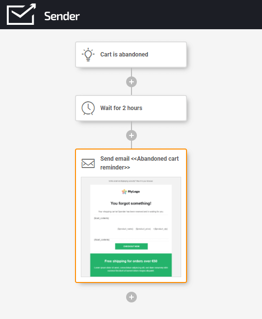
Ready to recover those lost sales? With Sender’s Free Forever plan, you’ll access the email design template library and email automation builder that’ll help you execute the best cart recovery campaign.
Key Takeaways
Abandoned cart emails offer a valuable opportunity to recover lost sales, and by implementing effective strategies and templates, businesses can increase their chances of converting abandoned carts into completed purchases and boosting revenue.
- An automated abandoned cart email sequence is cost-effective for generating revenue and recovering lost sales.
- Effective abandoned cart email templates include personalized subject lines, catchy introductions, clear product blocks showcasing abandoned items, enticing offers or discounts, prominent checkout buttons (CTAs), and branded email designs.
- Customization, creativity, providing value, and establishing an emotional connection with recipients are crucial elements for successful abandoned cart email campaigns.
- By leveraging abandoned cart emails, businesses can reduce cart abandonment rates, increase conversions, and ultimately improve their overall ecommerce performance.
Also read:


