Email footers are often left in the shadow of other email content parts. But if anything, it’s a vital email part as any other.
Your subscribers look at it to find the legal disclaimers, contact details, unsubscribe links, or links to social media channels – quite important stuff. This could be your opportunity to promote your brand, increase trust, or connect with your audience on a deeper level.
This blog post aims to prove that an email footer can have a measurable impact on your subscribers. You’ll find email footer best practices for crafting the perfect ending here. And, as a dessert – five best email footer examples worthy of your attention.
Why are Email Footers so Valuable?
Email footers undoubtedly bring more benefits than they are a bother to make. There’s more than one good reason to end your email marketing campaigns with a dedicated footer as it:
- Shares valuable information about your business, like the company’s address;
- Allows your subscribers to manage their email preferences;
- If done right, enhances your lead generation;
- Helps you grow consumer trust and brand awareness;
- Can include calls-to-action (CTAs) to maximize conversions.
However, you can expect these benefits only if you include the key elements of the email footer, which we’ll discuss next.
What to Include into Email Footer
We have another benefit of the email footer to tell you.
Emails that have a footer tend to be marked as spam way less (than the ones that don’t). This is because here you put unsubscribe links, preference centers, or company addresses and other information that subscribers expect to see there.
Here’s what your email footer should have overall:
- Unsubscribe link. You should always include an unsubscribe link. It allows your readers to opt out of receiving your emails and keeps your email list free of inactive users;
- Preference center. Allow your subscribers to manage how often they hear from you – include a ‘Manage Preferences’ link where readers can choose how many emails they want to receive or opt-out entirely;
- Contact information. Make your email more like a two-sided conversation by providing your readers with ways to contact your customer support email and phone number or an email signature with your personal details;
- Social media icons. Social media links help you promote your accounts on social media and create an omnichannel marketing experience. Given the many possibilities, social links encourage your customers to contact you;
- Legal information. Including important legal information in your email footer, such as copyright, anti-spam, privacy policy, and terms of use, reduces the risk of your negative sender and brand reputation.
11 Best Practises for Email Footer
Not to shoot your email campaign in the foot, follow these best email footer practices:
Tell Subscribers Where They Signed Up
If you haven’t written to your subscribers in a while, it’s important to remind them why and where they agreed to receive your emails in the first place – whether it was at your physical store, website, or social media channel. Otherwise, more forgetful readers may report your emails as spam.
The footer of Litmus’ email reminds subscribers how they signed up and provides options to update their email preferences:

Add a Personal Touch
Do you think all email footers are doomed by the curse of boring? Personalization can bring a magical touch and have a more significant, positive impact on your readers than expected.
Here’s how to add a dash of personality:
- Add a hand-scribbled email signature to add character to your footer.
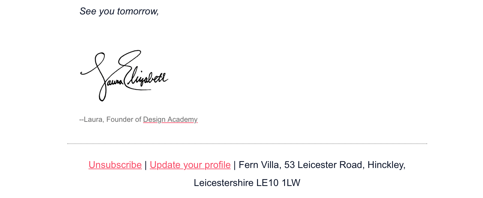
If you’re now unsure about your own email signature, check out how a proper professional email signature footer should look like.
2. Add a sign-off note saying “Tell us what you think” or simple “Say hello” to spark a conversation.
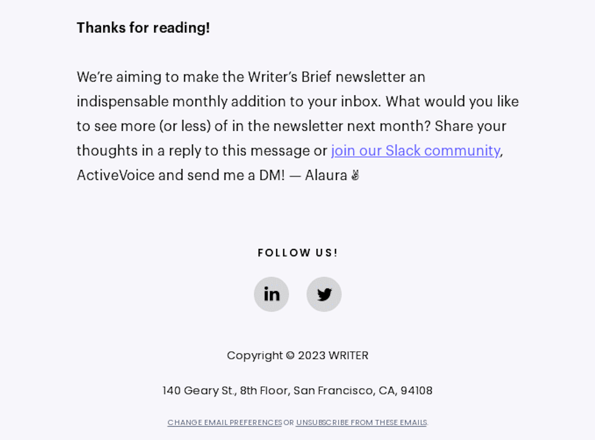
3. Tell your readers about yourself or your brand so they can relate and reply to you.

Specify Details and Restrictions on Offers
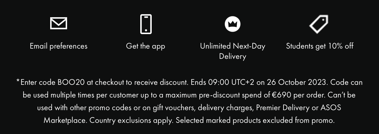
You don’t want to ruin your beautifully crafted sale email with the terms and conditions of the offer, but you have to include them somewhere. Why not do it neatly in the email footer?
Here, your subscribers will learn how much time they have to use your fantastic offer and what they need to do.
ASOS footer, for example, explains how to use the promo code given in the sale email:
Menus (if Applicable)
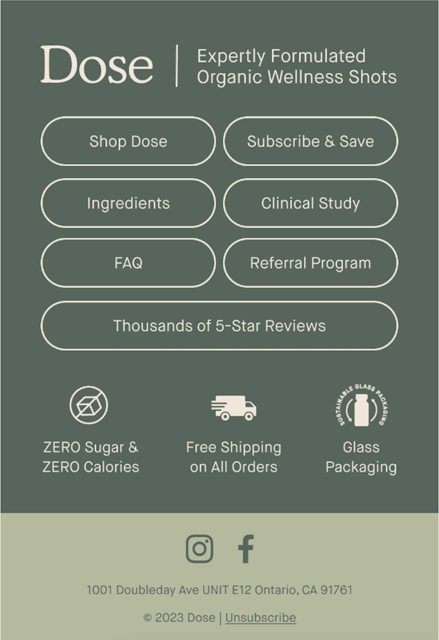
Sometimes, your subscribers may not be interested in your call-to-action. Don’t let that email open go to waste; include a menu in your email footer – maybe the subscriber will find something intriguing there.
The menu can have CTAs like “New Arrivals,” “Sale,” and “Limited edition,” or more practical CTAs like “Shop,” “FAQ,” and “Contact Us.”
Dose gave its audience the power to choose what to do next:
Note: Don’t use the menu for your main call-to-action. It might be lost among other, less important CTAs or not seen at all.
Add Social Media Buttons
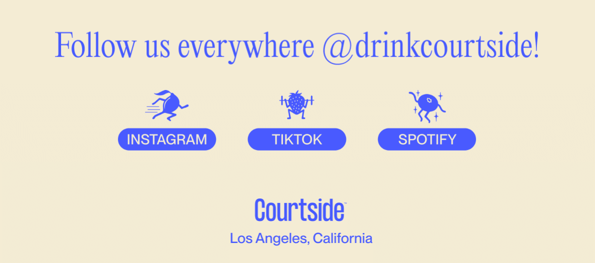
Social media connects you with your subscribers on a deeper level. Here, you can share behind-the-scenes glimpses of your brand’s life, and your followers can immediately react to it.
Encourage this relationship channel by including social links in your email footer and showing your readers where they can find you.
Optimize Your Email Footers for Mobile
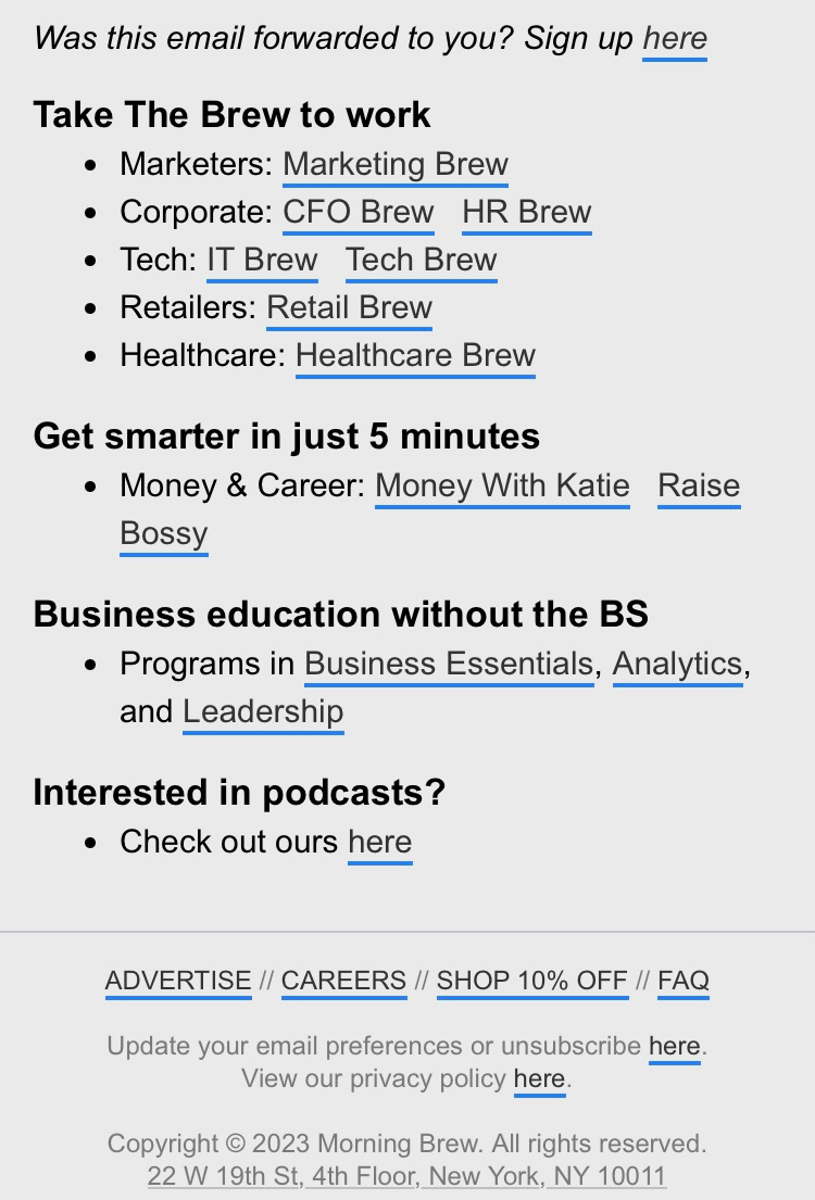
Ensure that your email footer looks good on any device with mobile optimization.
Choose a mobile-responsive design; your information will never look distorted or clipped. This way, your reader will always have access to relevant data and your contact details.
Here’s an excellent email footer example from Morning Brew. Even if on the larger side, their footer perfectly fits the mobile screen:
Add Plain Text to Your Footers
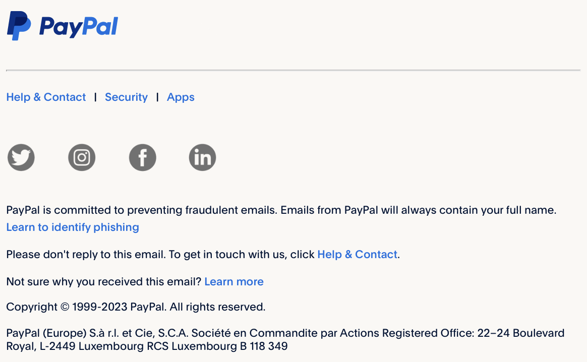
Plain text is what it sounds like – a written text without any embedded images.
This means that your footer loads quickly, and even subscribers with a slow internet connection can see it. Even better – plain text is easy to read for virtual assistants and makes your email more accessible.
PayPal, for instance, wrote their most important information in plain text:
Update Your Email Footer Periodically
Your beautiful emails don’t deserve a spoiled ending. Therefore, updating your email footers regularly and keeping only relevant information is better.
Usually, once a year is enough, but an email footer also deserves a touch when your brand has changed or your branding has been tweaked (for example, you’ve changed the company logo). When every design element works together, you can be sure your brand will be more visible.
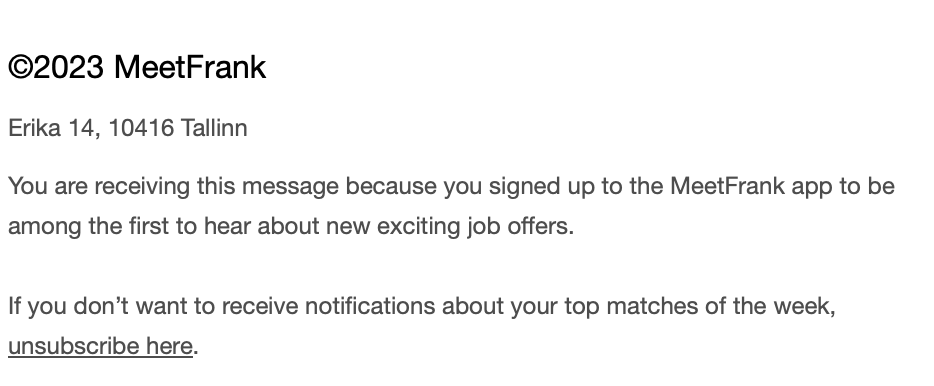
MeetFrank app has had consistent branding for some years now, so they at least make sure that their email footer has no broken links and has the current year shown:
Ask Readers to Add You to Their Address Books
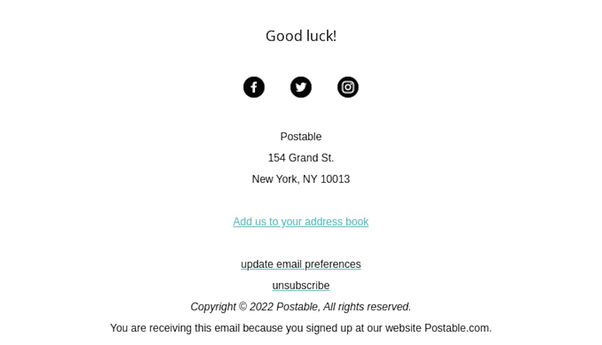
What if we told you your emails could avoid the spam folder? Your subscribers need only to add you to their email address book, and the email footer is the perfect place to encourage them to do so.
Here’s an example of how that encouragement could look like:
Add App Download Buttons
Do you have an app? Does it offer a better experience than the desktop version? Invite your customers to try it out and download it. A more subtle way is to include app buttons in the email footer.
For example, few people know Skillshare is also available as an app. The email footer informs subscribers and silently encourages them to download it.

Add an Unsubscribe Link
Ensuring readers can easily opt out of receiving your emails has become a crucial requirement under the CAN-SPAM and GDPR acts. Furthermore, it empowers your subscribers by giving them greater control over the content they receive.
You’ll see an unsubscribe link in every email, but it doesn’t mean you have to go overboard with it: :

5 Best Email Footer Tips and Examples
When it comes to email marketing, every piece of the puzzle matters. The email footer is no exception. That’s why you may rarely see two identical footers from different brands. Some are thin and straight to the point. Some stand as captivating images on their own. Some have lengthy texts designed to inform.
Below, you’ll find unique email footers that will change your look and inspire you to create yours:
1. Withings
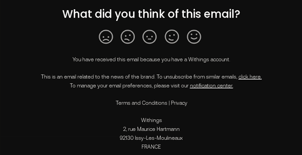
The email footer is also the perfect place to ask subscribers to rate your newsletter. Make it simple, like a line of smiley faces, and a boost in engagement is guaranteed.
Don’t tell us you wouldn’t click on Withings’ footer:
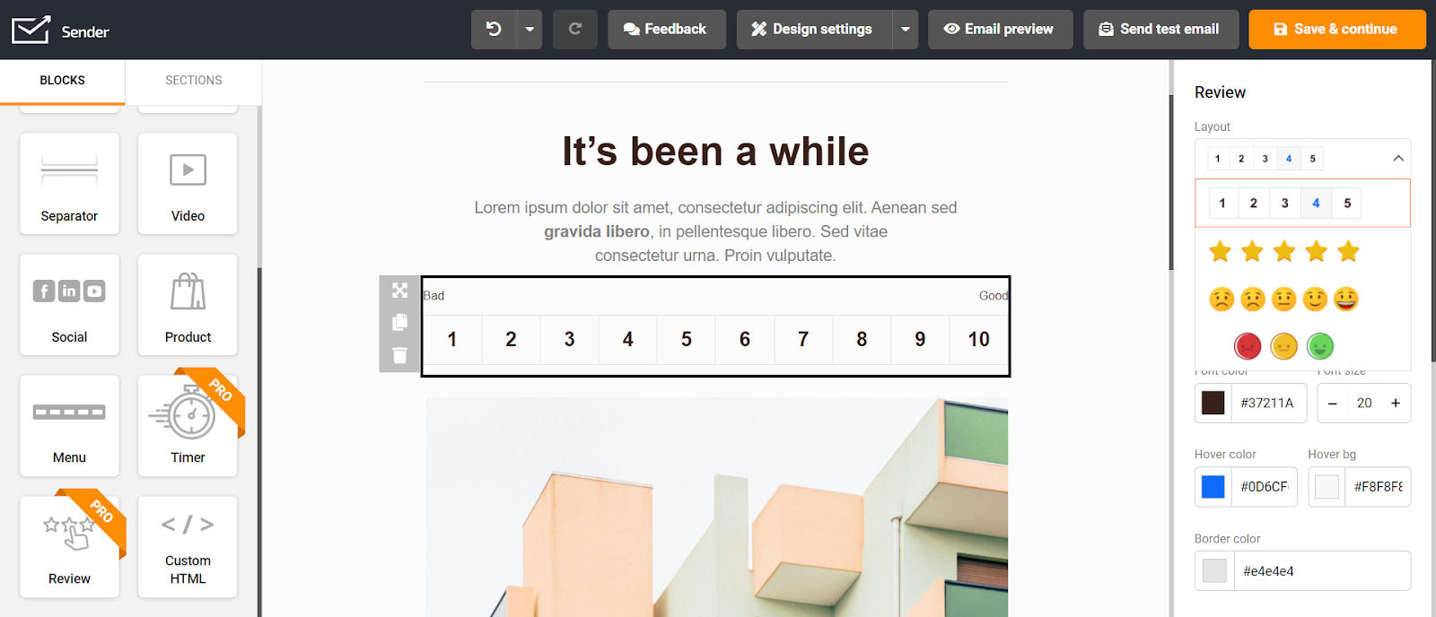
Knowing what subscribers thought of your email is easy with Sender. Using the intuitive drag-and-drop builder, you can add a number evaluation scale or smiley face surveys into the footer with a single click!
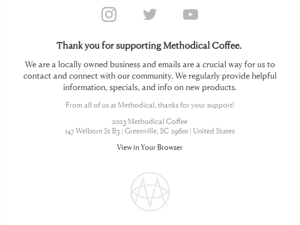
2. Methodical Coffee
As much as you try to make the email content for the reader, it still can come off as “we” and “our brand”. To make your subscribers feel seen, include a “thank you” note in the footer – show them that this email exists because of them.
Here’s what heartfelt message ends every Methodical Coffee’s email:
3. Little Beast
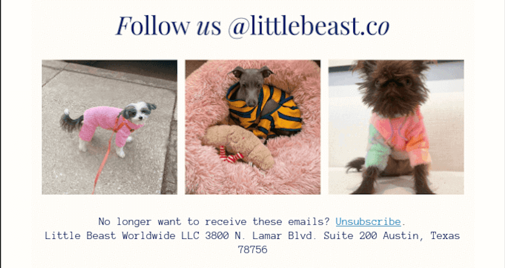
Including your social media buttons in your email footer is great for connecting with your readers on other channels. However, they may need more incentive to click the buttons and follow you.
Understanding that Little Beasts included a sneak peek into what content Instagram followers can expect from them:
4. Vacation
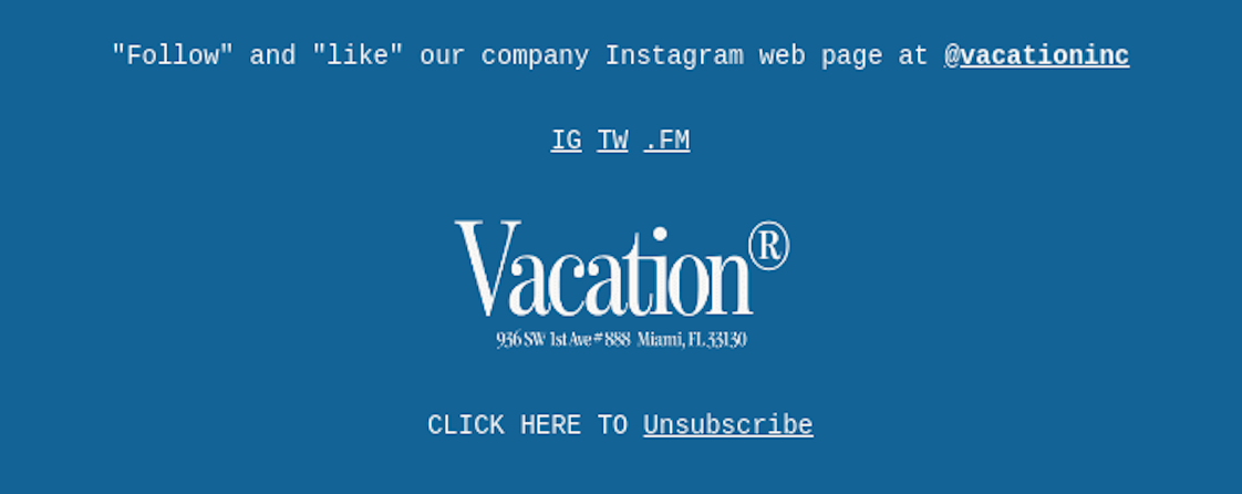
Every design detail from the header to your email footer should be unified – a recognizable design across the email increases brand awareness. For email footer, it often means brand colors, font, or, like in Vacation’s case – company logo:
5. SURI
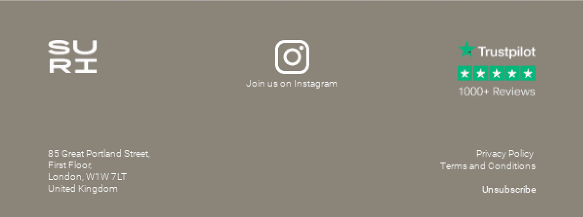
The email footer can also be a place for social proof, which increases new subscribers’ trust in your brand.
For example, SURI included a Trustpilot score showing that other customers, like the subscriber, appreciate their products:
Key Takeaways
Ready to end all of your emails on a high note? Here’s what you may take away from this article:
- Email footers are often overlooked but can hold valuable information and opportunities to engage subscribers, making them an essential part of your email marketing strategy;
- They can provide subscribers with legal disclaimers, contact details, an unsubscribe link, and links to your social media channels, enhancing transparency and subscriber experience;
- Email footers share valuable information, allow subscribers to manage their preferences, enhance lead generation, build trust, and include calls-to-action to maximize conversions;
Now that you have mastered email footer, why not improve other parts of your emails? To do that, check out these tips and best practices:
- The Ultimate Guide to Email Design: Examples & Best Practices
- 14 Best Email Marketing Examples & Engaging Templates
- How to End an Email & Sign Off Professionally (With Examples)
Author bio
Vesta Oldenburg is a content writer specializing in email marketing strategies. In her daily work creativity intertwines with a strategic mindset to create content that captivates its readers.
