


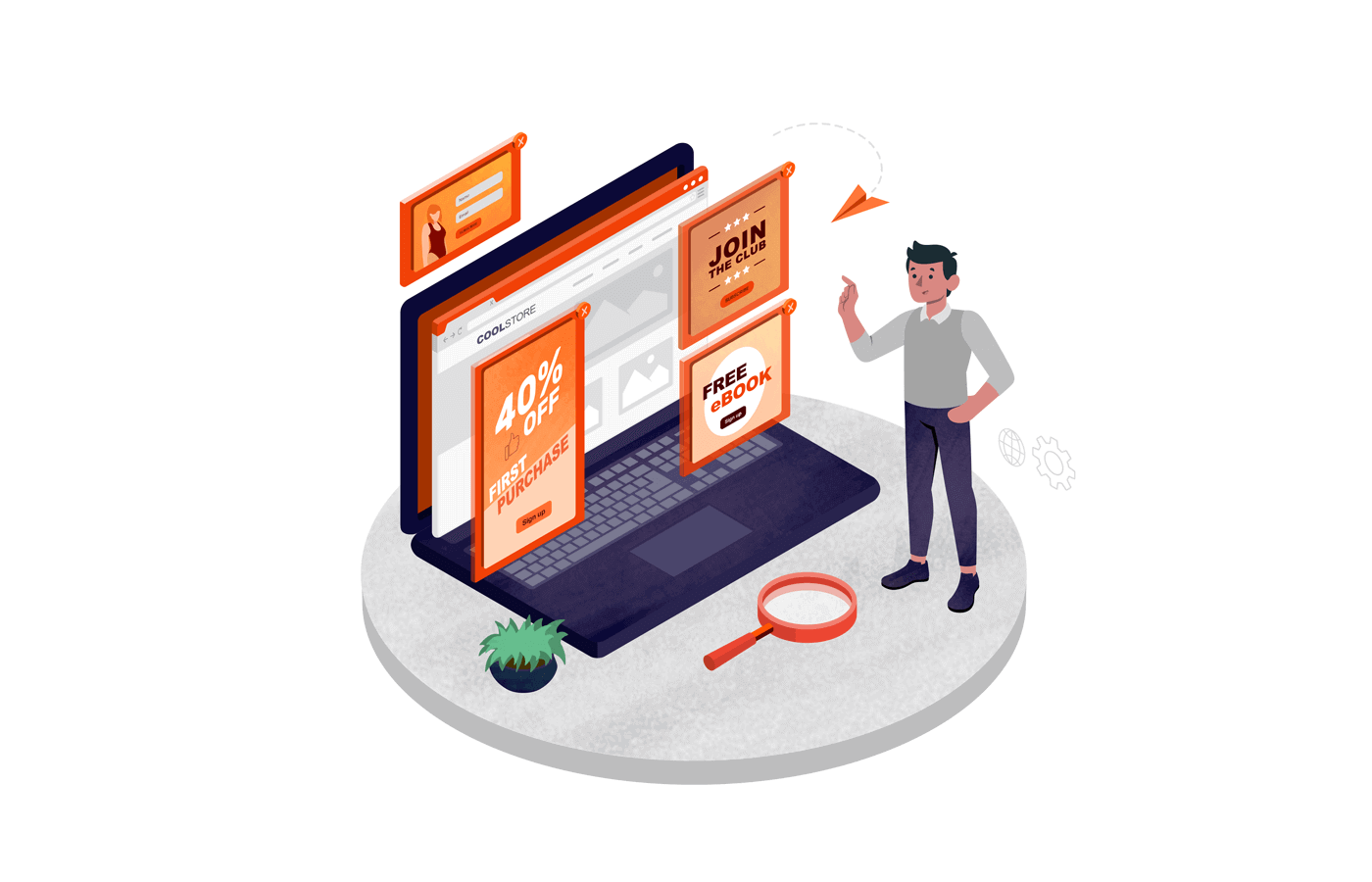

Ever found yourself tempted by a compelling offer after you click a social media ad? That’s what a landing page is designed for — to convince you to buy a product, a service, or claim an offer.
It’s not your homepage, not a blog post—just a targeted page built for one goal: getting visitors to take action. But how do you create landing pages that actually convert?
In this guide, we’ll share how to build landing pages. But first, let’s look at what they are.
What is a Landing Page?
A landing page is a standalone web page on your website designed specifically for an online marketing campaign. Unlike your home page, it’s laser-focused and stripped of distractions, guiding visitors clearly toward conversion.
A great landing page drives users toward a specific action—like buying something, signing up, or downloading a freebie. Think of landing pages as targeted sales pitches. They’re perfect for product launches, special offers, or capturing leads.
Key Elements of High-Converting Landing Pages
If you’re thinking landing pages are all about design aesthetics, make no mistake. It’s not just some sections tied together. It’s a strategic decision to blend elements that move the visitor towards clicking a button.
Here are the elements to make an effective landing page:
- Powerful headline. To grab the attention instantly and clearly state the value proposition — an offer, a benefit, or an opportunity;
- Clear call-to-action (CTA). CTAs are the button that tells visitors exactly what you want them to do—click, buy, or sign up;
- Persuasive copy. Your landing page copy should talk directly to your audience, highlighting benefits and addressing pain points;
- Appealing visuals. Use visuals and custom illustrations that reinforce your message and make the page easy on the eyes;
- Trust signals. These include social proof like testimonials, reviews, or badges to reassure visitors that you’re reliable;
- Optimized form. Use simple, easy-to-fill forms that only ask for essential info, in case you’re asking to sign up or collecting leads.
Also, remember that your landing page URL is as important as other elements mentioned above. It should match the topic as it will help search engines index faster and serve to users with the same search intent.
Want to see some powerful landing pages that are winning in real life? Check out these 12 high converting landing pages examples & how to build one.
8 Steps to Build Landing Pages That Convert
Building a landing page that converts isn’t luck—it’s a carefully thought-out process.
Here’s what we follow when creating landing pages that convert. Take these steps to create a landing page from scratch and turn it into a conversion machine.
Identify the Purpose of Your Landing Page
We’ve all come across landing pages trying to do too much. There are links, forms, videos, and offers all on one page, confusing visitors about what to do next.
Avoid this trap by clearly defining one primary goal before starting to create a landing page. Some simple goals include:
- Capturing emails;
- Selling a product, or;
- Booking appointments.
Once you’ve identified that purpose, let it guide every decision. Every element—from the headline and copy to the hero images and call-to-action—should support that goal.
For example, if your goal is to generate leads, focus your headline, offer, and copy entirely on that. Remove distractions like unnecessary links or secondary offers, and you’ll witness better conversion rates.
Here’s a small exercise that will help you define your landing page’s purpose:
- Write down one specific action you want visitors to take;
- Keep removing elements from your landing page that don’t directly support this action;
- Constantly ask yourself, “Does this help visitors do what I want?”
Turn visitors into leads effortlessly! Create eye-catching popups and signup forms in minutes—no coding needed.
Know Your Target Audience
You can’t create a compelling landing page out of thin air. You need to have an understanding of who you’re talking to, i.e., your target audience.
Create a buyer persona before you start designing.
Step into their shoes, identify real problems your visitors face daily, and then jot them down.
Are they busy entrepreneurs needing quick solutions, or cautious shoppers comparing multiple products?
Once you understand pain points, needs and motivations, you’ll be able to create a compelling copy, and design landing pages that speak directly to their needs.
Here’s a short checklist to start audience research. Screenshot, print and put it in front of you as a reminder:
- Identify pain points clearly. What frustrations or problems keep them awake?
- Understand motivations. What drives them to seek a solution? Saving money, gaining convenience, or something else?
- Jot down everything. Create a buyer persona by writing down their interests, buying behavior, etc;
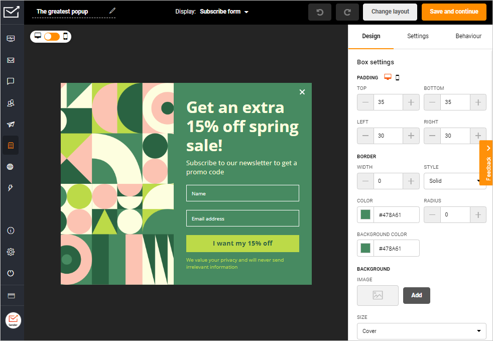
Choose a Landing Page Builder
Once you have clarity about what you want to convey, it’s time to find a landing page builder. Think of it as a reliable sidekick that will help you execute everything.
But remember, it’s not just about picking a fancy editor with hundreds of landing page templates. We all have made that mistake.
When evaluating builders, think beyond pre-made templates. Consider factors like integration options, analytics, and mobile responsiveness. Can it connect smoothly with your email marketing tool or CRM?
Prioritize builders that offer free landing page creation on a trial plan to test performance. Also, remember that a landing page maker should help you focus on crafting compelling offers rather than troubleshooting tech issues.
Here’s how to pick a landing page builder without being illusioned by a ‘shiny object’:
- Look at user-friendliness. See if has a smooth and easy drag-and-drop editor;
- Integrations. The builder should tie your marketing efforts by connecting smoothly with your marketing tools, Google Analytics, and website;
- Mobile-optimization. Responsiveness should be a default feature in a tool you should pick to ensure your page looks great on all devices.
Craft a Compelling Headline
Your headline is the most powerful part of your landing page. It’s your one chance to instantly grab attention and convince visitors to stay.
From our personal experience, we can tell that tweaking a weak headline can dramatically increase conversions—even doubling them overnight in some cases.
We’re not the only ones who’ve felt this. Harry Dry, the founder of Marketing Examples, has several examples to illustrate this fact. Here’s one:
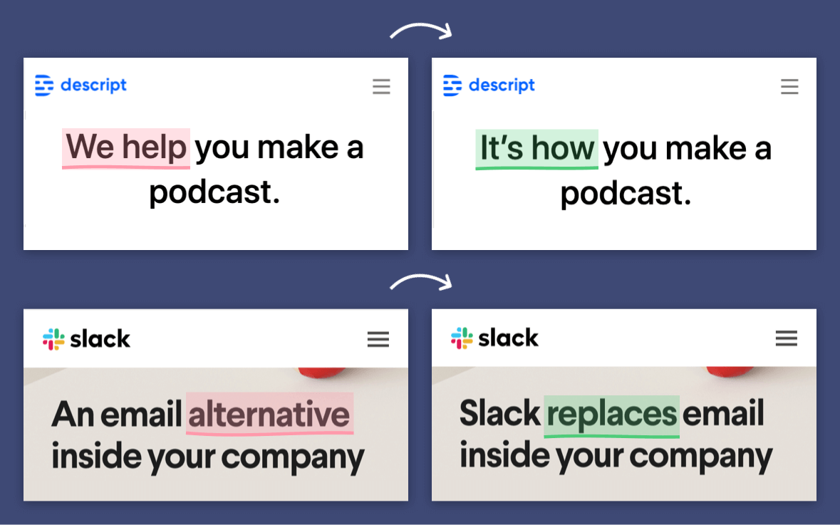
You can take inspiration from the above example and change the way you write headlines for all your landing pages. Let’s say you have a landing page to make for a productivity app. A generic approach would be to write ‘Stay Productive, Every Moment’ and call it a day.
However, a better approach would be to find out more about user problems and motivations and then write something. A better headline would be, ‘Stop Wasting 3 Hours a Day—Start Getting Things Done’. Would definitely give you better conversion rates. So, before you start writing a headline, think twice.
Remember the following tips to create a compelling headline:
- Clearly highlight a specific benefit or solution;
- Use a relatable scenario to grab attention;
- Directly address your audience’s pain points or desires.
Write Persuasive Copy
Good copy doesn’t just describe—it persuades. It shows your visitors exactly why your offer matters to them.
It might be hard to imagine what you should write. That’s why we suggested that you should know about your audience and their pain points.
Once you know what they’re facing, you can put them out on your landing page. Here’s a good landing page example with a persuasive copy from Roomeze:
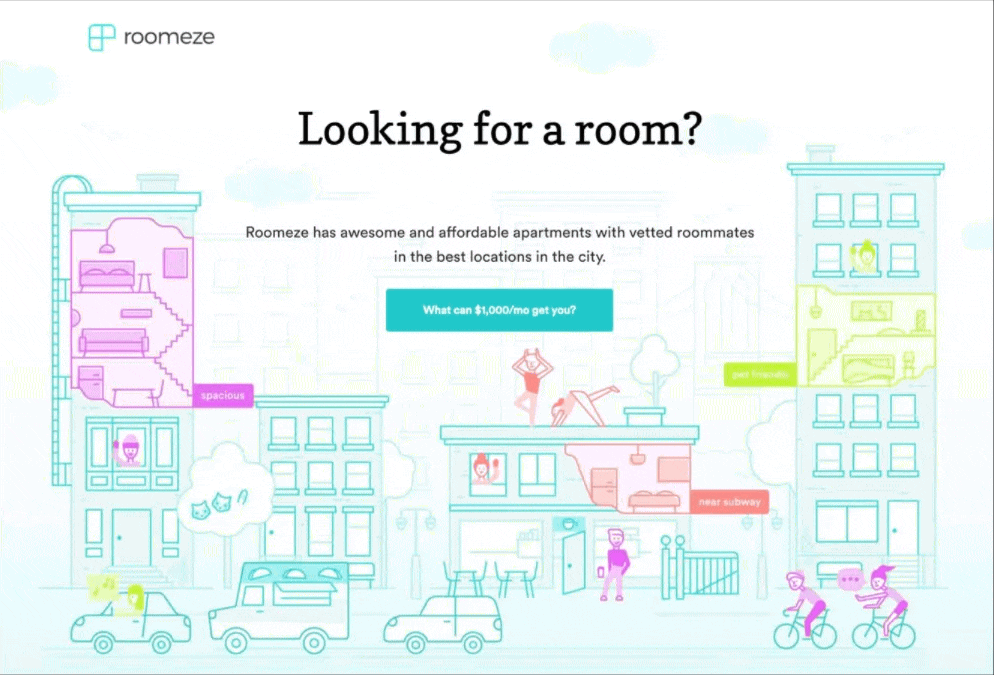
You’ll realize they’ve answered the biggest problems, right away. A person looking for a rental needs a good location, minimum brokerage, affordability, and reliable roommates. They’ve addressed it right away. Definitely makes people stop, scroll, and read on.
If you want to make the same impact, always ask yourself: “Am I clearly answering why my visitor should care?” and then start writing.
Remember, persuasive copy speaks to the reader’s problems, offers clear solutions, and urges action. Here are three things that will help you stay on track while copywriting for landing pages:
- Speak directly to your audience’s specific struggles;
- Include clear, relatable examples;
- Use actionable, benefit-focused language.
Design for Visual Appeal
When you’re clear about your copy, the next thing you need is your landing page design. But it isn’t just about looking good; it’s about impact.
With attention spans so short that we need 3-second hooks even for short form videos (like reels), you need to make an impression at a glance. Visitors decide in seconds if they trust your page and leave if it’s not appealing.
Use clean layouts, readable fonts, and high-quality images like Airbnb. Have a look at one of their pages for hosts:
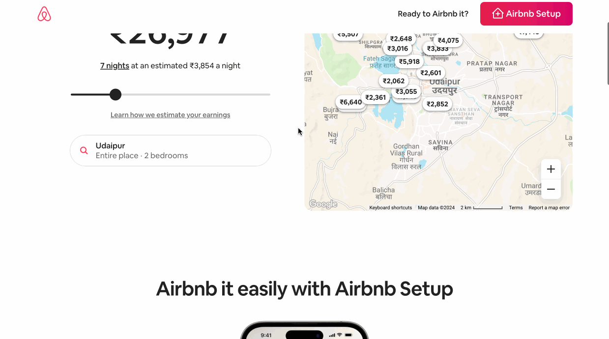
Their landing pages paint a visual story and appeal to the visitor. You’ll find more landing pages like this on their website. They use interactive elements, lots of whitespace, and minimal text to guide visitors smoothly toward the CTA.
Such a visual design conveys reliability and ease, making visitors feel at home and more likely to click.
Here are some quick takeaways, from the example above, in case you want to design your landing page with the same appeal:
- Use lots of whitespace to make your page easy on the eye;
- Add interactive elements or visuals that makes your audience stop scrolling;
- Try clear and readable fonts that look good on any device.
Add Trust Elements
Trust is critical for landing page conversions—without it, even the best offers fail. Think about your own buying habits: you’d rarely purchase from a business you don’t fully trust, right? Your visitors feel the same way, especially if they’re new to your brand.
Add social proof and elements to boost your credibility like reviews, brand mentions, etc. Visitors see themselves in the reviewer’s shoes, which helps remove doubts and moves them closer to driving action.
Here are some trust elements you should add to your landing pages:
- Testimonials. Short quotes or video reviews from happy customers;
- Client logos or PR mentions. Recognizable names build credibility;
- Security badges. Reassure visitors their information is safe;
- Real statistics or case studies. Specific numbers demonstrate chances of success.
Make It Mobile-Friendly
83% of landing page visits take place on mobile devices in 2025. So, you can’t ignore optimizing your landing pages for mobile.
We’ve often seen this problem with many businesses — responsiveness comes as an afterthought. But you shouldn’t make that mistake.
If your page isn’t optimized for smartphones, you risk frustrating visitors, which can increase your bounce rates. Plus, search engines also ignore a non-responsive page in 2025.
So, always use the best landing page builder that takes care of responsiveness, by default. If you prioritize mobile users, they’ll reward you with better results.
Here’s what you should do for mobile optimization:
- Ensure fast loading by compressing stock photos and heavy files;
- Use large, thumb-friendly CTA buttons;
- Use clear fonts and short copy for smaller screens.
Test and Launch
Launching without testing is like guessing in the dark—you might get lucky, but more often, you’ll miss your target. From experience, even small tests can reveal issues you hadn’t considered, saving you lost visitors and potential sales down the road.
Before launch, run quick checks: test load times, forms, buttons, and links on multiple devices. This can potentially save you from a lot of disappointments (and money).
Because if your sign-up form is broken and you didn’t test it, you will end up losing a lot of money.
Here are the things you should check before taking your landing page live:
- Forms & buttons. Check that the submission process works smoothly;
- Cross-device testing. Verify page looks great on desktop, tablet, and mobile;
- Speed test. Ensure the page loads quickly to avoid losing impatient visitors.
Best Practices for High-Converting Landing Pages
During the process of creating the landing page, you would already take care of a lot of basic things. But in a crowded industry, just the fundamentals won’t make the cut. You need to bring on your best show and follow some advanced best practices too.
We’ve personally tested countless pages, and found a few best practices that consistently boost performance. Here are our top recommendations:
Keep the Design Simple and Clutter-Free
In the AirBnB example above, we showed you how simplicity can be appealing too.
A simple design isn’t just easy on the eye—it’s directly tied to your conversions. Shorter landing pages with clear CTA outperform long ones by 13.5%.
Do you know why?
Cluttered landing pages confuse visitors and overwhelm them instead of guiding them.
Keep things simple to reduce friction and help visitors immediately focus on your key message.
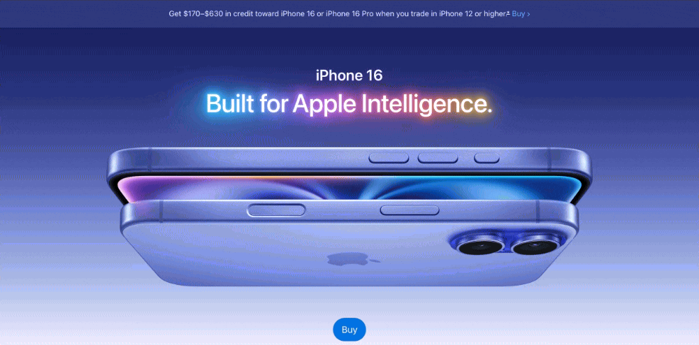
For example, Apple excels at minimalistic landing pages—clear headlines, lots of whitespace, and limited distractions. Their clean design helps visitors understand the offer instantly, increasing the chance of conversion.
Use Contrasting Colors for CTAs
Your call-to-action button should instantly grab attention and provoke visitors to act. So, make them prominently visible.
Using contrasting colors that distinctly differ from your overall design helps visitors see exactly where they need to click. Here’s an example by Ahrefs:
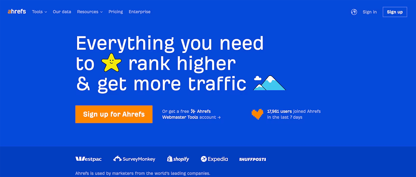
The orange sign up button is unmissable here. It stands out on a blue background, making it really easy for visitors to know what they’ve to do next.
Limit Form Fields To Essential Information
We all hate filling out long, tedious forms. So do your landing page visitors.
Each additional field lowers the likelihood they’ll convert. So, always keep forms short and easy—asking only for essential information that moves your prospect forward.
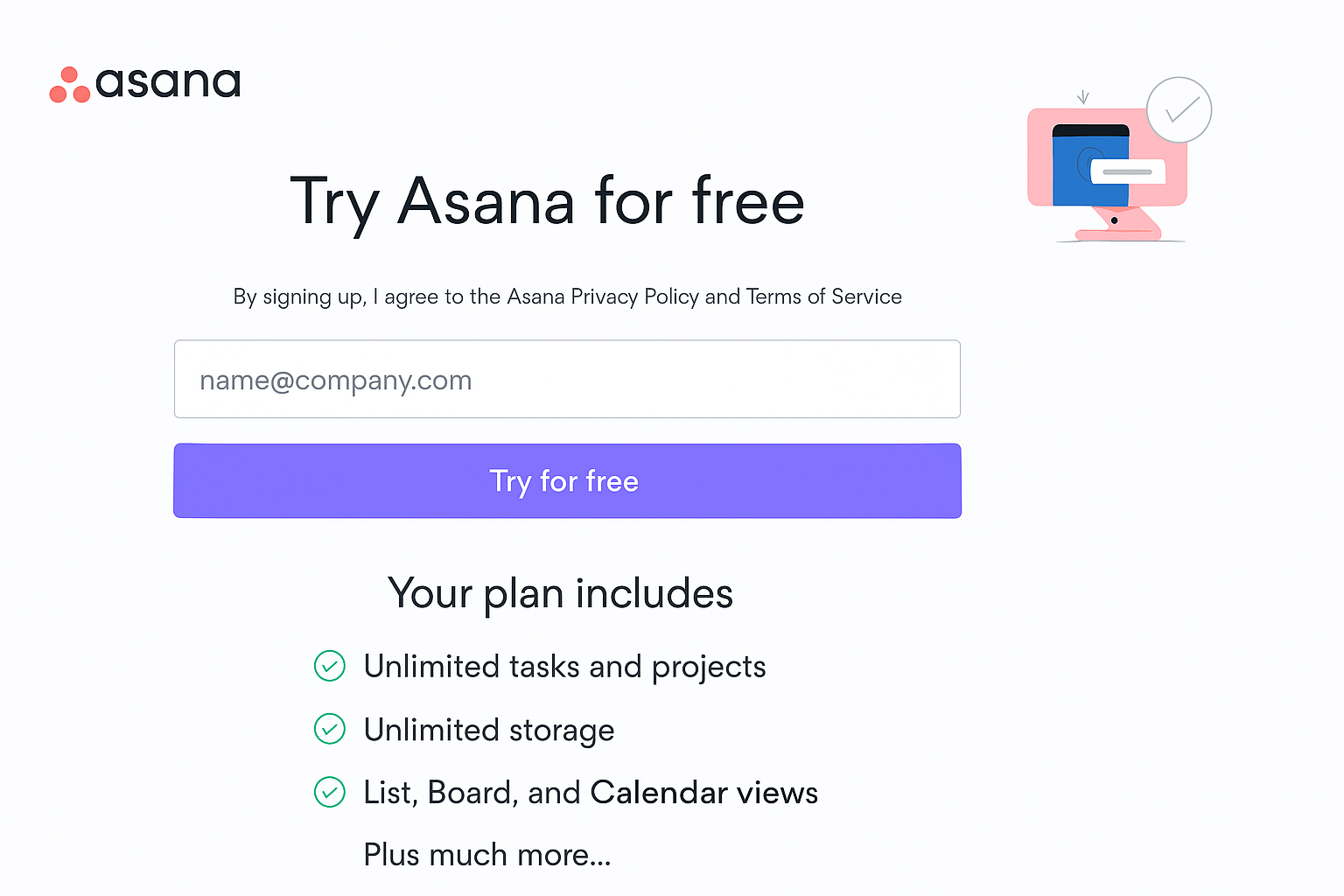
Simpler forms mean less friction, leading to higher conversion rates. Here’s a great example of a simple form to collect email addresses for a free trial offer by Asana:
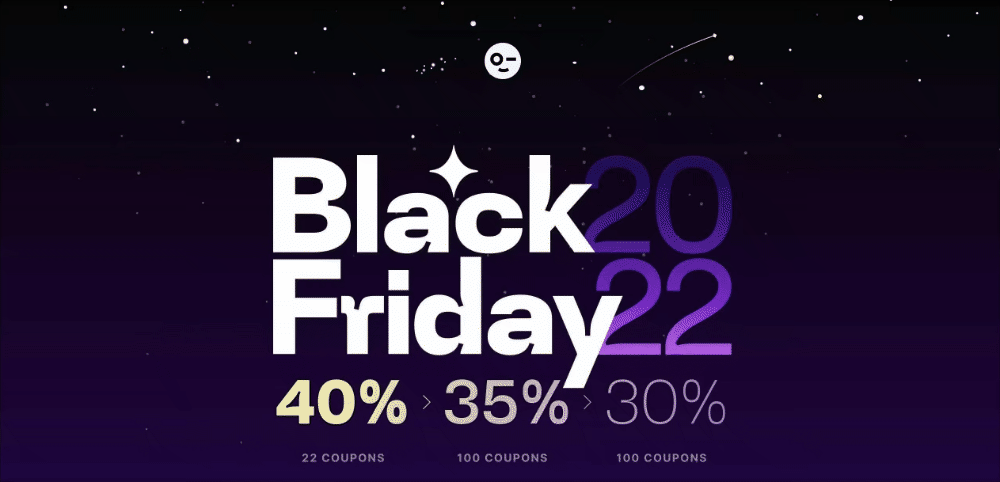
Leverage Urgency and Scarcity
People always feel like they might miss out on something, like a great offer. You can tap into this thought by using urgency and scarcity in your landing pages.
Urgency pushes visitors to act quickly, while scarcity makes your offer feel exclusive or limited. When visitors sense they’re about to lose out, they act faster.
Use time-sensitive offers like ‘24 hours only’, or show a limited stock availability, like ‘Only two items left’ on your product landing pages.
You can also use a countdown timer on as many landing pages as you like to showcase limited nature of your offer, like DesignModo did on their Black Friday deals landing page:
If you want to get the bigger picture on landing pages, check out these articles:
- 35+ Landing Page Statistics with Industry Benchmarks
- Landing Page Best Practices to Follow in 2025
- 15 Must-See Product Landing Page Examples