


Wondering how to make your target audience actually read through your long, text-heavy content?
The secret lies in visual content marketing. And no, we don’t mean just adding a bunch of generic stock photos to your blog. We’re talking videos, infographics, GIFs, carousels, or interactive elements–and aligning them with your content or the platform you are posting on.
Below we’ll break down what visual content marketing really is, why it’s crucial, plus seven powerful strategies to help you master it. Let’s dive in!
What is Visual Content Marketing?
Visual content marketing is using visual elements to communicate with your target audience.
These visuals should summarize complex data, add context or guidance, tell stories, increase brand recognition, or make your content look more exciting and dynamic.
Visual content marketing is available in various formats, such as:
- Images
- Videos
- GIFs
- Memes
- Infographics
- Screenshots
- Illustrations
- Visual roadmaps
- Dynamic CTAs
- Interactive content such as scratch cards, games, and puzzles
- …and so much more!
Why Visual Content Marketing Matters
Isn’t a piece of well-written content enough to engage your target audience? No, not really.
Let’s do a simple test here. Which one do you prefer between the two samples below?
You chose the one on the right, didn’t you? The majority of the people in the world are visual learners. Images help us understand complex topics and ideas better than verbal or text explanations.
Here are some more quick stats for you: the human brain processes visuals 60,000 times faster than text, and 90% of information transmitted to the brain is visual. People can also remember 80% of what they see, but only 20% of what they read and 10% of what they hear.
Visual content marketing can also:
- Boost social shares. Posts with visual content get 40x more shares on social media;
- Boost reach. The social media platform’s algorithm favors content with images. You’re likely to reach more people if you post with visuals instead of text-only;
- Strengthen branding. Consistent visual branding elements build a more recognizable brand identity;
- Improve SEO. Images can influence better search engine rankings since they can boost page engagement and page dwell, plus give more places to add your target keywords.
7 Visual Content Marketing Tips
Let’s examine key strategies for optimizing your visual marketing approach. Implementing these approaches will help elevate your visual content from merely attractive to strategically effective.
Brainstorm Your Ideas
Before you even start designing, it’s best to brainstorm for your visual content first. Look for ideas that align with your target audience, brand identity, marketing goals, and brand message.
Ask yourself:
- What problems am I solving for my audience?
- What significant benefits does my brand offer?
- What type of visuals resonate with my audience and the industry?
- What type of content is trending?
- What are the current visual trends?
- What emotions do I want to evoke?
Knowing all of these can help simplify your content creation process. This is because you’ll get a clear direction for your visual content.
During this step you can also create mood boards, research your competitors, or start sketching.
Focus on Storytelling Alongside Visuals
When a person sees a compelling story, the brain releases chemicals like dopamine and endorphins. This reaction causes a person to develop a deeper emotional connection with the brand over a story.
This logic can be applied to your visual marketing. Adding a compelling story alongside your visuals can evoke more emotions in your audience and make your content more memorable and relatable.
Nike’s “You Can’t Stop Us” campaign is a great example. They utilized a split screen to show athletes from different sports and backgrounds. The message is that even if they come from different places and have different journeys, they are still united by their passion for sports.
The powerful emotional storytelling combined with clever visual imagery makes this campaign highly successful.
Ensure the Visual Narrative Aligns with Your Content Marketing Strategy
Your visuals should align with the image you want your audience to perceive you as.
Let’s say your brand is all about sustainability. Using a green and white color palette, a leaf element, or soft and organic shapes will strengthen your nature-loving brand identity.
How about if you want to position yourself as a luxury brand? A black-and-white palette combined with minimalist serif typography can help reinforce that sophisticated image.
Your visuals are there to help build that cohesive identity for your brand. Imagine if Cartier suddenly switched to a colorful kiddy mascot for their logo. It’s a huge mismatch, right? Their current elegant cursive logo fits in better with their luxurious branding.
Another important element is consistency. Using the same visual style across all platforms helps build brand recognition. This consistency is why you instinctively associate that specific red and white color with Coca-Cola or the bright green shade to Spotify.
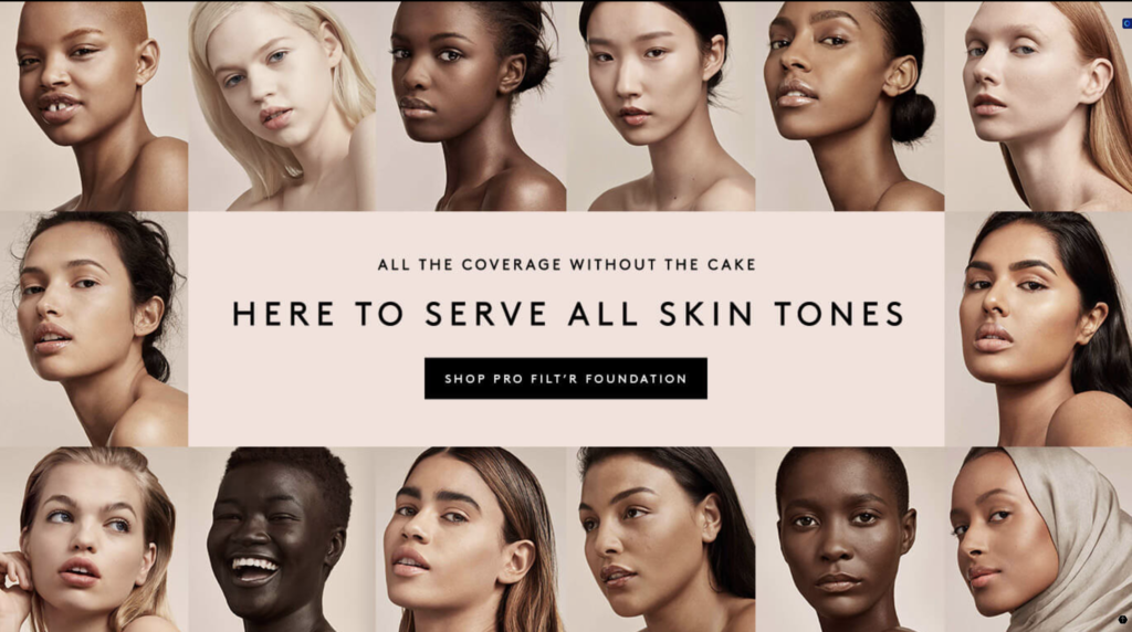
Represent Your Entire Audience Through Your Imagery
Your audience is diverse, and your visuals should reflect that. Use inclusive imagery that represents different ages, genders, ethnicities, and backgrounds to ensure that your audience feels seen and heard.
One example is Fenty Beauty. The heart of their visual content marketing strategy is diversity and inclusivity, which is why all of their marketing campaigns feature models with different skin tones and types, as well as models with skin conditions like vitiligo and albinism.
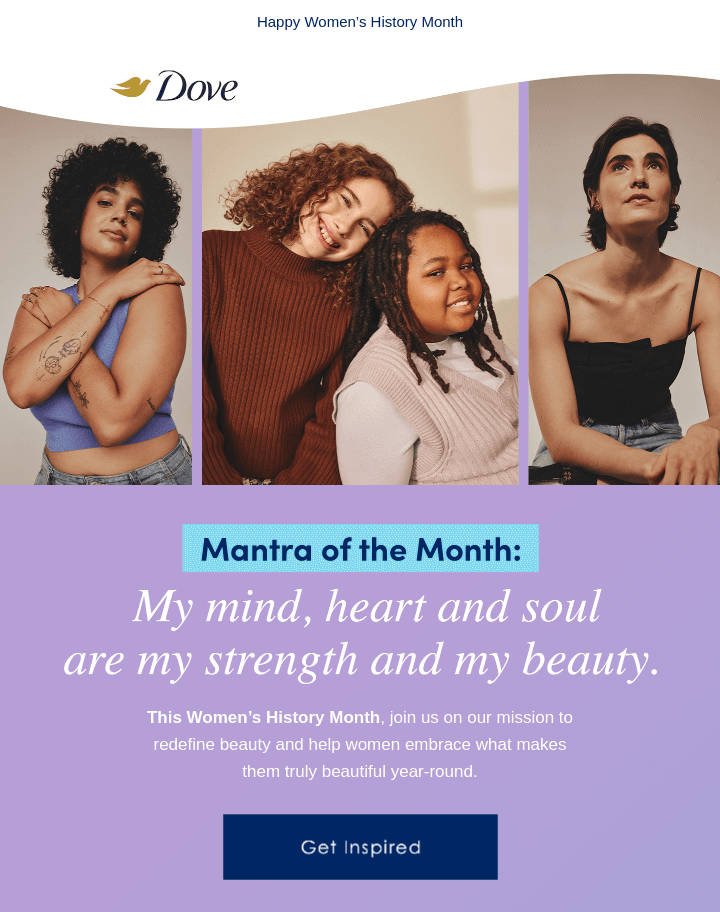
Another brand that excels with inclusive marketing is Dove. They use real people instead of models in their social media posts to avoid promoting unrealistic beauty standards. The people they feature are also of different ages, races, and body types to further promote diversity.
Adapt Visuals To Fit the Platform
Each marketing platform has specific guidelines for visual content, such as size, aspect ratio, file format, and video duration.
Even the style of the content will vary since each platform has a different audience base. Funny video content works for TikTok, but may not be as well-received for the straight-laced and professional LinkedIn audience. Beautiful aesthetic shots will be a hit on Instagram, but not so much on Twitter.
The key is to tailor your visual content’s size, format, and style to fit each platform’s best practices.
Consider using premade templates from specialized sites like Design.com. These templates come in the recommended sizes and designs already, so you don’t need to worry about making them fit the platform’s standards.
Repurpose Information and Insights into Visual Content
Instead of constantly creating new content, you can repurpose existing one by adapting it into different visual formats.
For example:
- Long blog articles can be summarized into infographics;
- Data reports can be converted into visual charts or tables;
- Snippets from webinars can be used as short videos;
- Customer reviews can be turned into quote graphics;
- Screenshots of product reviews can be added to websites as testimonials;
- UGC can be compiled into carousel posts or reels.
This extends the lifespan of your content. You won’t have to waste so much time coming up with and creating new content all the time. It also gives them new life, as content that has underperformed may work better when placed on a different platform.
Your text-heavy or data-heavy content will be more digestible for your audience as well since it is now in visual form.
Follow Effective Design Principles
Whether you’re creating Instagram Stories, YouTube banners, or any visual content, following fundamental graphic design principles can improve their quality.
These principles are:
- Balance. Space out your elements evenly to create stability and harmony. Symmetrical balance looks clean and polished, while (artfully!) asymmetrical ones can lead to dynamic and interesting looks;
- Contrast. Place different elements together to create visual interest. These elements could differ in size, color, shape, or texture. For example: light vs. dark, thick vs. thin, big vs. small;
- Hierarchy. Strategically arrange visual elements to guide your audience to see important aspects first. For instance, headers are usually bigger and placed in the center to draw attention. Meanwhile, subheaders and body text are smaller since they are supplementary;
- Proximity. Group related elements together to improve readability and comprehension;
- Repetition. Repeat color, shapes, lines, fonts, or patterns to tie your look together and reinforce brand identity;
- Whitespace. Use the negative space in the design strategically. You can use an ample amount of space to give focus and attention to a specific part of the design.
7 Excellent Examples of Visual Content Marketing
Since we know by now that the best way to learn is through visual content, why don’t we take a look at real-life examples from brands that are famous for their successful visual content marketing?
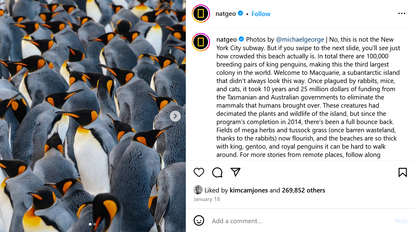
National Geographic – Capturing the World’s Natural Beauty
When we say nature photography, what’s the first thing that comes to your mind?
If you answered National Geographic, then you are right!
They are indeed the master of high-quality nature shots. Vivid colors, creative angles, and artistic cinematography help them create breathtaking photographs and engaging wildlife documentaries that capture the beauty of nature.
Just take a look at their Instagram account:
However, they are not limited to beautiful images. They also include compelling narratives about climate change, animal extinction, and other environmental concerns.
You can see it in their email marketing here:
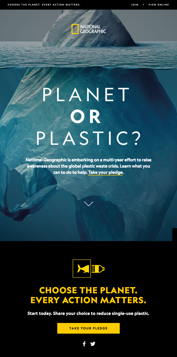
The beautiful visuals not only draw people’s attention but also reinforce the brand’s mission.
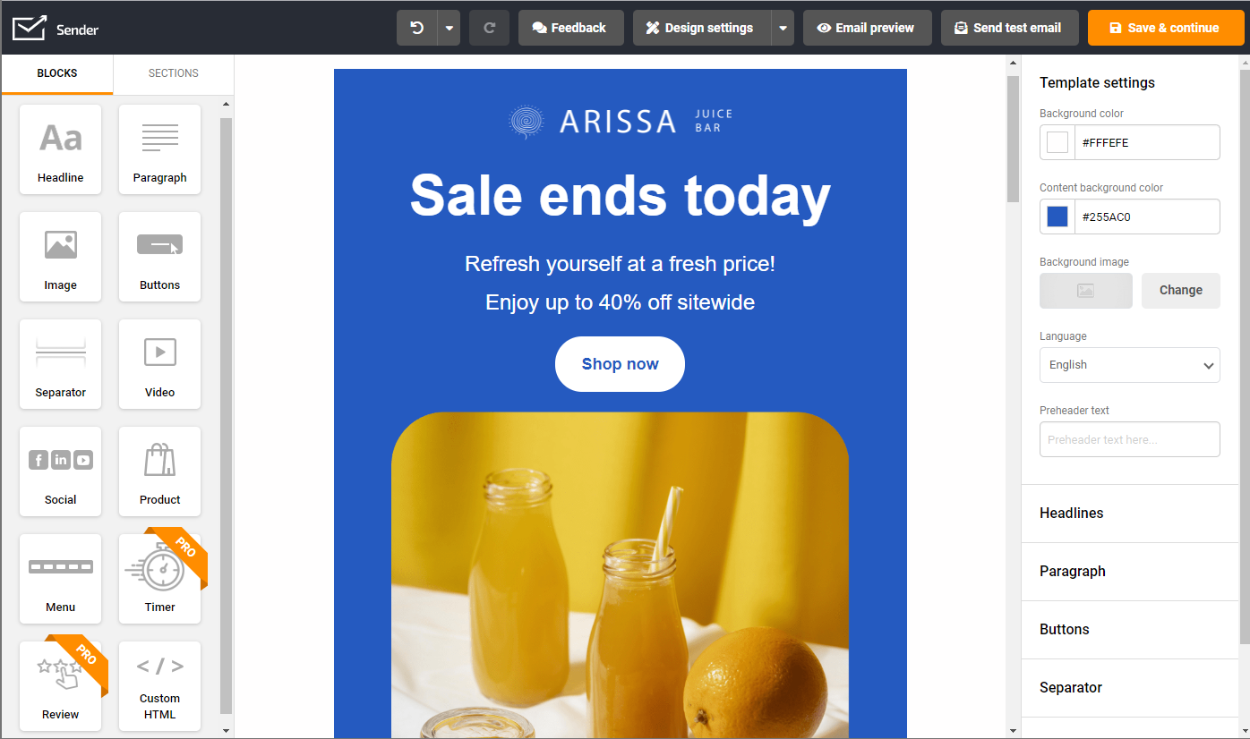
Want to create stunning email newsletters without breaking a sweat? Try Sender’s drag-and-drop email builder with a responsive templates gallery.
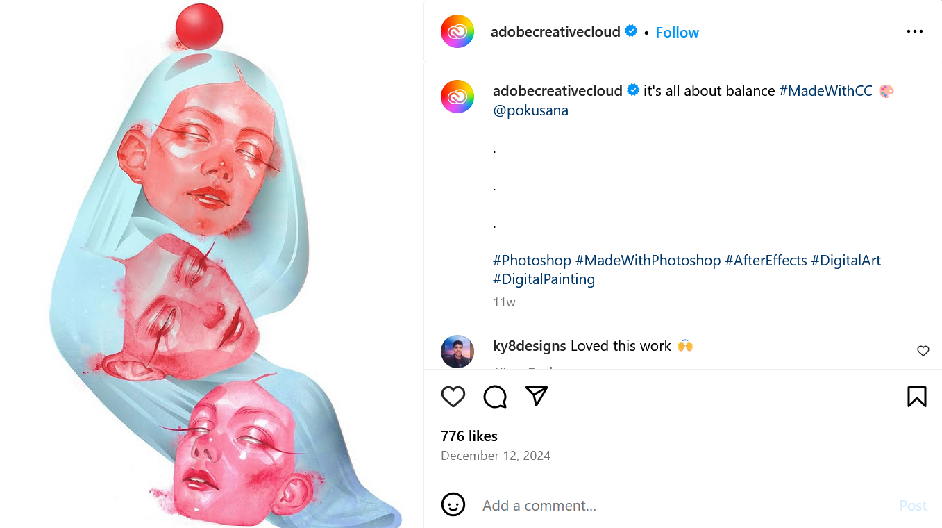
Adobe Creative Cloud – Empowering Creativity Through Beautiful Visual Tutorials
Adobe Creative Cloud’s marketing strategy is to not simply sell their products, but to show its capabilities.
Their social media accounts are filled with short and visually creative tutorials that highlight their products:
They also feature user-generated content that is created using their tools:
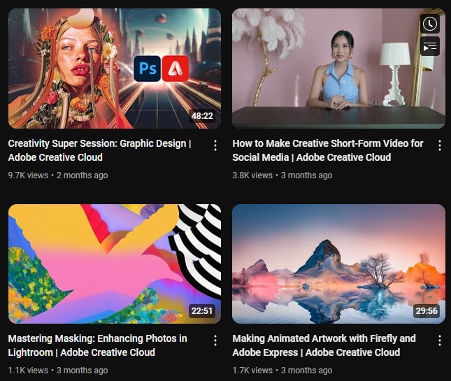
Looking for more in-depth guidance? Adobe also features editing tutorials and explainer videos on their YouTube channel.
Their strategy promotes their products while building a strong community for artists and creators.
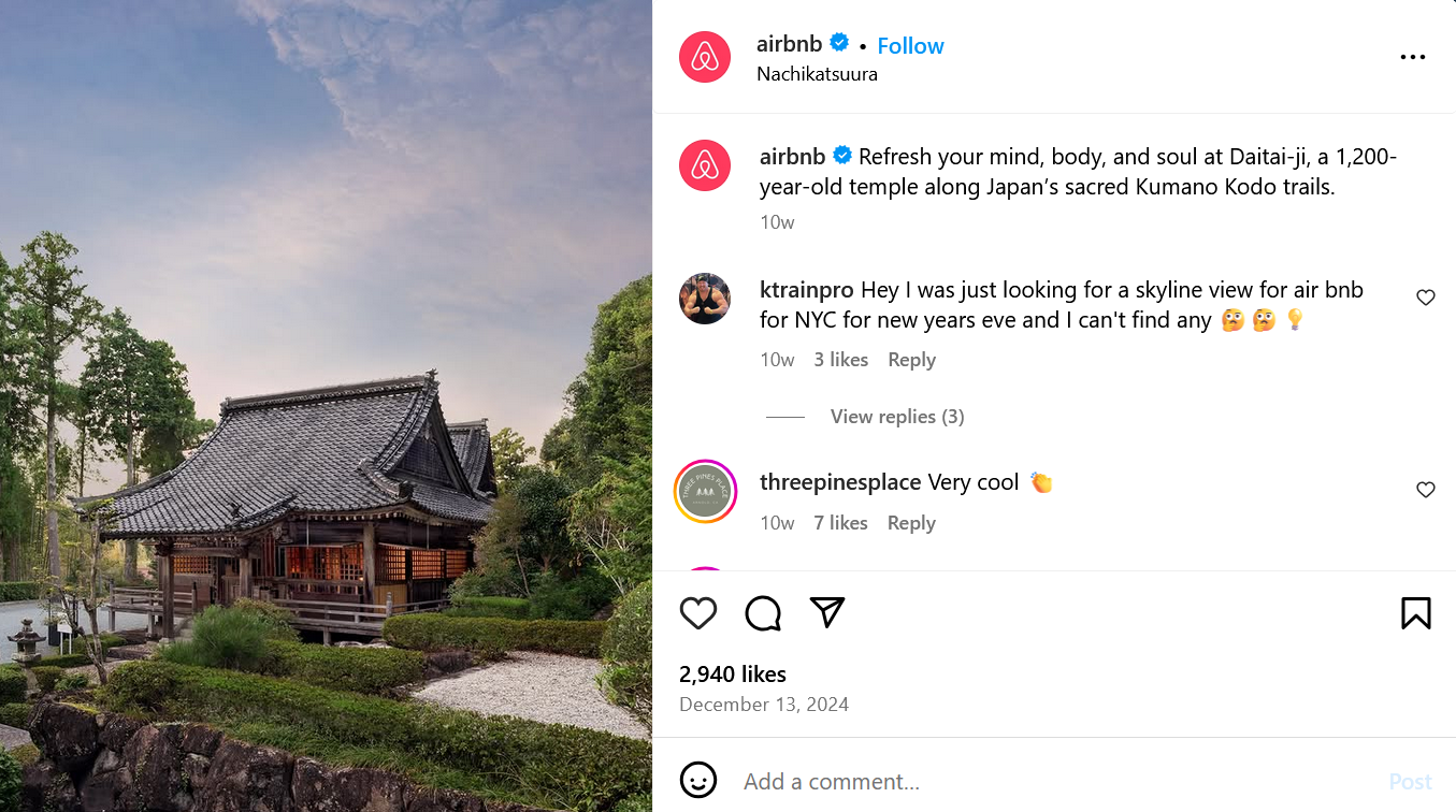
Airbnb – Showcasing the Beauty of Unique Stays
Airbnb’s social media platforms typically feature stunning, high-quality images of unique travel destinations and accommodations.
They also make use of motion graphics and creative animations to promote their service. Take a look at this one:
Airbnb doesn’t just entice customers with its visual content. They also share stories, testimonials, and unique experiences that one can experience through Airbnb.
The storytelling alongside their creative cinematography not only shows a different side of their business but also helps build an emotional connection with their audience.
Patagonia – Highlighting the Beauty of the Outdoors
Patagonia’s visual content marketing highlights nature, adventure, and outdoor lifestyle.
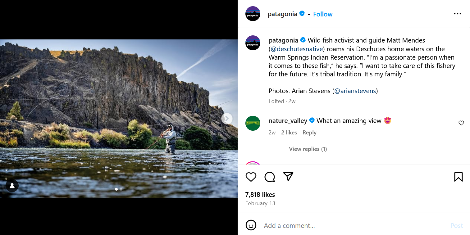
They frequently post photos and documentaries about scenic locations in the world.
This immersive, nature-inspired branding extends even when promoting their products. Just look at their commercial for their snow jacket.
It’s not just a simple studio shot. Instead, they showed people wearing the jacket during an actual snow hike. This approach not only helps them demonstrate how their product will work in real life, but reinforces their nature-loving brand identity.
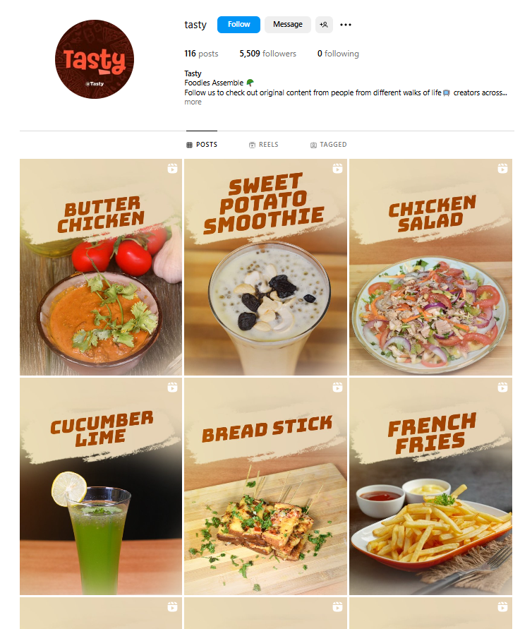
Tasty (BuzzFeed) – Short Yet Visually Engaging Recipe Videos
Is there anyone that hasn’t seen any of their videos? We personally have some recipes bookmarked to try for later!
Buzzfeed’s Tasty videos have gone viral for a reason. These snappy and mouthwatering cooking videos are loved by many for making cooking seem easier and more fun. These short and sweet videos also make it easier to consume (pardon our pun) and binge-watch.
Tasty videos follow a set color scheme, typography, music choice, and style. You can even easily visualize in your head what a Tasty video looks like due to this strong branding.
Huda Beauty – Stunning Makeup Tutorials
Huda Beauty thrives on visually compelling makeup tutorials, GRWMs, and product demonstrations.
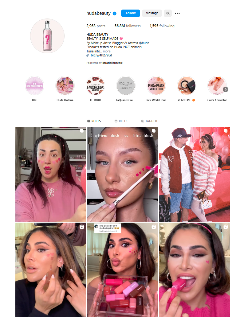
Their ads and marketing campaigns are filled with bursts of color and poppy visuals:
Their visual content not only shows how their product works but also entices their audience to try it just from their glossy, mesmerizing product shots that could make any makeup lover swoon.
Career Karma – Presenting Tech Professions with Engaging Data Visualizations
Career Karma makes the tech industry look more accessible with their visually stunning infographics.
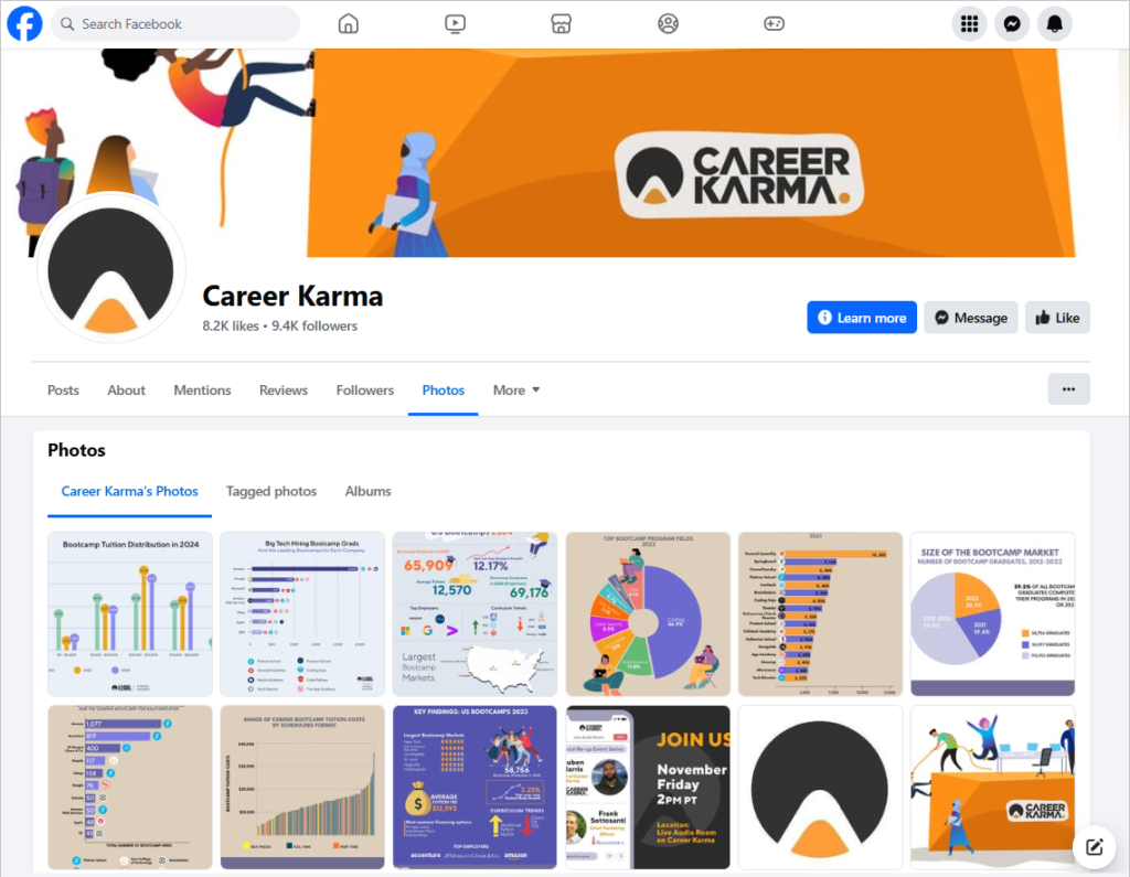
They also create behind-the-scenes videos, Ask Me Anythings, tutorial videos, and other video content to educate their audience about everything tech-related.
Career Karma proves that visual content can also be used for educational purposes. It also strengthens their positioning as the top educational resource in the tech/career space.