


Ever clicked an ad and landed on a cluttered page? That’s a big turnoff, right? You don’t want your customers to feel the same when promoting your business.
We’ve seen businesses waste tons of traffic by sending visitors to generic pages that don’t convert. In this guide, we’ll break down what a landing page is, how it works, and some great examples of effective landing pages.
What is a Landing Page on a Website?
A landing page is a standalone web page that guides visitors toward one clear action, whether that’s signing up, making a purchase, or downloading something valuable.
Unlike a homepage, which has multiple links and distractions, a landing page has a single agenda of moving the visitor towards what you want them to do.
The purpose of the landing page is to boost conversions and make your marketing campaigns more effective.
Key Features of a Landing Page
A landing page isn’t just a fancy-designed page on a website. It has some essential components to persuade the visitor and move them further towards a conversion.
Here are the main features of a good landing page:
- Unique selling proposition (USP). Your USP answers why someone should care. It clearly explains what makes your offer different and valuable. Keep it short, compelling, and focused on benefits;
- Headline. It’s the first thing visitors see. So, it should grab their attention instantly and highlight the main benefit of your product or service in a way that’s impossible to ignore;
- Hero image. A high-quality image or video that visually reinforces your message. If you’re selling a product, show it in action. If it’s a service, use an image that boosts trust and credibility;
- Call-to-action (CTA). The CTA is the most important element of a landing page. It tells the visitor exactly what to do next. So, it should always be clear, action-oriented, and compelling;
- Design. Create a clean, conversion-focused landing page design with no distractions. Use whitespace and bold typography. Remember to avoid navigation menus or unrelated content to guide the visitor’s attention toward the CTA;
- Form or lead capture. If the goal is to collect leads, keep the form short. Only ask for essential info—the more fields, the lower the landing page conversion rate. Bonus: Add social proof near the form to build trust;
Types of Landing Pages
Before creating landing pages for your website, you must have a solid understanding of landing page best practices. To help you understand what you should do, here are different types of landing pages with real successful landing page examples.
Lead Generation Landing Pages
Lead gen landing pages are designed to capture information like email addresses in exchange for something valuable—ebooks, free trials, or extra discounts.
They help grow an email list and nurture prospects before converting them into customers. Have a look at this lead capture page by CKBK:
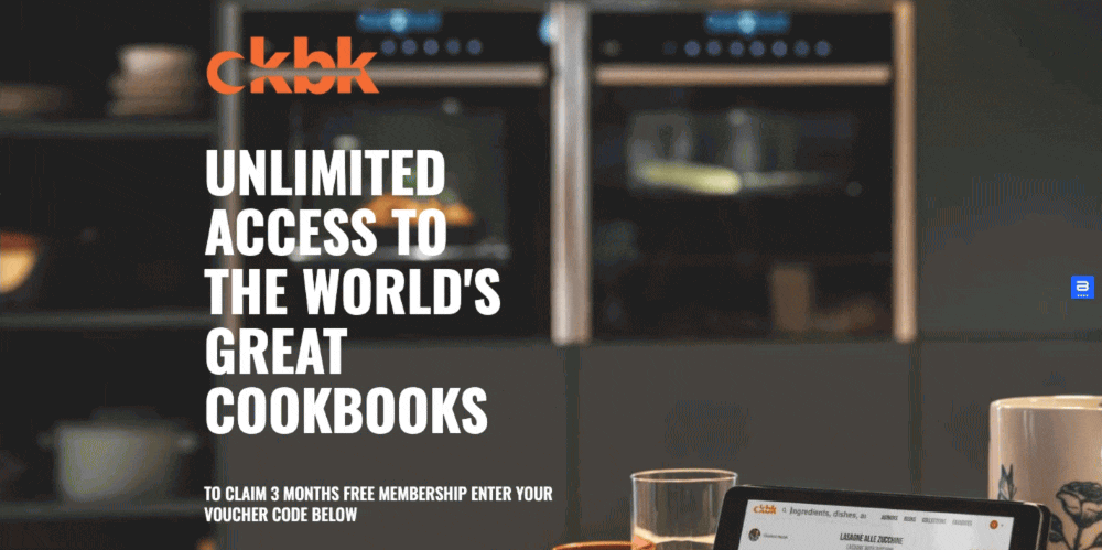
In this landing page, the brand encourages sign-ups by offering an extended free trial. But this landing page does more than just collect leads—it sells the experience. Through compelling visuals, testimonials, and feature highlights, it shows the value of a paid membership.
Different sections of this page address the questions buyers might have while showing the advantages of signing up.
Why this works?
- Free trial voucher gives a strong incentive for visitors to sign up;
- Clear value proposition right below the fold;
- Strong trust signals like testimonials from top chefs and press coverage;
Grow your audience effortlessly! Create stunning popups and signup forms in minutes with Sender – no coding needed.
Click-Through Landing Pages
Click through landing pages reduce friction in the buying process and warm up visitors before asking to buy. They offer details about an offer and include a CTA button leading to checkout, making them a great bridge between traffic source (like a paid ad), and the product.
Here’s a click-through landing page we found by Magic Spoon:
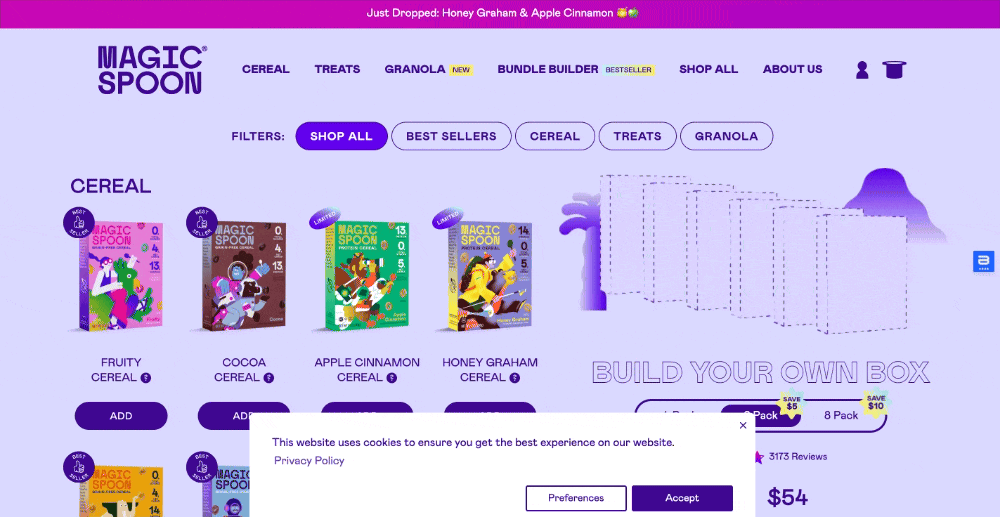
This landing page is great at showcasing what’s on offer. Plus, offering the option to customize the package on the landing page is a good way to engage a shopper. The use of interactive elements, trust signals, and a clear value proposition makes it a great example of a landing page designed to convert.
Why this works?
- The option to customize their boxes makes the experience personal;
- Strong trust signals in the form of reviews and testimonials;
- A clear ‘build your own box’ CTA button keeps users focused on completing the purchase.
Product/Sales Pages
A product landing page is a dedicated page that highlights a product’s features, benefits, and pricing. Unlike web pages with generic product information, these pages use strong visuals, compelling copy, and social proof to maximize conversions.
Here’s a great example of an ecommerce product page by Genius Litter:
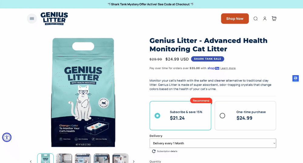
This page is doing more than just selling. It blends education with conversion-driven design, making it highly effective. The use of color-changing meters, testimonials, and comparisons with other litter brands show why the brand is a better option.
Why this works?
- Clear proposition communicated through infographics and value-packed sections;
- Customer reviews and mention of Shark Tank to build trust and credibility;
- Subscribe & save CTA to promote recurring purchases and boost lifetime value.
Event Registration Pages
These landing pages promote webinars, conferences, or virtual events. Such a page communicates the event’s value, date, and speakers and makes it easy for visitors to sign up.
Here’s an example of a cool event landing page by Collective Zoo:
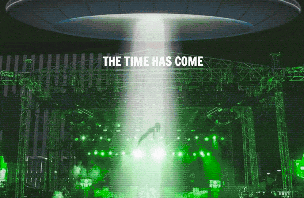
This event registration page goes all-in on immersive storytelling and strong visuals. It creates excitement, removes friction, and makes registration feel like the first step in a memorable experience.
The bold theme with the UFO imagery hooks the visitor and sets the tone for a unique adventure.
Why this works?
- Immersive theme and color tone to hook the visitor;
- Same CTA after every section on the page to remind users to RSVP;
- Special offer to incentivize participation in the event.
Thank You Pages
A thank you page confirms a completed action (like a form submission or purchase) and keeps engagement going. It’s the perfect place to upsell, share additional content, or encourage social sharing.
Here’s a good example of a thank you page by Axis Social:
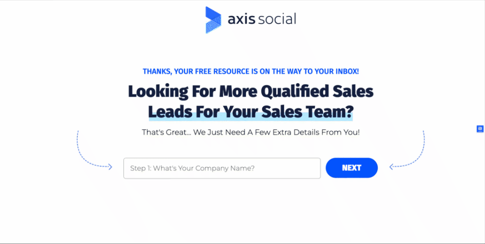
This thank you page goes beyond simple confirmation—it makes visitors want to experience more and invites them to take the next action.
There’s ample social proof on the page for reassurance and a dedicated section explaining the next step. In fact, it is a great page that moves a lead further into the funnel and serves as a launchpad for deeper engagement.
Why this works?
- Strong CTA to engage the visitor to book a ‘strategy’ session;
- Consistent branding and visuals with ample white space to keep visitors focused;
- Step by step breakdown of the next steps plus benefits derived to convince users.
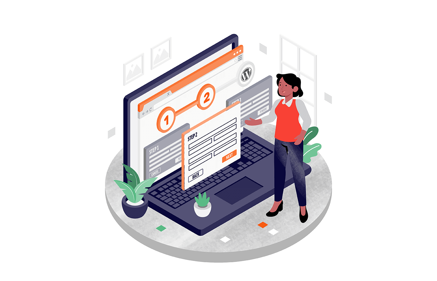
How a Landing Page Works?
A landing page moves the visitor toward one specific action — signing up for a newsletter, claiming an offer, buying something, or downloading a lead magnet.
As mentioned earlier, they remove distractions and focus solely on conversion. Here’s how a landing page works step by step:
- A visitor clicks on an ad, email, or social media link. Traffic comes from paid search ads, search engines, or a marketing or advertising campaign;
- They land on a focused, distraction-free page. No navigation bars or external links—just a clear offer and CTA;
- The page persuades them with strong messaging. A compelling headline, visuals, and benefits make the offer irresistible;
- The visitor takes action. They fill out a form, download content, or make a purchase;
- Data is captured and tracked. If it’s a lead generation page, their info is saved for follow-ups and retargeting.
Landing Page FAQs
What is the difference between a landing page and a homepage?
A homepage introduces your brand, while a landing page removes distractions to drive a specific result. Homepages are designed for exploration with multiple links and navigation, while landing pages are built for conversions, focusing on one action (signup, purchase, etc.).
Do I need a landing page for every campaign?
Yes! Every campaign should have a dedicated landing page tailored to the offer. Generic pages reduce conversions, while a targeted long-form landing page matches user intent, increases relevance, and improves ad performance.
What tools can I use to create a landing page?
Popular landing page builders include Unbounce, Leadpages, Instapage, and ClickFunnels. If you use WordPress, Elementor or OptimizePress are great options, too. Many email marketing tools like Mailchimp, or HubSpot also offer built-in landing page features.
Want to learn more? Here are some valuable articles about landing pages:
- 12 High Converting Landing Pages Examples & How to Build One
- 35+ Landing Page Statistics with Industry Benchmarks
- How to Create a Landing Page That Converts