If you’ve ever glanced at an email subject line and spotted a little extra text next to it—that’s a preheader. It might seem like a small detail, but it’s a powerful tool to boost opens and clicks.
At Sender, we’ve experimented with preheaders in countless campaigns, and their impact was surprising. So, we thought, why not break down what email preheaders are and share a few good practices?
Let’s dive in.
What is an Email Preheader?
Email preheaders are the short snippets of text that appear next to your subject line in the inbox. Think of them as the trailer or a short summary of the actual email.

Just like a trailer helps you decide if you want to watch a movie, they offer a sneak peek and help decide if someone wants to open or scroll-past an email.
Is Preheader Text the Secret Sauce You’re Missing?
Do you often wonder about the reasons why an email marketing campaign fails or clicks with your audience?
While there are a lot of factors, a preheader might just be the tiny tweak you need to turn your email campaigns from meh to must-open. If you’re ignoring preheaders, you’re probably leaving a lot on the table.
Here’s why the preheader text deserves your attention:
- Gets more eyes on your email. A relevant and intriguing preheader makes your email hard to ignore;
- Gives a quick peek inside. It teases what’s on cards, helping readers decide if they want to dive in;
- Works perfectly with subject lines. Together, they pack a punch and build curiosity;
- Keeps your emails out of spam. A relevant preheader adds context and helps dodge spam filters of email service providers;
- Makes the most of inbox space. Email preview text gives you an extra line to persuade your subscriber. So, why waste it?
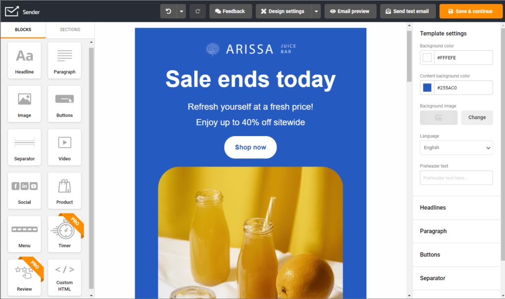
Create professional emails in minutes — with Sender’s drag-and-drop builder email marketing becomes a breeze.

How to Nail Your Email Preheader Every Time?
Writing the perfect email preheader text isn’t rocket science—it’s about building up curiosity. Think of them as your chance to say, “Hey, you don’t want to miss this!” .
Here are some email preheader best practices on how to create the perfect preheader every time:
Keep It Short and Snappy
Digital real estate, like inbox space, is limited; hence precious. Preheaders get cut off after a certain length, so you want to make every word count. Keep it short, sharp, and within the character limit of different inbox providers.
- Stick to 30-60 characters for optimizing visibility across all web email clients;
- Cut out filler words like “Hey there” or “Just wanted to say”;
- Test your email preheader length on mobile to avoid awkward cut-offs.
Here’s a great example of a short, yet impactful preheader that looks great, both on mobile and desktop:

Add a Little Extra to the Subject Line
Your preheader isn’t a prop — it’s the supporting act. If your subject line sets the stage, the preheader delivers the hook that seals the deal.
Use it to add context, tease the offer, or finish what the subject line started. Here’s what you can do:
- Add a bit of curiosity: “Here’s what you missed…”
- Highlight a benefit: “Open now for exclusive deals”;
- Complete the story: If the subject says “Sale is Live,” your preheader could say “Up to 50% off this weekend only.”
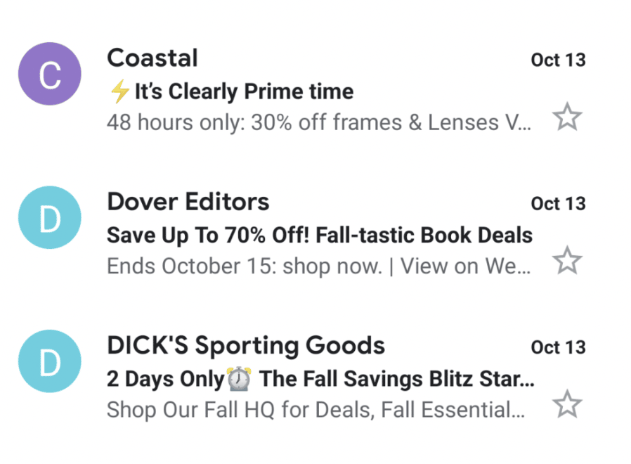
Here are some interesting examples of how to add ‘extra’ punch to your email subject lines:

Show Why the Email’s Worth Opening
Your audience is busy and constantly asking, “Why should I care?”. Give them a reason upfront through intriguing preheaders. Use them to hint at value, savings, or exciting news—something they can’t resist.
Here are some ideas:
- Mention a discount or benefit: “Get 20% off your first order”;
- Share urgency: “Limited seats available. Don’t miss out!”;
- Add intrigue: “We’re dropping a surprise—open to see”.
Drop a Subtle Hint to Take Action
Your readers need a nudge to take action. Use your preheader to drop hints about what action they should take—without being pushy. Make it feel natural and enticing, as if you’re inviting them to something special.
Here is a great example of how you can entice readers through your preheader:

If you need more inspiration, here are some additional ideas for preheader optimization:
- Ask a question: “Ready for something special?”;
- Use active, action-oriented words: “Claim your free gift today!”;
- Keep it playful: “Come see what we’ve got for you!”
Don’t Just Repeat Yourself
Repeating the subject line in your preheader is like telling the same joke twice—boring and forgettable. Instead, make the preheader an extension of the subject.
Together, they should create a flow that pulls readers in. Here’s some advice:
- Think of your subject line as the setup and the preheader as the punchline;
- Use it to add more detail, context, or excitement;
- Avoid copy-pasting—find fresh words that work.
For example, say you write a subject line — ‘Weekend plans sorted?’ for an emailer about events. Your preheader could be — ‘30% off on all experiences—start planning now!’.
Make It Personal and Relevant
Preheaders that speak directly to your readers feel more like a message to them and less like another marketing email. Adding names, locations, or interests shows readers you’re speaking to them, not at them.
Here are some tips for email personalization using preheaders:
- Address the reader: “Tom, your exclusive deal is inside”;
- Mention behavior: “Still thinking about that sweater? It’s on sale!”;
- Use timely relevance: “Cold weather? Warm deals await”.
Check out this personalized preheader where Tara used the space pretty smartly:

Check How It Looks on Phones
More than half of emails are opened on mobile devices. So, your preheader text for a sales letter needs to shine on smaller screens. Always preview and test your text to ensure it fits neatly.
- Keep preheaders under 50 characters for mobile;
- Use the first few words wisely—they’re what readers see first;
- Test across devices and many desktop clients to avoid surprises.
Try Out Different Options (and Learn)
Not every preheader will hit the mark, and that’s okay. A/B testing different styles, lengths, and tone for preheader text will tell you what your audience loves most.
Remember, the smallest tweaks will make a difference in the long run.
Here’s how you can try and test your options:
- Compare curiosity-driven vs. value-focused preheaders;
- Test lengths: short and punchy vs. slightly longer versions for desktop clients;
- Track open rates to see what resonates most.
Ditch the Placeholder Text
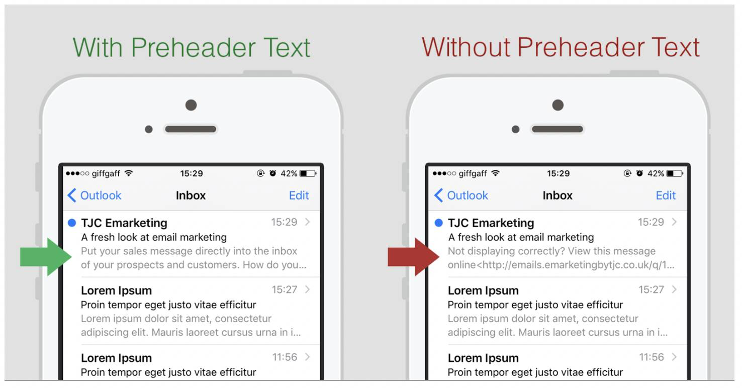
Never let ‘View this email in your browser’ steal your campaign’s spotlight.
Placeholder text screams oversight and kills any chance of making an impression. Take the extra minute to write something intentional and engaging.
- Double-check preheaders before sending;
- Preview your email in different inboxes;
- Set up automation rules to ensure placeholders are replaced.

Stay True to Your Brand’s Voice
Your preheader is part of your brand, so let it sound like you. Whether you’re quirky, professional, or fun, the preheader should match your style.
- Write like you talk—keep it natural;
- Match the vibe of your subject line;
- Stay consistent: if you’re playful, stay playful.
Your preheader is like the whisper that seals the deal. Pair it with a strong subject line and add relevant image alt text for the maximum impact on success rates.
Subject Line and Preheader Combos That Grab Attention
By now, you understand that your email subject line and preheader work together like a power duo to grab attention.
So, if you’re planning to optimize Gmail preheaders or looking for fresh ideas, these email preheader examples will help.
| Subject Line | Preheader |
| Your cart called… it misses you! | Check out now and enjoy 10% off. |
| Last chance: 24 hours left! | Grab your favorites before the sale ends. |
| Fresh arrivals are here 🚀 | Be the first to shop our new collection. |
| Sale alert: 50% off everything! | Stock up now – limited time only! |
| We saved something just for you. | Your exclusive deal is inside. Don’t miss it! |
| Today only: free shipping! | Order now and save on delivery. |
| Your wishlist items are on sale 🎉 | Hurry, these prices won’t last long! |
| Your perfect pair? Found it. | Explore bestsellers and treat yourself today. |
| Exclusive VIP access starts now. | Shop early and skip the holiday rush! |
| Psst… we dropped our prices! | Massive markdowns are live – shop now! |
| Trending now: don’t get left out. | See what everyone’s adding to their carts! |
| Running low: restock your favorites. | Before they’re gone for good – shop now! |
| Final hours: your discount expires! | One click away from 20% off your order. |
| Special deal, just for you 🛍️ | Your exclusive offer ends tonight. Open now! |
| Meet the season’s must-haves. | Styles everyone’s talking about – explore today! |
Remember, the magic lies in pairing the right subject line and preheader. So, test what works, tweak when needed, and let these email preheader examples inspire your next email marketing campaign.
Eager to learn more? Guides, tips and examples, at your service:
