
Building dedicated landing pages on your website for a single goal is one of the best tactics to boost the average conversion rate. A high-converting landing page will set up an effective sales funnel for your business and increase sales revenue.
But how do you ensure a landing page works as intended? First of all, you must understand what your target audience needs. Next, you need to observe the best landing page examples. To save you time, we’ve compiled some of the most effective examples in this blog post.
So, let’s start.
What is a High-Converting Landing Page?
A high-converting landing page on your website persuades the visitor to take the desired action, i.e., signing up for the newsletter, availing the offer, or downloading a resource. It may be through persuasive copywriting, scroll-stopping design, or a no-brainer deal.
Such landing pages are designed to grab instant attention and state the benefits clearly to persuade a reader to take some action.
Here are the most essential attributes of a high-converting landing page:
- Information should match the expectations or desires of the prospect;
- The value proposition should be highlighted through compelling copy or design;
- The page should have a strong yet easy-to-understand CTA (call-to-action).
In the next section, let’s look at some top converting landing pages for visualizing and be inspired to creating landing pages with the highest conversion rates.
12 High Converting Landing Page Examples
If you’re curious about how the best converting landing pages look, we’ve got you covered. Here are some high-converting landing page examples from brands you know.
1. Netflix
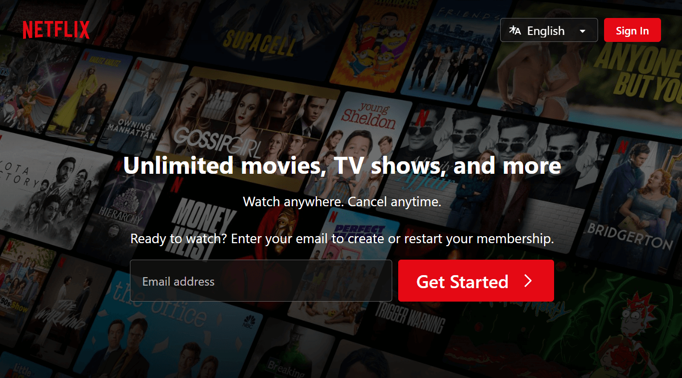
This type of layout allows the landing page visitor to understand what the offer is right away. It makes it easier for them to make the decision about paying for a subscription.
In the background, you will see ads for popular TV shows available on Netflix. The CTA button is clearly visible in the middle of the page. You will find the Login button on the right.
This page is one of the perfect examples of a landing page structure that perfectly conveys the brand’s value and improves the overall landing page conversion rate.
2. Branch Furniture
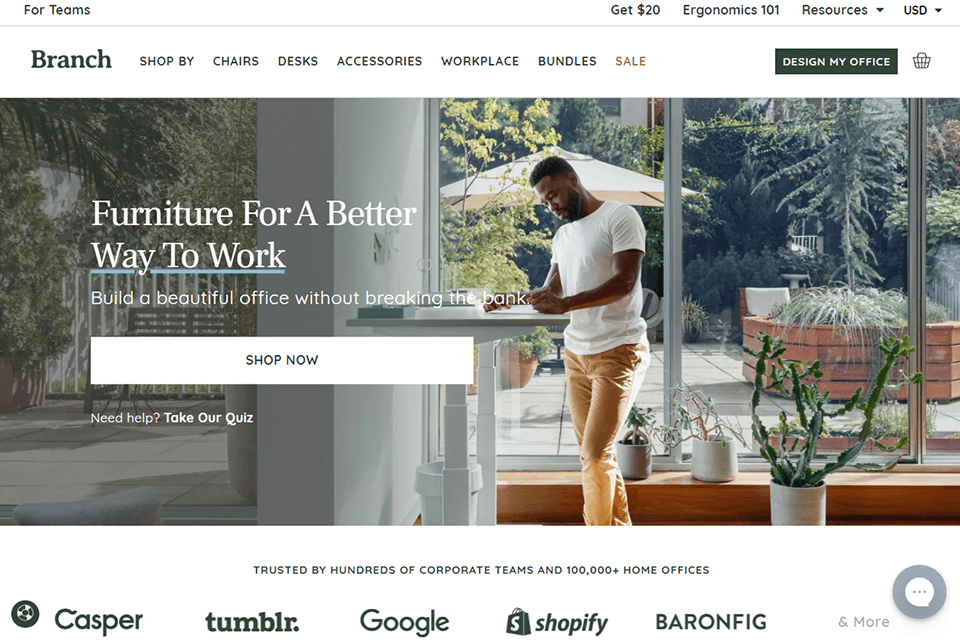
The modern landing page is perfect for the promotion of their products as it instantly shows site visitors what they are looking for – the company that can quickly design, manufacture, deliver, and install the furniture pieces they need.
The powerful headline “Furniture For A Better Way To Work” allows you to understand for whom this landing page was created and what the offer is. Logos of associates on the page, including Google, Shopify, and Tumblr, increase credibility and make it a great landing page example.
3. Slack
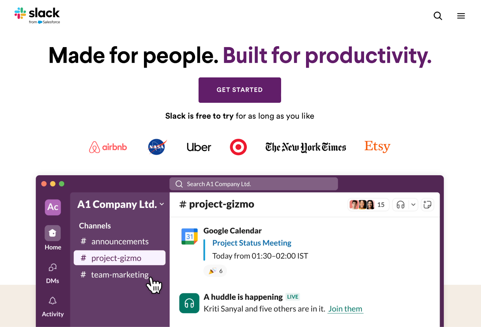
Slack has professionally designed landing pages that boost conversion rates. It also has high-converting sales pages across the website with eye-catching headlines and illustrations. A GIF works as a hero banner and demonstrates how to use this service.
The landing page design helps visitors see the main advantages right from the start. If they’re still not convinced, the logos of the worldwide-known platform’s clients add the final push towards checking it out.
Create stunning landin pages in hours, not days, with Sender – no coding needed.
4. Art On Bundjalung Market
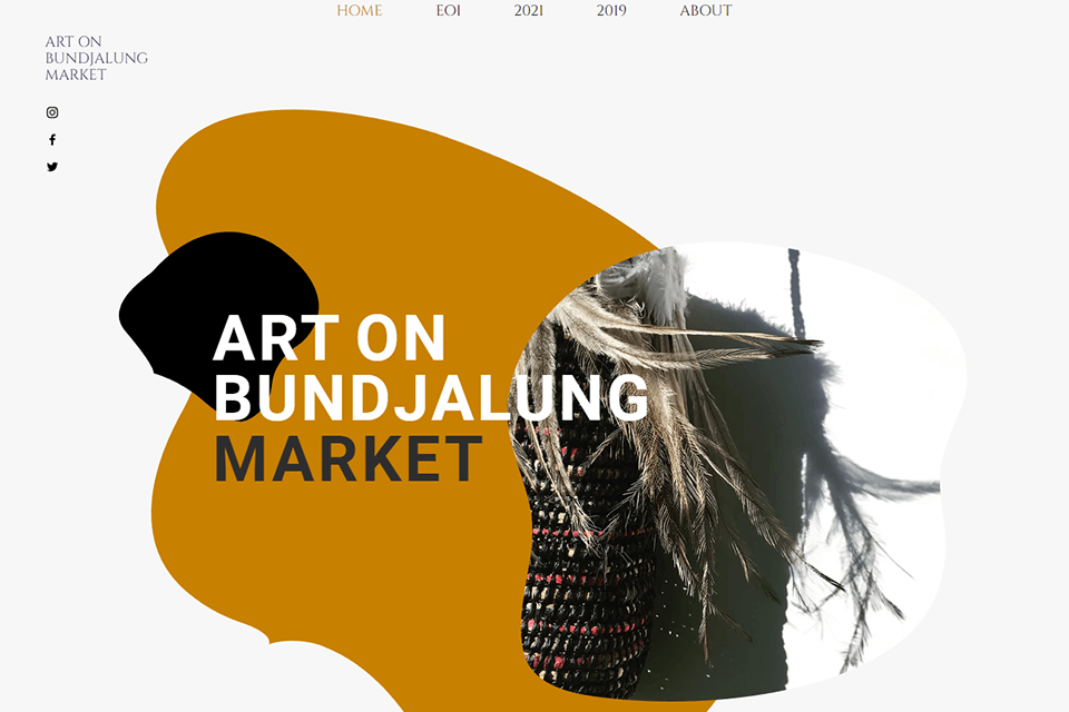
Landing page includes the elements of the culture of aboriginal Australian people. You can see plenty of relevant images and visual elements on the site. In the separate section, you will find videos shot during last-year fair, which allows the site to tell more about the mission of the organization.
The entire landing page has an asymmetric menu with vertical side elements and floating social media icons in the corners. This design makes it more attention-grabbing. The links to their Instagram, Facebook, and Twitter accounts are easy to find.
5. Zoho
Zoho has a landing page with a complex but streamlined design that doesn’t look cluttered. It brings the main message across perfectly. The web designers used more text than usual, but the result still looks great.
The goal is to drive visitors to sign up for a free trial plan. The web designers made the offer more appealing by explaining what’s on offer, making it a detail-oriented and compelling landing page example.
6. Robot Genius
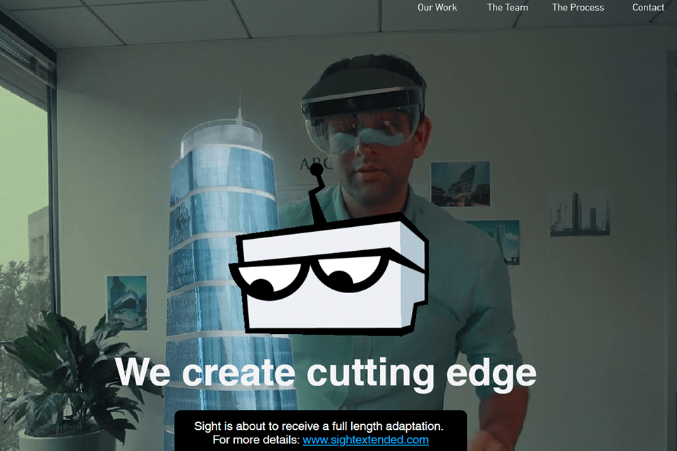
When you visit the official website of this film studio, you will see a professionally-looking animated loop. Robot Genius lets you see the best works from its portfolio immediately. The developers employed the parallax animation technique.
The landing page includes many high-quality photos. The animated logo adds a futuristic feel to the design. The doodles of the team members make this design funny and engaging.
7. Embossed Co

While this high-converting landing page doubles as the homepage, it’s designed to increase sales. This decision turned out to be quite effective.
The same landing page works as an effective marketing funnel. The first part is dedicated to the offer, while the second part explains the product’s key selling points in detail. The text is accompanied by attention-grabbing images.
The third part is dedicated to user reviews, which help make the company look more trustworthy. Below, you will see a CTA with a 5-star rating, which drives visitors to place an order.
8. Epicurrence
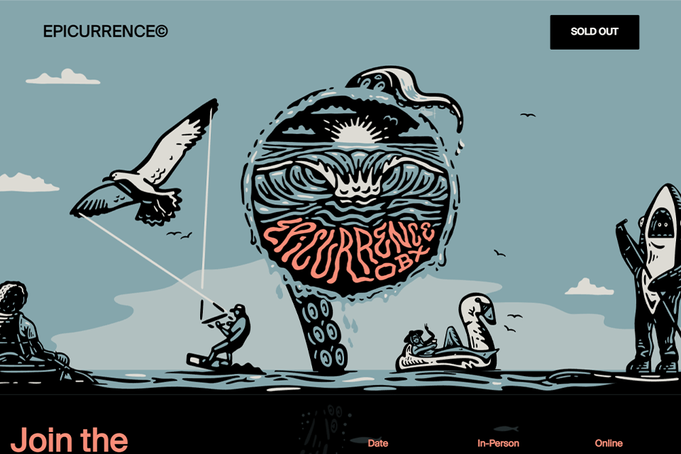
This website was created by Epicurrence to advertise their 4-day conference for creative professionals.
The layout contains all the necessary landing page elements. It also includes high-quality pictures and dioramas that allow visitors to see what different activities will look like. The CTA invites people to examine the website’s content and purchase tickets.
9. Squarespace
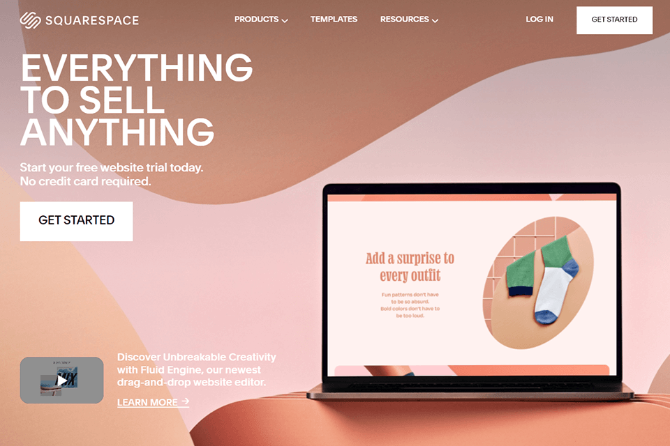
The developers of the platform believe that pages crammed with text look too uninteresting, so their official site has minimum text fields. They decided to opt for captivating visual elements to attract visitors and turn them into returning clients.
If you choose the service to build a website, you are sure to get a high converting landing page with beautiful images, graphics, and videos, shedding light on your products and services.
Besides, you can add a powerful headline, chosen in accordance with the specifics of your company so that customers can immediately grasp who they are dealing with.
10. Udemy for Business
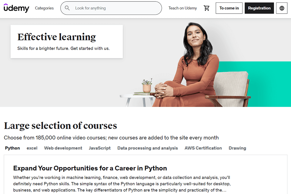
The text is written clearly and concisely. After first looking at the page, visitors will instantly understand what the company offers. The text in the top part of the page is easy-to-comprehend while the text below contains more detailed information. It makes the content of the page more engaging.
11. Wistia
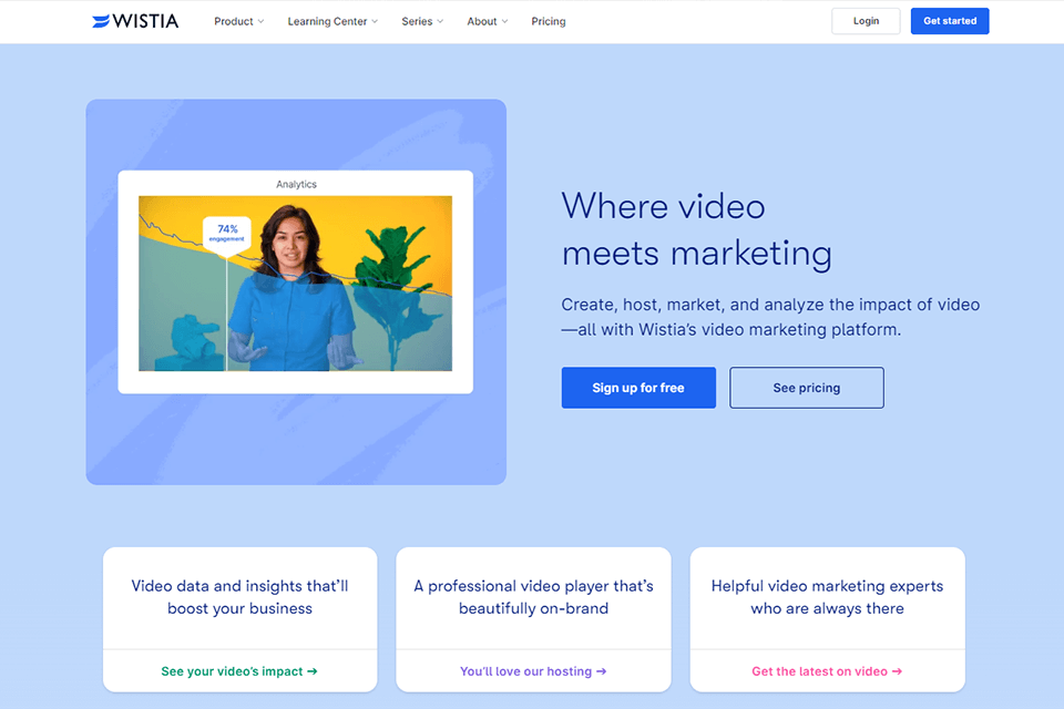
Opening the site, you instantly bump into a blue background with “Sign up for free” button. Besides, there is a video about all types of content you can create with Wistia and it makes sense to watch it till the end.
In case you aren’t sure whether this service is as cool as advertised, scroll to the bottom of the page and read over 375K verified reviews.
Accessing all available features is possible via a Google account. Next, you can take advantage of the autofill feature if you are pressed for time.
Being a highly popular video host, Wistia works wonders in displaying its capabilities using various mediums. The list includes colorful graphics, videos, and even links to cartoons aimed at marketing.
12. Pien Geerling

In the portfolio of Pien Geerling, you will see a collage made of the best photos taken by this photographer. It immediately grabs visitors’ attention and drives them to stay longer on the page.
The menu has a minimalist design. You will see the blocks of the landing page, including its cover, portfolio, and contact info. The pastel color palette allows for photos to stand out among other graphical elements.
Components of a High-Converting Landing Page
A high-converting landing page should serve as a funnel that drives people to buy something, subscribe to a newsletter, or get a deal.
All the successful landing pages above have some common attributes. If you want to create a good landing page that converts, you need to focus on these components and critical areas:
1. Dynamic Hero Banner
The hero banner is the first thing visitors see when they land on your own landing pages. It sets the tone and captures attention immediately.
- Visually striking. Use high-quality images or videos that resonate with your audience;
- Relevance. Ensure the visuals align with your product or service (or visitor’s needs);
- Placement. For an instant impact, place the most important details, like the deal proposition, ratings, and a CTA, above the fold.
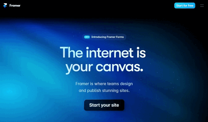
Here’s an interesting example of an interactive hero banner on Framer’s landing page:
2. Clear and Concise Call-to-Action
A call-to-action (CTA) drives the visitor to the next step in the buyer’s journey, so it should be clear and compelling.
- Action-oriented. Use verbs that prompt immediate action;
- Visible. Make the CTA button stand out with contrasting colors;
- Clear. Avoid complicated words or cluttered designs around the CTA to make it easy to spot.
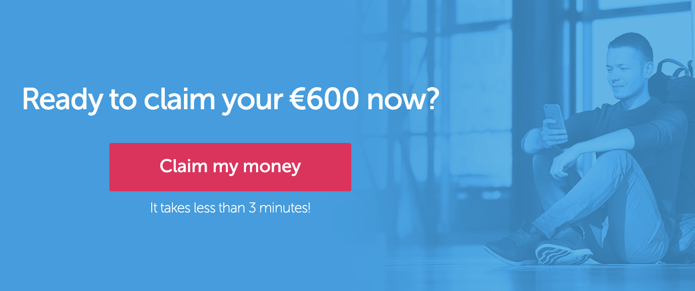
Here’s a great example of direct CTA from Claim Compass’ landing page:
3. Defined Value Proposition
Your value proposition explains what makes your product or service unique and why visitors should care. Here’s how your value proposition should be:
- Concise. Summarize the key benefit in one or two sentences;
- Relevant. Address the specific needs and pain points of your target audience;
- Prominent. Place it near the top of the page, often in the hero section or right below the headline.
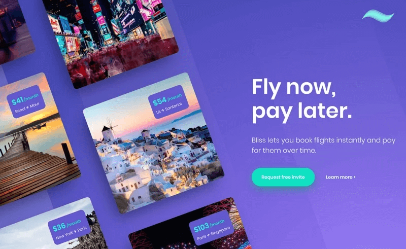
Here’s a great way to explain your value proposition in a crisp way, right in the hero section:
4. Engaging Headline
The headline is one of the first things visitors read. It should grab attention and convey the main benefit.
- Attention-grabbing. Use strong, impactful language that entices the visitor;
- Benefit-focused. Highlight what the visitor will gain through your offer or proposition;
- Brief. Keep it short and to the point, typically under 8 words.
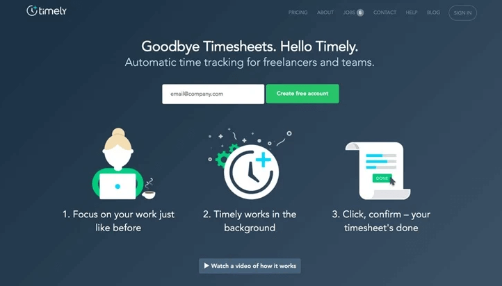
Want to see how it looks? Here’s an example from Timely:
5. Features Highlighting Benefits
Listing features is important, but focusing on the benefits of those features is what convinces visitors to convert.
- Benefit-oriented. Explain how each feature improves the user’s life or solves a problem;
- Clear. Use bullet points for easy scanning;
- Detailed. Provide enough detail to inform but not overwhelm.
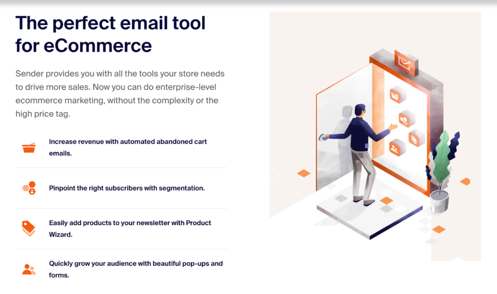
Here’s how we’ve been highlighting benefits on one of our landing pages:
6. Tailored Messages
Personalized content on landing pages converts really well. Your copy should resonate with your target audience. Here’s how you can make it happen:
- Segmentation. Address specific pain points or desires of a particular audience group on one landing page;
- Customization. Use dynamic content that changes based on visitor data;
- Relevance. Ensure the messaging feels personal and directly relevant to the reader.
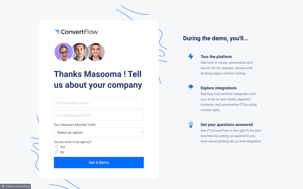
Here’s a simple example of a personalized landing page that has the visitor’s name + answers to their questions:
7. Testimonials or Social Proof
Social proof builds trust and credibility. Highlighting positive experiences from existing customers can persuade new visitors to take action.
- Add authentic reviews. Use real testimonials from actual customers;
- Showcase diversity. Include a range of testimonials from different segments that highlight different benefits;
- Highlight them. Place them strategically throughout the page, especially near CTAs.
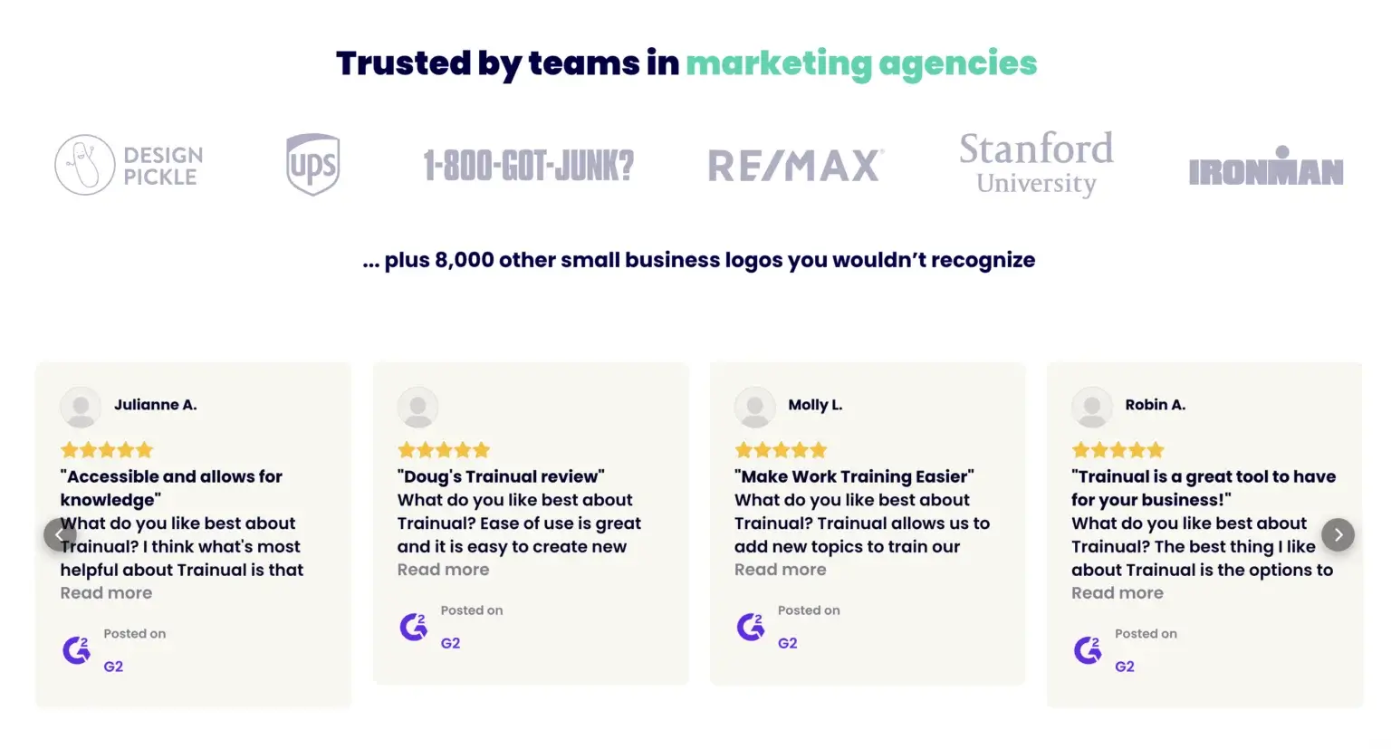
Here’s a great example where Trainual uses embedded G2 reviews on its landing page:
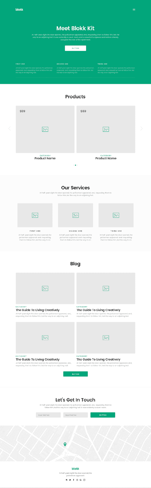
8. Supplementary Visuals
Additional visuals such as images, icons, and infographics help convey information quickly and enhance the page’s appeal.
- Supportive. Ensure visuals support and enhance the written content;
- High-quality. Use professional, high-resolution images and graphics;
- Relevant. Choose visuals that align with your brand and message.
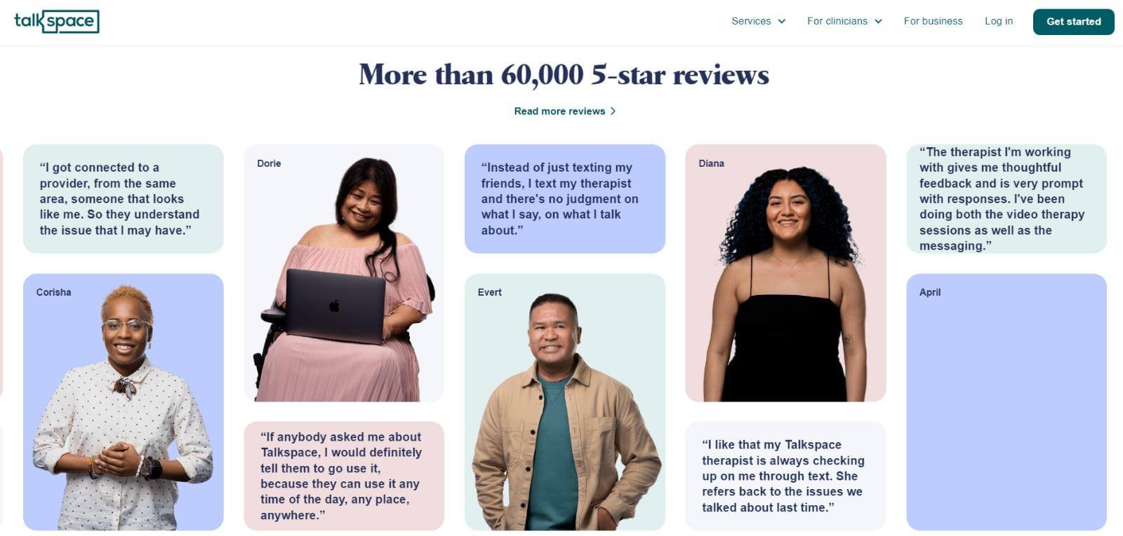
Here’s a nice example of a visual used by Talkspace for showing its testimonials on landing page:
How to Create High-Converting Landing Pages?
Create a landing page for a specific audience. It should have a logical and easy-to-understand structure. Here are some tips and best practices to help you design landing pages that convert.
1. Analyze Your Competitors
Unless you offer a unique product or service, you are bound to have competitors. You need to stand out among your competitors and explain why your potential clients should select you.
Avoid paying attention only to direct competitors as your task is to find any company that meets the needs of your clients. For instance, if the customer’s need is to be fit and healthy, your competitors will be not only gyms or fitness classes, but YouTube channels, sports apps (and more) as well.
To analyze the market, pay attention to the ads at the top of the search engine rankings or use social media.
2. Analyze Your Target Audience
A target audience consists of people who might be interested in your product or service. A high converting landing page should be created with their needs in mind.
A target audience may include people of the same sex or age and consist of people who have a similar educational background, live in the same area, or share the same interests.
One product may have a different value for different people. You need to use sound arguments to convince them to buy it.
How to analyze your audience and segment it:
- Find groups on social networks that are dedicated to a specific topic;
- Analyze the members and try to understand what features they have in common;
- Read cases and reviews on the websites of your competitors;
- Read forum discussions.
You need not only to learn the age, gender, or geographical location of your potential buyer but also to find out what they are interested in and whether your product will be useful to them.
Learn more about what is targeted marketing (definition, strategies & examples).
3. Write Text for a Landing Page
After setting a goal and analyzing your competitors, segment your audience and find out what issues your potential customers might have with your landing page. All these steps will help you write logical, well-structured, and powerful text for your landing page.
You may use the following structure:
- The header of the landing page. Headers include a name of a company and its logo.
- An offer — the idea of your proposal.
- Tell your clients in what cases they could use your product or services.
- Describe the advantages of your product in detail.
- Information about your company. Tell your clients why they should trust you.
When writing an offer, you must answer the questions “What is it?” and “Why do you need it?” Make sure to describe the key selling point of your product in your offer.
When writing the text for your site, avoid cliches and biased assessments. You must list facts, answer questions, provide proof, and use stats.
Make sure to optimize your text. SEO optimization will help you improve the search engine ranking of your website.
4. Create a Mockup
Before building a landing page, it’s important to create a mockup. It should contain a layout with all the page elements, including text, images, and links.
Using a mockup, you can create a well-thought-out layout where every element is in place.
Thanks to it, you will analyze whether all the elements are easy to access. It will allow you to improve the client’s journey and change the position of page blocks.
You can use several options for creating mockups:
- Dedicated software. For instance, Axure, InVision, Figma, and a dozen more. Web developers use them to build and test sites, programs, and apps. If you have already used such solutions, you won’t face any difficulties with them. Otherwise, it might be better to use the following option.
- Paper and pencil. To create a design for a landing page, you can draw it on a sheet of paper. You can quickly remove unwanted elements and edit the title using the eraser.
As a result, you will get the layout with all the necessary elements of your landing page. Using a mockup will make it easier for you to make edits.
5. Choose the Best Landing Page Builder to Do It
As there are many landing page builders on the market, choose the one with all the features you may need to create a landing page. You can either opt for a page builder for beginners or select a more advanced option for professional use.
If you don’t have any prior experience, it’s better to use a page builder with an extensive collection of templates. It will allow you to create a visually appealing landing page more quickly.
Regardless of your experience, you need to use analytical tools and perform A/B testing. After creating your landing page, analyze the number of page views, scroll depth, and click-through rate, as well as other parameters.
By conducting thorough A/B testing, you can make your page more effective and increase landing page conversions.
High Converting Landing Pages: Final Thoughts
Analyze the best high-converting landing pages before creating your own website. It’s crucial to perform A/B testing to check if your new landing page allows you to boost conversions and drive more traffic.
By testing your landing page, you will better understand what improvements it requires and whether it looks appealing to your target audience.
To create a high converting landing page, make sure to use all the components mentioned above. It will ensure that your potential clients will spend more time on your website.
Want to craft the best landing pages? Check out these articles for more knowledge:
- 17 Landing Page Optimization Best Practices for Better Conversions
- 15 Must-See Product Landing Page Examples
- 8 Landing Page Examples PROVEN to Convert
About Author
Ann Young is a talented person, who combines photography and writing to share her skills with others in the FixThePhoto blog. She graduated from New York University 18 years ago, and since then has been actively creating training resources for users mastering Adobe programs for photo and video processing. Currently, she is studying digital marketing and its main strategies.