


Did you know that 41% of marketers admit that email is their most effective marketing channel? If that’s not a compelling enough reason to take email marketing seriously, we don’t know what is.
Over the last few years, we’ve analyzed dozens of email campaigns across industries and found what separates great email marketing campaigns from merely good ones.
In this guide, we’ll walk you through 22 real-world email marketing campaign examples—from welcome series to cart abandonment saviors—that brought great results. And by the end of this guide, you’ll know how to apply the same tactics to your own email marketing strategy.
What is an Email Marketing Campaign?
An email marketing campaign is a coordinated series of emails sent to a specific audience with the goal of achieving a particular outcome. You can nurture leads, promote products, or share valuable content through email campaigns.
With the right email marketing tool you can automate workflow sequences, like welcome emails, cart abandonment reminders, or one-off newsletters tailored to current events or promotions.
Here’s why email campaigns are so crucial for businesses:
- Exceptional ROI. Email marketing ROI is one of the highest in the marketing world. For every $1 spent on email marketing, businesses see an average return of $36, equating to a 3600% ROI;
- Great for customer experience. 81% of small and medium businesses believe email marketing increases customer retention and helps acquire potential customers;
- Increasing relevance. 77% of marketing managers have reported an increase in email engagement in the last 12 months;
- Influence on consumer behavior. 60% of respondents say that marketing emails have influenced their purchases.
All these statistics point to one thing — email campaigns cannot be ignored and help in massive growth. And we’ve seen that time and again during our marketing efforts.
Take Icons8, for example. This creative resource platform partnered with Sender’s email marketing service to revamp their email marketing strategy, and the results were impressive.
Through smart email campaign management techniques, they were able to increase their click-through rates by 200% and email open rates by 33%. Furthermore, they also benefited because of a reduction of 80% in bounce rates.
Email marketing campaigns work if you know how to send effective ones. Now, let’s look at the different types of campaigns you can plan using email marketing software.
Types of Email Campaigns
Not all emails serve the same purpose. Each email campaign type plays a specific role in the customer journey, from that first hello to the final “thank you for your purchase”.
We’ve closely seen how mastering the right mix of these campaign types turns mediocre engagement into a thriving and loyal audience.
Let’s look at eight core types of email campaigns along with proven best practices to get it right.
Welcome Emails
Welcome emails are your first impression. They land when someone joins your list, so timing, tone, and clarity matter more than ever. The best welcome emails don’t just say “hi”. They show the reader what’s in it for them and invite them to explore.
More than 8 out of 10 people open a welcome email, and it generates 4x as many opens and 10x as many clicks as other email types. Why? Because the reader is most attentive right after signing up.
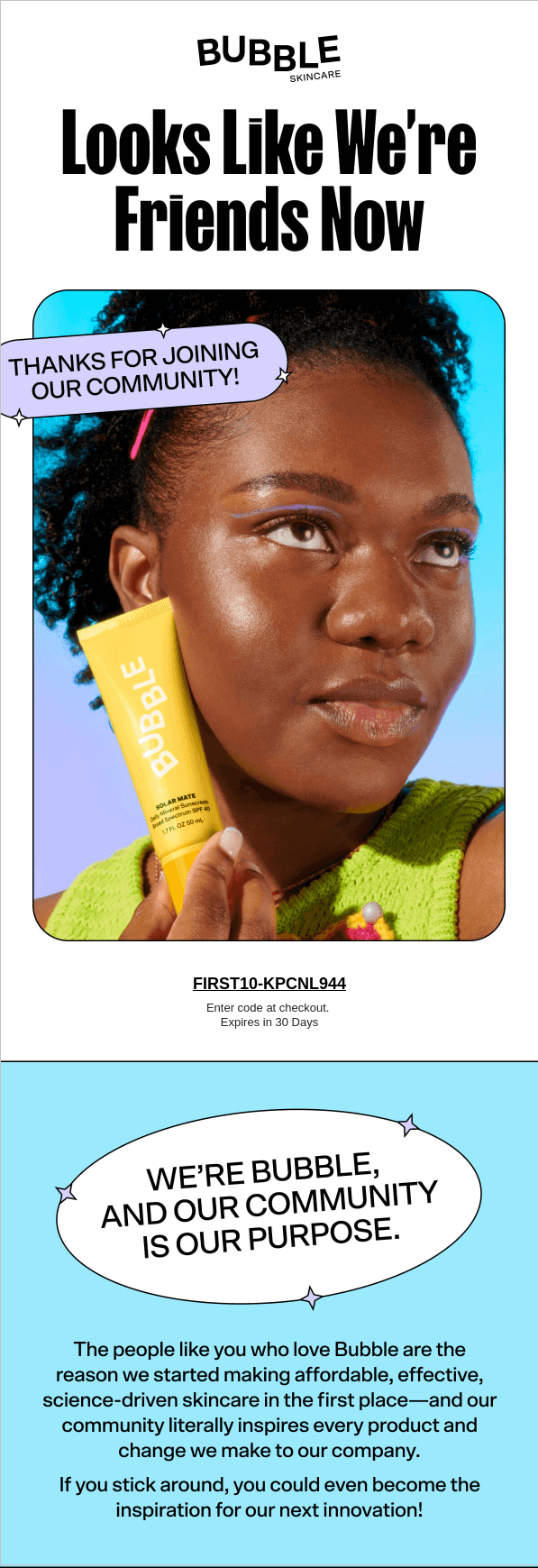
This email is a good example of how to welcome new subscribers because of:
- Headline hook. “Looks Like We’re Friends Now” immediately sets a friendly, Gen Z-aligned tone, less formal, more connection;
- Clear incentive. A prominent discount code with a 30-day expiry window encourages immediate action without pushiness;
- Community-focused. Their message isn’t “shop now”—it’s “you’re part of something”. This builds emotional loyalty from day one.
Email Newsletter Campaigns
These are your ongoing touchpoints to keep you top-of-mind in a crowded inbox. The best-in-class newsletters aren’t overly promotional. They blend updates, storytelling, education, and subtle nudges.
Newsletter campaigns are one of the most popular campaign types, used by 81% of marketers. What keeps readers opening them? Relevance, consistency, and a spark of brand personality.
Here’s an example of a brand newsletter by HUX:
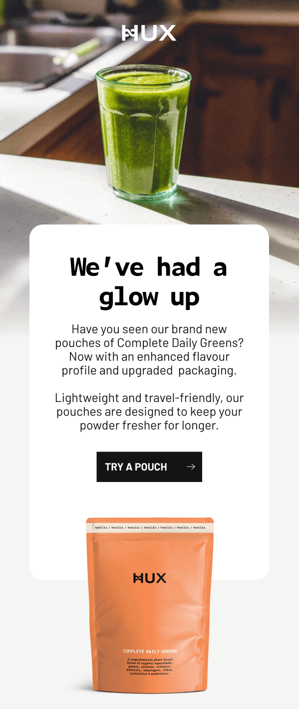
This newsletter sends a product update via newsletter and knows exactly how to make it interesting. Here’s why this works:
- Bold hook. “We’ve had a glow up” is playful, modern, and instantly curiosity-driving;
- Product storytelling. Instead of just announcing a new pouch, they frame it as a transformation (with better flavor, improved design, and usability);
- Relatable context. Lightweight, travel-friendly packaging? That’s not just a feature; it’s a lifestyle win.
Promotional Emails
Promotional emails are your digital pitch to drive attention toward your festive offers, product drops, and flash sales. But they don’t have to scream “SALE!” to be effective. A good promo email is a mix of urgency, design, and precision aimed at the right person.
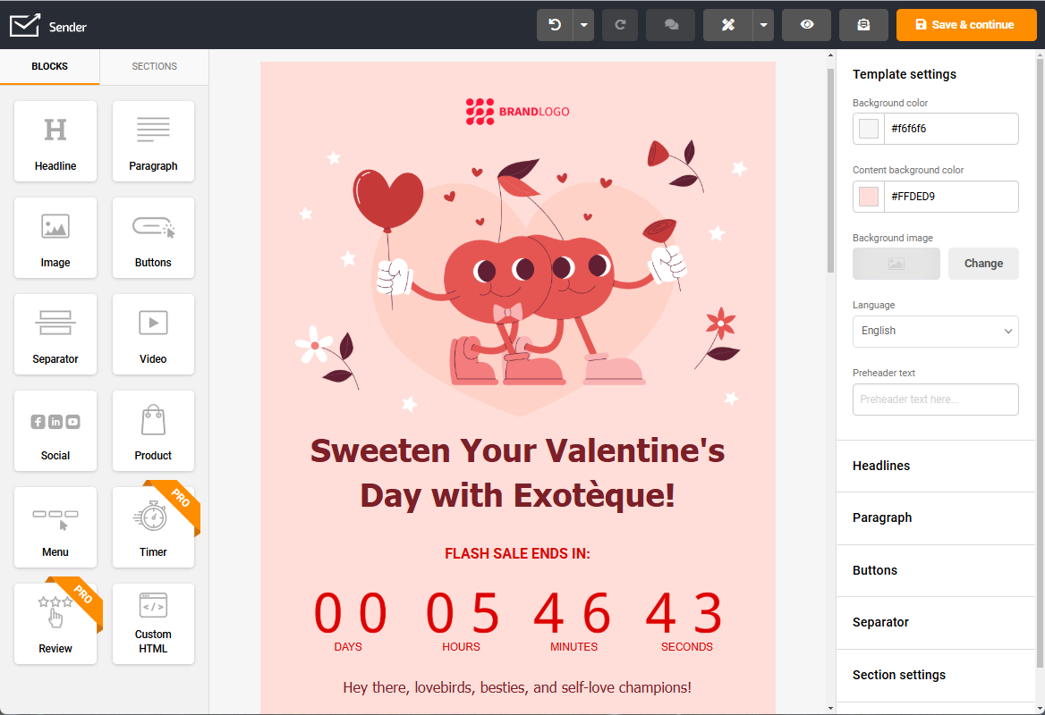
We recently ran a Valentine’s Day promo with a relatable copy and an urgency-driven promotional offer. Have a look:
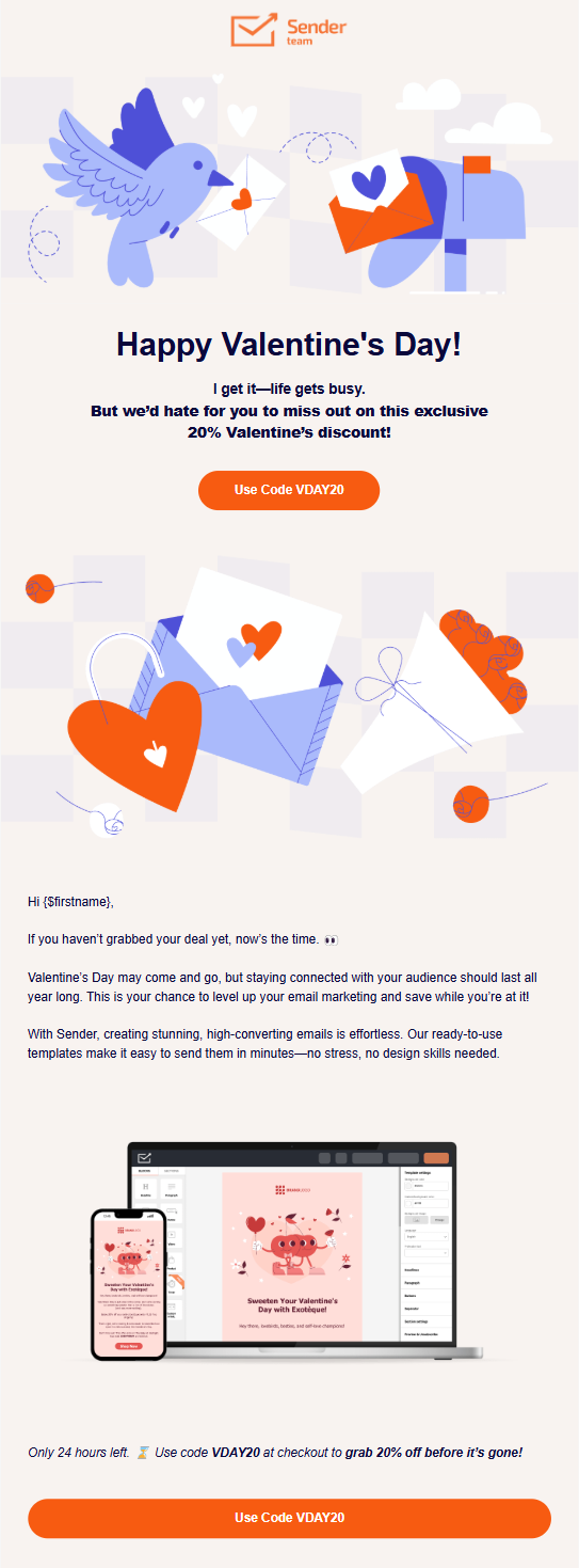
We A/B tested a “One-Day Only” vs. “This Weekend Only” promo—while both converted, the shorter deadline delivered 22% more clicks. Why? Fewer decisions = faster action.
Here are a few more things that we feel worked in our favor:
- On-point hook. “I get it—life gets busy”, tapped into routine challenges while softly nudging towards the offer;
- Urgency without anxiety. “Only 24 hours left” is mentioned at the bottom, creating FOMO without sounding desperate;
- Conversational copy. From “Now’s the time 👀” to “no stress, no design skills needed,”—the tone is casual and confidence-boosting.
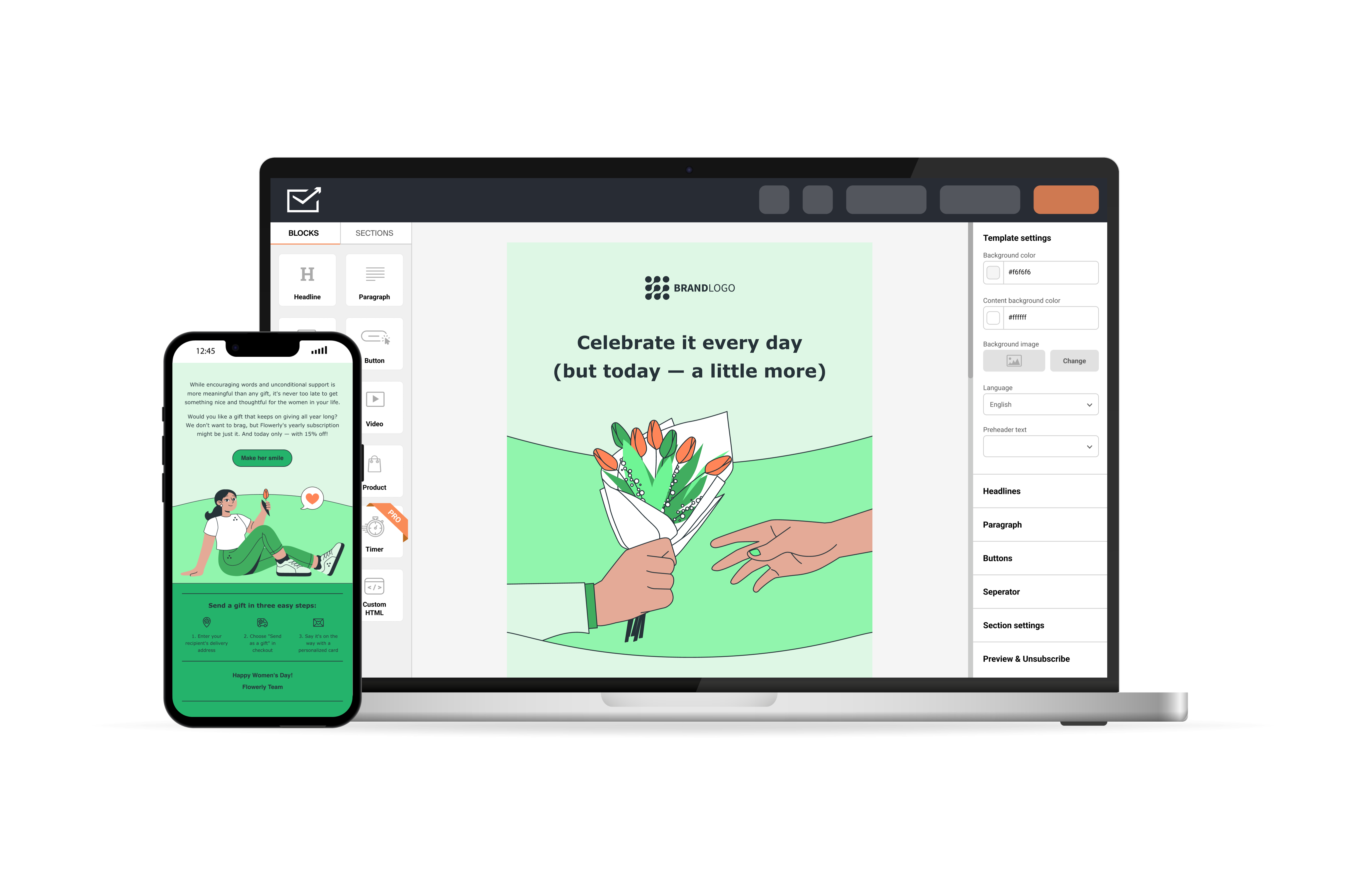
Want to build high-converting campaigns like this one? Sender’s drag-and-drop editor and responsive email templates makes it a breeze —no design skills needed.
Transactional Emails
Transactional emails are an important part of your email campaign strategy. They keep customers informed at every step and are triggered by user actions, like placing an order, resetting a password.
What we’ve found: subtle upgrades like brand voice, product recommendations, or helpful links in transactional emails can improve customer perception and even boost repeat purchases.
Here’s a great example of a transactional email by Ritual:
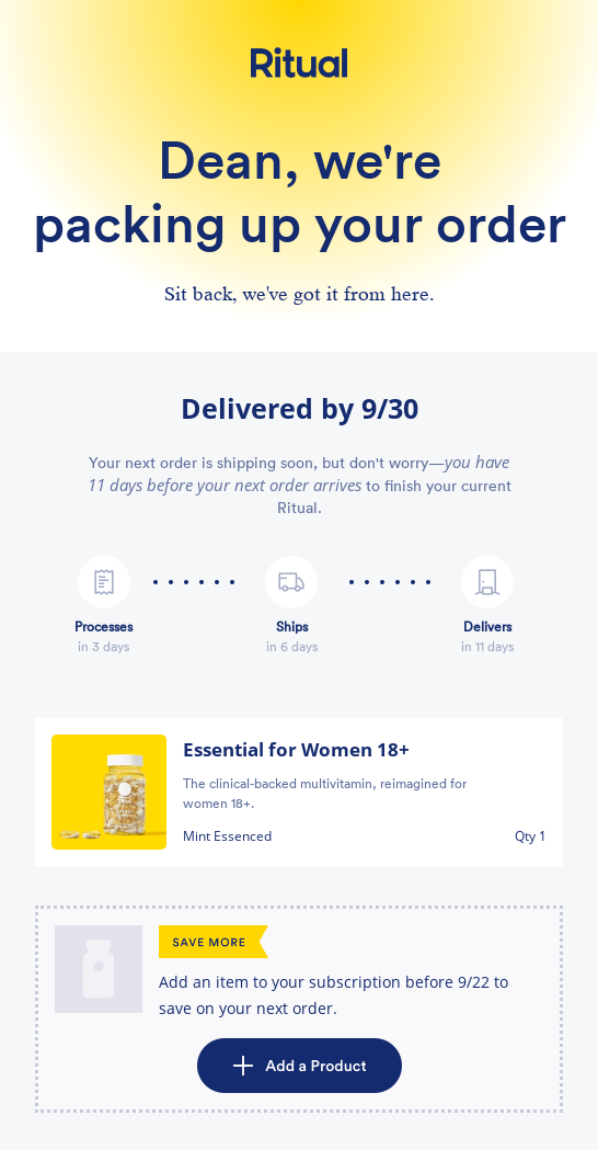
This order confirmation from Ritual has a lot of things to learn from. Here are the best ones:
- Personal touch. Starts with the customer’s name and a personal statement that feels direct and human;
- Timeline clarity. Instead of a vague “it’s shipped,” it outlines processing, shipping, and delivery steps with specific dates;
- Encourages action. Includes a smart cross-sell (“Add a Product”) with a time-sensitive offer.
Re-engagement Emails
Every list has sleepy subscribers. A good re-engagement campaign can wake up lapsed customers if done right. These emails give people a reason to come back, whether it’s with exclusive offers or a friendly nudge.
Win-back emails are emotionally timed. They whisper, “We miss you”, or tempt with, “You’re missing out”, and the best ones strike a balance between being friendly and irresistible, like the one below:
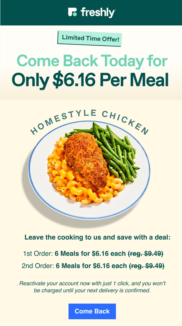
Freshly’s reactivation email gets a lot right, and it’s not just the homestyle chicken. Here’s everything we liked:
- Direct emotional hook. “Come Back Today” feels personal without being clingy;
- Clear offer. They lead with a specific, value-packed deal and showed it clearly;
- Sensory visuals. The hero image isn’t just food—it’s nostalgia on a plate, appealing to comfort and hunger;
- Low commitment CTA. ‘Come back’ looks friendly and doesn’t ask for an instant commitment, removing friction;
Abandoned Browse Emails
Abandoned browse emails step in when someone shows interest but leaves before taking action. Instead of pushing for a sale, these emails gently re-open the conversation by resurfacing the product they viewed, (hopefully) giving them a good enough reason to take a second look.
Effective browse emails keep things light and helpful—focusing on clear visuals, simple copy, and a subtle prompt to continue exploring—making them a low-pressure way to turn casual browsing into renewed engagement.
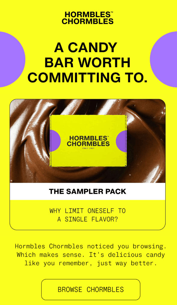
Hormbles Chormbles’ abandoned browse email nails the balance of personality, clarity, and persuasion. Here’s what makes it work so well:
- Instant visual impact. The high-contrast neon palette grabs attention the second you open the email—impossible to ignore;
- Playful brand personality. The quirky tone (“Which makes sense. It’s delicious candy…”) makes the message feel fun, not salesy;
- Product-first layout. The sampler pack sits front and center, immediately reconnecting the shopper with what they viewed;
Cross-Sell & Upsell Emails
Cross-sell and upsell emails help you increase order value by suggesting products that naturally complement what a customer has already viewed or purchased. Instead of feeling salesy, the best of these campaigns act like helpful recommendations—surfacing relevant add-ons, upgrades, or refills at exactly the right moment to enhance the customer’s overall experience.
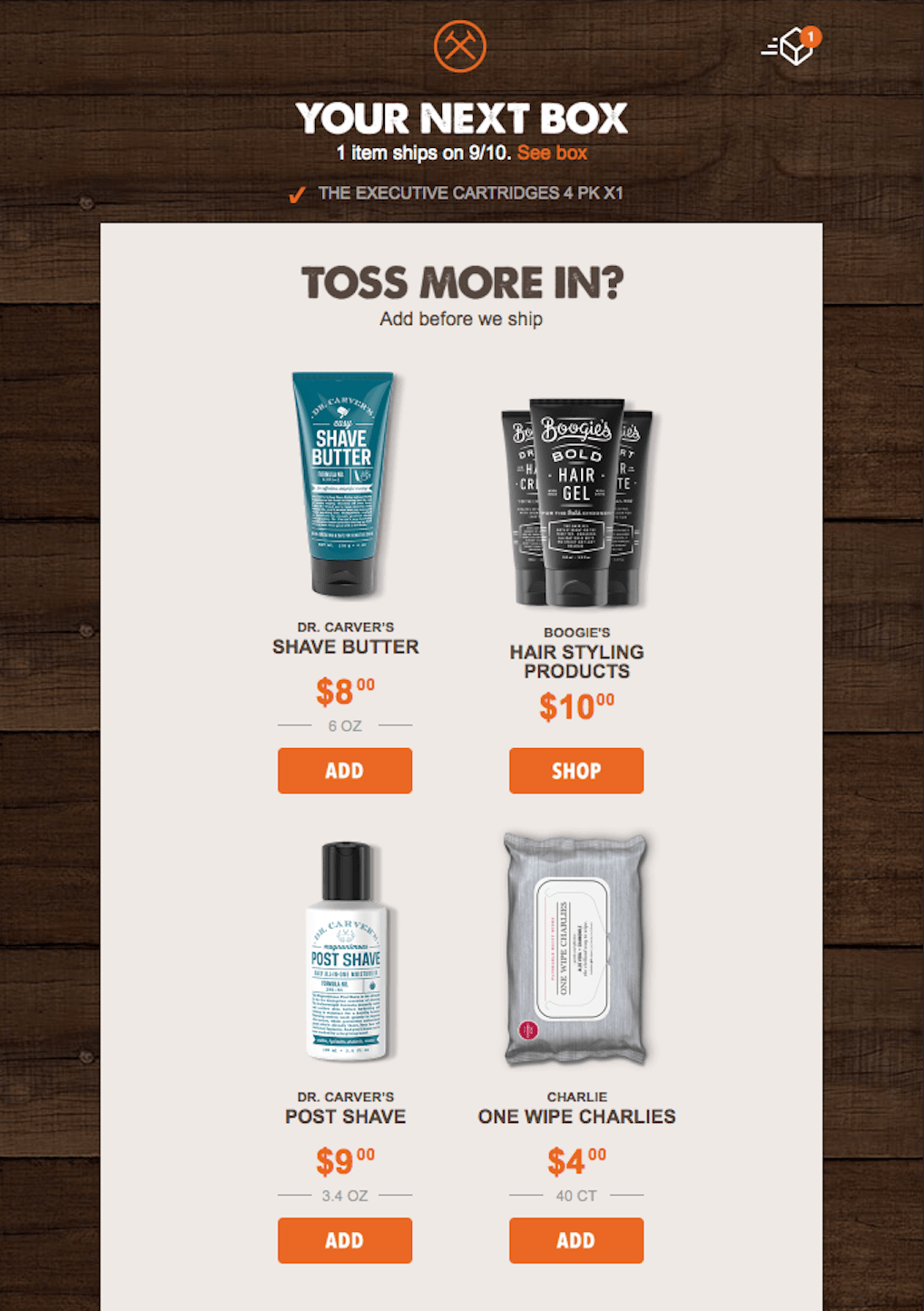
Dollar Shave Club’s cross-sell email works because it hits customers at the perfect moment—right before their next box ships—making add-ons feel useful, timely, and completely natural. Here’s what makes it so effective:
- Perfect timing. Sending the email before shipment maximizes the chance customers will toss in extras they genuinely need;
- Clear product lineup. Each recommendation includes a clean image, price, and short descriptor, making comparisons effortless;
- Relevant suggestions. All featured products directly complement the customer’s core purchase, so the recommendations feel thoughtful rather than pushy.
Back-in-Stock Alerts
Back-in-stock emails step in when a customer wants something that wasn’t available the first time around. Instead of pitching something new, these emails revive existing demand by letting shoppers know the item they cared about is finally available again.
Great back-in-stock alerts keep the message clear and upbeat—highlighting the returned product, reminding shoppers why it was worth waiting for, and adding a gentle nudge to act before it sells out again. It’s a simple, low-pressure way to convert pent-up interest into quick, excited purchases.
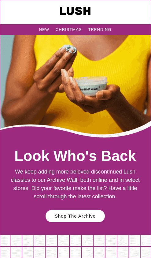
Lush’s back-in-stock email nails the emotional angle of bringing fan-favorite products back into the spotlight. It blends excitement, nostalgia, and clear direction to pull shoppers right back into browsing. Here’s what makes it work so well:
- Warm, welcoming headline. “Look Who’s Back” feels friendly and fun, instantly sparking curiosity;
- Vibrant, on-brand visuals. The rich purple palette and lifestyle imagery make the email feel joyful and unmistakably Lush;
- Straightforward CTA. “Shop the Archive” gives readers an easy, low-friction way to dive back into products they’ve missed.
Effective Email Marketing Campaigns Examples
Now that you know different types of email campaigns, let’s look at brands putting them all into practice.
These successful email marketing campaigns show how the right mix of strategy, timing, and design can drive sales.
Thank You Emails — Wonder Valley
A thank you email signifies a warm gesture and is sent after a customer completes a purchase, signs up, or supports your brand. It humanizes your brand and turns a transaction into a relationship.
Wondering how you should structure your ‘Thank you’ email? Take inspiration from this email by Wonder Valley:
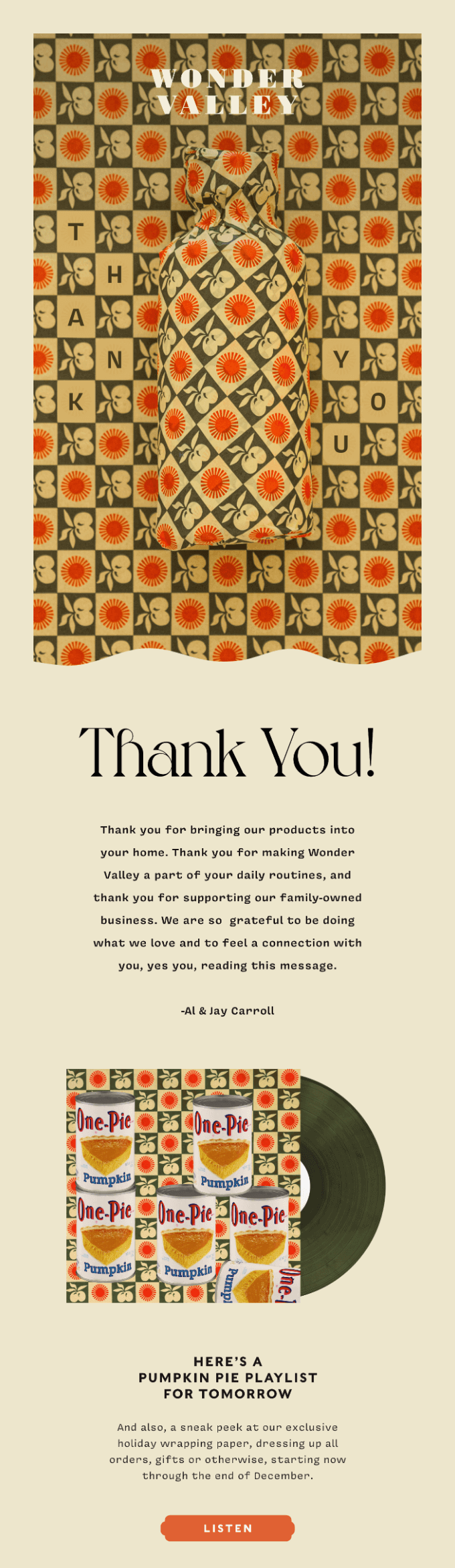
This email is beautiful, and every element feels personal — from the founder’s note to the nostalgic visuals. It doesn’t try to sell; it tries to connect. The message is genuine, the design intentional, and the bonus playlist makes it feel like a gift, not a campaign.
Why it works?
- Builds emotional equity without pushing a product, which is ideal for retention;
- Founder sign-off makes it feel handcrafted, not automated;
- Bonus playlist deepens the brand’s story and improves delight.
Seasonal Email Campaign — Sender
Seasonal emails are time-bound campaigns around special events, holidays, or cultural moments like Women’s Day, Diwali, Black Friday, or Back to School. They help you tap into the vibe of the season and ‘shared awareness’ about a popular event.
We’ve been sending seasonal emails for years now, and here’s what we did for Women’s Day:
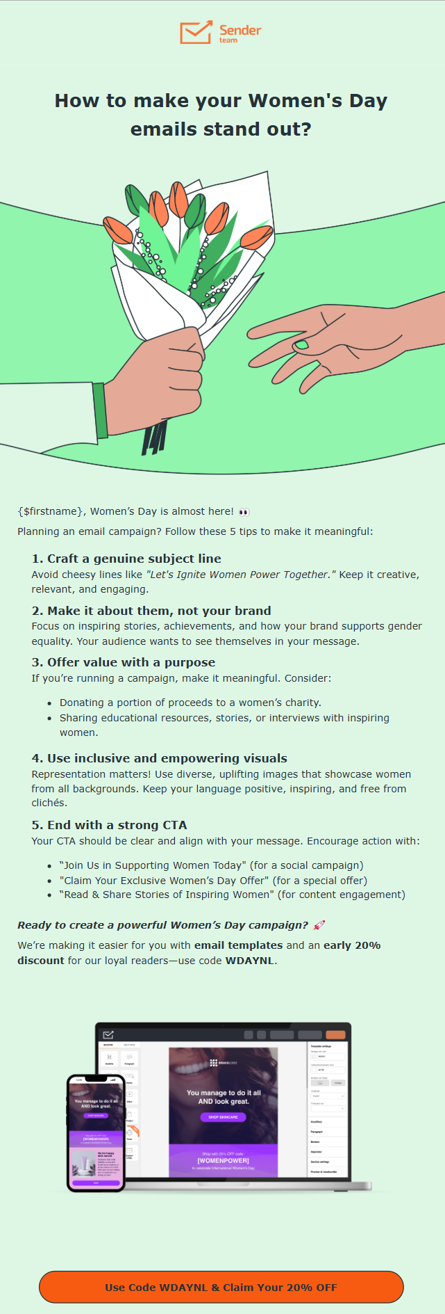
If you notice, this campaign doesn’t just wish — it tries to add value. We balanced it for people who want to send Women’s Day campaigns and added a subtle nudge with an offer.
Ready to create email campaigns that actually get noticed? Grab your free HTML templates and start building stunning newsletters — without the stress!
Educational Emails — Dollar Shave Club
Educational emails aim to inform and build trust. These targeted emails are used to teach your target audience something helpful via tips or advice that makes their lives easier.
Adding educational email campaigns to your email marketing strategy is always a good idea. Studies suggest that consuming educational content increases the likelihood of buying from a brand by 131%.
Here’s a great example of how you can create an educational email without boring customers:
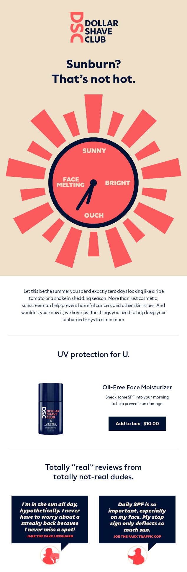
This email nails education with personality. Instead of educational emails, which often come with long walls of plain text, they used a catchy visual to introduce the problem.
The short paragraph explains why it’s a good idea to put on sunscreen. It informs without being too preachy and sells without forcing.
Why it works?
- Explains a common problem using a scroll-stopping visual;
- Infuses education with brand voice;
- Connects learning to product use naturally, not forcefully.
Feedback & Survey Emails — J.Crew
Feedback emails are sent shortly after a customer makes a purchase or uses a service. Their purpose isn’t just the collection of valuable information but also building customer relationships.
A well-timed review request shows existing customers that their opinions matter while generating valuable social proof. Here’s an example by J.Crew:
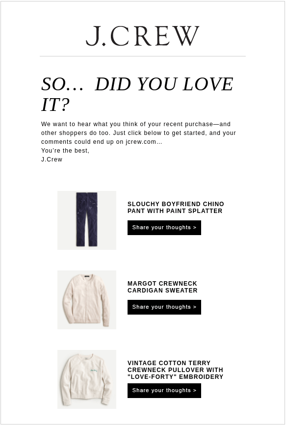
The email is minimalist and gives direct CTAs to users to share their opinions about their recent purchases. The writing is direct and impactful. There’s no extra element in the email, which reduces distraction and directs readers to the review page.
Why it works?
- Minimalist design with zero distractions;
- Contextual and relevant ask about past purchases;
- Direct CTA buttons asking to share thoughts.
Nurturing Emails — Wix
Email nurturing campaigns are sent to nurture prospects or website traffic to influence them to buy something. In the B2B context, these emails are often central to lead-generation and long-term deal closing.
The key purpose is to move them further into the buyer’s journey and make them buy something from your store. Efficient nurturing practices with timely follow-ups help companies increase conversions by up to 50%.
Here’s how you can use email marketing campaigns to nurture your leads:
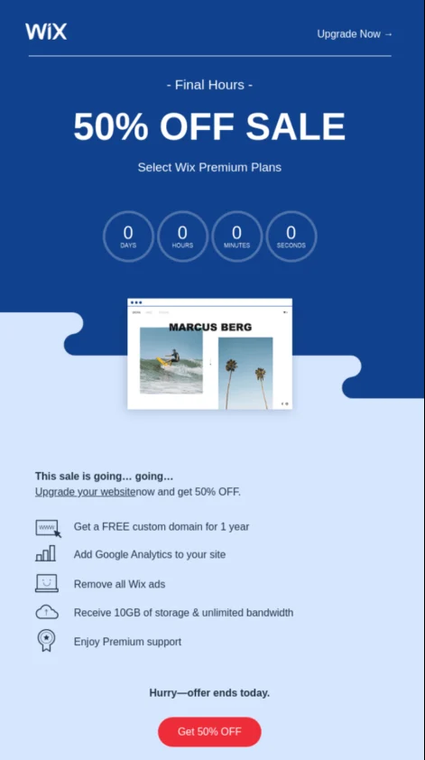
This email from Wix is sent to free or trial users on the verge of churn. Instead of a generic push, it combines a compelling discount with a countdown timer to create urgency.
But what’s more strategic? It addresses the #1 friction point for SaaS users: price hesitation.
Reframing the offer as limited-time value makes the leap to a paid plan feel like a smart (not pressured) decision.
Why it works?
- Great offer focused on addressing price apprehension;
- Countdown timer, adding a sense of urgency to act;
- Contrasting CTA button highlighting price savings.
Abandoned Cart Emails — Luxy Hair
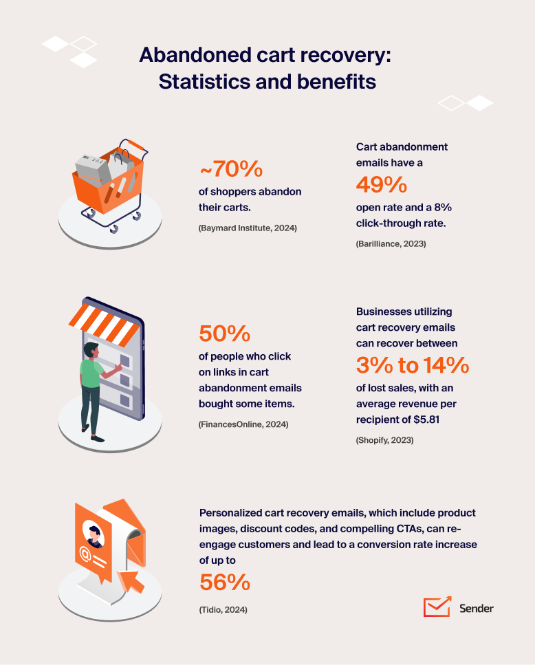
Abandoned cart emails are triggered when a user adds products to their cart but doesn’t complete the checkout. Timing is critical to sending such emails. In fact, sending the first email within an hour can recover up to 16% of lost revenue.
Automating a cart abandonment email can be profitable to win back your customers and increase your sales revenue. Here’s an interesting cart abandonment email template example by Luxy Hair:
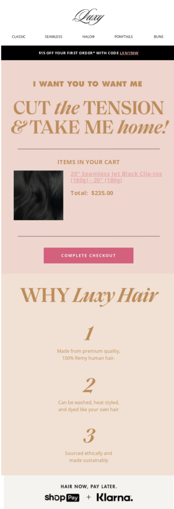
Luxy Hair’s email doesn’t chase the abandoner — it charms them. The witty one-liners in the header with a bold CTA button to complete checkout make them give a second thought to their cart. However, an extra discount or offer would have made this email more compelling.
Why it works?
- Witty copywriting in the header;
- Solid reasons to choose the brand, added prominently in the email;
- Special ‘Buy Now Pay Later’ offer to reduce friction.
While abandoned cart emails are a powerful recovery tool, preventing drop-off in the first place is even better. Most shoppers abandon carts due to hidden costs, complicated checkouts, or lack of urgency.
Here are some proven ways to reduce cart abandonment:
- Show shipping costs early—no surprises at checkout;
- Offer guest checkout to remove login friction;
- Use exit-intent popups with time-sensitive offers;
- Add product reviews and trust badges near the “Add to Cart” button;
- Retarget cart abandoners on other marketing channels with special offers;
- Include real-time stock notices (“Only 3 left!”) to trigger urgency.
Birthday & Anniversary Emails — L’Occitane
Happy birthday emails are personalized campaigns that surprise subscribers with exclusive offers or gifts on meaningful dates. These dedicated emails aren’t just feel-good messages—they actually make people click and shop.
Studies say that happy birthday emails generate over twice the revenue of bulk promotional emails. And anniversary emails are even better. They generate nearly seven times more revenue than bulk promotional emails.
They’re best scheduled a few days before the birthday or milestone to give customers time to redeem their reward. Here’s a beautiful example with personalized content by L’Occitane:
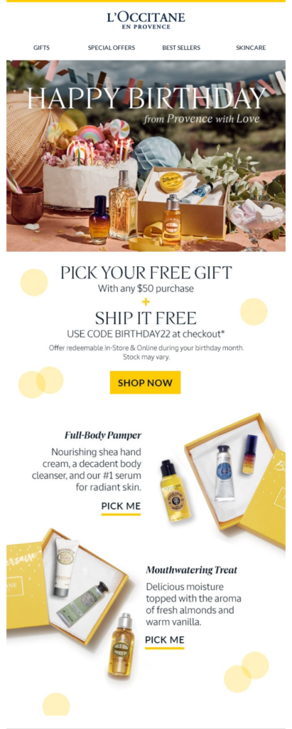
This email from L’Occitane strikes the perfect emotional tone. It’s warm and elegant, and offers a free gift and shipping with any birthday purchase, but it doesn’t stop there.
Contextual product suggestions and luxurious visuals reinforce the premium brand experience while still feeling personal.
Why it works?
- Offers a real incentive tied to a personal milestone;
- Dynamic content in the form of recommendations based on past behavior;
- The design feels like a birthday card, not a sales pitch.
Promotional Emails — beats
Promotional emails are designed to share your offers, special launches, or promote a sale event. They’re most effective when timed around seasonal shopping events. But with inboxes flooded daily, standing out requires clarity, timing, and restraint.
Look at this minimal yet impactful promotional email example by beats:
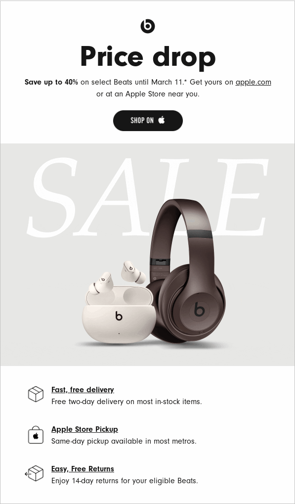
Beats keeps it clean and focused. A bold subject line announces a price drop on a flagship product.
High-resolution visuals show the product in detail, while quick-hit bullet points highlight shopper benefits. The urgency is subtle but smart: mentioning the final date near the CTA nudges action without pressure.
Why it works?
- Crisp, minimalist layout draws immediate attention to the offer;
- Deadline hint boosts urgency without triggering banner blindness;
- Benefits are simplified into skimmable bullets—no cognitive overload.
Drip Campaign — Pulp & Press
A drip campaign is a series of automated, behavior-triggered emails designed to guide email subscribers through a journey—onboarding, purchase, or retention.
Unlike standalone blasts, drip emails are sent in response to user actions, making them timely and relevant.
Here’s a drip campaign by Pulp & Press that’s sent automatically after purchase:
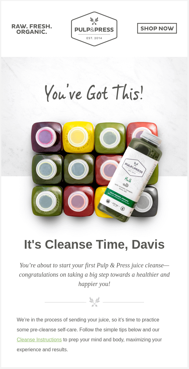
This email lands after a customer places an order and is part of a drip flow aimed at building trust and reducing post-purchase anxiety.
It combines visual storytelling (clean product imagery) with actionable info (how to use it). The tone is encouraging, making the user feel reassured and cared for—not just sold to.
Why it works?
- Perfectly timed in the journey—turns a transaction into anticipation;
- Adds value with how-to content, not just order confirmation;
- Reinforces trust while boosting satisfaction and long-term retention.
Abandoned Browse Email — Sometimes Always
Abandoned browse emails target shoppers who viewed products but didn’t add anything to their cart. These emails work because they reconnect curiosity with intent, reminding customers of what caught their eye without being pushy.
A strong browse abandonment email typically highlights the exact item they looked at, adds social proof or benefits, and uses a soft nudge to bring them back. The best ones feel more like a helpful reminder than a sales pitch.
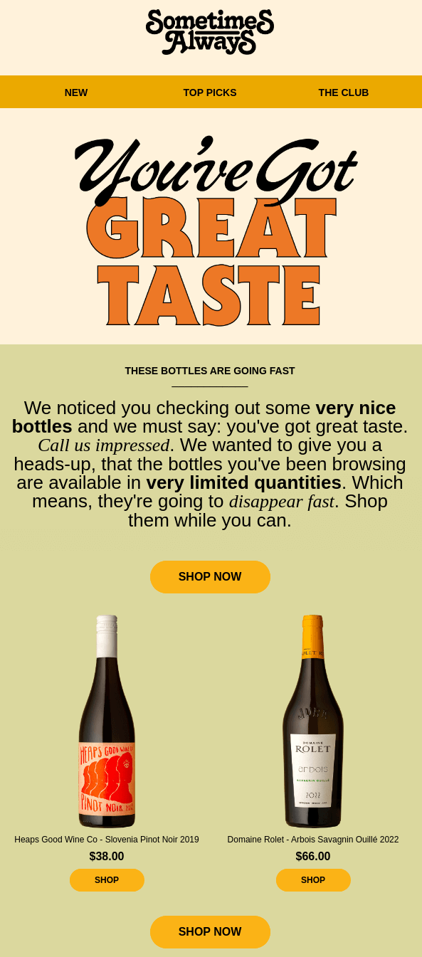
This abandoned-browsing email from Sometimes Always works because it turns casual interest into urgency without feeling pushy. The bold headline immediately flatters the reader, making the message feel personal and rewarding rather than sales-driven. Instead of focusing on what the shopper didn’t do, the email leans into positive reinforcement and curiosity.
The copy cleverly reframes inactivity as exclusivity: the bottles the reader viewed are described as “very limited,” “going fast,” and worth grabbing before they disappear. This soft urgency is paired with a clean layout showcasing the exact types of wines the shopper was exploring, making the jump back to shopping completely frictionless.
Why it works?
- Phrases like “very limited quantities” and “going to disappear fast” create urgency without pressure;
- The showcased wines directly match what the user was exploring, making the message feel relevant and well-timed;
- Multiple “Shop Now” buttons and a curated product feed streamline the next step, boosting reconversion chances.
Cross-Sell Email — Moment
Cross-sell emails are designed to introduce customers to products that complement what they’ve already purchased or plan to receive. By showcasing relevant add-ons at the right moment, these emails increase order value while genuinely enhancing the customer’s experience with items that make their original purchase even better.
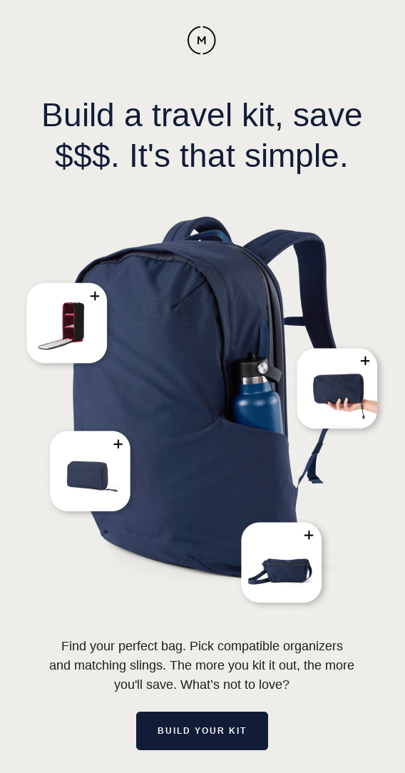
This cross-sell email from Moment works because it extends the shopping experience instead of interrupting it. After highlighting the customer’s originally viewed product, the email immediately surfaces complementary items that feel like natural additions rather than upsells. The layout is intentionally simple, allowing the recommended products to shine without overwhelming the reader.
By showing similar products and related apparel, Moment taps into browsing momentum. The customer already demonstrated interest in a specific style, so the algorithmically paired suggestions feel relevant and timely. Each product picture links to a different product, making it effortless for shoppers to explore alternatives with a single click.
Why it works?
- Recommendations align closely with the original item, increasing the chance of add-ons or substitutions;
- Large, crisp product images make comparison easy and appealing;
- Cross-sell items sit naturally below the main product, mimicking the in-store “you might also like” experience.
Back-in-Stock Alert Example — Better Booch
Back-in-stock alerts give customers a second chance at something they already showed interest in, making them some of the highest-converting emails you can send. By notifying shoppers the moment an item becomes available again, these emails tap into built-up demand, urgency, and the excitement of finally getting what they wanted—often leading to quick, decisive purchases.
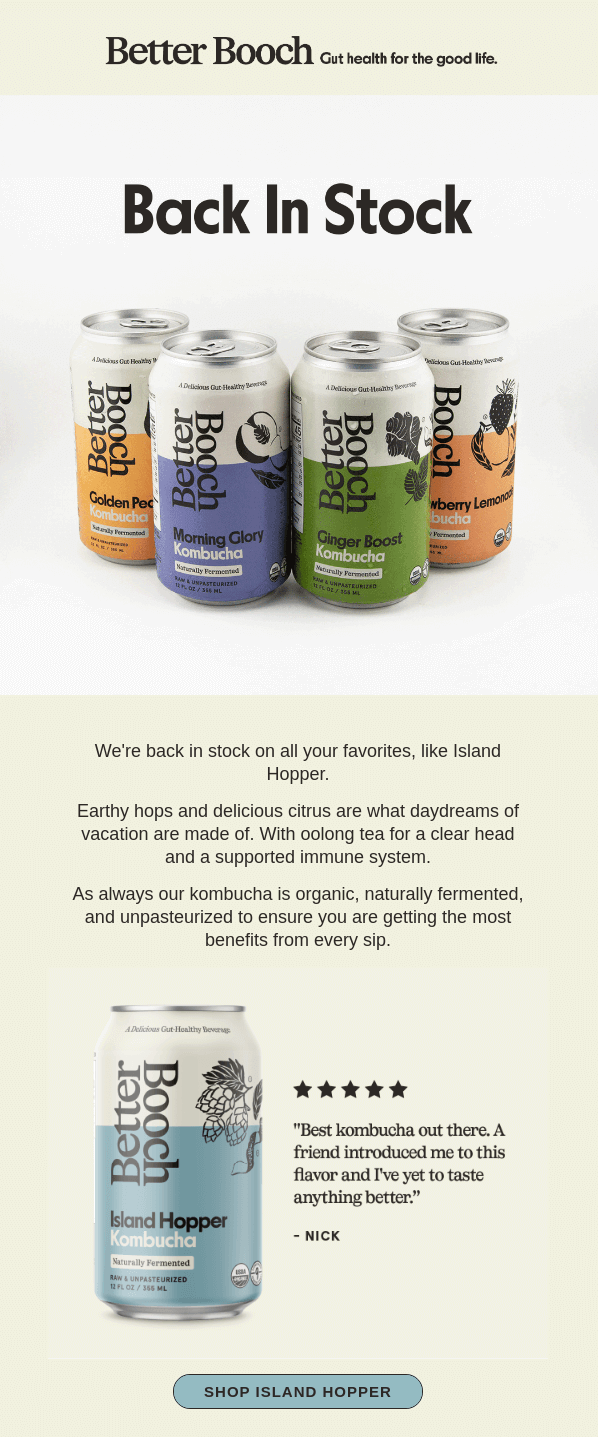
This back-in-stock email from Better Booch works because it taps into customer anticipation and delivers exactly what returning shoppers want to hear. The bold “Back In Stock” headline instantly signals good news, while the hero image showcases the full lineup in a bright, inviting way.
By highlighting a fan-favorite flavor and pairing it with a glowing customer review, the email rebuilds desire through social proof. The clean layout, spacious design, and single, focused CTA keep the path to purchase simple and enticing. It’s a perfect example of how to use a restock notification to re-ignite interest and convert high-intent shoppers.
Why it works?
- Clear value right away. The “Back In Stock” headline delivers the exact update customers care about with zero fluff;
- Clean, product-first layout. Bright product imagery keeps attention on what matters — the kombucha flavors now back on the shelf;
- Focused CTA. A single, standout button (“Shop Island Hopper”) removes friction and guides shoppers straight to checkout.
Quiz/Product Finder Example — Supergoop
Quiz and product finder emails help customers make quicker, more confident decisions by guiding them to the best product based on their needs and preferences. These campaigns remove guesswork, deliver instant personalization, and create a fun, interactive experience that naturally leads to higher engagement and conversions.
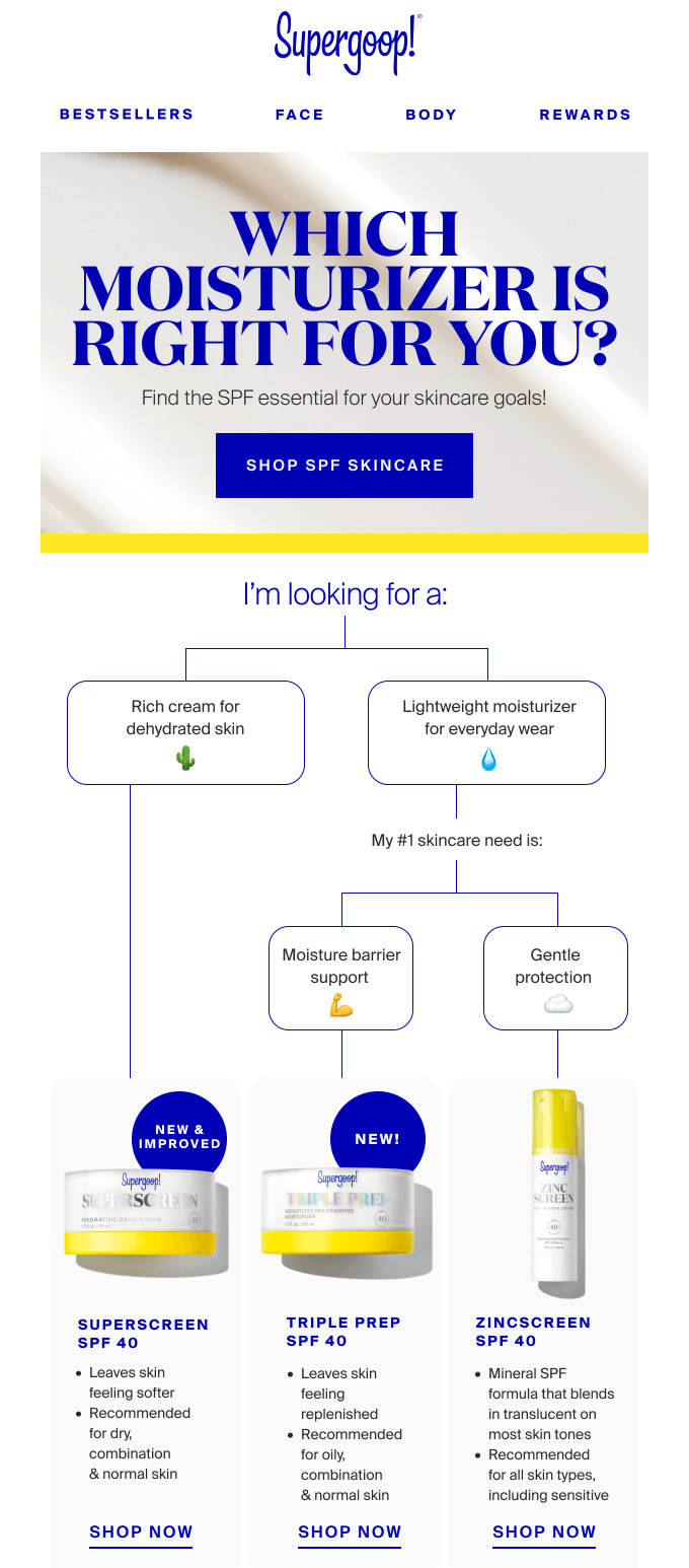
This guided-choice email from Supergoop works because it instantly simplifies the decision-making process for shoppers who feel overwhelmed by SPF options. The bold, central headline positions the message as a personalized helper rather than a product push, while the bright, clean layout keeps the entire flow easy to follow.
By breaking the quiz into quick visual choices (rich cream vs. lightweight moisturizer, moisture barrier support vs. gentle protection), the email makes the customer feel understood from the very first click. The step-by-step path removes friction, turning product discovery into an intuitive experience. And with each result clearly matched to a recommended SPF, shoppers can move from browsing to buying with confidence.
Why it works?
- The email acts like a mini skincare consultant, narrowing options based on the reader’s needs;
- The flowchart-style layout makes the quiz effortless to navigate at a glance;
- Readers see why each product fits their specific concern, reducing guesswork and decision fatigue.
Loyalty Program Example — Navyist
Loyalty program emails are designed to reward your most engaged customers and keep them coming back. By highlighting exclusive perks, points, and member-only benefits, these campaigns strengthen long-term relationships and make customers feel genuinely valued—ultimately boosting repeat purchases and overall lifetime value.
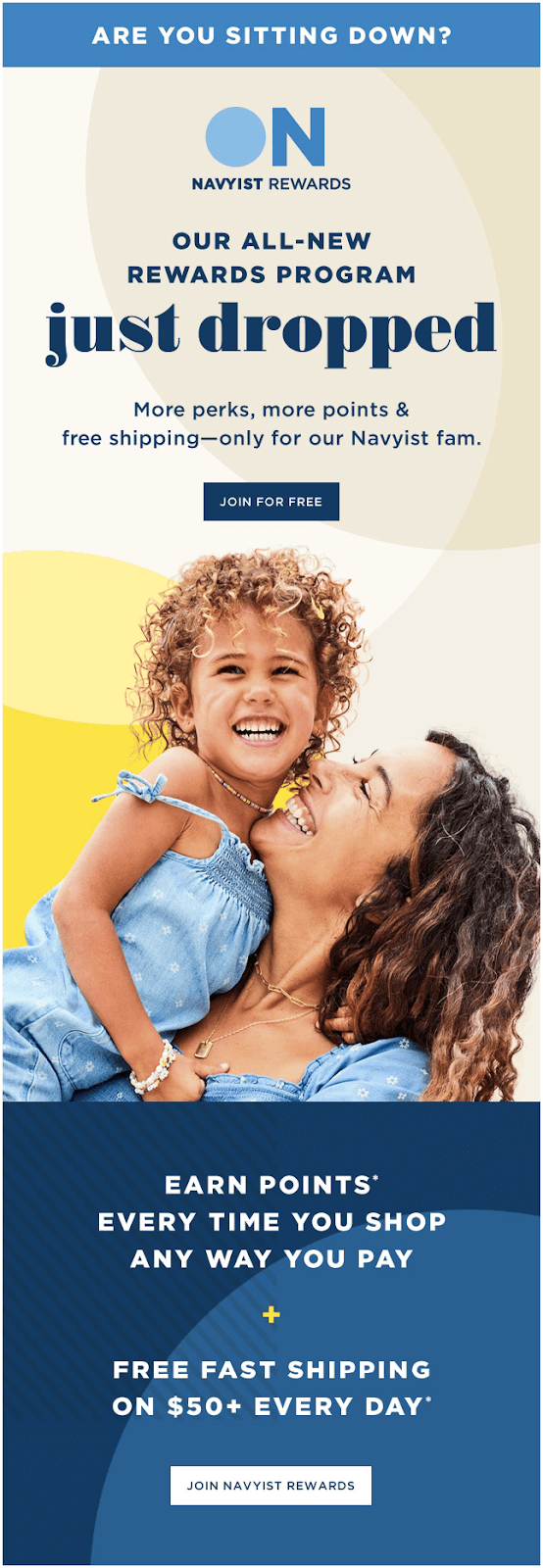
Navyist customer loyalty program email works because it feels exciting, fresh, and instantly rewarding. The bold “just dropped” headline creates launch-level hype, while the cheerful imagery reinforces positivity and belonging.
Clear benefit statements—like earning points on every purchase and always-on free shipping—communicate immediate value, making the program feel like a no-brainer. The strong “Join for free” CTA removes hesitation, encouraging customers to sign up on the spot and start collecting perks right away.
Why it works?
- Hype-driven language (“just dropped”) builds excitement around joining;
- Clear benefit framing makes the perks easy to understand at a glance;
- Highlights everyday rewards (points + free shipping) to reinforce ongoing value.
How to Create an Effective Email Campaign?
After seeing all the interesting email marketing campaigns above, you must be eager to start creating campaigns for your business. Before you do that, here are some tips to help you create high-converting campaigns, easily:
Plan Your Goals
A successful email campaign starts with a purpose and clear business goals and email marketing strategy. Always ask yourself if you’re creating the campaign to nurture leads, attract new customers, or promote an offer.
Without a clear goal, even the most thoughtful emails can underperform. In fact, marketing managers who set clear goals are 376% more likely to succeed in their outcomes.
Here’s what you should do to set clear goals:
- Define your campaign type. Welcome, promo, newsletter, etc.
- Identify success metrics. Will you track open rates, CTR, conversions, or something else;
- Visualize before execution. Set timelines and email automation logic before you draft a word;
- Maintain your email list quality. Regularly clean inactive subscribers, remove bounced addresses, and segment your audience so each message lands where it matters.
Get to Know Your Audience
Your email campaign is only as good as your understanding of your target audience. The best-performing emails feel personal because they are personalized to the customer’s behavior or preference.
A technique that most marketers use is called email list segmentation. In fact, the marketers who segment their audience increase sales and email marketing revenue by 760%.
Segmenting your contact list helps you personalize the message as well as the moment you send it—allowing you to tailor campaigns to different segments based on what they actually care about. Here are some ideas to segment your audience:
- Categorize your mailing lists based on user demographics like age, gender, location, etc.;
- Group them based on behavioral data like past purchases or site activity;
- Segment them based on their subscription source, such as quiz results, landing pages, ad opt-ins, etc.
Icons8 implemented audience segmentation in their automated email campaigns. This helped them deliver relevant content, resulting in a 33% increase in open rates and a 200% boost in click-through rates.
Maintain Your Email List Quality
Keep your subscribers’ data accurate and regularly clean your email list. Start by implementing a double opt-in for your subscription form to ensure there are no typos in email addresses and that a real person is behind each one.
As your list grows, some contacts will naturally decay, becoming invalid or outdated over time. To avoid sending emails to these non-existent addresses, do an email list cleanup every few months, removing contacts who no longer open your emails or addresses that have become invalid for any reason.
You can check your email list using bulk email verifiers like Skrapp, which scan your entire subscription list in one go and tell you which contacts to remove and which to keep.
Write Email Content That Clicks
Good email copy doesn’t just inform; it moves. Focus on subject lines to create intrigue, body copy to empathize, and CTAs that guide action.
Here’s why you should focus on content:
- 47% of email recipients open an email based on the subject line alone;
- 69% report emails as spam based on irrelevant content.
If you’re clueless about how to write good email content, here are some tips:
- Hook readers with subject lines under 9 words;
- Write as if you’re talking to one person—not subscriber lists;
- Remove fluff. Every sentence should be crisp and direct.
When in doubt, remember — clarity over cleverness always wins.
Use Personalization
Personalized emails deliver 6x higher transaction rates. However, email personalization is not just about adding a first name tag to subject lines.
Go beyond first-name tokens. Here are some ideas:
- Recommend products based on purchase history;
- Send emails triggered by behavior (e.g., abandoned cart, category visited);
- Use location and past purchase data to drive relevance.
The goal isn’t to leverage automation (or smart tags). It’s to make users feel special. When users feel seen, they click.
Add a Call-to-Action That Stands Out
Your CTA is the conversion point—make it count. Think of your CTA as the finish line of a well-run race. Don’t trip there.
Bold buttons, whitespace, and positioning above the fold all matter. Whether it’s a “Shop Now”, button, or something interesting, it needs to be:
- Visible (don’t hide it in text!);
- Clear (avoid vague phrases like “Click here”);
- Emotionally framed (“I want this” > “Submit”)
Also, remember that emails with a single CTA increase clicks by 371% and sales by 161%.
Optimize for Mobile
With over 46–60% of all emails opened on mobile devices, optimizing for small screens is non-negotiable. Mobile-friendly emails load fast, scale beautifully, and allow subscribers to skim your message without pinching or zooming.
- Keep your layouts clean. Simple, uncluttered designs help subscribers skim quickly and focus on your main message without distractions;
- Use larger fonts. Bigger, readable text ensures your email is effortless to read on small screens;
- Compress your images. Optimized visuals load faster, preventing slow or broken emails on mobile;
- Use big buttons. Large, tappable CTAs make it easier for mobile users to take action without misclicks.
The goal is simple: whether someone views your email at their desk or on the go, the experience should feel smooth, intuitive, and friction-free.
Track Your Email Engagement
You can’t improve what you don’t measure. So, keep a close eye on open rates, click-throughs, unsubscribes, and bounce rates to understand what’s working—and what will improve your future campaigns.
According to industry benchmarks, a good email open rate is typically between 20-30%, while a healthy CTR is around 2.5% or higher.
If your numbers fall short, test subject lines, timing, or content. Your data isn’t just feedback—it’s your way to optimize your email engagement tactics.
Monitor Your Campaign Metrics
Once a campaign is live, your job isn’t done—it’s just getting interesting. As we said above, you need to regularly measure and monitor important metrics:
Keep an eye on:
- Conversion rate (revenue per email sent);
- Email heatmaps (where people are clicking or dropping off);
- A/B test results (subject line vs. CTA variations).
Email marketing platforms like Sender offer real-time metrics dashboards. Use them wisely to boost your email marketing success. Even a 0.5% lift in CTR can mean thousands in revenue over time.
Remember, the brands that win measure, tweak, and repeat their best-performing campaigns.
Common Mistakes to Avoid
Even the best email strategy can fall apart if you overlook the basics. To keep your campaigns effective and subscriber-friendly, steer clear of these common mistakes:
- Clickbait subject lines. Overpromising erodes trust and leads to higher unsubscribe and spam rates;
- Ignoring mobile users. Poor mobile rendering hurts engagement and instantly sends readers away. If an email displays poorly, no matter how good the content is, it’s likely to be deleted in under 3 seconds;
- Generic mass emails. One-size-fits-all messages feel irrelevant and reduce conversions;
- Email overload. Sending too often overwhelms subscribers and increases unsubscribe rates;
- Weak CTAs. Vague or hidden calls-to-action confuse readers and kill click-through performance. Most importantly—clear call-to-actions can boost conversion rates by up to 161%.
Key Components of an Email Marketing Campaign
An email campaign consists of several important email elements, which, when combined, create the desired impact. Let’s look at the different components of an effective email campaign and see how you can nail them.
- Email Subject line. It’s the deciding factor for your email’s performance and your first opportunity to make an impression on your subscribers;
- Preview text. Preview text appears alongside the subject line and provides additional context to entice customers to open your email;
- Call-to-action (CTA). Email CTA is the specific action you want your recipients to take after reading your email and is detrimental to driving conversions;
- Design and layout. Professional design is essential to attract and engage customers. So, choose email templates with a responsive and clean design that enhances readability and guides readers toward your CTA;
- Segmentation. Email segmentation involves dividing your email list into smaller groups for personalizing your email campaigns;
- Timing. Timing matters as much as what’s inside your email. Scheduling emails during early morning hours, such as between 3:00 and 7:00 a.m., has been associated with increased engagement, as emails are more likely to appear at the top of recipients’ inboxes when they start their day.
Create and send Stunning Email Campaigns with Sender
Tired of email marketing tools that overpromise and underdeliver? Sender gives you everything you need to run high-converting email campaigns without being overwhelmed.
Whether you’re welcoming new subscribers, launching a sale, or want to update subscribers with the latest drops, Sender’s user-friendly drag-and-drop editor and library of professionally designed templates are a big help.
No design skills? No problem—just pick a layout, tweak the copy, and hit send. Start with an email service provider that offers 15,000 emails/month to 2,500 subscribers for free, forever. No credit card needed. No catch.